Author Archives: author

Differences in Evaluation of Hydroxychloroquine and Face Masks for SARS-CoV-2

DOI: 10.31038/JNNC.2020342

Abstract

Current medical opinion, based on randomized controlled trials (RCTs), is that hydroxychloroquine is ineffective for treatment of SARS-CoV-2. Previous anecdotal and uncontrolled evidence that the drug might be helpful is now outweighed by RCTs. However, leading medical authorities and public health organizations such as the CDC, the Surgeon General and NIAID are strongly recommending wearing of face masks in public to reduce coronavirus transmission. Many governments and businesses are mandating face masks. These recommendations are based on weak, anecdotal, uncontrolled evidence and there are multiple meta-analyses of RCTs in the literature, not one of which found a single RCT in which face masks reduced viral transmission in public. The RCTs are ignored and not referenced on the CDC website. Organized medicine is taking the risk of serious blowback when and if the public learns that face masks are ineffective in viral pandemics. This blowback could undermine public confidence in vaccines and many other interventions and treatments for many different medical problems.

Criteria Applied to Hydroxychloroquine for SARS-CoV-2

In a recent opinion piece in JAMA, Saag [1] defined the criteria for evaluating scientific medical evidence, and specifically for evaluating potential interventions for treatment and prevention of coronavirus infections. His comments included the statement that: “First, a single report based on a small, nonrandomized study must be considered preliminary and hypothesis generating, not clinically actionable. Likewise, anecdotal case reports and case series that include several cases likewise must be considered anecdotal and preliminary.” (p. 2162) These criteria are undisputed in medicine. They should be applied to all public health, pharmacological, vaccine and other preventive and treatment interventions for SARS-CoV-2. Saag applied these criteria in evaluating the effectiveness of hydroxychloroquine for the treatment of SARS-CoV-2 and concluded that: 1) based on the highest level of evidence, randomized controlled trials (RCTs), hydroxychloroquine is ineffective and should not be used, and 2) enthusiasm for hydroxychloroquine was not based on science or data, but instead was due to the politization of the pandemic: “However, the politicization of the treatment was a more important factor in promoting interest in use of this drug. On April 4, the US president, “speaking on gut instinct,” promoted the drug as a potential treatment and authorized the US government to purchase and stockpile 29 million pills of hydroxychloroquine for use by patients with COVID-19. Of note, no health official in the US government endorsed use of hydroxychloroquine owing to the absence of robust data and concern about adverse effects.” (p. 2162).

“The clear, unambiguous, and compelling lesson from the hydroxychloroquine story for the medical community and the public is that science and politics do not mix. Science, by definition, requires diligence and an honest assessment of findings; politics not so much. The number of articles in the peer-reviewed literature over the last several months that have consistently and convincingly demonstrated the lack of efficacy of a highly hyped “cure” for COVID-19 represent the consequence of the irresponsible infusion of politics into the world of scientific evidence and discourse. For other potential therapies or interventions for COVID-19 (or any other diseases), this should not happen again” (p. 2162). The present author is in agreement with these statements by Saag concerning hydroxychloroquine for treatment of SARS-CoV-2, and evaluation of any intervention for prevention or treatment of coronavirus infections. Presumably, the large majority of physicians are in agreement with Saag on these points. Initial hopefulness about hydroxychloroquine early in the pandemic was understandable, but it is now time to abandon that drug for that indication. Public health authorities such as the CDC, the NIAID and the U.S. Surgeon General are all in agreement on that point.

Criteria Applied to Face Masks for SARS-CoV-2

When we turn to the use of face masks for reducing coronavirus transmission in the community, a very different picture emerges. Now we see the CDC, NIAID and the Surgeon General strongly recommending the wearing of face masks in public, and we see governments and businesses mandating the wearing of face masks. This is said to be based on science and data. However, the evidence cited for the effectiveness of facemasks is anecdotal and uncontrolled. At the same time that face masks are being strongly recommended or mandated, five meta-analyses of RCTs for the use of face masks for reducing the transmission of viruses in public have not found a single RCT that showed any effect of face masks. This is why, in their December 1, 2020 Interim Guidance on mask use in the context of COVID-19, the World Health Organization [2] stated that: “At present there is only limited and inconsistent scientific evidence to support the effectiveness of masking of healthy people in the community to prevent infection with respiratory viruses, including SARS-CoV-2” (p. 8) In support of this conclusion, the World Health Organization referenced two recent papers published in the Annals of Internal Medicine, one of which was a randomized controlled trial of facemasks in Denmark with 4862 participants [3] that found no evidence of a protective effect of face masks. The second reference was to a review paper [4] of seven randomized controlled trials in the community and two in health care settings that found no protective effects of facemasks. Additional meta-analyses of RCTs for wearing of face masks in public include reviews of three RCTs [5], nine RCTs [6], four RCTs [7], ten RCTs [8] and most recently eleven RCTs [9]. The meta-analysis of eleven RCTs by Pezzolo et al. [9] involved a total of 7469 participants and found the relative risk for becoming corona virus-positive in people who wore face masks compared to people who did not to be 0.92. They stated that this difference is not significant. Prior to April, 2020, the WHO, CDC, NIAID and Surgeon General were stating that there is no need to wear face masks in public to reduce transmission of any type of virus, and they had been saying so for years. Within a few months, in the United States but not in the WHO, a complete about face took place. This was justified as being based on newly emerging evidence, but in fact the new evidence was small, uncontrolled and anecdotal. As of December, 2020, the list of references on the CDC website used to justify public wearing of face masks for the COVID-19 pandemic is entirely anecdotal. Not one of the RCTs is referenced. Rather than the CDC basing its recommendation on RCTs, the RCTs are ignored.

An example of an anecdotal observational study referenced by the Director of the CDC [10], in a paper on which he is a coauthor, is a study of two coronavirus-positive salon workers who wore facemasks at work, as did 102 of their 104 exposed clients. None of the clients became ill, but none of them were tested for coronavirus so the number of asymptomatic carriers in the client group is unknown, therefore we can’t reach any conclusion about the effectiveness of the face masks. In their paper, published in JAMA on July 14, 2020, the authors stated that, “At this critical juncture when COVID-19 is resurging, broad adoption of cloth face covering is a civic duty.”

In the present climate, anyone questioning the effectiveness of face masks for preventing transmission of the coronavirus in public takes the risk of being attacked as a conspiracy theorist, a right-wing extremist, a racist, a white supremacist, a narcissist, or even as being brain damaged [11]. Writing in JAMA, Miller [11] offered possible explanations for science denial in the context of the SARS-CoV-2 pandemic, specifically denial that face masks are effective for reducing coronavirus transmission in public. He stated that, “The relationship between anti-science viewpoints and low science literacy underscores new findings regarding the brain mechanisms that form and maintain false beliefs.” (p. 2255) Miller then went on to discuss how conspiracy theories that face masks do not work could be due to a variety of forms of neurological impairment including several different forms of dementia: “Conspiracy theories may bring security and calm, as with the patient with frontotemporal dementia who is content to believe they are rich.” (p. 2256) Organized medicine has maintained a stance of being based on science and data, and it has stated that the wearing of face masks in public is proven by science, when in fact the opposite is true. There are more RCTs confirming that face masks do not work than there are RCTs confirming that hydroxychloroquine does not work.

The Pore Size of Surgical Masks

It is not physically possible for surgical masks to reduce transmission of the coronavirus by asymptomatic carriers. The size of the coronavirus is about 0.1 microns, and the size of respiratory aerosols is about 2-3 microns. The pore size of surgical masks is 50-100 microns. Wearing a mask to prevent catching or transmitting the coronavirus is like putting a stake in the ground every 40 feet to prevent mice from coming onto your property [12-14]. Uninfected people and asymptomatic carriers are not coughing and sneezing in public, so they are not emitting any significant number of larger respiratory droplets. People who are symptomatic should stay at home. Isolation and quarantining should be the public health interventions for them. Face masks were never recommended for the flu because they don’t work. Face masks for coronavirus are not based on science. They may be a symbol of solidarity, a social control mechanism, an anti-hysteria strategy, or a well-intentioned effort to help people feel safe. Whatever the motives of face mask advocates, face masks are not science or data-based and are not effective for reducing coronavirus transmission in public. The medical profession is taking the risk of future blowback and loss of confidence in all its public health recommendations, including vaccines, by insisting that doctor knows best concerning face masks.

Conclusions

Organized medicine and public health authorities have been stating for more than six months that face masks are effective for reducing coronavirus transmission in public. This is not scientifically true. If the criteria that are applied when evaluating hydroxychloroquine for COVID-19 were applied to face masks, the CDC, the Surgeon General and NIAID would be stating, as they did up till early 2020, that there is no need to wear face masks in public.

References

  1. Saag MS (2020) Misguided use of hydroxychloroquine for COVID-19: The Infusion of Politics Into Science. JAMA. [crossref]
  2. World Health Organization (2020) Mask use in the context of COVID-19. Interim guidance, December 1, 2020.
  3. Bundgaard H, Bundgaard JS, Raaschou-Pedersen DET, Buchwald CV, Todsen T, et al. (2020) Effectiveness of adding a mask recommendation to other public health measures to prevent SARS-CoV-2 infection in Danish mask wearers: A randomized controlled trial. Annals of Internal Medicine. [crossref]
  4. Chou R, Dana T, Jungbauer R, Weeks C, McDonagh MS (2020) Masks for prevention of respiratory virus infections, Including SARS-CoV-2, in health care and community settings: A living rapid review. Annals of Internal Medicine 173: 542-555. [crossref]
  5. Brainard J, Jones N, Lake I, Hooper L, Hunter PR (2020) Face masks and similar barriers to prevent respiratory illness such as COVID-19: A rapid systematic review. Medrxiv.
  6. Aggarwhal N, Dwarakananthan V, Gautham N, Ray A (2020) Facemasks for prevention of viral respiratory infections in community settings: A systematic review and meta-analysis. Indian Journal of Public Health 64: 192-200. [crossref]
  7. Cowling BJ, Zhou Y, Ip DK, Leung GM, Aiello AE, et al. (2010) Face masks to prevent transmission of influenza virus: a systematic review. Epidemiology of Infection 138: 449-56. [crossref]
  8. Xiao J, Shiv EYC, Gao H, Wong JY, Fong MW, et al. (2020) Nonpharmaceutical measures for pandemic influenza in nonhealthcare settings – personal protective and environmental measures. Emerging Infectious Diseases 26: 967-975.
  9. Pezzolo E, Cazzaniga S, Gallus S, et al. (2020) Evidence from randomized controlled trials on the surgical masks’ effect on the spread of respiratory infections in the community. Annals of Internal Medicine 26 November.
  10. Brooks JT, Butler JC, Redfield RR (2020) Universal masking to prevent SAR-CoV-2 transmission – the time is now. JAMA. [crossref]
  11. Miller BL. Science denial and COVID conspiracy theories (2020) Potential neurological mechanisms and possible responses. JAMA 324:2255-2256. [crossref]
  12. Ross CA (2020) Thoughts on COVID-19. Journal of Neurology and Neurocritical Care 3: 1-3.
  13. Ross CA (2020) Facemasks are not effective for preventing transmission of the coronavirus. Journal of Neurology and Neurocritical Care 3: 1-2.
  14. Ross CA (2020) How misinformation that facemasks are effective for reducing is transmitted. Journal of Neurology Neurocritical Care 3: 1-2.

Perception and Understanding of Greek Dentists on Periodontal Regenerative Procedures: A Questionnaire Based Study

DOI: 10.31038/JDMR.2020345

Abstract

Objectives: The aim of this cross-sectional questionnaire study was to evaluate the perception and preferences of Greek dentists who either specialised in or had an interest in periodontal regenerative procedures and to compare the results with corresponding findings from two previous studies from different countries.

Materials and methods: The questionnaire was divided in two main sections and included multiple choice and/or open/closed questions. The first section consisted of six questions and was designed to collect demographic data of the sample and the second section, consisting of 15 questions, included general questions regarding periodontal regeneration procedures and questions based on specific clinical cases. 200 questionnaires were distributed at selected venues in Greece by the investigators. The participants were given one month to complete and return the questionnaires to the School of Dentistry in Thessaloniki.

Statistical analysis: Data management and analysis was performed using both Microsoft Excel 2007® (Microsoft Corporation, Reading, UK) and SPSS® version 22.0 software (IBM United Kingdom Ltd, Portsmouth, UK). Frequencies and associations between the demographic profiles of the participants were evaluated and presented in the form of frequency tables, charts, and figures.

Results: 104 questionnaires (67 males, 37 females: mean age 43.2 years [±9.8]) (52% response rate) were received. Of those who responded 56.7% (n=59) specialized in Periodontics and 43.3% (n=45) specialized in a variety of other dental disciplines (General Dentistry, Oral Surgery and Implantology). Guided tissue regeneration procedures and the use of enamel matrix derivative were recommended for the reconstruction of bony defects and both subepithelial connective tissue graft and coronally advanced flap with or without enamel matrix derivative were the most popular choices for root coverage. Smoking was considered a contraindication by most of the participants and conflicting responses were given regarding the use of antibiotics as part of the post-operative care following regenerative procedures.

Conclusions: The participants incorporated both traditional and “novel” techniques and products in reconstructive procedures and appeared to be up to date with the evidence from the dental literature. However, it was evident that there was confusion regarding the role of antibiotics in regenerative procedures.

Introduction

Reconstructive periodontal surgery has been one of the most dynamic and innovative therapeutic procedures in periodontology over the last 30-40 years. However, the goal of regeneration of the periodontal supporting tissues remains both unpredictable and challenging to the clinician [1,2]. Previously published cross-sectional surveys have reported on the management of regenerative procedures and techniques such as the regeneration of intrabony defects and the coverage of exposed root surfaces [1-4] and several investigators have indicated that there are numerous factors that need to be accounted for and modified before undertaking any surgical procedure of this manner [2-6]. Several reviews have previously established the use of Guided Tissue Regeneration (GTR) procedures for the reconstruction of intrabony and interradicular defects [5-10]. More recently with the advent of tissue engineering in Dentistry and the development of novel biomaterials such as enamel matrix derivatives (EMD) in combination with surgical procedures such as GTR have been utilised in general and specialized dental practices [1-2,5-8]. The type of surgical procedure including the flap design and the choice of whether to include regenerative materials or not, is important to achieve complete resolution of both the osseous and soft tissue defect [1]. There have been a number of regenerative materials and surgical techniques such as the Coronally Advanced Flap (CAF) with or without use of Sub-Epithelial Connective Tissue Graft (SCTG), enamel matrix derivatives (EMD), as well as the Free Gingival Graft (FGG) procedure which have also been recommended for root coverage [11-15]. Several studies have previously sought to evaluate whether the outcomes from clinical research in specialized and hospital-based practices has been translated into mainstream dental practices and whether the clinicians were conversant with the current recommendations and familiar with utilising the new regeneration techniques. The purpose of the present questionnaire-based study was to evaluate the knowledge and preferences of a selected group of Greek dentists in the treatment of a variety of common periodontal defects such as gingival recession, intrabony and furcation defects and to compare the results with corresponding findings from two previous studies using a similar questionnaire in two different countries.

Materials and Methods

The questionnaire was used in previous studies [1,2] and translated into Greek by native speaking Greek Dentists (DC, DS) and retranslated back into English to check for clarification of the text. The design of this study was previously assessed by the Queen Mary University of London Research Ethics Committee, London, UK (Reference: QMREC1343b) Two hundred questionnaires were prepared and distributed by two of the authors (AV, GAM) at several venues as follows: 1) the School of Dentistry of Aristotle University Thessaloniki, Greece, 2) private clinics in Thessaloniki and 3) a national periodontology conference. The participants were given one month to complete and return to the questionnaires to the Dental School in Thessaloniki.

The questionnaire consisted of 21 open and closed questions, divided in two main sections. The questions’ format was multiple-choice or open-ended or dichotomous in nature. The first section consisted of six questions and was designed to collect demographic data of the sample such as age, gender, specialty (periodontics, general dentistry, implantology, or other) as well as their year of graduation. To estimate the interest in periodontal regenerative procedures of the participants, they were asked to mark a line on a numerical scale from 1 (no interest) to 10 (high interest) based on the number of subscriptions to periodontal journals as well as the estimated number of periodontal regenerative procedures performed annually. The second section of the questionnaire, consisting of 15 questions, included general questions regarding periodontal regeneration, the site-specific factors that should be considered during the pre- and post-surgical assessment and the type of regenerative materials used in the procedure (Q. 5-6). The second section also included a set of questions about the management of four selected clinical case scenarios with labial marginal tissue recession of different stages (Miller class I–IV) [16] together with the relevant clinical photographs in colour and simplified line diagrams depicting the clinical situation. The participants were asked to choose between the following clinical options (Q. 7) and procedures (Q. 8-12): (1) CAF with or without EMD, (2) SCTG, (3) FGG, (4) laterally positioned flap (LPF), (5) double papilla flap (DPF), (6) GTR, and/or (7) other treatment. Following this section four further clinical photographs in colour with accompanying simplified diagrams of three-, two-, one-wall intrabony defects and class II furcation defects required from the participants to provide a response about the potential management of the specific clinical scenario. (Q. 13-16). Several treatment choices were provided for each of the clinical scenarios such as: (1) open flap debridement alone (OFD), (2) resective surgery, (3) GTR, (4) bone graft with or without barrier membrane, (5) EMD with or without bone fillers, and/or (6) other options A final set of questions asked about the frequency of EMD use per month and whether the participants used any special flap designs during periodontal regeneration procedures such as a papilla preservation or a coronally advanced flap procedure [CAF] (Q 17-18). Last but not least, questions relating to the exclusion of smokers from regenerative procedures and whether systemic antimicrobials should be prescribed as part of the postoperative care as well as an estimation of patients’ acceptance of using animal derived regenerative materials in regenerative procedures were also included (Q. 19-21].

Results

104 questionnaires (67 Male; 37 female participants; mean age 43.2 ± 9.8 years) were returned (52% response rate) to the School of Dentistry in Thessaloniki. The mean years after graduation from University was 19.3 ± 10.2 for the participants (range 1-41 years). Of those who responded 56.7% (n=59) specialized in Periodontics and the rest of the participants (43.3%; n=45) specialized in a variety of other dental disciplines (General Dentistry, Oral Surgery and Implantology). Data management and analysis of the returned responses was performed using both Microsoft Excel 2007® (Microsoft Corporation, Reading, UK) and SPSS® version 22.0 software (IBM United Kingdom Ltd, Portsmouth, UK) and presented in the form of frequency tables, charts, and figures. 71.2% (n=74) of the participants responded that they have a subscription in at least one periodontal journal whereas 28.8% (n=30) reported not having any. 94.5% (n=69) of those who subscribed to periodontal journals answered that they had up to four subscriptions, whereas (29.8% of the participants declined to give an answer). When asked to express their interest in periodontal regeneration procedures 76% (n=79) recorded a Visual Analogue Scale score of 7 and above, 19.2% (n=20) a score of 4-6 and 4.8% (n=5) indicated a VAS score between 1-3 (Q. 5). When asked to estimate the number of regenerative procedures (%) that they had performed in one year (Q.6) 87.5% (n=91) estimated that up to 30% of the surgeries performed in their clinical practice annually were regenerative in nature (mean percentage 20.5% ± 17.1%).

The main clinical parameters that were evaluated prior to and following a regenerative procedure are shown in Figure 1.

fig 1

Figure 1: Parameters considered prior to and following a regenerative procedure (Q.7).

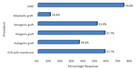
In response to the techniques and materials commonly used in regenerative procedures (Q.8) the most popular choices were 1) EMD (74%; n=77), 2) GTR with a resorbable barrier membrane (57.7%; n=60), 3) Allogenic graft (with or without a barrier membrane) (57.7%; n=60) and 4) Xenogenic graft (with or without a barrier membrane) (51%: n=53) (Figure 2).

fig 2

Figure 2: Techniques and materials used in regenerative procedures.

Q. 9-12 required the participants to indicate their preferences for treatment of four clinical scenarios corresponding to each of the four categories of the Miller Classification for marginal recession defects.

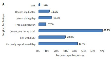
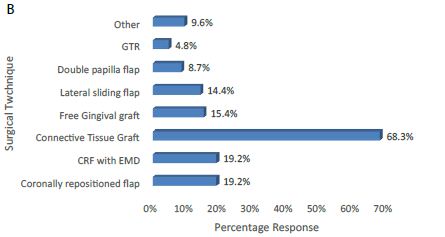
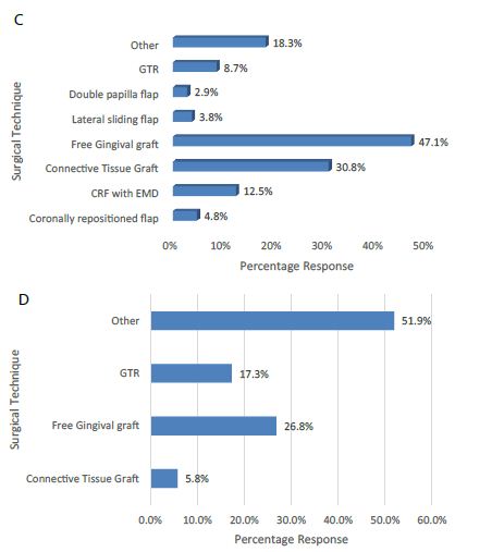
The responses for treating a Miller Class I defect were as follow: 1) CTG (69.2%; n=72), 2) CRF (42.3%; n=44), 3) CRF with EMD (28.8%; n=30) and 4) LSF (13.5%; n=14) (Figure 3a). Of the participants who chose “other” as a response, the double papilla flap (11.5%; n=12) and free gingival graft (7.7%: n=8) were more frequently suggested. The responses for the treatment of a Miller Class II marginal defect were: 1) Connective Tissue Graft (68.3%; n=71), 2) CRF (19.2%; n=20), 3) CRF with EMD (19.2%; n=20), 4) FGG (15.4%; n=16) and 5) LSF (14.4%; n=15) (Figure 3b). Of the other responses a CRP/CTG combination (30%; n=3) and a mucogingival graft ((20%; n=2) were suggested as alternative options. The responses for the treatment of a Miller Class III marginal defect were: 1) Free Gingival Graft (26.8%; n=28), 2) GTR (17.3%; n=18), 3) CTG (5.8%; n=6) and 4) ‘Other’ (51.9%; n=54) Figure 3c). Of the 19 ‘Other’ responses, 36.8% (n=7) of the participants administered no treatment, 15.8% (n=3) suggested a mucogingival graft and 10.5% (n=2) suggested a subepithelial graft with a tunnelling technique. The responses for the treatment of a Miller Class IV marginal defect were as follows: 1) Free Gingival Graft (26.8%; n=28), 2) GTR (17.3%; n=18), 3) CTG (5.8%; n=6) and 4) ‘Other’ (51.9%; n=54) (Figure 3d). Of the ‘Other’ responses, 53.7% (n=29) of the participants offered no treatment, 7.4% (n=4) suggested extraction, 5.6% (n=3) offered non specified conservative treatment and 4) 5.6% (n=3) suggested a mucogingival graft.

fig 3a

fig 3b

fig 3c & 3d

Figure 3a-3d: The preferences of the participants regarding the various treatment options available for the different Miller Classification marginal recession defects (a) Miller Class I; (b) Miller Class II; (c) Miller Class III; and (d) Miller Class IV.

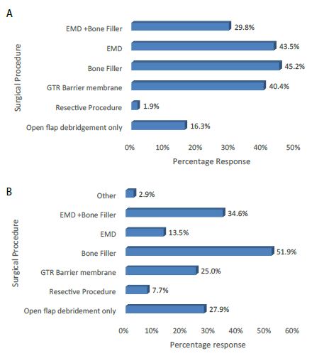
The preferences of the participants regarding various surgical options available for the treatment of intrabony defects namely: (a) 3-wall defect; (b) 2-wall defect; and (c) 1-wall defect were addressed in Q. 13-15. The main preferences for treating a 3-wall defect were: 1) use of a bone filler (45.2%: n=47), 2) EMD (43.5%: n=45), 3) GTR with a resorbable membrane (40.4%: n=42) and 4) EMD with a bone filler (29.8%: n=31) (Figure 4a)

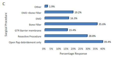
The main preferences for treating a 2-wall defect were: 1) use of a bone filler (51.9%: n=54), 2) EMD with a bone filler (34.6%: n=36), 3) Open flap debridement only (27.9%: n=29) and 4) GTR with a resorbable membrane (25%: n=24) (Figure 4b).

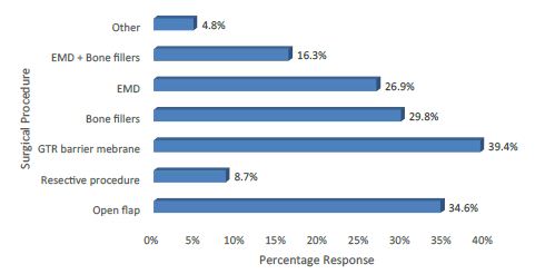
The main preferences for treating a 1-wall defect were: 1) Open flap debridement alone (39.4%: n=41), 2) using a bone filler (35.6%: n=37), 3) Resective procedure (28.8%: n=30) and 4) EMD with a bone filler (19.2%: n=20) (Figure 4c).

fig 4a & 4b

fig 4c

Figure 4a-4c: The preferences of the participants in relation to the various surgical options available for the treatment of intrabony defects namely: (a) 3-wall defect; (b) 2-wall defect; and (c) 1-wall defect.

The main preferences for treating a Class II furcation defect (Q. 16) were as follows: 1) GTR with a barrier membrane (39.4%; n=41), 2) Open flap debridement alone (34.6%: n=36), 3) use of a bone filler (29.8%: n=31) and 4) EMD (26.9%: n=28) (Figure 5).

fig 5

Figure 5: The main preferences for treating a Class II furcation defect.

92.3% (n=96) of the participants indicated that they used EMD in regenerative procedures (Q. 17). When asked how often was EMD used in regenerative procedures within a month, 58.3% (n=60) of the participants indicated that they applied the product 1-3 times per month. Of the other responses 14.6% (n=14) applied EMD 4-6 times within a month, a 6.8% (n=7) 7-9 times a month. and a 5% (n=5) of the participants indicated that they never applied EMD during regenerative procedures (Figure 6).

fig 6

Figure 6: Estimated monthly application of EMD in regenerative procedures.

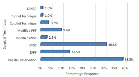
The most popular flap design incorporating a minimally invasive surgical approach (Q. 18) included 1) a papilla preservation technique (38.5%; n=40) and 2) MIST (30.8%: n=32) (Figure 7).

fig 7

Figure 7: Choice of a specific flap design incorporating a minimally invasive surgical approach.

70.2% (n=73) of the participants responded that they usually exclude smokers from regenerative procedures whereas 29.8% (n=31) indicated that they would attempt a periodontal regeneration surgery to smokers (Q. 19). The main reasons for the exclusion of smokers were compromised host response, impaired wound healing, risk of membrane exposure and a low success rate.

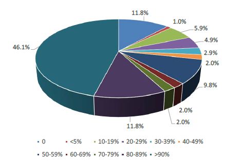
88.2% (n=90) of the participants stated that they would prescribe antibiotics (e.g., Amoxicillin and Metronidazole) after a regenerative procedure, but 11.8% (n=12) indicated that they would not (Q. 20). Of those participants who would prescribe antibiotics 46.1% (n=47) indicated that they would do so for at least 9 out of 10 of their patients (Figure 8).

fig 8

Figure 8: Estimated percentage of patients receiving antibiotics after regeneration procedures.

The main antibiotics prescribed after a regenerative procedure (Q. 20) were: 1) Amoxicillin (54.8%; n=57), 2) Amoxicillin and Clavulanic acid (35.6%: n=37), 3) Metronidazole (16.3%: n=17) and 4) Clindamycin (15.4%: n=16).

When asked whether any of their patients had refused to have an animal derived product placed in situ as part of a regenerative procedure, 84.6% (n=88) of the participants gave a negative answer (Q. 21), whereas of those participants who indicated that their patients may refuse to receive one of these products, (8.7%; n=9), although, ≤ 5% of the patients would actually refuse an animal derived product as part of a regenerative procedure.

A comparison of the results from the present study together with the previous outcomes from the UK and Kuwaiti studies are shown in Table 1.

Table 1: Comparison of studies in the UK, Kuwait and Greece.

Question Siaili et al. (UK) Abdulwahab et al. (Kuwait) Violesti et al. (Greece)
Q. 1-2 Demographics (Age: Gender) 141 participants (M:84: F: 51 mean: 44 ± 1.05 years) Response rate: 38.5% 129 participants (M 90: F 39; mean age: 35.7 ± 7.2 years). Response rate 86%. 104 participants (M 67: F 37; mean age 43.2 ± 9.8 years). Response rate 52%.
Q. 3 Professional Status 65.5% (n=91) specialized in Periodontics and 35.5% (n=50) were General Dental Practitioners with a special interest in Periodontics. 55.8% (n=72) were General Dental Practitioners, 26% (n=34) specialised in Periodontics. Other disciplines included Oral Surgery, Orthodontics Implantology and Prosthodontics. 56.7% (n=59) specialized in Periodontics, 43.3% (n=45) specialized in a variety of dental disciplines including Periodontics, General Dentistry, Oral Surgery and Implantology)
Q. 4 Years from Graduation 20 ± 1.04 years (range 2–50 years) 9.8 ± 7.0 years (range 0-33 years) 19.3 ± 10.2 years (range 1-41 years)
Q. 5a-b Journal Subscription 68.1% (n=96) subscribed to one or more journals 30% (n=39) subscribed to one or more journals 71.2% (n=74) subscribed to one or more journals
Q. 5c Interest in Periodontal Regenerative procedures Mean VAS 7.57 ± 0.2 (High) Mean VAS 6.5 ± 2.3 (Moderate) Mean VAS 7.79 ± 2.2 (High)
Q. 6 Estimation of the number of Regenerative procedures Mean percentage 14% ± 1.96% Mean percentage 27.5% ± 25.5%. Mean percentage 20.5% ± 17.1%.
Q. 7 Parameters to be considered prior to and following a regenerative procedure Oral hygiene, pocket depth measurement, radiographic presentation and, CAL Oral hygiene, tooth mobility, probing depth measurements and radiographic presentation Oral hygiene, pocket depth measurement, radiographic presentation and, CAL
Q. 8 Techniques and materials used in regenerative procedures 1) EMD, 2) GTR with a resorbable (absorbable) membrane 1) GTR, 2) allogenic graft (with or without a barrier membrane), 3) alloplastic grafts (with or without a barrier membrane) and 4) EMD 1) EMD, 2) GTR with a resorbable barrier membrane), 3) Allogenic graft (with or without a barrier membrane) and 4) Xenogenic graft (with or without a barrier membrane)
Q.9 The preferences of the participants regarding the various treatment options available of a Miller Class I marginal defect 1) SCTG, 2) CAF, 3) FGG and 4) CAF with EMD 1) CRF, 2) CTG, 3) FGG and 4) CRF with EMD 1) CTG, 2) CRF 3) CRF with EMD and 4) LSF
Q.10 The preferences of the participants regarding the various treatment options available of a Miller Class II marginal defect 1) SCTG, 2) FGG, 3) CAF with EMD and 4) CAF 1) CTG, 2) CRF, 3) GTR and 4) CRF with EMD 1) CTG 2) CRF, 3) CRF with EMD and 4) FGG
Q.11 The preferences of the participants regarding the various treatment options available of a Miller Class III marginal defect 1) SCTG, 2) FGG and 3) ”Other” (e.g., non-surgical treatment) 1) GTR with a resorbable barrier membrane 2) FGG, 3) CTG and 4) LSF 1) FGG, 2) GTR, 3) CTG and 4) ‘Other’ (no treatment, a mucogingival graft and a subepithelial graft with tunnelling)
Q.12 The preferences of the participants regarding the various treatment options available of a Miller Class IV marginal defect 1) FGG and 2) GTR procedures were indicated although 3) other treatment options such as ‘nonsurgical treatment’ and extraction were preferable GTR with a resorbable barrier membrane and CTG were recommended although ‘Extraction’ was the preferred option 1) FGG, 2) GTR, 3) CTG 4) other options preferred such as no treatment, extraction, and non-specified conservative treatment or a mucogingival graft.
Q. 13 The preferences of the participants in relation to the various surgical options available for the treatment of a 3-wall infrabony defect 1) EMD without and with bone grafts (filler) and 2) using bone grafts (filler) with or without the use of barrier membranes 1) GTR with a resorbable barrier membrane, 2) bone grafts (filler), 3) OFD and 4) EMD combined with bone grafts 1) using a bone filler, 2) EMD, 3) GTR with a resorbable membrane, and 4) EMD with a bone filler
Q. 14 The preferences of the participants in relation to the various surgical options available for the treatment of a 2-wall infrabony defect 1) EMD combined with bone grafts, 2) bone grafts (filler) with or without barrier membranes, 3) GTR with resorbable membranes and (4) EMD 1) GTR with a resorbable barrier membrane, 2) bone grafts (filler), 3) combined with bone grafts and 4) OFD 1) using a bone filler, 2) EMD with a bone filler, 3) OFD and 4) GTR with a resorbable membrane
Q. 15 The preferences of the participants in relation to the various surgical options available for the treatment of a 1-wall infrabony defect 1) Resective surgery and 2) OFD 1) Resective surgery, 2) OFD, 3) Bone graft and 4) GTR with the use of a resorbable barrier 1) OFD 2) using a bone filler, 3) Resective procedure and 4) EMD with a bone filler
Q. 16 The main preferences for treating a Class II furcation defect 1) EMD, 2) GTR with the use of resorbable barrier membranes 3) OFD 4) EMD and bone grafts 5) resective surgery And 6) bone grafts with or without barrier membranes 1) GTR with a resorbable barrier, 2) OFD and bone graft. EMD was the least preferred option for the management of a Class II furcation defect 1) GTR with a barrier membrane 2) Open flap debridement only, 3) using a bone filler, and 4) EMD
Q. 17 Estimated monthly application of EMD in regenerative procedures The main response was one to three times per month The main response was one to three times per month The main response was one to three times per month
Q. 18 Choice of a specific flap design incorporating a minimally invasive surgical approach 1) The papilla preservation flap and 2) coronally advanced flap 1) Papilla preservation 2) coronally displaced (advanced) flap 1) a papilla preservation technique and 2) MIST procedures
Q. 19 Would Smokers be excluded from regenerative procedures Smoking was considered a contraindication for regenerative procedures by most of the participants. Vasoconstriction, impaired postoperative healing, and compromised outcomes were reasons why Smokers should be excluded from these procedures. Smoking was not considered a contraindication for regenerative procedures by most of the participants of those participants who would exclude Smokers factors such as impaired healing, poor prognosis, vasoconstriction and, treatment results in failure (low success rate) Smoking was considered a contraindication for regenerative procedures by most of the participants. The main reasons for exclusion included a compromised host response, wound healing, risk of membrane exposed and a low success rate.
Q. 20 Prescription of antibiotics following regenerative procedures Most of the participants reported that they would prescribe antibiotics for their patients with 35% indicating that they would not prescribe antibiotics Most of the participants reported that they would prescribe antibiotics for their patients with 9.6% indicating that they would not prescribe antibiotics Most of the participants reported that they would prescribe antibiotics for their patients with 11.8% indicating that they would not prescribe antibiotics
Q. 20 Choice of Antibiotic prescribed to patients 1) Amoxicillin, 2) Combination of Amoxicillin and 3) Metronidazole and 4) Doxycycline Metronidazole, 1) Combination of Amoxicillin and Metronidazole, 2) Augmentin, 3) Amoxicillin and 4) Clindamycin 1) Amoxicillin, 2) Amoxicillin and Clavulanic acid), 3) Metronidazole and 4) Clindamycin
Q. 21 What % of your patients undergoing a regenerative procedure would reject an animal derived material Variable response with at least one-third of the participants indicating that their patients would not reject an animal derived material. Of those participants who indicated that their patients may refuse to have one of these products <5% of their patients would do so Most of the participants reported that

their patients would reject an animal-derived material. According to the participants’ responses, at least 30% of their patients would reject the product.

Most of the participants indicated that none of their patients would reject an animal derived material. Of those participants who indicated that their patients may refuse to have one of these products <5% of their patients would do so.

Key: M: Male; CAF: Coronally Advanced Flap; F: Female; FGG: Free Gingival Graft; VAS: Visual Analogue Scale; CRF: Coronally Repositioned Flap; EMD: Enamel Matrix Derivative; LSF: Laterally Sliding Flap; GTR: Guided Tissue Regeneration; OFD: Open Flap Debridement; SCTG: Subepithelial Connective Tissue Graft.

Discussion

The aim of the present study was to assess the awareness and preferences of a selected group of Greek clinicians and to compare the outcomes with two previous cross-sectional questionnaire studies in the UK and Kuwait [1,2]. The response rates from the three studies were at variance with each other (38.5% to 86%) differing also from the response rate of the present study, which was 52%. When comparing the age and experience of the participating dentists with the two previous studies [1,2], the age and experience of the Greek dentists were comparable with the UK study [1] although the dentists in the Kuwait study [2] were on average younger with less clinical experience. The professional status of both the UK based clinicians and those in the present study was similar with >50% of the participants being specialized in Periodontics as compared to the Kuwaiti sample where only 26% was specialized in Periodontology. This was evident when comparing the interest in performing regenerative procedures. The result of the present study was comparable to the UK based study with both groups expressing a high degree of interest in performing regenerative procedures (Mean VAS 7.79 ± 2.2 [Greek]: 7.57 ± 0.2 [UK]) whereas the corresponding result from Kuwait was moderate (mean VAS 6.5 ± 2.3). The mean percentage of periodontal regenerative procedures recorded in the present study (20.5%) was comparable to the Kuwaiti based group (27.5%) and remarkably higher comparatively to the one recorded in the UK study (14%). When considering the clinical parameters taken into account prior to and following a periodontal regeneration procedure, the overall responses from the three studies (oral hygiene, pocket depth measurements, radiographic presentation and CAL) from Greece and the UK were similar although in the Kuwaiti study the assessment of CAL seemed to be underestimated. The assessment of CAL is perhaps one of the most important factors in periodontal regeneration [9] and the apparent underestimation of this factor may be the result of the lack of experience of the younger participants in Kuwait. When considering the type of technique(s) and materials used in regenerative procedures both the UK and Greek group indicated that they prefer 1) EMD and 2) GTR with a resorbable membrane. On the other hand, the Kuwaiti group indicated that although they widely choose a GTR procedure as well, they prefer to combine this technique with either allogenic or alloplastic grafts (with or without the use of a membrane). Notably, at the time of conducting the study in Kuwait the use EMD was not as popular as in the UK and Greece.

Comparison of the preferred treatment modalities for the four selected clinical situations based on the Miller Classification [16] (Q. 9-12) evaluated the participants’ responses to root coverage procedures in terms of the ‘the most predictable’ outcome for the clinical cases (Miller Class I & II defects) as well as the ‘least predictable’ outcomes based on Miller Class III & IV recession defects. The most popular technique to treat Miller Class I defects was a CTG procedure in agreement with [1] but not with [2] where the principal choice was a CRF/CAF procedure (Table 1). For the treatment of a Miller Class II defect a CTG procedure was the most popular choice in all three studies in agreement with evidence from the published literature, indicating the superiority of CAF with or without EMD and/or CTG in root coverage procedures [15]. The responses for treating a Miller Class III defect were at variance with the other two studies in that the main choice in the present study was for a FGG procedure which was not the first choice in the other two studies [1,2] although it was popular (Table 1). The treatment preferences for managing a Miller Class IV defect were in general agreement with the studies from the UK [1] and Kuwait [2] Although the Kuwaiti study’s first preference was a GTR procedure, other options including non-surgical treatment and extractions which was also suggested in all three studies (Table 1).

Responses to Q. 13-15 related to the materials and techniques used in the management of 1, 2 or 3-walled intrabony defects indicated that in the management of both the 3- and 2- walled defects there was overall agreement between the three studies with EMD (with/without a bone filler) being favoured in the present study and the UK study [1]. On the contrary, GTR procedures were favoured in the Kuwaiti study [2] (Table 1). For the treatment of a 1-walled infrabony defect OFD was the first choice in the present study, whereas resective surgery was the preferred choice in the UK and Kuwaiti studies [1,2]. The differences in the use of EMD between the present study and the Kuwaiti study may either have been related to religious issues or the availability of the specified biomaterial. Furthermore, it should be recognised that some of the minimally invasive procedures employed in Specialist and Hospital based practices may not be undertaken in the general practice environment.

The main preferences for treating a Class II furcation defect (Q. 16) in the present study were 1) GTR with a barrier membrane (39.4%; n=41), 2) Open flap debridement alone (34.6%: n=36), 3) use of a bone filler (29.8%: n=31) and 4) EMD (26.9%: n=28) (Figure 6) in agreement with Abdulwahab et al. [2]. The main difference between the UK study and the other two was the preference for EMD [1,2] (Table 1). In response to Q. 17 there was general agreement as far as the estimated monthly EMD application was concerned (Table 1). The main choice of a specific flap design incorporating a minimally invasive surgical approach was the papilla preservation flap (Q. 18) (Table 1). Flap design is of critical importance in regenerative procedures as it facilitates both full surgical site coverage and wound stability during the healing process [11].

When asked whether smoking was a contraindication for regenerative procedures (Q. 19), most of the participants in the present study concurred with those in the UK study [1] that smokers should be excluded. This was in contradistinction to the Kuwaiti study [2] where smokers would not be excluded (Table 1). Evidence from previous studies would suggest that smokers appear to have impaired healing response as well as lower frequencies of complete root coverage compared to non-smokers [13,16].

Most of the participants in all three studies would prescribe antibiotics after a regenerative procedure (Q. 20). The number of dentists who would prescribe antibiotics was higher for both the present and the Kuwaiti study [2] as compared to the results from the UK [1] indicating that a larger number of respondents in the UK study would not prescribe antibiotics after a periodontal regeneration surgery (Table 1). According to Abdulwahab et al. [2] this response from UK dentists may be due to a greater awareness of the current problems with antibiotic resistance due to over-prescription. The choice of a specific antibiotic (Q. 20) in the present study was in general agreement with previous studies [1,2] (Table 1).

The acceptance or rejection of an animal-derived regenerative material as part of the regenerative procedure by the patients (Q. 21) may depend on the cultural or religious beliefs of the patients. For example, most of the participants in the present study would accept this kind of material in agreement with studies [1,3] but in contradiction with [2] where most of the participants would reject this material based on their patients’ preferences (Table 1).

The results from the present study appear to validate the questionnaire previously used [1,2] and there was general agreement from the three studies on how practitioners would treat the various clinical scenarios however it was evident that several points of disagreement arose from the results of the two previous studies [1,2] such as whether to exclude smokers prior to a regenerative procedure, post-operative administration of antibiotics following regenerative procedures [2] or the acceptance of animal derived products during these procedures. The results from the present study generally concur with previous European studies, particularly regarding the use of animal derived biomaterials [1,3]. The techniques and regenerative materials have changed over the last decade and this may be reflected in the responses acquired by the three studies. This may also suggest that there is a lag period regarding the transfer of information from evidence-based clinical practice to the general practice as well a lack of opportunity or availability to develop clinical skills from hands on clinical training in regenerative procedures.

Conclusion

The results of the present pilot study would suggest that dentists need to be more informed regarding recent innovations in regenerative procedures and techniques when treating a range of periodontal defects.

Acknowledgements

The investigators would like to thank all the participants who helped with this study.

References

  1. Siaili M, Chatzopoulou D, Gillam DG (2014) Preferences of UK-Based Dentists When Undertaking Root Coverage and Regenerative Procedures: A Pilot Questionnaire Study. Int J Dent 2014: 548519. [crossref]
  2. Abdulwahab A, Chatzopoulou D and Gillam DG (2018) A Survey of the Professional Opinions of Dentists in Kuwait in the Use of Periodontal Regenerative Surgical Procedures for the Treatment of Infra Bony and Localized Gingival Defects. J Dent & Oral Disord 4: 1104.
  3. Schroen O, Sahrmann P, Roos M, Attin T, Schmidlin PR (2011) A survey on regenerative surgery performed by Swiss specialists in periodontology with special emphasis on the application of enamel matrix derivatives in infrabony defects. Schweiz Monatsschr Zahnmed 121: 136-142. [crossref]
  4. Zaher CA, Hachem J, Puhan MA, Mombelli A (2005) Interest in periodontology and preferences for treatment of localized gingival recessions: a survey among Swiss dentists. Journal of Clinical Periodontology 32: 375-382. [crossref]
  5. Needleman I Tucker, R Giedrys-Leeper E, Worthington H (2005) Guided tissue regeneration for periodontal intrabony defects-a Cochrane systematic review. Periodontol 2000 37: 106-123. [crossref]
  6. Cortellini P, Tonetti MS (2009) Improved wound stability with a modified minimally invasive surgical technique in the regenerative treatment of isolated interdental intrabony defects. Journal of Clinical Periodontology 36: 157-163. [crossref]
  7. Esposito M, Grusovin MG, Papanikolaou N, Coulthard P, Worthington HV (2009) Enamel matrix derivative (Emdogain) for periodontal tissue regeneration in intrabony defects. Eur J Oral Implantol 2: 247-266. [crossref]
  8. Trombelli L, Farina R (2008) Clinical outcomes with bioactive agents alone or in combination with grafting or guided tissue regeneration. J Clin Periodontol 35: 117-135. [crossref]
  9. Caton JG, Greenstein G (1993) Factors related to periodontal regeneration. Periodontol 2000 1: 9-15. [crossref]
  10. Cortellini P, Tonetti MS (2005) Clinical performance of a regenerative strategy for intrabony defects: scientific evidence and clinical experience. Journal of Periodontology 76: 341-350. [crossref]
  11. Chambrone L, Chambrone D, Pustiglioni FE, Chambrone LA, Lima LA (2008) Can subepithelial connective tissue grafts be considered the gold standard procedure in the treatment of Miller Class I and II recession-type defects? J Dent 36: 659-671. [crossref]
  12. Chambrone L, Pannuti CM, Tu Y-K, Chambrone LA (2012) Evidence-based periodontal plastic surgery. II. An individual data meta-analysis for evaluating factors in achieving complete root coverage. J Periodontol 83: 477- 490. [crossref]
  13. Cheng YF, Chen JW, Lin SJ, Lu HK (2007) Is coronally positioned flap procedure adjunct with enamel matrix derivative or root conditioning a relevant predictor for achieving root coverage? A systemic review. J Periodontal Res 42: 474-485. [crossref]
  14. Cairo F, Pagliaro U, Nieri M (2008) Treatment of gingival recession with coronally advanced flap procedures: a systematic review. J Clin Perio 35: 136-162. [crossref]
  15. Miller Jr PD (1985) A classification of marginal tissue recession. The International Journal of Periodontics & Restorative Dentistry 5: 8-13. [crossref]
  16. Trombelli L, Scabbia A (1997) Healing response of gingival recession defects following guided tissue regeneration procedures in smokers and non-smokers. J Clin Periodontol 24: 529-533. [crossref]

A Mind Genomics Cartography of Craft Beer: Homo Emotionalis vs. Homo Economicus in the Understanding of Effective Messaging

DOI: 10.31038/NRFSJ.2020312

Abstract

This mind cartography of craft beers explores what interest’s prospective consumers in a craft beer, and how much they will pay. Each respondent tested unique sets of 48 vignettes, comprising 2-4 elements selected from a set of 36 elements. The permutation strategy enables an individual-level model to be constructed relating the presence/absence of 16 elements (messages) to both rated interest in the beer, and price willing to pay. Clustering the models by individuals revealed two different patterns of mind-sets. The first triple of mind-sets emerges from the interest rating (Homo Emotionalis: Appearance & Beer Story, Flavor & Romance, and Quirky). The second triple of mind-sets emerges from the price selection (Homo Economicus: Quality Package & Flavor; Flavor & Experience; Sensory Decadence). The paper introduces the PVI, personal viewpoint identifier, expanding the findings by assigning new people to a mind-set based upon the response pattern to six question emerging from the segmentation on Question 1 The paper finishes with scenario analysis, an approach to discover how pairs of elements interact in ways that could not have been known at the start of the experiment. The scenario analysis is applied to the interaction of origin to the other elements, both for Homo Emotionalis (ratings of interest, question #1) and for Homo Economicus (selection of price, question #2).

Introduction

Craft beer, a recent development in the word of brewing, has been summarized by Wikipedia as follows:

A craft beer or microbrewery is a brewery which produces small amounts of beer…and is often independently owned. Such are brewers are generally perceived and marketed as having an emphasis on enthusiasm, new flavours and varied brewing techniques. The microbrewing movement began both in the United States and United Kingdom in the 1970’s…

In an age of automation and conformation to production and product specifications in the interest of business, the growth and flowering of the craft beer industry may be symptomatic of a deep of people, viz. to express themselves and their creativity in crafts. In a world where standardization continues relentlessly, and the economics of scale demand conformity, there is a desire for people to express themselves. This expression can be the quotidian act of preparing one’s own food in a creative way, cooking, creating one’s own mixtures of ingredients in smoothies, or creating one’s own beverage by traditional processes, viz., home brewing and the effort of craft brewing. In the world of brewing the appellation of a craft beer may become a strong marketing positive, either because of direct or because of the romanticization of the traditional, the small, and the so-called ‘authentic’ [1-6].

The food and beverage world has welcomed studies about food for more than a century. Food and beverage are important, but of greatest important is the realization that we eat and drink for many reasons, ranging from basic survival to sensory preferences to socially motivated issues like companionship. Furthermore, foods and small, inexpensive items, are purchased not in a strategic way by business specialists, but rather by the ordinary person. Understanding the features of products is important in such a world where freedom of choice is feasible, and indeed a major component with which marketers must contend.

Most of the popular literature, e.g., newspapers, bogs, videos, and so forth, talk about the interesting parts of craft beer, such as the history of the product, the emotions felt in making the product, the emotions of the trade and buyer, and so forth. The stories are ‘happy,’ topical, and of general interest. The science of beer making, and the issues faced by beer makers who are brewing their own craft beers are less interesting, but nonetheless important.

The motivation for this study was the interest in marketing messages about craft beer. The language of craft beer is a romantic one, as one which connotes a rebellion of sorts, and a focus on the ‘arts and crafts’ of brewing. Beers with connections to countries traditional perceived as brewers, e.g., England, Germany, Belgium, etc., are often romanticized as being tasty, and special. Despite the large literature on craft beer from the worlds of marketing, sociology and sensory research, there does not seem to be a systematic analysis readily available of the responses to messages about the nature of craft beer. In the spirit of Mind Genomics, thus study provides a preliminary cartography, focusing on what messages about craft beer drive interest, and what messages drive willingness to pay.

The topic of craft beer, especially the combination of economics and communications, is part of an ongoing project by the authors, focusing on a new approach to understanding of how people make decisions. The general study is Mind Genomics, described below, and the specific focus is an emerging subdiscipline of Mind Genomics, cognitive economics, which fits into the world of behavioral economics. When applied to the topic of ‘what is important’ in craft beer, and what do people say they ‘value economically,’ Mind Genomics provides a contribution both to behavioral economics, and the world of beer.

The Emerging science of Mind Genomics

Mind Genomics is an emerging behavioral science with the objective of studying the decision making of everyday life through simple experimentation. Mind Genomics can be thought as a combination of experimental psychology studying how we make decisions, anthropology to look deeply into behavior, sociology to look at that behavior in the context of life, with influences from the methods consumer research and statistics, respectively. Mind Genomics focuses on a world often overlooked, the world of the everyday, specifically how we make decisions [7-10].

A study on craft beer using Mind Genomics might easily focus on the act of ordering and drinking beer, looking at what is important in the daily acts of choosing to consume, ordering a product, and relaxing with the product. This specific study in Mind Genomics moves beyond that ‘experience-focus’ to a focus on the product per se, to understand how people react to the nature of the craft beer as it is described to them in a small, easy-to read vignettes.

The strategy of Mind Genomics follows a set group of steps, outlined below. To summarize these steps, the objective of Mind Genomics is to understand the nature of the product or experience, doing so by study responses to short, easy to read vignette. The pattern of responses to these vignettes reveals the way the respondent ‘thinks’ about the topic.

The vignettes created by Mind Genomics comprise short descriptions of a product or a service, or even a state-of-mind. The description comprises a series of short phrases, stacked one atop the other in an easy-to-search set of messages. The respondent is instructed to treat this set of disparate messages as one single idea, and to rate this composite as one single idea. The task starts out to be daunting when the first vignette is presented, simply because the vignette seems to be composed in a fashion which seems random, something which disturbs many people. The opposite, however, is true. An underlying ‘experimental design’, viz., a recipe book of specific combinations, guides the composition of each vignette.

When faced with this seeming ‘blooming, buzzing confusion’ in the words of psychologist Wm James, one might think that the respondent would just give up and leave. Most respondents do not, and rather sink down, pay less attention, and respondent to the elements and their combination in a matter that might be construed as guessing. It will be this return to an almost automatic, gut-feel response, which allows Mind Genomics to understand the mind of the consumer, defeating the attempt by people to respond in a way that they believe the researcher wants them to do, defeating the attempt to be ‘politically correct’.

The Process of Mind Genomics

Mind Genomics follows a series of steps to generate the necessary insights and understanding. The steps are straightforward, put together in a way to make research easy to do by being ‘templated’, inexpensive to execute, with deeply analyzed data and reports emerging immediately. The vision is a science which creates a ‘wiki of the mind’ for the ordinary aspects of human behavior, a science which generates databases showing the different aspects of daily life analyzed into its components, and augment with knowledge about what is important to people. We present these steps as a description of responses to craft beer, a topic of increasing interest in markets all around the world.

Step 1: Select a Topic

The topic forces the researcher to think about the issues. Our topic is craft beer. Mind Genomics allows the topic to be broad or narrow. It will not be the topic itself, however, which is important, but rather the specifics as we see in the full set of steps, which, when followed, generate that ‘wiki of the mind’.

Step 2: Select Six Questions which Tell the Story

It is at this step that Mind Genomics departs from many other approaches such as surveys. Mind Genomics begins with a set of questions which allow the research to approach the topic in a granular, ‘micro’ fashion. Rather than focusing on answering ‘big questions’ with the ‘experimentum crucis,’ just the right experiment to answer a question about mechanisms, Mind Genomics uses the questions in the manner of a cartographer, to ‘map out’ a location. The six questions force the researcher to think about what type of information will be relevant about the topic. The questions will be ones answered with a phrase, not with a yes/no or a single word. The researcher ought to think like the proverbial reporter who must focus on information which tells a story. The proper set of questions in the proper order should help that. The reader should note that the two most popular forms of Mind Genomics are the 4×4 (four questions, four answers to each question) and the 6×6 (six questions, six answers to each question, the version used in this study)

Step 3: Formulate Six Separate Answers to Each Question

It is in the selection of answers that Mind Genomics will make its greatest contribution. The iteration towards the most important answers will be the iteration towards deeper understanding of the topic, from the point of view of how people respond to the questions, and thus for our study how people think of craft beer study. At the same time, it is important to stress the simplicity and affordability of iteration, so that Mind Genomics provides a powerful tool to explore, and to learn inductively from patterns, rather than simply a tool to accept or falsify a hypothesis, in the manner of the scientific project as described by philosopher Karl Popper [11].

Table 1 presents the six questions and the six answers for each question. Note that the process is inexpensive, fast, and thus designed to be iterative, to help learning, rather than simply to answer a problem, to ‘plug a hole in the literature,’ in the common parlance of why studies are done.

Table 1: The six questions and the six answers for each question.

  Question 1 – What does the beer TASTE like?
A1 Earthy … hay-like, grassy, and woody
A2 Crisp … light and clean tasting
A3 Spicy … Orange, citrus and coriander aromas
A4 Hoppy … with a high level of bitterness
A5 Dark … bittersweet chocolate and coffee flavors
A6 Sour taste with a fruitiness … dark cherry, plum, currants
Question B: What does the beer LOOK like?
B1 A little hazy or cloudy
B2 Pale, clear and light bodied
B3 Amber colored and medium bodied
B4 Dark and full bodied
B5 Dense, long-lasting head … stays until your last sip
B6 Not too fizzy … just the right amount of carbonation
Question C: What is the drinking experience ?
C1 Long lingering finish keeps delivering pleasure
C2 Short finish prepares you for your next sip
C3 Smooth, creamy mouthfeel
C4 A mouthfeel that leaves you a little dry and puckering
C5 So good … should be appreciated without food
C6 Pairing this beer with your meal … brings out the best in both
Question D: Where is the beer brewed?
D1I From a local craft brewer … with a great story
D2 Brewed in the USA
D3 From Mexico
D4 Imported from Belgium
D5 From the UK
D6 From Germany
Question E: What is the benefit?
E1 Refreshing and thirst quenching …Hits the spot on a hot summer’s day
E2 Helps you unwind after a busy day
E3 A beer for bonding and relaxing with friends
E4 Savor and enjoy slowly
E5 Brewed from the heart … authentic, hand-crafted
E6 A great beer to include in your beer appreciation journey
  Question F: Where do you get it (venue), how do you drink it?
F1 Best enjoyed with the right type of glass … served at the right temperature
F2 Drink it straight from the can or bottle
F3 Fun, irreverent label
F4 Limited availability … buy from a beer specialty store
F5 Packaged in a brown glass bottle … to stay fresher longer
F6 Buy it anywhere beer is sold

Step 4: Create a Simple Orientation Page to Tell the Respondents about the Study

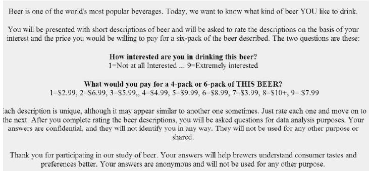
Figure 1 shows the orientation, and the scale. Note that for this version of Mind Genomics there are two scales and 36 elements, the practice appropriate during the years 2010-2016, when the consumers were not over-sampled, and when it was feasible to do studies lasting 15-17 minutes. Those ‘early days’ are now gone, and most studies must be kept to less than five minutes because of the reduced attention time characteristic of today’s over stimulating environment.

fig 1

Figure 1: The orientation page.

Note in Figure 1 that the interest scale goes from a low of 1 to a high of 9, but the price scale is in irregular order of prices. This irregular order is a precaution to ensure that the price scale does not turn into another interest scale. When assigning prices, the respondent must ‘think’ because the prices are in irregular order. It is also noteworthy that the respondent is given as little information as possible. The paucity of information is relevant when the respondent is familiar with the topic. In other situations, such as studies in the law or in medicine, the orientation page may be a good deal longer, more filled with relevant detail.

Step 5: Combine the Answers into Small, Easy to Read Combinations, So-called Vignettes

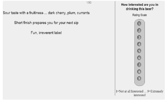
Figure 2 shows the way the vignette appears to the respondent, with the text centered, one answer or ‘element’ atop the other in centered format, with no effort to connect the answers. It is the respondent’s job to read through the information and make a judgment. The effort to connect the elements is counter-productive because the focus is on the individual elements and not on a connected paragraph.

fig 2

Figure 2: Example of a vignette (left) comprising three elements (left) and the rating scale (right).

The vignettes are created according to an experimental design, which dictates combinations comprising 3-4 elements for the 6×6 design, at most one element or answer from each question. Each respondent evaluates 48 unique vignettes. Each element appears five times, one time in each of five vignettes, and is absent from the remaining 43 vignettes. The experimental design creates combinations ensuring that each respondent will see a full design, but the specific combinations will differ across respondents thus covering a lot of the ‘design’ space. The experimental design is set up so that the 36 elements are statistically independent of each other, allowing for OLS (ordinary leas-squares) regression to relate the presence/absence of the elements to the respondent (interest, price paid).

Each respondent sees a unique set of 48 vignettes, an experimental design for that respondent. This means that the data from each respondent can be analyzed either separately as preparation for mind-set segmentation (see below), or using group data to generate a model (e.g., for all respondents in the study, viz., the total, or for all respondents in a specific mind-set).

The questions themselves do not appear in the vignette. Rather, only the answers appear; it is the answers which convey the specific information. The questions act as guides, to drive the ‘right’ type of answer. The specific information in the answer is left to the researcher, who may use a variety of sources to create the answer. The answer is usually presented as a stand-alone phrase, one emerging from competitive analysis, from published information, or even from one’s imagination in a creativity session.

Finally, the experimental design is set up so that there is absolutely no collinearity possible, and that there are ‘true zeros.’ True zeros, where a question (or so-called variable) is entirely absent from a vignette ensures that the coefficients have absolute values, comparable from study to study.

Executing the Mind Genomics Experiment and Preparing the Data for Analysis

Step 6: Invite Respondents to Participate

With the advent of the Internet, a great deal of research has migrated to online venues, wherein the respondent is invited by an email or pop-up link. At the time of this research (2016) the studies with the 6×6 design took approximately 15-18 minutes to complete, comprising 48 vignettes, each rated on two scales, along with an extensive classification. Six years before, by the year 2010 or so, respondents were tiring of the ever-increasing number of requests to participate, and it was becoming harder to get volunteers. At that point, companies began to enter the business, and provide respondents from their so-called ‘on-line’ panels; groups of individuals who agreed to participate, and were recompensed by the company. The result was an easier-to-execute study, albeit not with paid respondents. For Mind Genomics studies, looking for patterns rather than for single ratings of no/yes, the paid panel was appropriate. The panelists for this study were recruited by Luc.id, Inc.

Step 7: Execute the Study on the Respondent’s Computer, Tablet, or Smartphone

The respondent received the invitation from Luc.id, opened the study (an experiment), read the introduction, evaluated 48 vignettes unique to the respondent (ensured by the strategy of permuted experimental design), and then completed an extensive self-profiling classification.

Step 8 – Acquire the Ratings and Transform the Data

The ratings for interest were converted to two binary scales:

Top3, focusing on what interested the respondent. Ratings of 1-6 were converted to 0, to show little or no interest. Ratings of 7-9 were converted to 100, to show active interest. A random number(< 10-5) was added to each transformed rating to ensure variation in the dependent variable in case the respondent selected ratings all lying between 1 and 6 or all lying between 7 and 9.

Bot3, focusing on what actively disinterested the respondent (viz., anti-interest). Ratings of 1-3 were converted to 100, to show active disinterest. Ratings of 4-9 were converted to show little or no disinterest. Again, the small random number was added for the same prophylactic reason, viz., to ensure variation in the dependent variable.

The prices were converted to dollar values. The Mind Genomics program measured the Response Time (RT), defined as the number of seconds to the nearest tenth of seconds elapsing between the appearance of the vignette on the respondent’s screen and the first response (question #1, interest)

Step 9: External Analyses – Distribution of Ratings

Mind Genomics studies generate a great deal of data, providing a rich bed of results for analysis. The basic data, without knowledge of the composition of the stimulus vignette, are the ratings and the response times, along with external information, such as the position of the vignette in the set of 48, the respondent who assigned the rating, etc.

The analysis of these data is called ‘external analysis’, so-called because we do not know anything about the nature of the stimulus, other than the number and source of elements. There is not yet any linkage between the responses and the meaning of the elements. This is the type of data with which most researchers work, looking for patterns, but forced to work with data which themselves have no intrinsic meaning. The pattern of data emerging from this analysis tells us a great deal about how the respondent thinks about the topic, in terms of ratings, in terms of response times, and in terms of changing responses with repeated evaluation of vignettes, but without any understanding of the ‘meaning’ of the test stimuli and the differences among the feelings toward these stimuli traceable to the nature of the difference stimuli.

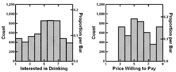
The first external analysis assesses the distribution of the ratings, and the response times. Figure 3 shows two histograms, the left showing the distribution of the ratings on the 9-point scale, the right showing the distribution of the prices the respondent is willing to pay. Keep in mind the prices were converted to the appropriate dollar value.

fig 3

Figure 3: External analysis showing the distribution of ratings for interest (left) and for price that one would pay (right). Data from the total population.

The ratings of interest describe a reasonable, but certain far from ideal inverted U curve, which could be interpreted as a ‘somewhat’ normal distribution. The only problem is the excessive number of ratings at level 1, the lowest interest. The price willing to pay shows no consistent patterns.

It is important to keep in mind that without deeper knowledge of what the elements mean (viz., their exact language), the researcher has nothing to analyze except for these externalities. There are no insights yet, despite the substantial amount of data used to create the graphs in Figure 3.

Step 10: External Analyses: Stability vs. Instability across the 18-Minute Experiment with 48 Vignettes

Our second ‘external analysis’ measures the change in the average rating across the 48 positions. Recall that each respondent tested a unique set of 48 combinations. One of the questions that we might ask is whether over time, and with these many combinations, do people change their criteria of judgment in a general fashion, becoming more critical, less critical, and so forth. That is do people increase their rating or decrease their rating as they evaluate the set of 48 vignettes?

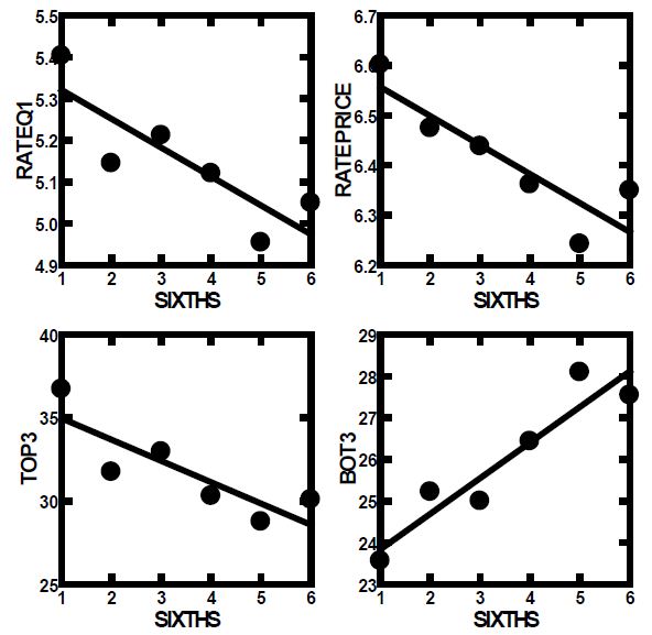
The set of 48 ratings was divided into six strata, each stratum comprising data from eight positions, viz., 1-8, 9-16, 17-24, 25-32. 33-40, 41-48. The averages were computed for each position and plotted in Figure 4. The plots are linear, suggesting a systematic but modest drop in the positive ratings, a complementary but slightly steeper pattern of increase in the negative ratings, and a sharper drop in price of almost 50 cents. The pattern is sharply linear, and reaffirms the value of completely rotating the combinations, in addition to create a unique design permutation for each respondent.

fig 4

Figure 4: How the average rating and price paid change during the evaluation. Each point represents the average rating from a set of six positions in the 48 vignettes (viz., 1-8, 9-16 etc.).

Step 11: External Analyses: An Emergent Linear Relation between Interest and Price Willing to Pay

We expect that people will pay more for what they like, although we have no direct data from studies. People can be asked whether they like something, and what they are willing to pay for this. The analysis has been called ‘hedonic pricing’ [12]. The pattern will not appear from the raw data comprising 113 respondents x 48 vignettes/respondent or 5424 data points. There are so many observations that a clear pattern cannot easily emerge.

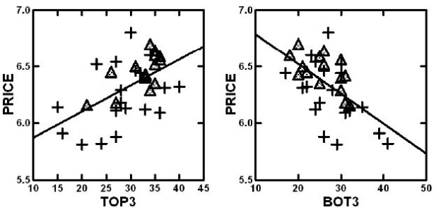
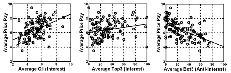
When one does this analysis by averaging the interest ratings of respondents across the 48 vignettes, and the price willing to pay across the same 48 vignettes, one has a value both for average interest and another value for average price. Across the 113 respondents there are thus 113 pairs of averages. Figure 5 shows a pattern which is linear when the independent variable is either average rating on the interest scale (question 1), average Top3 (interest), or average Bot3 (anti-interest. It is important to note that we use individual averages to get a sense of liking vs. price, an analysis that economists call ‘cross sectional analysis’.

fig 5

Figure 5: Relation between average price willing to pay (ordinate) and rating (Question 1, left panel), Top3 (interest, middle panel), and Bot3 (anti-interest, right panel). Each circle corresponds to one of the 113 respondents.

Moving from External Analyses of Patterns to Deeper Understanding through Vignette Structure

The external analysis can bring our understanding to an appreciation of possible relations between variables. Indeed, much of behavioral science stops at the observation of these observed relations, leaving the rest for conjecture. At some point during the inquiry into the topic, one or another enterprising researcher may pick up problem, and precede somewhat further, usually with a different viewpoint, different tools. The direct line is lost, viz., the line connecting the research of the problem, and the subsequent research inspired by the original investigation, usually, the research is conducted by an entirely different group, with different motivations, tools, and world views. As an aside, the inevitable is that the scientific project is often metaphorically compared to an object with many holes, many gaps, many ‘calls for further work’, and so forth.

The motive for this slight detour is the ability of Mind Genomics to move from the study of external patterns into the immediacy of the mind, at least with respect to the topic. Beyond that simple migration from the ‘external’ to the ‘internal’ is the ability of Mind Genomics to iterate through repeated and evolving studies while the topic is studied, viz. ‘to strike when the iron is hot’.

With that in mind, we move now to the beginning of the internal analysis, and the introduction of cognitive meaning. The first internal analysis looks at the general content of the vignettes, and how the content covaries with estimated Top3 (interest), estimated Bot3 (anti-interest) and estimated Price.

There are three ways to understand the relation between the surface structure of the vignette and the rating.

a.  What is the relation between the number of elements in the vignette and the response? That is, are we likely to get lower or higher ratings with vignettes comprising three elements versus vignettes comprising four elements? The approach here is to relate the number of elements to the ratings, without knowing which specific elements are present in the vignette. The statistics use regression to estimate the parameters of the equation: Rating = k1(Number of elements). We can estimate the equation for the total panel, and then estimate the equation as the respondent moves through the 48 vignettes. Is there a change in the pattern as the respondent moves from the first eight vignettes, to the second eight vignettes, until the sixth of the eight vignettes?

Table 2 shows the number of scale points corresponding to each element in the vignette. We do not know what is contained in the vignette. We just know the number of elements in the vignette, either three or four, respectively. We are beginning to get a sense that longer vignettes comprising four elements are better than shorter vignettes comprising three elements for emotion-relevant responses. As a worked example, consider the Total panel. For vignettes comprising three questions we expect to have a 9-point rating scale of 3×1.36 or 4.08. When we look at the expected rating but at the beginning of the evaluations (vignettes 1-8) we expect a rating of 3×1.42, or 4.26. When we look at the expected rating, but at the end of the evaluations, vignettes 41-48, we expect a rating of 3.99. The data in Table 2 suggests that there will be little change in the ratings, but when we look at the Top3 we expected a lower rating, when we look at the Bot3 we expect a higher rating (more negative), and when we look at price we expect little change.

Table 2: The number of points added by each element in the vignette, independent of the nature of the questions or the specific elements.

Number of points on scale corresponding to each element in the vignette
Question #1 TOP3 BOT3 PRICE
Total 1.36 8.41 6.81 $1.69
Vignettes # 1-8 1.42 9.72 6.26 $1.74
Vignettes # 9-16 1.36 8.37 6.56 $1.71
Vignettes # 17-24 1.37 8.75 6.56 $1.70
Vignettes # 25-32 1.35 8.05 6.95 $1.68
Vignettes # 33-40 1.31 7.66 7.31 $1.65
Vignettes # 41-48 1.33 7.91 7.21 $1.66

a.  On average, what does each question contribute to the rating? This question can be answered by determining which specific questions are present in each vignette and relate the presence/absence of the type of question (Taste, Appearance, etc.) to the rating. To answer this, we create a simple model for total panel, and for each set of six vignettes. The model is expressed as: Rating = k1(Taste) = K2(Appearance) + k3(Experience ) + k4(Origin) + k5(Benefit) + k6(Venue).

Table 3 shows that the most important driver of Top3 (interest) and Bot3 (anti-interest) is Taste. Appearance is a driver of interest, but not a driver of anti-interest, which makes sense from other information about food. People do not form polarizing love/hate relationships with appearance in the same way that they do with taste/flavor. Homo Emotionalis, emerging from likes and dislikes of a sensory and experiential nature, is far more expansive than is Homo Economicus, which is constricted. We know what we like, but we don’t know the value of what we like or dislike.

Table 3: The number of points added by each question in the vignette, independent of the nature of the specific element.

Top3 Total Vig. 1-8 Vig. 9-16 Vig. 17-24 Vig. 25-32 Vig. 33-40 Vig. 41-48
Taste 9.9 9.6 11.5 8.6 8.6 9.5 9.9
Appearance 9.3 10.2 9.6 7.6 7.6 10.1 7.3
Origin 8.8 6.5 6.5 9.5 9.5 8.4 11.0
Venue 8.0 9.8 3.2 8.5 8.5 9.6 6.5
Experience 7.7 11.1 10.5 6.5 6.5 2.9 10.3
Benefit 6.8 11.0 9.2 7.7 7.7 5.4 2.3
Bot3 Total Vig. 1-8 Vig. 9-16 Vig. 17-24 Vig. 25-32 Vig. 33-40 Vig. 41-48
Taste 12.1 9.2 13.0 11.3 11.3 14.6 14.3
Experience 6.6 8.4 6.8 3.7 3.7 8.8 7.8
Venue 6.3 4.0 9.8 7.0 7.0 8.4 5.3
Origin 5.7 5.7 4.9 6.5 6.5 4.7 3.5
Benefit 5.4 7.1 2.3 7.5 7.5 2.9 6.9
Appearance 4.7 3.2 2.2 5.6 5.6 4.5 5.7
Price Total Vig. 1-8 Vig. 9-16 Vig. 17-24 Vig. 25-32 Vig. 33-40 Vig. 41-48
Taste $1.72 $1.75 $1.73 $1.73 $1.73 $1.64 $1.58
Appearance $1.72 $1.91 $1.73 $1.63 $1.63 $1.78 $1.68
Origin $1.71 $1.72 $1.69 $1.62 $1.62 $1.69 $1.72
Experience $1.67 $1.50 $1.85 $1.76 $1.76 $1.48 $1.72
Benefit $1.67 $1.69 $1.72 $1.76 $1.76 $1.67 $1.62
Venue $1.66 $1.86 $1.54 $1.56 $1.56 $1.65 $1.66

a.  On average, which structure of the vignette drives the rating? There are 35 different structures of vignettes in the Mind Genomics design. Comprising six questions and six answers for each question. There are 20 different structures comprising three questions out of the six, and 15 different structures comprising four questions out of the six. Each vignette can be coded as being one of these 35 design structures. Do any of these design structures perform noticeably better or worse than others, in terms of Top3 (interest), Bot3 (anti-interest) or Price? Each of these 35 design structures became its own variable, taking on the value 1 for a vignette when the vignette conformed to that specific structure, and taking on the value 0 for a vignette when the vignette did not conform to that structure. A vignette could be coded ‘1’ for only one structure.

Table 4 shows that there is a large range of interest (Top3), from a high of 40 (Appearance, Experience, Origin; Top 3 = 40), to a low of 15 (Experience, Benefit, Venue). There is a similar range for Bot3 (anti-interest), but hardly any range for price. Once again, Homo Emotionalis is far more expansive than Homo Economicus.

Table 4: The number of points added by each design structure of a vignette, independent of the nature of the specific elements in the design.

Code Vignette comprises one element from: Est Top3 Est Bot3 Est Price
  Three-element vignettes
BCD Appearance Experience Origin 40 22 $6.32
ABD Taste Appearance Origin 37 21 $6.31
ABF Taste Appearance Venue 36 31 $6.09
BCF Appearance Experience Venue 34 23 $6.60
ADE Taste Origin Benefit 33 24 $6.12
ACF Taste Experience Venue 32 30 $6.44
BEF Appearance Benefit Venue 32 17 $6.44
ADF Taste Origin Venue 31 26 $6.46
ACD Taste Experience Origin 30 27 $6.80
ABE Taste Appearance Benefit 29 32 $6.13
ABC Taste Appearance Experience 28 25 $6.18
BCE Appearance Experience Benefit 28 28 $6.29
ACE Taste Experience Benefit 27 24 $6.54
BDF Appearance Origin Venue 27 32 $6.11
CDF  Experience Origin Venue 27 26 $5.88
CDE  Experience Origin Benefit 24 41 $5.82
AEF Taste Benefit Venue 23 30 $6.52
DEF  Origin Benefit Venue 20 29 $5.81
BDE Appearance Origin Benefit 16 39 $5.91
CEF  Experience Benefit Venue 15 35 $6.14
  Four element vignettes
ACDE Taste Experience Origin Benefit 36 30 $6.56
ADEF Taste Origin Benefit Venue 36 25 $6.59
ABCD Taste Appearance Experience Origin 35 26 $6.52
ABDE Taste Appearance Origin Benefit 35 26 $6.64
ABEF Taste Appearance Benefit Venue 35 25 $6.35
BCEF Appearance Experience Benefit Venue 35 18 $6.60
ABCF Taste Appearance Experience Venue 34 30 $6.29
BCDE Appearance Experience Origin Benefit 34 20 $6.70
ABDF Taste Appearance Origin Venue 33 30 $6.40
ACEF Taste Experience Benefit Venue 33 31 $6.42
BCDF Appearance Experience Origin Venue 33 20 $6.43
CDEF Experience Origin Benefit Venue 31 21 $6.50
ACDF Taste Experience Origin Venue 27 31 $6.18
BDEF Appearance Origin Benefit Venue 26 22 $6.45
ABCE Taste Appearance Experience Benefit 21 32 $6.16

A scattergram plot from the price structure (Table 4) of Estimated Price (ordinate) versus estimated Top3 (interest) or Bot3 (anti-interest) (abscissa) show a clear relation between price willing to pay (ordinate) and either interest or anti-interest. The triangles correspond to the vignettes comprising four elements; the crosses correspond to the vignettes comprising three elements. Figure 6 suggests a clear linear, yet somewhat noisy relation between price and interest or anti-interest.

fig 6

Figure 6: Plot of the estimate price to be paid versus the estimated Top3 (interest, left panel) or Bot3 (anti-interest, right panel). Data from Table 4, showing the estimated values for different vignette structures.

Internal Analysis: Moving from Vignette Structure to the Impact of the Individual Element

Up to now the analysis has focused primarily on the externalities of the data, the averages and distributions of the ratings, and relations between variables. There is no deep understanding of what the data mean. Indeed, we have no idea about the topic of the data, other than knowing that the data pertain to responses to messages about craft beer. We have been able to learn a lot, and in fact may even be able to create hypotheses about what might be occurring. Our hypotheses deal with the behavior of what is occurring, focusing both regularities in the data, and on emergent patterns, respectively. To reiterate, however, we would have no idea about how people describe the specifics of the craft beer experience.

It is at this point that we return to the fact that we really do ‘know’ what these elements mean, at least in a superficial way. The researcher might well have asked the respondent to rate the interest in beer and the price of the beer, after exposing the respondent to each element, one elements at a time. The answers would be ‘strained’ because it is hard to make a judgment based on one element, but the data emerging from that question and answer would, in fact, provide deeper knowledge, data which are ‘internal,’ rather than external, data which deal with the ‘meaning’ of the element.

The Mind Genomics process moves from evaluation of single elements in a question-and-answer format to the evaluation of systematically varied combinations of elements, so-called test vignettes. Respondents have an easier time reacting to a combination of elements which tell a story, even when the combination or ‘story’ emerges out of an experimental design, an underlying set of combinations fabricated according to statistical considerations, rather than dictated by the desire to tell a story.

Step 12: Lay Out the Data for OLS (Ordinary Least-Squares) Analysis

With 113 respondents, the data comprises one row for each vignette for each respondent (113 x 48 =5424 rows). The data matrix just created comprises one column for each of the elements, or precisely 36 columns to ‘code’ the independent variables, the 36 elements.

The matrix contains the number ‘1’ when the element is present in the vignette, and the number ‘0’ when the element is absent from the vignette.

At the end of the input matrix are five columns, corresponding to the dependent variables.

The first pair of response data columns are the two ratings, for interest, and for actual price, and the second pair of response data columns are the two transformed variables, Top3 (either 0 or 100) and Bot3 (either 0 or 100), respectively.

Step 13: Create 113 Individual Models for Top3, and 113 Individual Models for Price, One per Respondent

This is a preparatory step. The individual level models can be readily created because the original experimental design ensured that each respondent would evaluate 48 unique vignettes, created according to a full experimental design. That provision enables the researcher to create an individual-level model for a respondent. The subsequent analysis clusters the 113 respondents twice, first by the pattern of the 36 coefficients of Top3, and then the pattern of the 36 coefficients for price. The clustering is done by k-Means, a well-accepted statistical process which created groups of respondents whose patterns of coefficients are maximally similar within a cluster, and whose patterns of averages of coefficients within a cluster maximally different from cluster to cluster. These clusters are created by k-means clustering, using the distance metric (1-Pearson Correlation). Two respondents are most similar, perfectly related to each other and in the same cluster when the Pearson Correlation calculated from the 36 coefficients is 1.0. Two respondents are most different from each other, and in different clusters, when the Pearson Correlation between them calculated from the 36 coefficients is -1 (perfectly opposite). Three clusters emerged from the clustering of the Top3, and three other clusters emerged from the (separate) clustering of the Price [13,14].

We call these clusters ‘mind-sets’ because they represent the way the respondent thinks about the topic. The respondent may or may not be able to tell the researcher her or his own mind-set, but it will become clear from the study, or later from a tool called the PVI, personal viewpoint identifier.

Step 14 – Extract Three Mind-sets for Top3 (What Interests), and Three Parallel Mind-sets for Price (Pattern of What They will Pay)

Create two sets of models or equations, one for Top3, and one for Price, respectively. The models look the same, except the Price model does not have an additive constant.

Top3 = k0 + k1(A1) + k2(A2) … k36(F6)

Price = k1(A1) + k2(A2) … k36(F6)

Step 15: Uncover the Mind-sets Based on What Interests the Respondent about Craft Beer

Lay out the coefficients for the Top3 model, but do not put in any of the negative coefficients which are 0 or negative. Furthermore, highlight the coefficients which are +8 or above. The rationale for showing only partial data is to ensure that the pattern of coefficients emerges clearly, allowing the researcher to identify the elements which ‘drive’ interest. Putting in 0 and negative coefficients hinders the ability identify the patterns. Furthermore, sort the table by the three mind-sets.

Table 5 shows the additive constant and the coefficients for the total panel and the three emergent mind-sets. For the Total Panel, two elements emerge: A5 (Dark…bittersweet chocolate and coffee flavors, coefficient = 14) and A6 (Sour taste with fruitiness … dark cherry, plum, currants, coefficient =10). One might think that these two KEY elements for craft beer. They are certainly strong elements, but the division of the respondents into three mind-sets reveals different groups with varying preference, and many more opportunities when these groups can be identified and receive the proper advertising for craft beer. The opportunity for business as well as learning will be enhanced by understanding how the respondents divide in the pattern of their preferences, especially when the rating scale is ‘interest’ (question 1).

Table 5: Positive coefficients for the 36 elements for Total Panel and for three mind-sets. Data based on the coefficient for the Top3 value from all respondents in the group.

table 5

Step 16: Uncover the Patterns for Mind-Sets Based on Price the Respondent is Willing to Pay

Lay out the 36 elements for price, sorted by the three emergent mind-sets based on clustering using the price coefficients. Table 6 shows these results. In contrast to Table 5, all prices are shown; although for the patterns one might eliminate a low price, such as $1.60 or less. The choice of what constitutes an irrelevant element is left to the researcher.

Table 6: Coefficients for the 36 elements for Total Panel and for three mind-sets. Data based on the coefficient for Price from all data from respondents in the group.

table 6

Table 6 suggests three groups of respondents whose preferences are less polarized when the groups are constructed based upon the patterns of price (Homo Economicus). The groups certainly different in the price that they are willing to pay for the feature. On the other hand, within a mind-set (homogeneous with respect to price), the nature of the specific elements driving the high price is not clear. The groups are more similar than they are different, based upon the ‘meaning ‘of the elements. This leads us to the conclusion that clustering or segmenting people based economic aspects, such as price, will ‘work’ in terms of delivering statistically meaningful clusters. That is accepted because the clustering is assumed to be done correctly. What is surprising, however, is the difficulty of seeing the dramatically different patterns across the clusters created by the price coefficients. Homo Economicus does exist, and can be demonstrated, but is clearly less interpretable.

Step 17: Create a Method to Discover these Mind-sets in the Population

Mind Genomics reveals mind-sets based upon the pattern of responses to granular information about relatively small, minor topics. As such, the conventional methods used by researchers to create ‘personas’ in the population and assign an individual to one of these persona’s is limited, both by the reality that the topic is usually too small to invest in, and that the research may often be investigating the topic as the first person to do so.

The value of the mind-set is knowledge, which simply remains within the data, but the larger value is to assign NEW PEOPLE to mind-sets, whether to understand people, or more ambitiously to link together behaviors and markers (biological, sociological, behavioral, respectively). All are possible, once there emerges a simple, cost-effective method to assign new people to the mind-sets already discovered.

Table 6 shows a cross-tabulation of mind-sets by gender, and mind-sets by each other (Top3 or acceptor mind-sets versus Price mind-sets vs. Bot3 or rejector mind-sets). The mind-sets cannot be easily predicted from each. Knowing a person’s gender will not predict to which mind-set a person will belong. Table 6 suggests that a male or a female show similar but not identical distributions of membership in the three mind-sets emerging from clustering the coefficients for Top3. Furthermore, looking at the bottom of Table 6 we see three mind-sets separately created for Bot3, the anti-interest pattern, viz., the elements which clearly DO NOT interest the respondent. The membership patterns differ from the membership patterns of Top3, meaning that knowing something about a respondent does not easily predict knowing their mind-set. A different approach needs to be created to assign new people to the mind-sets.

Recent, the authors have suggested that one can create a small set of six questions, based upon the summary data from the study. This is called the PVI, the personal viewpoint identifier. The respondent answers six questions, the questions using the same or similar language to that used to create the mind-sets, the answers presented as a binary scale (NO vs. YES, or similar language). The pattern of the six answers enables the PVI to assign the respondent to the most likely mind-set. The PVI is set up ahead of time, with the underlying mathematics comprising a Monte-Carlo simulation system with added variability to ensure a robust assignment mechanism. The output of the system is feedback to either the researcher or to the user as to the membership in the specific mind-set, as well as the nature of the three mind-sets. Figure 7 shows the web-based form filled out by the respondent. The web-link as of this writing (Winter, 2020) is https://www.pvi360.com/TypingToolPage.aspx?projectid=1262&userid=2018

fig 7

Figure 7: The PVI for craft beer, showing the three classification questions on the left panel (not used by the PVI for assignment), and the six questions on the right panel used for assignment to one of the three mind-sets emerging from Top3 cluster analysis.

Step 18: Discover Pairwise Interactions Using ‘Scenario Analysis’

An ongoing issue in messaging, one which has never been successfully resolved, is to demonstrate on a repeatable basis that ideas interact with each other, either enhancing each other, or suppressing each other. The notion of interaction makes sense when we think about products, especially foods and beverages, where it is the combination that is liked, not the individual ingredients.

In experimental design, and in the approaches used here, the basic notion is that each element is an independent ‘actor’ in the combination. The independence is assured, at least at a statistical level, by creating vignettes where the same elements appear in different combinations so that they are statistically independent of each other. Does the Mind Genomics systemized permutation covering a great deal of the so-called ‘design space’ (potential combinations), enable the researcher to uncover hitherto unexpected synergies or suppressions of pairs of elements?

A simple way to discover these interactions builds them in at the start, creating a design which comprises both linear terms (single elements) and known combinations of elements. With six questions and six answers per question, there are 15 pairs of questions, each pair of questions responsible for 36 combinations. This comes to 540 pairwise combinations in the 6×6 Mind Genomics design used here. For the more recent, preferred 4×4 design (four questions, four answers per question) there are 6 pairs of questions, and 16 possible pairs of answers for each pair of questions, viz., 96 pairwise combinations to create and test. The design effort is simply too great, and the typical conjoint approaches cannot deal with the discovery and evaluation of pairwise interactions (Table 9).

Table 9: Scenario analysis showing how the coefficients of the elements change in terms of Price (Question 2) when the vignette with the element is constructed to have a specific origin provided by Question D.

table 9

The task of uncovering pairwise and even higher order interactions can be made simpler, virtually straightforward in the Mind Genomics paradigm [15-17]. Let us illustrate it by looking for interactions of elements with question D, Source of the craft beer. There are six Sources (D1-D6), and a seventh Source (D0) where no Source is mentioned). We create a new variable, called ByD. The new variable, ByD, takes on the values 0 when the vignette has no mention of a source (viz., D does not contribute an element), and takes on the value 1-6 depending upon which specific element appears in the vignette. Thus, the variable ByD stratifies the data matrix.

One sorts data matrix according to the newly created variable, ByD. One then performs seven OLS regressions, one OLS regression for each of the seven strata, respectively. The independent variables are the remaining elements, viz., all starting elements except elements D1-D6. Thus, the independent variables are 30, rather than 36 (A1-A6; B1-B6; C1-C6; E1-E6; F1-F6).

The OLS regression returns with estimates of the 30 coefficients, for each stratum, specifically the stratum where D=0 (does not appear), where D=1 (local brewery with a great story) …D6 (from Germany). The OLS regression estimates the additive constant and the 30 coefficients when the dependent variable is Top3 (interested), and the 30 coefficients without the additive constant when the dependent variable is Price. Synergisms and suppressions appear when one compares the performance of an element in the absence of source (viz., D=0) vs. the performance of the same element in the presence of a specific source (viz., D=1). Synergism emerges when the coefficient with a source is ‘higher’ than the coefficient estimated in the absence of source (viz., D=0).

Tables 7 and 8 show the three strongest performing elements and the three weakest performing elements for the total panel, first for the dependent variable being Top3 (interest; Table 7) and for the dependent variable being Price (Table 8).

Table 7: Distribution of respondents into mind-sets based upon gender, by Top3 (what interests them), by Bot3 (what does not interest them), and by Price (what they are willing to pay). The patterns of membership differ.

Total Top M3S1 Top3 MS2 Top3 MS3
  Total 113 38 40 35
 
Gender Male 62 19 24 19
Gender Female 51 19 16 16
   
Mind-Set Top3 MS1 38 38 0 0
Mind-Set Top3 MS2 40 0 40 0
Mind-Set Top3 MS3 35 0 0 35
 
Mind-Set Price MS4 35 6 18 11
Mind-Set Price MS5 37 25 4 8
Mind-Set Price MS6 41 7 18 16
 
Mind-Set Bot3S7 47 14 21 12
Mind-Set Bot3S8 32 11 8 13
Mind-Set Bot3S9 34 13 11 10

Table 8: Scenario analysis showing how the coefficients of the elements change in terms of Top3 (interest, Question 1) when the vignette with the element is constructed to have a specific origin provided by Question D.

table 8

a.  The ‘strongest’ performers and the weakest performers are defined by the performance when the coefficients are estimate for the stratum where D=0 (no mention of origin).

b.  The columns are sorted by the sum of the additive constant (for Top3, not for price) and the arithmetic average of the 30 coefficients. The first column is always the coefficients for the case when the source is absent from the vignette.

The scenario analysis generates many numbers. It is easiest to see patterns and interactions by eliminating the zero and negative coefficients, to focus on the effect of the different ‘origins’ shown in the columns on a single element (shown in a row). Tables 7 and 8 show evidence of quite strong interactions in some cases, and quite weak interactions in other cases. It is important to keep in mind that these are only estimates of the possible interactions. The negative coefficients are eliminated so we can see cases when the interactions can be very power in the positive direction (Hoppy … with a high level of bitterness, a basically anti-interest element by itself) synergizing with source (Germany).

The synergisms are clearly far stronger for the elements evaluated on interest (question #1), and far weaker for elements evaluate on price. A cursory look at the six elements studied for price (Table 8) reveals, however, that all six of the elements increase in dollar value when they are associated with country of origin. It is discoveries like this, unexpected, which can lead to a new appreciation of craft beer, especially the way people think about it.

Discussion and Conclusions

The sequence of steps presented here produces an exceptionally rich database of information about the mind of the respondent, a database which is obtained within hours and days, a database whose information is achievable, and who metrics, the coefficients, have ratio-scale values, and are comparable from study to study, from topic to topic, so long as the rating scales are same.

In the spirit of Mind Genomics, the discussion is brief. The data essentially present the whole story. There is no need to plug holes in the literature, to falsify hypotheses and conjectures. There may be hypotheses to be tested with the data, but the data serves as an exploration of a topic, as an understanding of the mind of people respect to something from their ‘everyday’ experience.

Of interest from the point of view of science of the mind and decision making is the difference within the same person when the person deals with price versus when the person deals with emotion. The former, Homo Economicus, is well recognized as an entity in the scientific literature. The latter, Homo Emotionalis, is just beginning to be studied (although consumer researchers have long known about the importance of Homo Emotionalis in decision making. Those in government and public policy are just now beginning to understand the role of emotion and feeling in policy, although it has always been present, recognized perhaps but not acknowledged [18-20].

The logical next steps for Mind Genomics vary by the goal and vision of the researcher. The world of beer, of alcoholic beverages lies open for a concerted research effort. Beyond the world of the knowledge of beer is the marketing, and the benefits conferred on the marketer by knowing the three mind-sets, and how to assign a new person to a mind-set using the PVI. Inserting the PVI into digital marketing, e.g., as a game, might allow the marketer to drive the respondent’s online inquiry into a landing page appropriate for the mind-set.

At the level science, however, we have a paradigm to acquire and analyze data, and a template to store and present the results. One might imagine the happy day in a few years when these studies are done as the standard way of exploring new topics, not so much in a piecemeal way to falsify or not falsify hypotheses, but rather simply to create the aforementioned ‘wiki of the mind’ as a living, dynamic encyclopedia of life as it is experienced.

References

  1. Acitelli T, Magee T (2017) The audacity of hops: The history of America’s craft beer revolution. Chicago Review Press.
  2. Chapman NG, Lellock JS, Lippard CD (2017) Untapped: Exploring the cultural dimensions of craft beer. West Virginia University Press.
  3. Elzinga KG, Tremblay CH, Tremblay VJ (2015) Craft beer in the United States: History, numbers, and geography. Journal of Wine Economics 10: 242.
  4. Lamertz K, Foster WM, Coraiola DM, Kroezen J (2016) New identities from remnants of the past: An examination of the history of beer brewing in Ontario and the recent emergence of craft breweries. Business History 58: 796-828.
  5. Orth UR, Lopetcharat K (2006) Consumer-based brand equity versus product-attribute utility: A comparative approach for craft beer. Journal of Food Products Marketing 11: 77-90.
  6. Rice J (2016) Professional purity: Revolutionary writing in the craft beer industry. Journal of Business and Technical Communication 30: 236-261.
  7. Moskowitz HR (2012) ‘Mind genomics’: The experimental, inductive science of the ordinary, and its application to aspects of food and feeding. Physiology & behavior 107: 606-613. [crossref]
  8. Moskowitz HR, Silcher M (2006) The applications of conjoint analysis and their possible uses in Sensometrics. Food Quality and Preference 17: 145-165.
  9. Moskowitz HR, Gofman A, Beckley J, Ashman H (2006) Founding a new science: Mind genomics. Journal of Sensory Studies 21: 266-307.
  10. Porretta S, Gere A, Radványi D, Moskowitz H (2019) Mind Genomics (Conjoint Analysis): The new concept research in the analysis of consumer behaviour and choice. Trends in Food Science & Technology 84: 29-33.
  11. Shareff R (2007) Want better business theories? Maybe Karl Popper has the answer. Academy of Management Learning & Education 6: 272-280.
  12. Hargrave M (2018) Hedonic pricing. https://www.investopedia.com/terms/h/hedonicpricing.asp
  13. Kaufman L, Rousseeuw PJ (2009) Finding groups in data: an introduction to cluster analysis (Vol. 344). John Wiley & Sons.
  14. Tuma MN, Decker R, Scholz SW (2011) A survey of the challenges and pitfalls of cluster analysis application in market segmentation. International Journal of Market Research 53: 391-414.
  15. Ewald J, Moskowitz H (2007) The push-pull of marketing and advertising and the algebra of the consumer’s mind. Journal of sensory studies 22: 126-175.
  16. Gofman A, Moskowitz H (2010) Isomorphic permuted experimental designs and their application in conjoint analysis. Journal of Sensory Studies 25: 127-145.
  17. Gofman A (2006) Emergent scenarios, synergies and suppressions uncovered within conjoint analysis. Journal of Sensory Studies 21: 373-414.
  18. Archer MS (2013) Homo economicus, Homo sociologicus and Homo sentiens. In Rational choice theory 46-66.
  19. Markwica R (2018) Emotional choices: How the logic of affect shapes coercive diplomacy. Oxford University Press.
  20. Meier AN (2018) Homo Oeconomicus Emotionalis?: Four Essays in Applied Microeconomics (Doctoral dissertation, Wirtschaftswissenschaftliche Fakultät der Universität Basel).

COVID-19 and Spanish Flu Pandemics – Similarities and Differences

DOI: 10.31038/JPPR.2020332

Keywords

Pandemics, Human influenza, Coronavirus, Severe acute respiratory syndrome

Summary

The aim of this paper is to analyze the similarities and differences between the COVID-19 and Spanish Flu and to predict the course of the COVID-19 pandemic. We carried out a literature search of publications in English in PubMed database with the following keywords: “COVID-19” and “Spanish Flu”. We found the following similarities between Spanish Flu and the COVID-19: the new agent, affected the whole world, similar reproductive numbers, similar case fatality rates, spreading through droplets or by touching contaminated surfaces, similar symptoms and signs, and middle-age as a dominant one among cases. The main differences are the causal agents, Spanish Flu started in the USA, while the COVID-19 started in China, currently, the number of cases and deaths was several times higher in Spanish Flu than in the COVID-19, and the incubation period is much longer in the COVID-19 (up to 28 days) than in Spanish Flu (1-2 days). Based on the experiences from Spanish Flu it may be expected that the COVID-19 pandemic may last until the end of 2021.

The current COVID-19 pandemic is causing tectonic health, economic, political and safety disturbances in the world. This is an unusual global epidemiologic event that frustrates all the world nations and health professionals because of constantly increasing number of cases and deaths and the absence of efficient treatment or vaccine [1]. To predict the course of this pandemic it may be helpful to analyze a similar previous pandemic. The pandemic that mostly resembles the COVID-19 is the Spanish Flu which devastated the world during 1918-1920. The Spanish Flu was the single most deadly epidemic in human history with around 500 million cases and 50 million deaths [2]. The main contextual difference between these two pandemics is that the Spanish Flu started during the First World War, while the COVID-19has begun in global peace. Of course, there is also a hundred years time difference between the Spanish Flu and the COVID-19that has been fulfilled with research and development in medicine.

The aim of this study is to compare the Spanish Flu and the COVID-19 pandemics using literature research. We expect that this comparison may be helpful in predicting the course of the COVID-19pandemic. We carried out a literature search of publications in English in PubMed database with the following keywords: “COVID-19” and “Spanish Flu”. A comparative analysis used usual epidemiological key parameters. The comparative data concerning the Spanish Flu and the COVID-19 are presented in Table 1.

Table 1: Comparative data concerning Spanish Flu and COVID-19.

Parameter

Spanish Flu Covid19

Reference

Time of Onset

4 March 1918 31 December 2019 [1,2]
Place of Onset Military Campus, Kansas, USA Sea-food and animal market,

Wuhan, China

[1,2]

Agent

H1N1 virus SARS CoV-2 virus [6,7]

Agent Novelty

New New

[6,7]

Duration Two years 1918-1920

Currently ten months

[1,2,5]

Cases

500 million Currently around 44 million

(28.10.2020)

[1,14]
Deaths


50 million Currently around 1,2 million

(21.10.2020)

[1,14]

Affected Region

World World [1,2]
Reproductive Number (Median) 1.8 2.5-2.9

[8,9]

Case Fatality Rate

2.5% (up to 25%) 3,4% (up to 11%) [10,11]
Incubation period 1-2 days 0-28 days

[11,12]

Common Symptoms and Signs

Fever, Dry Cough, Weakness, Hypoxia, Dyspnea, Cytokine Storm, Acute Respiratory Distress Syndrome, Pneumonia


Ibidem

[1,2]

Specific Symptoms and Signs

Purple color of the face Anosmia, Ageusia,

Hypoacusis, Diarrhoea,

Disseminated Intravascular Coagulation

[1,2]

Treatment

Symptomatic AspirinQuinineArsenics,

DigitalisStrychnine,

Epsom SaltsCastor Oil and Iodine

Symptomatic

Remdesivir, Lopinavir,  Hydroxychloroquine,

Azithromycin , Dexamethason, Heparine

[1,2]

Vaccine

No Not yet [1,2]
Way of Spreading Person to person via droplets or touching contaminated surfaces Ibidem

[1,2]

Dominant Age of Cases

W shape (Very Young, Middle Aged, Yery Old) Middle Aged [1,2]
Categories under High Mortality Risk Young Adults (18-40 years) Very Old, Chronic Diseases, Immuno-Compromised Patients)

[1,2]

Pandemic Course

Four Waves Currently Three Waves [1,2]

Public Information

Mainly Censored Mainly Uncensored

[1,2]

Public Health Measures Limited Massive

[13.14]

The main similarities are that the agent was new, the affected region was the whole world, the reproductive numbers were similar, mean case fatality rates were similar, fast spreading through droplets or by touching contaminated surfaces, major symptoms and signs were similar, and dominant age among cases was middle-aged.

The main differences are that the Spanish Flu was caused with the H1N1 influenza virus while COVID19 is caused with the SARS CoV-2 virus, the Spanish Flu started in the USA, while the COVID-19 started in China, currently the number of cases and deaths was several times higher in the Spanish Flu compared to COVID-19, the incubation period is much longer in the COVID-19 (up to 28 days) than in the Spanish Flu (1-2 days), the specific symptoms are purple face in the Spanish Flu and anosmia, ageusia, hypoacusis and disseminated intravascular coagulation in the COVID-19, in the Spanish Flu the case fatality rate was highest among young adults while in the COVID-19 it is among very old people and immuno-compromised patients, the highest case fatality rate in the Spanish Flu was 25% and much lower in the COVID-19 (11%), in the Spanish Flu the public information about the pandemic was censored due to war, while in the COVID-19 it is uncensored; finally, public health measures in terms of quarantine, isolation, and social distancing and protective masks were limited to the most developed countries in the Spanish Flu while in COVID19 they are massive.

Spanish Flu is a wrong name for the 1918 pandemic. It did not start in Spain. Spain was the first country to inform about the epidemic because it was neutral in the war conflict. In the war affected countries like France and Britain the information about the epidemic was hidden. In Spain the disease was named French Flu [3]. The index case of Spanish Flu was in a military camp and more probably in Kansas (USA) than in France [2], while in Covid-19 it was at an animal market in Wuhan, China (1). In Spanish Flu there were four waves in the period between the spring 2018 and spring 2020. The first wave is not universally regarded as Spanish Flu because it was very similar to a seasonal influenza [4]. However, in August 2016, a disastrous second wave of the Spanish Flu started and it lasted six weeks [5]. The analysis of permafrost-frozen corpses from 1918 showed that the Spanish Flu had been caused by a new strain of the H1N1 influenza virus A, and the victims usually died of secondary bacterial pneumonia due to yet undiscovered antibiotics [6]. COVID-19 was caused by a novel strain of RNA coronavirus with about 80% genetic similarity with the SARS CoV and the Middle East Respiratory Syndrome Coronavirus [7]. The median reproduction number (R0) or the number of persons an affected person can infect for the Spanish Flu was 1.80 [8] while the current data concerning COVID-19 suggest that R0 is around 2.5-2.9 [9].

The mean case-fatality rate in the Spanish Flu was about 2.5%, but in some countries it rose to 25% [10]. The mean case fatality rate of the COVID-19 is about 3, 4% and in Italy it has increased to 11% (11). A median incubation period in Spanish Flu was 1-2 days [11]. The median incubation period of the COVID-19 is between 2 and 12 days (median 5.1 days) and the full range is from 0-28 days [12]. The Spanish Flu was characterized with fever, dyspnea, dry cough, weakness and hypoxia [2]. The all-too-common sequelae of the Spanish Flu were hypoxia and death, with vivid descriptions of the purple color of the skin of those whose lungs could no longer supply their bodies with vital oxygen. That is why a common name for the Spanish Flu was “purple death”.

The main symptoms of the COVID-19 are fever, cough, fatigue, slight dyspnoea, headache, conjunctivitis and diarrhea. The specific feature of the COVID-19 is a neurotropism of SARS CoV-2 which may invade the olfactory nerve, acoustic nerve or sensory fibres of the vagus nerve [1]. The Spanish Flu was treated with Aspirin, Quinine, Arsenics, Digitalis, Strychnine, Epsom Salts, Castor Oil and Iodine. Similarly, there is no registered medicine for the COVID-19. The patients are treated with Remdesivir, Lopinavir, Hydroxychloroquine, Azithromycin, Dexamethason and Heparin [2]. In order to avoid panic among the people during the Spanish Flu many local authorities used to hide statistics about the affected and deaths [13]. Contrary to the Spanish Flu, in the COVID-19 the world statistics on the pandemic is open to the public in all countries [14].

In conclusion, the COVID-19 and the Spanish Flu are the greatest pandemics in the history of mankind with many similarities. However, there are also numerous specific features of each pandemic. This paper summarizes the results of this comparison. Based on the experiences from the Spanish Flu it may be expected that the COVID-19 might last until the end of 2021.

Conflict of Interest

The author declares no conflict of interests.

References

  1. Di Wu, Wu T, Liu Q, Yang Z (2020) The SARS-CoV-2 outbreak: what we know. Int J Infect Dis 94: 44-48. [crossref]
  2. Flecknoe D, Wakefield BC, Simmons A (2018) Plagues & wars: the ‘Spanish Flu’ pandemic as a lesson from history. Med Confl Surviv 34: 61-68.
  3. Barry JM (2004) The Great Influenza: The Story of the Deadliest Pandemic in History. London: Penguin Books Ltd.
  4. Radusin M (2012) The Spanish flu – part I: the first wave. Vojnosanit Pregl 69: 812-817. [crossref]
  5. Radusin M (2012) The Spanish flu – part II: the second and third wave. Vojnosanit Pregl 69: 917-927.
  6. Morens DM, Taubenberger JK, Harvey HA, Matthew JM (2010) The 1918 Influenza Pandemic: Lessons for 2009 and the Future. Crit Care Med 38. [crossref]
  7. Phan T (2020) Genetic diversity and evolution of SARS-CoV-2. Infect Genet Evol [crossref]
  8. Biggerstaff M, Cauchemez S, Reed C, Manoj Gambhir, Lyn Finelli (2014) Estimates of the reproduction number for seasonal, pandemic, and zoonotic influenza: a systematic review of the literature. BMC Infect Dis 14. [crossref]
  9. Peng PWH, Ho PL, Hota SS (2020) Outbreak of a new coronavirus: what anaesthetists should know. Br J Anaesth 124: 497-501. [crossref]
  10. Rosenau MJ, Last JM Maxcy-Rosenau (1980) Preventive medicine and public health. New York: Appleton-Century-Crofts.
  11. Giangreco G (2020) Case fatality rate analysis of Italian COVID-19 outbreak. J Med Virol 92: 919-923. [crossref]
  12. Lauer SA, Grantz KH, Bi Q, Forrest K. Jones, Qulu Zheng, et al. (2020) The incubation period of coronavirus disease 2019 (COVID-19) from publicly reported confirmed cases: estimation and application. Ann Int Med.; 172: 577-582. [crossref]
  13. Aligne CA (2016) Overcrowding and mortality during the influenza pandemic of 1918. Am J Public Health.; 106: 642-644 [crossref]
  14. COVID19 coronavirus pandemic. Available at <https://www.worldometers.info/coronavirus > Accessed November 5, 2020.

Personalized and Precision Medicine (PPM) as a Unique Healthcare Model of the Future to Come: Hype or Hope?

DOI: 10.31038/IMROJ.2020542

Abstract

A new systems approach to diseased states and wellness result in a new branch in the healthcare services, namely, Personalized and Precision Medicine (PPM). To achieve the implementation of PM concept, it is necessary to create a fundamentally new strategy based upon the subclinical recognition of biopredictors of hidden abnormalities long before the disease clinically manifests itself.

Each decision-maker values the impact of their decision to use PPM on their own budget and well-being, which may not necessarily be optimal for society as a whole. It would be extremely useful to integrate data harvesting from different databanks for applications such as prediction and personalization of further treatment to thus provide more tailored measures for the patients resulting in improved patient outcomes, reduced adverse events, and more cost effective use of health care resources. A lack of medical guidelines has been identified by the majority of responders as the predominant barrier for adoption, indicating a need for the development of best practices and guidelines to support the implementation of PPM!

Implementation of PPM requires a lot before the current model «physician-patient» could be gradually displaced by a new model «medical advisor-healthy person-at-risk». This is the reason for developing global scientific, clinical, social, and educational projects in the area of PPM to elicit the content of the new branch.

Кеуwords

Translational research, Personalized & precision medicine (PPM), Next-generation sequencing (NGS), Drug discovery, Educational cluster, Education-science-innovation complexes (ESIC)

Introduction

Translational Research & Applications (TRA) is a term used to describe a complex process aimed to build on basic scientific research to create new therapies, medical procedures and diagnostics [1]. It is critical that scientists are well acquainted with organogenesis and of human pathogenesis arising from microbial infection and natural errors in gene functioning. Most students and scientists do not have sufficient knowledge.

Medical scholars and students are acquainted with basic anatomy and even basic molecular biology, but their under-standing of fundamental processes located in living systems is limited. For instance, the concept of “stem cell” in human development and in pathogeneses as in the development of cancers or atherosclerotic plaque are not yet understood even in the world’s leading centers of basic and medical research.

Despite a tremendous impact of human genome project on our understanding of the pathogenesis of cancer, autoimmune and other chronic conditions and an invention of different techniques such as single cell sequencing or proteome and metabolome profiling, the current educational system is not opened and thus sufficient at preparing a next-generation specialist, which is able to use all the advances have been made [2]. For example, an implementation of NGS into clinical practice requires a “Big data” approach based on high integrity between clinical informatics, bio-informatics, and fundamental studies as well to secure finally the proper clinical decision being evidence-based. A major challenge in the clinical setting is the need to support a dynamic work-flow associated with the constant growth of the laboratory’s NGS test menu and expanding specimen volume [3]. To perform such kind of the mission it is crucial to educate specialists, which will know medical, biological and informatics aspects of the problem and will know how to use their knowledge in solving this problem as well. And that is just the tip of the iceberg. Human genetic databases are corrupted by false results. NGS studies have built in error rates of approximately 0.3 to 3.0% per base pair, which does not favor an improved understanding of diseases and the implementation of advanced therapeutics. The concept of Personalized & Precision Medicine (PPM) requires high integrity between fundamental research, industry, and clinic [4,5].

The lack of translation is the challenging problem in the various fields of medicine such as creating of human-computer interfaces or investigations of drug resistance and cancer [6-8]. We are not saying that the problem is mainly due to the obsolete education system, for example, the lack of clinical translation in cancer research can be explained by the fact that animal models is not a precise reflection of a human organism [8]. Conversion of research findings into meaningful human applications, mostly as novel remedies of human diseases, needs progress of appropriate animal models. Research methodologies to test new drugs in preclinical phases often demanded animal models that not only replicate human disease in etiological mechanisms and pathobiology but also biomarkers for early diagnosis, prognosis, and toxicity prediction. Whereas the transgenic and knockout procedures have developed guidance of rodents and other species to get greater understandings of human disease pathogenesis, but still generating perfect animal models of most human disease is not available [8].

Clinical trials themselves have limitations, and hence the results of these studies could be misunderstood [9]. The point is: in order to provide an effective «bench to bed» workflow there is a huge need for specialists, which are capable of performing a wide range of tasks. Nowadays due to a tremendous amount of available information, it is feasible to create a specialist who knows how to interconnect different areas of research and how to adapt to constantly changing conditions, whereas to create a specialist knowing how to do every-thing on his own is not. An education of these specialists is the pivotal objective for the new education system, and the creation of this system is at the top of the agenda for this paper.

Drug discovery is extremely both time- and money-consuming process. The basic translational pipeline here consists of at least eight units, namely, target to hit, hit to lead, lead optimization, preclinical trials, three stages of clinical trials, and finally, submission to launch [10]. The whole process lasts as long as a decade and a half and requires interdisciplinary-educated staff not only familiar with fundamental research but also with different techniques and approaches used in the drug discovery. A number of potential solutions to improve R&D productivity and increase clinical translation of drug candidates have been offered by Paul et al. [10]. Some of these solutions propose a total transformation of the current single company-owned R&D enterprise to one that is highly networked, partnered and leveraged (Fully Integrated Pharmaceutical Network or FIPNet) [10]. Authors also stated that in order to improve drug development it is vital to provide a cash-flow from the high expensive phase II and III trials to less expensive preclinical and 1-st phase clinical trials, thereby increasing the number of drug candidates to select the most promising ones. These candidates, in turn, would have a higher chance to be approved [10]. Obviously, both of the ideas aforementioned require a strong collaboration between research, stakeholders, and government. And we suggest that the education is the starting point to deploy such a network. Once developed, this new education system should kill two birds with one stone, namely, should prompt the collaboration between fundamental research and industry, yet also should allow to use an approach close to simulation-based medical education that has been proved to be highly effective in different areas of medical education [11-15]. The main difference of the approach proposed is the use of it in the settings of drug discovery.

Mastery learning is another approach, which could be used in the modern education system. Despite its development as early as in 1963, it has a lot of progressive features, such as clear learning objectives, deliberate skills practice, and complete mastery of the discipline selected [16]. However, it also has some considerable limitations especially meaningful in a case of drug development. One of these limitations is the unlimited time to reach the mastery. The time factor is one of the most important ones during the translation process. To reduce the negative influence of unlimited time of mastering one could involve only talented students in such a program, which expected time to acquire a new skill or master a new subject is relatively low. However, does it fit in with a standard mastery learning paradigm?

The problem of great concern is the designing of a mechanism that could detect, educate, and implicate highly motivated students and young scientists in order to meet the needs from industry and healthcare system. It is clear that somehow, we should tightly interconnect different areas of research, saving student-oriented education principles. Some attempts are already ongoing: universities are experimenting with new programs and courses to teach innovation. Within the life sciences, there is particularly strong traction in the area of biomedical technology innovation, in which a number of interesting new training initiatives are being developed and deployed. However, how this experiments will affect the healthcare system remains to be determined. System itself requires not just new courses and programs, but a total rearrangement at all.

Fundamental Aspects of the Educational Reforms

At the present stage, the main task is the development of the concept changes of Healthcare Service and creation of new medical education model. The purpose of employment of the knowledge is to predict and prevent diseases, increase the life expectancy, strengthen and preserve human health, as well as the identification and monitoring patients with underlying risk for the development of a particular pathology.

A key reason for changing the health care system became an active use in the practice of a hospital physician of advances in omics, allowing penetrating inside biostructures and creating therein conditions for visualization of lesions, previously concealed from the eyes of a clinician.

At the heart of the developed concept of PPM use there are postulates which promote change in the culture and the mindset of society as a whole. In the first place it is the awareness of individuals that they are responsible for their own health and the health of their children, an active involvement of the people in a sphere of preventive and prophylactic measures designed for promotion of individual, community-related and public health, in particular.

Meanwhile, putting PPM-tools in a public health perspective requires an apprehension of the current and future public health challenges. Those challenges are produced by the new technological developments, health transition, and the increased importance of non-communicable diseases, even in low-income environments.

The principles of PPM and efforts to approaching the right health issues in a timely manner can be applied to public health. Doing so will, however, require a careful view and concerted effort to maintain the needs of public health at the forefront of all PPM discussions and investments. Briefly, a prime concern for public health is promoting health, preventing disorder, and reducing health disparities by focusing on modifiable morbidity and mortality. In this connection, more-accurate and precise methods for measuring disease, pathogens, exposures, behaviors, and susceptibility could allow better assessment of public and individual health and development of policies and targeted programs for preventing disease and managing disorders at the individualized level whilst operating with precision tools and datasets. So, the initial drive toward PPM-based public health is occurring, but much more work lies ahead to develop a robust evidentiary foundation for use.

In this connection, one of the major organizational tasks is to carry out restructuring of the existent health care system to ensure implementation of preventive, diagnosis, remedial and rehabilitation measures designed to reduce morbidity and death rate of population, ensure maternal and infant health care and promote healthy lifestyle.

Implementation of the PPM model will lead to the replacement of the existing “doctor-patient” relationship model by the “doctor-consultant-healthy person” model. In this regard, it is obvious that the society needs a new scientific and technical school for the formation of specialists of a new generation, using non-traditional methods and a technological arsenal based on the achievements of systems biology and translational medicine.

For training of specialists it is required to restructure programs of pre-university, undergraduate, graduate and postdoctoral medical training as well as to develop fundamentally new interdisciplinary programs, focused on training of specialists in the areas related to PPM. In implementing the principle of continuity of an ongoing education a model of multi-stage training of a specialist is being built, which is characterized by a phase-by-phase process of individual development going over, while information is learned, from one level of an ongoing training to another.

In such a manner, at the 1st level of education (pre-university) school special significance is on the pre-university level is the selection of talented young specialists and involvement them into creative activities. At the 2nd (university) level, students will be offered in-depth study of fundamental and applied aspects of PPM. The core of the third (post-university) level will be interdisciplinary aspects of PPM, targeted to resident physicians and postgraduates [17-21].

An important component of the new educational model is its focus on the practical skills and the ability to apply knowledge. Many of universities has already organized ESIC for the purpose of increasing the quality of education and strengthening the liaison with the production. The specifics of ESIC consists in that thanks to the cooperation of scientific research, educational and production capacities, there is ensured a new quality of education, development of research and commercialization of the results of scientific and technological joint performance.

Some Features of the Educational Model

Currently, the first roots of the new educational program are being developed within the heart of the Russian medical community, aimed at training doctors and specialists in the field of biopharma. Within the program it is planned to train specialists for medical, pediatric and bioengineering faculties. The courses of the program are divided into three categories, i.e., basic, elective and specialized. At the first stage of pre-university training, general aspects of human physiology and anatomy, the foundations of molecular and cell biology will be considered, and also students will learn the basics of PPM. The first includes the first two courses, in which students will study the fundamental foundations of PPM (Omics, Genetic Engineering, Genomic Editing and Gene Therapy, Immunology, Biomarkers, Bioinformatics, Targeting, Technologies for Working with Proteins and Genes, Biobanks). Further, at the stage of the three-year university education will be the study of diagnostic, preventive and therapeutic diagnostic platforms of target categories of PPM, among them pharmacogenomics, oncology, pulmonology, pediatrics and others. At the next one-year training stage, students will study clinical and preclinical models with predictive-diagnostic and preventive-preventive orientation, risks, their evaluation and the formation of diagnostic protocols. At the postgraduate stage students will study preclinical and clinical trials using the biobank base, a program for managing one’s own health, including family planning, the stage of genomic scanning and clinical evaluation, clinical bioinformatics, as well as interdisciplinary aspects, including bioethics, the basis of public-private partnerships in modeling personalized and preventive medicine and questions of sociology.

An important part of program is the creation and development of fundamentally new technological platforms with elements the commercialization of the results of basic research and following introduction of them into clinical practice. For example, the development of innovative methods system of screening and monitoring will allow estimating the reserves of health, allocate among the asymptomatic contingent in the process of preventive examinations of patients and persons from risk groups with preclinical stages, and create objective prerequisites for personalized therapy. And the creation of an information system for personalized medicine prescribes the development of a new model of the patient and people at risk with using biomarkers, preclinical and predictive diagnostics technologies, and the development of new methods for targeting and motivating healthy lifestyles and active longevity. The key to implementing PPM in clinical practice is information technologies, including machine learning and artificial intelligence.

Obstacles and Problems to Battle Seems to Hamper the Implementation

World practice has shown that as soon as a country enters a phase of sustainable economic development, there is an increase in the social welfare of people and an increase in the life expectancy of the population, then at the same time an increase in the death rate of the population from cancer and cardiovascular diseases is observed. The priority struggle against socially significant ills of modern civilization is an important step, but it is not decisive in increasing the life expectancy of the population of the country. In the civilized world, there was a steady idea of ​​how to fundamentally reverse the negative trend of growth of socially significant diseases without financial bleeding of the country’s budget. More and more economically developed countries are converting their health care in line with the concept of PPM.

Changing the paradigm of health care actually entails reformatting the system for training specialists, reorienting research centers to solving health problems and creating new breakthrough technologies, and qualitatively modernizing the domestic bio-pharmaceutical industry and related industries in the Russian Federation. It is obvious that without interactive regulation and restriction of “egoistic” requests of departments, participants of this global project, any financial investments only in health care and education will be ineffective.

The implementation of the project to modernize health care in its scientific, technical and social significance is akin to a nuclear project of the USSR. Its result was not only the emergence of the country’s “atomic shield”, but also the creation of new knowledge-intensive branches of the national economy, which ensured economic progress and improved well-being of citizens. The PPM project is aimed at preserving and improving the quality of health of those who are protected by the “atomic shield” of the country. Taking into account the modern structure of the Russian economy, as well as the role of the state in regulating financial flows in the implementation of projects of such scale, it is necessary to give it a special status with the involvement of all possible sources of financing for its implementation.

If we consider the modernization of education as an element of the project with modern scientific and technical achievements, then we have a chance to transform the educational system taking into account breakthrough precision technological platforms. At the same time, in the very system of today’s education, there are yesterday’s mechanisms that inhibit its mobility and ability to reform.

Despite an ample need to Implementing new educational system into practice, there are some considerable limitations, which could hamper all the process.

First of all, how should we evaluate the impact of the reform on national health care system, quality of life, and even the employment of biopharma specialists? And, in the case of failure, what actions should be performed to prevent additional aggravations in the industry? The main issue here is that we don’t have an approach to a transparent analysis of such the data. For instance, a social return on investment – based approach seems to be a promising one due to the fact that it includes the information on the amounts of resources used by a program, in addition to program activities, and represent program value to society as a whole rather than a specific stakeholder group. Unfortunately, this approach is not devoid of flaws, such as raw methods in use and the possibility of inclusion only “appropriate” social groups in the analysis [21,22]. Additionally, several years (or even decades) should pass to enrich the data of reform outcome, and thus allowing to analyze the impact of this reform.

The second issue is the cost of the reform in a broad sense. When speaking of a total rearrangement of the educational system, it is of great importance to determine the source of financing. It seems to be obvious that both the government and the industry are interested in a new education system. However, are these sides interested enough to provide an immense amount of investments required to reach this goal, taking into account that return on investment is not expected in upcoming years? Moreover, to make the reform real it is crucial to implicate well-qualified staff, which demand a salary at least higher than average. Increased administrative expenses, expenses on reform implication, wages for workers, and on additional factors, such as new equipment, could eventually increase the cost of undergraduate and graduate education.

And finally, the educational reform is multifaceted, time-consuming process, which could be viewed as a process with its own translation pathway. Taking into account that calls for reform of graduate medical education started as early as in 1940 [18], and nothing has changed dramatically ever since (in terms of the education system), the major issue is to prevent the reform from getting stuck in the translation.

Conclusion

Health care today is in crisis as it is reactive, inefficient, and focused largely on one-size-fits-all treatments for events of late-stage disease. An answer is PPM which is Benefitting patients across many different diseases and even persons-at-risk to prevent a state of being diseased!

The first wave of PPM has entered mainstream clinical practice and is changing the way many diseases are identified, classified, and treated. The second wave (a wave of targeted therapies) has turned lots of chronic disorders from deadly ones into the states and conditions in which patients or persons-at-risk live close to normal life spans. In this sense, biopharma and biotech are becoming committed to advancing PPM-related armamentarium, and, in turn, the research and development pipeline would secure great promise for targeted therapies.

So, PPM can create efficiencies in the health care system as a whole. And to help the latter, partnerships and collaborative alliances would transform the research and development of PPM-related resources. And, especially, to increase recognition from both government and private stakeholders of the value and promise of PPM whilst resuscitating the policymaker interest for being grown. Since PPM is increasingly becoming an integral part of daily clinical care and we expect this trend to continue along with greater recognition of the value of PPM by payers and providers.

Despite the tremendous advances that have been made to date, much work is needed to further stimulate innovations in PPM. As you might see from the above-mentioned, PPM and PPM-based public health calls for an upgraded approach to support safe and effective deployment of the new enabling predictive, diagnostic and therapeutic technologies not to treat but to get cured!!! This approach (PPM and PPM-based public health) mentioned should be based on postulates which will change the incarnate culture and social mentality! And thus the above-mentioned PPM and PPM-based public health model would strongly need for novel training since the society is in bad need of large-scale dissemination of novel systemic thinking and minding. And upon construction of the new educational platforms in the rational proportions, there would be not a primitive physician created but a medical artist to be able to enrich flow-through medical standards with creative elements to gift for a patient a genuine hope to survive but, in turn, for a person-at-risk – a trust for being no diseased. So, the Grand Change and Challenge to secure our individual, community-related and public health and wellness are rooted not in Medicine, and not even in Science! Just imagine WHERE?! In the upgraded Hi-Tech Culture! To secure the next-step outcome in the therapeutic future to secure Prevention, Prophylaxis, Canonical Treatment and Rehabilitation as the New Entity!

Our model for accelerated development of continuous vocational education in the sphere of biopharmaceutics and biopharmaceutical industries is based on the combinatorial approaches (competence, module, personality-activity, program-design and problem-oriented) to the elucidation of innovative processes of modernization of the existing system. Correspondingly, the unit to build up the content of educational programs and sites is the task of pedagogics oriented for the innovation context in education development, and it allows each hearer to organically combine individual and group work with the aim to enrich oneself with the experience of the colleagues, and also to use own professional experience.

The aforestated reform of bio-pharmaceutical education, when implemented, will provide the ability to attain and maintain a professional standard of training for specialists in Russian universities, which in turn, will bring them up to world standards and promote academic, professional and inter-regional mobility. It will also enable the creation of an open system of university education, which will ensure that specialists are well enough trained to work in a constantly changing environment.

References

  1. Dougherty D, Conway PH (2008) The “3T’s” road map to transform US health care: the “how” of high-quality care. JAMA 299: 2319-2321. [crossref]
  2. Nelson EA, McGuire AL (2010) The need for medical education reform: genomics and the changing nature of health information. Genome Med 2: 18. [crossref]
  3. Roy S, LaFramboise WA, Nikiforov YE, Nikiforova MN, Routbort MJ, et al. (2016) Next-Generation Sequencing Informatics: Challenges and Strategies for Implementation in a Clinical Environment. Arch Pathol Lab Med 140: 958-975. [crossref]
  4. Bodrova TA, Kostyushev DS, Antonova EN, Slavin S, Gnatenko DA, et al. (2012) Introduction into PPPM as a new paradigm of public health service: an integrative view. EPMA J 3: 16. [crossref]
  5. Lemke HU, Golubnitschaja O (2014) Towards personal health care with model-guided medicine: long-term PPPM-related strategies and realisation opportunities within ‘Horizon 2020’. EPMA J 5: 8. [crossref]
  6. Serruya MD (2014) Bottlenecks to clinical translation of direct brain-computer interfaces. Front Syst Neurosci 8: 226. [crossref]
  7. Wijdeven RH, Pang B, Assaraf YG, Neefjes J (2016) Old drugs, novel ways out: Drug resistance toward cytotoxic chemotherapeutics. Drug Resist Updat 28: 65-81. [crossref]
  8. IWMak, Evaniew N, Ghert M (2014) Lost in translation: animal models and clinical trials in cancer treatment. Am J Transl Res 6: 114-118. [crossref]
  9. Mann DL, Mochly-Rosen D (2013) Translational medicine: mitigating risks for investigators. Nat Rev Drug Discov 12: 327-328. [crossref]
  10. Paul SM, Mytelka DS, Dunwiddie CT, Persinger CC, Munos BH, et al. (2010) How to improve R&D productivity: the pharmaceutical industry’s grand challenge. Nat Rev Drug Discov 9: 203-214. [crossref]
  11. Lopreiato JO, Sawyer T (2015) Simulation-based medical education in pediatrics. Acad Pediatr 15: 134-142. [crossref]
  12. McGaghie WC, Issenberg SB, Cohen ER, Barsuk JH, Wayne DB (2012) Translational educational research: a necessity for effective health-care improvement. Chest 142: 1097-1103. [crossref]
  13. Kalaniti K, Campbell DM (2015) Simulation-based medical education: time for a pedagogical shift. Indian Pediatr 52: 41-45.
  14. Kim J, Park JH, Shin S (2016) Effectiveness of simulation-based nursing education depending on fidelity: a meta-analysis. BMC Med Educ 16: 152. [crossref]
  15. Abdelshehid CS, Quach S, Nelson C, Graversen J, Lusch A, et al. (2013) High-fidelity simulation-based team training in urology: evaluation of technical and nontechnical skills of urology residents during laparoscopic partial nephrectomy. J Surg Educ 70: 588-595. [crossref]
  16. McGaghie WC (2015) Mastery learning: it is time for medical education to join the 21st Acad Med 90: 1438-1441. [crossref]
  17. Yates BT, Marra M (2017) Social Return On Investment (SROI): Problems, solutions … and is SROI a good investment? Eval Program Plann 64: 136-144.
  18. Ludmerer KM (2012) The history of calls for reform in graduate medical education and why we are still waiting for the right kind of change. Acad Med 87: 34-40. [Crossref]
  19. Strategy of Development of Medical Science in RF for a Period till 2025.
  20. Collection of Educational Programs, Typical Tasks and Issues. Training aid for bachelors as per direction 550800 «Chemical Technology and Biotechnolo-gy» // Shvets VI. [et al.] – Moscow: MV. Lomonosov Moscow State Acade-myof Fine Chemical Technology, 2002. – 2.4 printer’s sheet.
  21. Engineering Fundamentals of Biotechnology. Training aid for students of Higher Engineering School [Electronic learning resource]: [interactive training aid]. / Registration Certificate No. 1195 of 14 November 2001. Number of state registration 0320100382; edited by D.G. Pobedimsky.
  22. Studneva М, Mandrik M, Song Sh, Tretyak E, Krasnyuk I, et al. (2015) “Strategic aspects of higher education reform to cultivate specialists in diagnostic and biopharma industry as applicable to Predictive, Preventive and Personalized Medicine as the Medicine of the Future”, The EPMA Journal 6: 18. [crossref]

Functional Impact of Osteosuture in Medial Bilateral Clavicular Physeal Fracture in Teenagers

DOI: 10.31038/JNNC.2020341

Abstract

Proximal physeal fracture of the medial clavicular physis is a rare specific injury occurring in the immature skeletal. Several studies describe unilateral cases with posterior or anterior displacement and the following complications (vascular and mediastinal compression). An immediate diagnosis and management are necessary to avoid complications. The clinical diagnostic might be obvious or difficult, pain and swelling in the sternoclavicular joint area, sometimes a deformity and focal tenderness. A chest X-Ray may help and a three-dimensional reconstructed computed tomography scan has to be done to evaluate the lesions before surgery. The imaging is useful to confirm and specify the diagnostic and the displacement. After reviewing the literature of the unilateral clavicular physeal fracture, we can conclude that the ideal management of these injuries has not been well described. An open reduction associated an osteosuture with non-resorbable suture was performed. One-year follow-up, both of them had full recovery without any functional impact or any complains. This management of the proximal physeal fracture of the medial clavicle on children shows an excellent result according our cases and the literature. The purpose of this study is to evaluate the functional impact of osteosuture in medial bilateral clavicular physeal fracture in teenagers after 1-year follow-up. We present 4 cases of proximal physeal fracture of the medial clavicular physis in 2 male-teenagers with bilateral displacement, one posterior and the other asymmetric.

Introduction

Clavicular physeal fracture is an uncommon pediatric fracture [1-9], especially bilateral. The lesion is not the same as in adults, who have a sternoclavicular disjunction. In children, it is a physeal fracture, included in Salter & Harris classification [5,7,10]. The diagnosis, management and treatment totally differ in adults. These injuries mostly occur during sport activities [8], with high energy trauma, due to a direct force applied to the medial clavicle or an indirect force on the shoulder [1,3,6,9]. The clinical diagnostic might be obvious or difficult [8,10], pain and swelling in the sternoclavicular joint area [1], sometimes a deformity, focal tenderness and a clinical instability [2]. Therefore X-Ray and CT scan must be done in order to confirm the diagnosis [1,3-6,10]. Three-dimensional reconstructed computed tomography scans may help to evaluate the lesions before surgery [2,3]. Several complications [8,10], such as tracheal or vascular compression [11,12], which are revealed by dyspnea, dysphagia or odynophagia [1,5], can be noticed. Because of the risk of complications in retrosternal displacement of the medial clavicular metaphysic [8,9], a surgical treatment has to be performed [4,5,10,13]. The purpose of this treatment is different than in adults, the primary instability caused by the fracture will be resolute with the osteosuture and the bone healing. In adults, an arthrodesis is necessary to access the definitive stability of the sterno-clavicular articulation. The aim of this report is to demonstrate the functional impact on the medial bilateral clavicular physeal fracture after 1-year follow-up. This report explains 4 cases of proximal physeal fracture of the medial clavicular physis in two teenage boys treated surgically, one of them suffered from a bilateral posterior displacement of clavicular physeal fracture, and the other one, an asymmetric displacement clavicular physeal fracture.

Materials and Methods

In our center, we received 4 cases of proximal physeal fracture of the medial clavicular physis in two teenage boys. One of them, a 13-year-old skier, presented a bilateral proximal physeal fracture of the medial clavicular physis with a posterior displacement. He complained about dysphonia, dysphagia and dizziness. Initial radiography of the right clavicle was suspicious. A CT scan was performed finding a left physeal fracture with posterior (Salter and Harris I) and a right physeal fracture with posterior displacement (Salter and Harris II) associated with a 4-cm hematoma. The other one, a 15-year-old boy sustained a high-energy trauma, presented a bilateral proximal physeal fracture of the medial clavicular physis with an asymmetric displacement. A chest X-Ray was performed and wasn’t contributive (Figure 1). The CT-scan showed a left physeal fracture with posterior displacement (Salter and Harris I) and a right physeal fracture with anterior (Salter and Harris I) displacement. The diagnosis was uncertain about the right injury but confirmed intraoperatively because of the clinical instability (Figure 2).

fig 1

Figure 1: Chest X-Ray.

fig 2

Figure 2: Frontal and three-dimensional reconstructed computed tomography scans confirm the diagnosis of a left physeal fracture (Salter and Harris I) and a right physeal fracture (Salter and Harris II) of the medial clavicular physis.

Surgical Technique: Surgical treatment of these injuries was performed under general anesthesia after consent of the patients and their legal representatives. The patient was lying in the supine position, arms stretched along the body. After asepsis, a draping taking both clavicles was carried out (Figure 3). An arcuate incision centered on the right sternoclavicular joint was performed in the first place. The incision was then continued over the defect to the physis and then to the articulation while the hemostasis was achieved. Once the lesions were exposed after dissection, right physeal fracture with posterior displacement was confirmed as seen in the tomography scan (Figure 2). The clavicle was reduced using a bone hook. Stability was then reassessed and the periosteal incision was closed with three non resorbable simple stitches with Mersuture® 1 to perform the osteosuture (ORIF: Open Reduction and Internal Fixation) (Figure 4). A drain was necessary and the closing was achieved with 5-0 resorbable rapid sutures. The same procedure was carried out on the other side. Any vascular complication was notice during the intervention. After the surgery, the patient was kept in a shoulder immobilizer only for post-operative care in order to reduce the pain, during approximately 24 hours. The Disabilities of the Arm, Shoulder and Hand (DASH) Score (HAS) can be used to appreciate the progress during the recovery [14]. According the DASH Score [14], 3 themes are evaluate (30 questions, sports activities and musical activities) with a grade from 0 (Disability) to 100 (Full recovery). To demonstrate the functional impact on the medial bilateral clavicular physeal fracture after 1-year follow-up, we used the DASH Score [14], the resumption of the sports activities and the cicatrization of the incisions (Figures 5-7).

fig 3

Figure 3: Drawing of the incision and intraoperatively seeings showing the different steps.

fig 4

Figure 4: Schematic view of the osteosuture.

fig 5

Figure 5: Chest X-Ray non-contributory.

fig 6

Figure 6: Preoperative three-dimensional reconstructed computed tomography scans show a left physeal fracture (Salter and Harris I) and a right anterior physeal fracture (Salter and Harris I) of the medial clavicular physis.

fig 7

Figure 7: 6 weeks post-operative three-dimensional reconstructed computed tomography scans.

Results

One-year follow-up, both of them had full recovery without any functional impact or any complains. The DASH Score (French National Authority for Health) reached 100/100 [14]. The disability of practicing sports activities lasted 3 months at least. The scars on the clavicles were thin and didn’t occur any problem (Figure 8).

fig 8

Figure 8: Scars 4 months post-operative.

Discussion

The primary purpose of this study is to evaluate the functional prognostic of a displaced physeal clavicular fracture after a surgical treatment. The clavicular physeal fracture concern the pediatric population mostly the teenagers with an average of 13 year-old (0; 23) (Table 1). Usually it occurs during sports activities after a direct fall on the shoulder [2-5]. In the first place, swelling and pain in the area of the sternoclavicular joint can be noticed with a limitation of the shoulder movements and with the attitude of the upper limb’s traumatism [6,7].

Table 1: Review of the literature.

Author, year n Age Displacement Treatment Complications
Gobet et al. 2004 3 6-10 Ant 3 ORIF (Osteosuture) Dysphagia (2)
3 8-15 Post 2 closed reduction + 1 ORIF (Osteosuture) Dysphagia (2)
Laffosse et al. 2010 13 15-20 Post 13 ORIF (5 failure of closed reduction/Different techniques) Dysphagia (3)
Tennent et al. 2012 7 14-19 Post 7 ORIF (Osteosuture) Dysphagia (2) / Dyspnea (6)
Garg et al. 2012 1 12 Post 1 ORIF (Osteosuture) X
Gil-Albarova et al. 2012 3 11-13 Ant 2 ORIF (Osteosuture) + 1 Gilchrist X
1 11 Post 1 closed reduction X
Lee et al. 2014 20 13-18 Post 2 closed reduction + 18 ORIF (Osteosuture)

(2 failure of closed reduction)

Mediastinal compression (6) (Dysphagia, odynophagia)
Ozer et al. 2014 1 16 Post 1 closed reduction Dyspnea Left brachiocephalic vein compression
Tepolt et al. 2014 6 7-17 Post 6 ORIF (Osteosuture) (2 failure) Dysphagia + Dyspnea
Kassé et al. 2016 3 0-17 Ant 1 ORIF (Osteosuture) + 2 orthopedics X
3 16-19 Post 3 ORIF (1 crossed pins + 1 excision 1/3 internal clavicle with osteosuture + 1 osteosuture) Odynophagia (1) Vascular compression (1)
Beckmann et al. 2016 1 15 Post 1 ORIF (1 failure of closed reduction) X
Elmekkaoui et al. 2011 1 16 Ant (Salter II) 1 ORIF (Osteosuture + 1 pin) X
Deganello et al. 2012 1 13 Post 1 ORIF (Osteosuture) x
Emms et al. 2002 1 23 Post (Salter II) Excision of the first rib Subclavian vein compression

According the literature, many patients presented immediate complications such as dysphagia [7,12], dyspnea or vascular compression [9,13,15,16]. One of our patient complained about dyspnea and dysphonia that were resolute after a surgical treatment. To avoid complications in the retrosternal structures by either the instable fragment or callus formation, an immediate surgical treatment has to be attempted [1,11]. In adults as in children, the risk of complications is the same due to the displacement and the compression.

Several authors described [7,11,12], sometimes this kind of injuries can be missed in the first place. The recurrence of the pain with an initial clinical exam subtle and an inadequate imaging can lead to a tardive diagnosis [12]. A shortening of the acromio-clavicular distance may help to diagnose the fracture but can be less specific when the both clavicles are injured. The position of the clavicular epiphysis has to be found to specify the diagnosis. A clinical instability can reveal a reduced medial clavicular physeal fracture with a normal tomography scan. Despite the delayed diagnosis none of their patients present any functional complication [7,12]. Intraoperatively, the diagnosis can be more accurate than the initial imaging could reveal [7]. The difference between dislocation and physeal fracture can be determine intraoperatively [7]. The type of the fracture in the Salter & Harris classification [2,5,7] can be adjust during the surgery. Surgery is the only way to confirm the definitive diagnosis and allow the most appropriate treatment for the patient. Many unilateral cases are described in the literature with diverse treatment: non operative [15], closed reduction [6,7,13] or ORIF with osteosuture [2-5,7]. Siebenmann published a case series and review of the literature about the management of epiphysiolysis type Salter and Harris I of the medial clavicle with posterior displacement [1]. He recommends an open reduction and fixation (ORIF) of the injury with posterior displacement. The term “epiphysiolysis” [1] is maladapted to characterize the lesion because there isn’t a lysis of the physis but a traumatism of the physis as describe by Salter and Harris. In our case, open reduction and osteosuture were performed bilaterally even if, in one of them, the displacement was anterior. This is an instable lesion so the orthopedic treatment is inadequate. This technique was used to avoid an asymmetric result and in order to have a good esthetic result. This treatment is easy to realize, affordable (surgical suture material mostly) and with excellent results. It appears to be important to evaluate the functional prognostic of this injury in the follow-up [7,13]. Our patients reach a total of 100/100 after 1-year follow-up with the DASH Score [14]. Mostly return to sports activities between 3 months and a 1 year of recovery [1,3,4] without any complication reported. Esthetic complications can be reported such as hypertrophic or keloid scars where a surgical revision can be useful [7,15]. None of our patients complain of their scars.

Conclusion

This study and literature review demonstrate that a quick surgical treatment of the bilateral clavicular physeal fracture with anterior or posterior displacement has to be done. We highly recommend an ORIF with osteosuture using non resorbable sutures to avoid sequels and hoping a full recovery with a resumption of the sports activities. A thoracic three-dimensional reconstructed computed tomography scan has to be realize to define the lesion. This diagnosis is underreported because this fracture can be occult on imaging. Therefore, all skeletally immature patients with suspected sternoclavicular joint injury have to be carefully examined and especially the signs of complications such as vascular or mediastinal compression. The management of the physis fracture of the medial clavicle totally differ from the management of the sternoclavicular disjunction on the adult population, this is a specific diagnosis, treatment and recovery. The primary instability caused by the fracture will be resolute with the osteosuture and the bone healing. In adults, an arthrodesis is necessary to access the definitive stability of the sterno-clavicular articulation.

References

  1. Siebenmann C, Ramadani F, Barbier G, Gautier E, Vial P (2018) Epiphysiolysis Type Salter I of the Medial Clavicle with Posterior Displacement: Case Series and Review of the Literature. Case Rep Orthop [crossref]
  2. Beckmann N, Crawford L (2016) Posterior sternoclavicular Salter-Harris fracture-dislocation in a patient with unossified medial clavicle epiphysis. Skeletal Radiol 45: 1123-7. [crossref]
  3. Deganello A, Meacock L, Tavakkolizadeh A, Sinha J, Elias DA (2012) The value of ultrasound in assessing displacement of a medial clavicular physeal separation in an adolescent. Skeletal Radiol [crossref]
  4. El Mekkaoui MJ, Sekkach N, Bazeli A, Faustin JM (2011) Proximal clavicle physeal fracture -separation mimicking an anterior sterno-clavicular dislocation. Orthop Traumatol Surg Res 97: 349-352.
  5. Garg S, Alshameeri ZA, Wallace WA (2012) Posterior sternoclavicular joint dislocation in a child: a case report with review of literature. J Shoulder Elbow Surg 21: 11-16. [crossref]
  6. Gil-Albarova J, Rebollo-González S, Gómez-Palacio VE, Herrera A (2013) Management of sternoclavicular dislocation in young children: considerations about diagnosis and treatment of four cases. Musculoskelet Surg 97: 137-143. [crossref]
  7. Gobet R, Meuli M, Altermatt S, Jenni V, Willi UV (2004) Medial clavicular epiphysiolysis in children: the so-called sterno-clavicular dislocation. Emerg Radiol 10: 252-255. [crossref]
  8. Laffosse J-M, Espié A, Bonnevialle N, Mansat P, Tricoire J-L, et al. (2010) Posterior dislocation of the sternoclavicular joint and epiphyseal disruption of the medial clavicle with posterior displacement in sports participants. J Bone Joint Surg Br 92: 103-109. [crossref]
  9. Tepolt F, Carry PM, Heyn PC, Miller NH (2014) Posterior sternoclavicular joint injuries in the adolescent population: a meta-analysis. Am J Sports Med. 42: 2517-2524.
  10. Chaudhry S (2015) Pediatric Posterior Sternoclavicular Joint Injuries: J Am Acad Orthop Surg 23: 468-475. [crossref]
  11. Lee JT, Nasreddine AY, Black EM, Bae DS, Kocher MS (2014) Posterior Sternoclavicular Joint Injuries in Skeletally Immature Patients: J Pediatr Orthop 34: 369-375. [crossref]
  12. Özer UE, Yalçin MB, Kanberoglu K, Bagatur AE (2014) Retrosternal displacement of the clavicle after medial physeal fracture in an adolescent: MRI. J Pediatr Orthop B 23: 375-378. [crossref]
  13. Tennent TD, Pearse EO, Eastwood DM (2012) A new technique for stabilizing adolescent posteriorly displaced physeal medial clavicular fractures. J Shoulder Elbow Surg 21: 1734-1739. [crossref]
  14. DASH Score. 2000. Available at: https://www.s-f-t-s.org/images/stories/documentations/EPAULE_SCORE_DASH.pdf. Accessed November 15, 2019.
  15. Kassé AN, Mohamed Limam SO, Diao S, Sané JC, Thiam B, et al. (2016) [Fracture-separation of the medial clavicular epiphysis: about 6 cases and review of the literature] Pan Afr Med J 25: 19 [crossref]
  16. Emms NW, Morris AD, Kaye JC, Blair SD (2002) Subclavian vein obstruction caused by an unreduced type II Salter Harris injury of the medial clavicularphysis. J Shoulder Elbow Surg 11: 271-273.

A Critical Mathematical Review on Protein Sequence Comparison Using Physio-Chemical Properties of Amino Acids

DOI: 10.31038/JMG.2020332

Abstract

The review tries to list out maximum number of physical and chemical properties of amino acids, which are being used directly or indirectly in protein sequence comparison. Next it tries to sum up different types of methodologies used so far in protein sequence comparison based on physio-chemical properties of amino acids. It also tries to examine critically all the methods under mathematical precision. Finally it tries to point out how to modify the methods, in case they are not sound. It also suggests some possible open problems.

Purpose

The purpose of the review is three fold: First to highlight different types of methodologies used so far in connection with protein sequence comparison based on physio-chemical properties of amino acids; second to find out if there is any mathematical discrepancies in any one of the methodologies, and if so, to suggest proper way out to make them sound and workable; lastly to suggest some novel methods of comparison for protein sequence comparison based on physio-chemical properties of amino acids.

Pre-Requisites

To begin with, it may be mentioned that in case of genome sequences owing to Bio-chemical properties, the nucleotides are classified in the following groups: (R/Y) [Purine-Pyrimidine],(M/K) [Amino-Keto] and (W/S) [Weak-Strong H-Bonds], where R=(A, G) and Y=(C, T), M=(A, C) and K=(G, T), W=(A, T) and S=(C, G). Representations based on such classified groups are obtained for Genome sequences and methodologies are developed for their comparisons accordingly. But there is no method of comparison using directly Bio-chemical properties, because they are not enough for the purpose.

To discuss similar aspects in protein sequences, we are to understand what we actually mean by a protein sequence. In fact, by a protein sequence, we mean primary structure of a protein. Externally Protein’s primary structures are sequences of 20 peptides (amino acids). It is a polypeptide chain. The peptides are linked together just as the compartments of a train by what is called a peptide bond. As sequences, Protein’s primary structures differ externally due to the number and relative position of the peptides in the chain. So to understand protein sequences, we are to first understand structure of amino acids (peptides) given below:

Structure of Amino Acids

Structure of Amino Acids

The α carbon is joined on the left by an amino group, on the right by a carboxyl (acid) group; this justifies the name amino acid. On the top it is connected by a R group, which gives the side chain and it is joined below by a H atom. This is a three dimensional structure formed by four vertices of a tetrahedron. This structure without R is called the backbone structure of the amino acid. By a protein sequence we mean sequences of backbone structures of its amino acids.

Mechanism of the Process

Mechanism of the Process

Individual amino acids are linked together, one after another. What happens is that a –OH group is removed from the first amino acid and H is removed from the next one linked to the first. As a whole, what is removed is a water molecule. The exposed broken bonds left on the two amino acids are then attached together, producing a linkage, called a peptide bond. It is a covalent bond. All amino acids have their back-bone structures same. They differ only in having different R group (side chains) as given below:

Amino Acids with Hydrocarbon R-groups (Six)

Amino Acids with Hydrocarbon R-groups (Six)

Amino Acids with Neutral R-Groups (Seven)

Seven of the twenty amino acids that make up proteins have neutral R-groups:

Amino Acids with Neutral R-Groups (Seven)

Amino Acids with Basic or Acidic R-Groups (Seven)

Seven of the twenty amino acids that make up proteins, six of them have acid or base R-groups. Glycine may be taken in this group also.

Amino Acids with Basic or Acidic R-Groups (Seven)

Glycine may be taken along with the six elements of the first group.

Amino acids can be broadly classified into two general groups based on the properties of the “R” group in each amino acid. Amino acids can be polar or non-polar. Polar amino acids have “R” groups that are hydrophilic, meaning that they seek contact with aqueous solutions. Polar amino acids may be positively charged (basic) or negatively charged (acidic). Non-polar amino acids are the opposite (hydrophobic) meaning that they avoid contact with liquid. Aliphatic amino acids are those non polar amino acids, which contains an aliphatic side chain. Aromatic amino acids are amino acids that have an aromatic ring in the side-chain. Details of the classifications are shown in the following Venn Diagram:

venn diagram

List of values of some of the Physical properties of amino acids:

Amino Acid Abb. Sym. Relative Dis. RD Side-chain Mass Specific Volume Residue Volume Residue Wt Mole  Vol
Alanine Gly S .2227 15 .64 43.5 71.08 31
Cysteine Ala C 1.000 47 .74 60.6 103.14 55
Methionine Thr M .1882 75 .70 77.1 131.191 105
Proline Ser P .2513 41 .63 60.8 97.12 32.5
Valine V Pro V .1119 43 .76 81 99.13 84
Phenylalanine Val F .2370 91 .86 91.3 147.17 132
Isoleucine Leu I .1569 57 .90 107.5 113.16 111
Leucine Ile L .1872 57 .90 107.5 113.16 111
Tryptophan Met W .4496 130 .75 105.1 186.21 170
Tyrosine Phe Y .1686 107 .77 121.3 163.18 136
Aspartic acid Tyr D .3924 59 .71 123.6 115.09 54
Lysine Trp K .1739 72 .68 144.1 128.17 119
Asparagine Asn N .2513 58 .62 78.0 114.10 56
Arginine Glu R .0366 100 .66 90.4 156.19 124
Serine Asp S .2815 31 .60 74.1 87.08 32
Glutamic acid Gln E .1819 73 .67 93.9 129.12 83
Glycine Lys G .3229 1 .82 108.5 57.05 3
Histidine Arg H .0201 81 .70 111.5 137.14 96
Glutamine His Q .0366 72 .67 99.3 128.13 85
Threonine Cys T 0 45 72.5 101.11 61

List of values of some Chemical properties of amino acids:

Amino acid Abb. Sym bol pKa-COOH17 pKa-NH3 +17 Hydropathy Index h Hydrophobicity Hydrophillicity Isoelectric Point pI Polar requirement
Alanine Gly A 2.34 9.69 1.8 -0.4 1.8 6.01 7.0
Cysteine Ala C 1.71 9.69 2.5 1.8 -4.5 5.07 4.8
Methionine Thr M 2.18 9.21 1.9 -0.7 -3.5 5.74 5.3
Proline Ser P 1.41 10.60 -1.6 ­-0.8 -3.5 6.48 6.6
Valine V Pro V 2.32 9.62 4.2 -1.6 2.5 5.97 5.6
Phenylalanine Val F 1.83 9.13 2.8 -4.2 -3.5 5.48 5.0
Isoleucine Leu I 2.36 9.60 4.5 3.8 -3.5 6.02 4.9
Leucine Ile L 2.36 9.60 3.8 4.5 -3.5 5.98 4.9
Tryptophan Met W 2.38 9.39 -0.9 1.9 -0.4 5.89 5.2
Tyrosine Phe Y 2.20 9.11 -1.3 2.8 3.2 5.66 20.5
Aspartic acid Tyr D 2.09 9.82 -3.5 -1.3 4.5 2.77 13
Lysine Trp K 2.18 8.95 -3.9 -.09 3.9 9.74 10.1
Asparagine Asn N 2.02 8.80 -3.5 -3.5 1.9 5.41 10
Arginine Glu R 2.17 9.04 -4.5 -3.5 2.8 10.76 9.1
Serine Asp S 2.19 9.15 -0.8 -3.5 -1.6 5.68 7.5
Glutamic acid Gln E 2.19 9.67 -3.5 -3.5 -0.8 3.22 12.5
Glycine Lys G 2.34 9.60 -0.4 -3.9 -0.7 5.97 7.9
Histidine Arg H 1.82 9.17 -3.2 -4.5 -0.9 7.59 8.4
Glutamine His Q 2.17 9.13 -3.5 -3.2 -1.3 5.65 8.6
Threonine Cys T 2.63 10.43 -0.7 2.5 4.2 5.87 6.6

Introduction

We like to consider protein sequence comparison based on physio-chemical properties of amino acids sequentially as follows: First we like to consider protein sequence comparison based on classified groups of amino acids. The main classified groups of amino acids based on physio-chemical properties of amino acids, which have been used so far in protein sequence comparison are mainly the following:

(i) (a) 3 group Classification [1]: Dextrorotatory E, A, I, K, V ; Levorotatory N, C, H, L, M, F, P, S; Irrotational G, Y, R, D, Q (i)(b) 3 group Classification [1]: hydrophobic amino acids H={C, M, F, I, L, V, W, Y}; hydrophilic amino acids P={N, Q, D, E, R, K, H}; and neutral amino acids N={A, G, T, P, S}.

(ii) (a) 4 group Classification [2]: Strongly Hydrophilic (POL) R, D, E, N, Q, K, H; strongly hydrophobic (HPO) L, I, V, A, M, F; Weakly Hydrophilic or weakly Hydrophobic (Ambiguous) Ambi S, T, Y,W; Special (none) C, G, P;

(ii) (b) 4 group Classification [3]: Hydrophobic (H) Non-polar A, I, L, M, F, P, W, V; Negative polar class D, E; Uncharged polar class N , C, Q, G, S, T, Y; Positive polar class R, H, K;

(iii) 5 group Classification [4]: I=C, M, F, I, L, V, W, Y; A=A, T, H; G=G, P; E=D, E; K=S, N, Q, R;

(iv) (a) 6 group Biological Classification based on side chain conditions: Side chain is aliphatic G, A, V, L, I; Side chain is an organic acid D, E, N, Q; Side chain contains a sulphur M, C; Side chain is an alcohol S, T, Y; Side chain is an organic base R, K, H; Side chain is aromatic F, W, P;

(iv) (b) 6 group Theoretical Classification [5]: I=I; L=L,R; A=V A, G, P, T; E=F, C, Y, Q, N, H, E, D, K; M=M,W;S=S.

Use of Classified Groups in Protein Sequence Comparison

Representations based on such classified groups of amino acids of different cardinalities and corresponding methodologies are also tried in several papers [6-8]. Obviously there was a need to develop a unified method of comparison of protein sequences based on classified groups of all cardinalities. Hopefully this is also done in [9].

Next we consider protein sequence comparison based on pair of classified groups of different cardinalities. Such protein sequence comparison based on pair of classified groups of cardinality three is found in [10]. The classifications are given by (i)(a) and (i)(b). Now the classified group (i)(a) of order three based on chilarity property is clear, the same based on hydrophobic and hydrophilic property (i)(b) is doubtful. In fact, if we compare (i)(b) with (ii)(a), it is seen that S, T, Y, W belong to ambiguous class; nothing definite can be said about their positions in POL or HPO. Again it is sure that C does not belong to neither of the classes POL and HPO. But in this paper, C is placed in the HPO class. Also no sufficient reference is given in support of class (i) (b). It is to be changed accordingly. Also the methodology is not sound; it is a mere trial and error policy. It has got to be improved. Proper methodology may be that given in [11] or 2D FFT [12] under ICD method modified accordingly.

Lastly we consider Protein sequence comparison directly based on physio-chemical properties of amino acids. There are several papers based on representations under physio-chemical properties of amino acids. In the article [13], the authors first outline a 2-D graphical representation on a unit circle based on the physicochemical properties of amino acids, mainly the hydrophobicity properties. Anyway this gives the two dimensional coordinates (x, y) on the circle. Next they consider relative weight, a physical property of amino acids. Based on these values they determine the z-coordinates and a 3D representation of amino acids is obtained. This consists of 20 distinct three dimensional points. With the help of tensors of moments of inertia the protein sequences are compared. It may be noted that the 3D representation is a degenerate representation. It is better if the corresponding non-degenerate representation could be made before calculating the descriptors. The paper [14] is based on purely chemical properties of amino acids. The properties are pKa COOH, pKa NH3+. The corresponding pKa values for terminal amino acid groups COOH and NH3 give two complementary properties of amino acids. These are of major importance in Biochemistry, as they may be used to construct protein map, and to determine the activity of enzymes. In the paper [15], two indices of physicochemical properties of 20 amino acids, hydrophobicity value and isoelectric point, are considered for graphical representation of protein sequences. The graphical representation has no degeneracy. The descriptor is calculated based on the ratio between the distance and the cosine of correlation angle of two vectors corresponding to two curves. Similarities/ dissimilarities of 9 different ND5 proteins are obtained and the results are compared with those obtained under ClustalW by using correlation and significance analysis. The present results show improvements. A novel position-feature-based model [16] for protein sequences is developed based on physicochemical properties of 20 amino acids and the measure of graph energy. The physio-chemical properties considered give pI and pKa values of the amino acids. The method obtains a characteristic B-vector. Afterwards, the relative entropy to the sequences representing B-vectors is applied to measure their similarity/dissimilarity. The numerical results obtained in this study show that the proposed methods leads to meaningful results compared with competitors such as Clustal W. Side-chain mass and hydrophobicity of the 20 native amino acids are used in getting the coordinates in the 2D-Cartesian frame [17]. The graphic curve is called the ‘‘2D-MH’’ curve, where ‘‘M’’ stands for the side-chain mass of each of the constituent amino acids, and ‘‘H’’ for its hydrophobic value. The graphic curve thus generated is a one-to-one correspondence relation without circuit or degeneracy. A metric is used for the ‘‘evolutionary distance’’ of a protein from one species to the other. It is anticipated that the presented graphic method may become a useful tool for large scale analysis of protein sequences. A 2-D graphical representation of proteins is outlined based on 2-D map of amino acids [18]. The x and y coordinates are taken as the pKa COOH value and pKa NH3 value respectively. The plot of the difference between the (x, y) coordinates of two graphical representations of proteins gives visual inspection of protein alignment. The approach is explained on segments of a protein of the yeast Saccharomyces cerevisiae. The 2D graphical representation of protein sequences based on six physicochemical properties of 20 amino acids is obtained- the properties are relative molecular weight, volume, surface area, specific volume, pKa (-COOH) and pKa (-NH3)and the relationship between them [19]. Moreover, a specific vector from the graphical curve of a protein sequence could be obtained to calculate the distance between two sequences. This approach avoids considering the differences in length of protein sequences. Finally, using this method the similarities/dissimilarities of ND5 and 36PDs are obtained. The analysis show better results compared with ClustalX2. In the article [20], a new mapping method for protein sequences is developed by considering 12 major physicochemical properties of amino acids – these are (p1: chemical composition of the side chain; p2: polar requirement; p3: hydropathy index; p4: isoelectric point; p5: molecular volume; p6: polarity; p7: aromaticity; p8: aliphaticity; p9: hydrogenation; p10: hydroxythiolation; p11: pK1(–COOH); p12: pK2(-NH3). By applying method of PCA, the percentages of amino acids along the 12 principal axes are obtained. Accordingly a simple 2D representation of the protein sequences is derived. Lastly a 20D vector is obtained for each sequence for its descriptor. The method is first validated with nine ND6 proteins. Next another application is done on the HA genes of influenza A (H1N1) isolates. To validate the proposed method, a comparison of protein sequences is made; this consists of nine ND6 proteins. The similarity/dissimilarity matrix for the nine ND6 proteins correctly reveals their evolutionary relationship. Next, we another application is done for the cluster analysis of HA genes of influenza A (H1N1) isolates. The results are consistent with the known evolution of the H1N1 virus. A 2D graphical representation of protein sequences based on six physicochemical properties of amino acids is outlined [21]. The properties are Mra, pIa, Solubilityb [g/100g, 250C], Specific rotation [α]D25, (5N HCl)c, Hydropathy indexd, Melting pointc (°C). The numerical characterization of protein graphs is given as the descriptor. It is useful for comparative study of proteins and also to encode innate information about the structure of proteins. The coefficient of determination is taken as a new similarity/dissimilarity measure. Finally, the result is tested with the ND6 proteins for eight different species. The results show that the approach is convenient, fast, and efficient. A powerful tool for protein classification is obtained in the form of a protein map [22]. It considers phylogenetic factors arising from amino acid mutations and also it provides computational efficiency for the huge amount of data. Ten different amino acid physico-chemical properties are used for the purpose. These are the chemical composition of the side chain, two polarity measures, hydropathy, isoelectric point, volume, aromaticity, aliphaticity, hydrogenation, and hydroxythiolation. The proposed method gives for protein classification greater evolutionary significance at the amino acid sequence level. A protein sequence is first converted into a 23 dimensional vector by considering three physicochemical properties indexes PI, FH and Hp. Finally, based on the Euclidean distance, the similarities of ND5 proteins of nine species are obtained [23]. Also to check utility of the present method, correlation analysis is provided to compare the present results and the results based on other graphical representation with the Clustal W’s. A novel family of iterated function system (IFS) is introduced using different physicochemical properties of amino acids, which are pK1, h, pK2 and pI [24]. This gives rise to a 2D graphical representation of protein sequences; then a mathematical descriptor is suggested to compare the similarities and dissimilarities of protein sequences from their 2D curves. Similarities/dissimilarities are obtained among sequences of the ND5 proteins of nine different species, as well as sequences of eight ND6 proteins. The phylogenetic tree of the nine ND5 proteins is constructed according to Fuzzy cluster analysis. By correlation analysis, the ClustalW results are compared with the present results and other graphical representation results to demonstrate the effectiveness of this approach. A novel method to analyze the similarity/dissimilarity of protein sequences based on Principal Component Analysis-Fast Fourier Transformation (PCA-FFT) is proposed [25]. The nine different physio-chemical properties of amino acids considered in the analysis are mW, hI, pk1, pK2, pI, S, cN, F(%) and vR. PCA is applied to transform protein sequences into time series and they are finally changed to frequency domain by applying FFT on them. Comparison is done on the frequencies expressed by complex numbers. The similarity/dissimilarity of 16 different ND5 protein sequences and 29 different spike protein sequences, are studied. Furthermore, the correlation analysis is presented for comparing with others methods. It may be noted that while comparing two complex sequences the authors use the sum of the absolute values of the complex numbers. But this is mathematically wrong. There is no ordering in complex numbers. The smaller absolute difference does not imply that the two sequences are nearer. Naturally such a measure fails to contribute anything in phylogeny analysis. This could be avoided by applying ICD (inter coefficient distance) method, which has been used earlier in such situations. So the paper needs modifications. Lastly we mention one paper, where complex representation based on physio-chemical properties of amino acids is used. It may be mentioned that based on two properties Volume and Polarity, a multiple sequence alignment program MAFFT was developed [26]. But no attempt was made for the use of FFT in protein sequence comparison. The complex representation based on the properties of hydrophobicity and residue volume was given [27]. But no protein sequence comparison based on this representation was considered. The complex representation of amino acids based on the properties of hydrophilicity and residue volumes is used [28]. The representation is not the same as the earlier one [27]. In this paper, the represented sequence is transferred to the frequency domain by Fourier transform. But the transformation is something special, as the original sequence under consideration is a complex sequence, not a real one. Anyway ICD method for such a transformation is modified accordingly and with suitable descriptor protein sequence comparison is carried out using Euclidean norm as the distance measure. Interestingly, the protein sequences are compared for both types of representations given in [27,28]. It is found that in the later case, the result is better. It proves that the property of hydrophillicity (polarity) is a better choice than hydrophobicity for protein sequence comparison.

Some Open Problems

a. Can the results of [27,28] be developed avoiding complex representations? Are the conclusions same?

b. Can the results be developed by taking only hydrophobicity and only hydrophillicity properties separately? Does the conclusion remain the same?

c. Is it possible to ascertain bio-logically the minimum number of physio-chemical properties which are most important? If so, methodology is to be developed accordingly using only those properties.

Conclusion

Protein sequence comparison based directly on the physio-chemical properties of amino acids is still an open area of research.

References

  1. Yu-hua Yao, Fen Kong, Qi Dai, Ping-an He (2013) A Sequence segmented method applied to the similarity analysis of Long Protein Sequence. MATCH Commun Math Comput Chem 70: 431-4502.
  2. Wang J, Wang W (1999) A computational approach to simplifying the protein folding problem: Nat Struct Biol 6: 1033-1038. [crossref]
  3. Zu-Guo, Vo Anh, Ka-Sing Lau (2004) Chaos game representation of protein sequences based on the detailed HP model and their multi-fractal and correlation analysis. Journal of Theoretical Biology 226: 341-348. [crossref]
  4. Chun Li, Lili Xing, Xin Wang (2007) 2-D graphical representation of protein sequences and its application to corona virus phylogeny. BMB Reports 41: 217-222. [crossref]
  5. Soumen Ghosh, Jayanta Pal, Bhattachara DK (2014) Classification of Amino Acids of a Protein on the basis of Fuzzy set theory-International Journal of Modern Sciences and Engineering Technology (IJMSET) 1: 30-35.
  6. Chun Li, Lili Xing, Xin Wang (2007) 2-D graphical representation of protein sequences and its application to corona virus phylogeny. BMB Reports 41: 217-222. [crossref]
  7. Yusen Zhang, Xiangtian Yu (2010) Analysis of Protein Sequence similarity.
  8. Ghosh Pal SJ, Das S, Bhattacharya DK (2015) Differentiation of Protein Sequence Comparison Based on Biological and Theoretical Classification of Amino Acids in Six Groups. International Journal of Advanced Research in Computer Science and Software Engineering 5: 695-698.
  9. Soumen Ghosh, Jayanta Pal, Bansibadan Maji, Dilip Kumar Bhattacharya (2018) A sequential development towards a unified approach to protein sequence comparison based on classified groups of amino acids. International Journal of Engineering & Technology 7: 678-681.
  10. Yu-hua Yao, Fen Kong, Qi Dai, Ping-an He (2013) A Sequence-Segmented Method Applied to the Similarity Analysis of Long Protein Sequence. MATCH Commun Math Comput Chem 70: 431-450.
  11. Yu-hua Yao, Xu-ying Nan, Tian-ming Wang (2006) A new 2D graphical representation—Classification curve and the analysis of similarity/dissimilarity of DNA sequences. Journal of Molecular Structure: THEOCHEM 764: 101-108.
  12. Brian R King, Maurice Aburdene, Alex Thompson, Zach Warres (2014) Application of discrete Fourier inter-coefficient difference for assessing genetic sequence similarity. EURASIP Journal on Bioinformatics and Systems Biology 2014: 8. [crossref]
  13. Wenbing Houa, Qiuhui Panab, Mingfeng He (2016) A new graphical representation of protein sequences and its applications. Physica A 444: 996-1002.
  14. Jia Wen, Yu Yan Zhang (2009) A 2D graphical representation of protein sequence and its numerical characterization. Chemical Physics Letters 476: 281-286.
  15. Yuxin Liu, Dan Li, Kebo Lu, Yandong Jiao, Ping-An He (2013) P-H Curve, a Graphical Representation of Protein Sequences for Similarities Analysis. MATCH Commun Math Comput Chem 70: 451-466.
  16. Lulu Yu, Yusen Zhang, Ivan Gutman, Yongtang Shi & Matthias Dehmer () Protein Sequence Comparison Based on Physicochemical Properties and the Position-Feature Energy Matrix. Sci Rep 7: 46237. [crossref]
  17. Zhi-Cheng Wu, Xuan Xiao, Kuo-Chen Chou (2010) 2D-MH: A web-server for generating graphic representation of protein sequences based on the physicochemical properties of their constituent amino acids –Journal of Theoretical Biology 267: 29-34.
  18. Milan Randic (2007) 2-D graphical representation of proteins based on physico-chemical properties of amino acids. Chemical Physics Letters 444: 176-180.
  19. Dandan Suna, Chunrui Xua, Yusen Zhang (2016) A Novel Method of 2D Graphical Representation for Proteins and Its Application MATCH Commun Math Comput Chem 75: 431-446.
  20. Zhao-Hui Qi, Meng-Zhe Jin, Su-Li Li, Jun Feng (2015) A protein mapping method based on physicochemical properties and dimension reduction. Computers in Biology and Medicine 57: 1-7. [crossref]
  21. YU-HUA YAO, DAI QI, LING LI, XU-YING NAN, PING-AN HE, et al. (2009) Similarity/Dissimilarity Studies of Protein Sequences Based on a New 2D Graphical Representation.
  22. Chenglong Yu, Shiu-Yuen Cheng, Rong L He, Stephen ST Yau (2011) Protein map: An alignment-free sequence comparison method based on various properties of amino acids. Gene 486: 110-118. [crossref]
  23. Yan-ping Zhang, Ji-shuo Ruan, Ping-an He (2013) Analyzes of the similarities of protein sequences based on the pseudo amino acid composition. Chemical Physics Letters 590: 239-244.
  24. Tingting Ma, Yuxin Liu, Qi Dai, Yuhua Yao, Ping-an He (2014) A graphical representation of protein based on a novel iterated function system. Physica A 403: 21-28.
  25. Pengyao Ping, Xianyou Zhu, Lei Wang (2017) Similarities/dissimilarities analysis of protein sequences based on PCA-FFT. Journal of Biological Systems 25: 29-45.
  26. Katoh K, Misawa K, Kuma K, Miyata T (2002) MAFFT: a novel method for rapid multiple sequence alignment based on fast Fourier transform. Nucleic Acids Res 30: 3059-3066. [crossref]
  27. Changchuan Yin, Stephen ST Yau (2020) Numerical representation of DNA sequences Based on Genetic Code Context and its applications in Periodicity Analysis Genomes.
  28. Pal J, Maji B, Bhattacharya DK (2018) Protein sequence comparison under a new complex representation of amino acids based on their physio-chemical properties. International Journal of Engineering & Technology 7: 181-184.

Albedo Changes Drive 4.9 to 9.4°C Global Warming by 2400

DOI: 10.31038/ESCC.2020212

Abstract

This study ties increasing climate feedbacks to projected warming consistent with temperatures when Earth last had this much CO2 in the air. The relationship between CO2 and temperature in a Vostok ice core is used to extrapolate temperature effects of today’s CO2 levels. The results suggest long-run equilibrium global surface temperatures (GSTs) 5.1°C warmer than immediately “pre-industrial” (1880). The relationship derived holds well for warmer conditions 4 and 14 million years ago (Mya). Adding CH4 data from Vostok yields 8.5°C warming due to today’s CO2 and CH4 levels. Long-run climate sensitivity to doubled CO2, given Earth’s current ice state, is estimated to be 8.2°C: 1.8° directly from CO2 and 6.4° from albedo effects. Based on the Vostok equation using CO2 only, holding ∆GST to 2°C requires 318 ppm CO2. This means Earth’s remaining carbon budget for +2°C is estimated to be negative 313 billion tonnes. Meeting this target will require very large-scale CO2 removal. Lagged warming of 4.0°C (or 7.4°C when CH4 is included), starting from today’s 1.1°C ∆GST, comes mostly from albedo changes. Their effects are estimated here for ice, snow, sulfates, and cloud cover. This study estimates magnitudes for sulfates and for future snow changes. Magnitudes for ice, cloud cover, and past snow changes are drawn from the literature. Albedo changes, plus their water vapor multiplier, caused an estimated 39% of observed GST warming over 1975-2016. Estimated warming effects on GST by water vapor; ocean heat; and net natural carbon emissions (from permafrost, etc.), all drawn from the literature, are included in projections alongside ice, snow, sulfates, and clouds. Six scenarios embody these effects. Projected ∆GSTs on land by 2400 range from 2.4 to 9.4°C. Phasing out fossil fuels by 2050 yields 7.1°C. Ending fossil fuel use immediately yields 4.9°C, similar to the 5.1°C inferred from paleoclimate studies for current CO2 levels. Phase-out by 2050 coupled with removing 71% of CO2 emitted to date yields 2.4°C. At the other extreme, postponing peak fossil fuel use to 2035 yields +9.4°C GST, with more warming after 2400.

Introduction

The December 2015 Paris climate pact set a target of limiting global surface temperature (GST) warming to 2°C above “pre-industrial” (1750 or 1880) levels. However, study of past climates indicates that this will not be feasible, unless greenhouse gas (GHG) levels, led by carbon dioxide (CO2) and methane (CH4), are reduced dramatically. Already, global air temperature at the land surface (GLST) has warmed 1.6°C since the 1880 start of NASA’s record [1]. (Temperatures in this study are 5-year moving averages from NASA, Goddard Institute for Space Studies, in °C. Baseline is 1880 unless otherwise noted.) The GST has warmed by 2.5°C per century since 2000. Meanwhile, global sea surface temperature (=(GST – 0.29 * GLST)/0.71) has warmed by 0.9°C since 1880 [2].

The paleoclimate record can inform expectations of future warming from current GHG levels. This study examines conditions during ice ages and during the most recent (warmer) epochs when GHG levels were roughly this high, some lower and some higher. It strives to connect future warming derived from paleoclimate records with physical processes, mostly from albedo changes, that produce the indicated GST and GLST values.

The Temperature Record section examines Earth’s temperature record, over eons. Paleoclimate data from a Vostok ice core covering 430,000 years (430 ky) is examined. The relations among changes in GST relative to 1880, hereafter “∆°C”, and CO2 and CH4 levels in this era colder than now are estimated. These relations are quite consistent with the ∆°C to CO2 relation in eras warmer than now, 4 and 14 Mya. Overall climate sensitivity is estimated based on them. Earth’s remaining carbon budget to keep warming below 2°C is calculated next, based on the equations relating ∆°C to CO2 and CH4 levels in the Vostok ice core. That budget is far less than zero. It requires returning to CO2 levels of 60 years ago.

The Feedback Pathways section discusses the major factors that lead from our present GST to the “equilibrium” GST implied by the paleoclimate data, including a case with no further human carbon emissions. This path is governed by lag effects deriving mainly from albedo changes and their feedbacks. Following an overview, eight major factors are examined and modeled to estimate warming quantities and time scales due to each. These are (1) loss of sulfates (SO4) from ending coal use; (2) snow cover loss; (3) loss of northern and southern sea ice; (4) loss of land ice in Antarctica, Greenland and elsewhere; (5) cloud cover changes; (6) water vapor increases due to warming; (7) net emissions from permafrost and other natural carbon reservoirs; and (8) warming of the deep ocean.

Particular attention is paid to the role that anthropogenic and other sulfates have played in modulating the GST increase in the thermometer record. Loss of SO4 and northern sea ice in the daylight season will likely be complete not long after 2050. Losses of snow cover, southern sea ice, land ice grounded below sea level, and permafrost carbon, plus warming the deep oceans, should happen later and/or more slowly. Loss of other polar land ice should happen still more slowly. But changes in cloud cover and atmospheric water vapor can provide immediate feedbacks to warming from any source.

In the Results section, these eight factors, plus anthropogenic CO2 emissions, are modeled in six emission scenarios. The spreadsheet model has decadal resolution with no spatial resolution. It projects CO2 levels, GSTs, and sea level rise (SLR) out to 2400. In all scenarios, GLST passes 2°C before 2040. It has already passed 1.5°. The Discussion section lays out the implications of Earth’s GST paths to 2400, implicit both in the paleoclimate data and in the development of specific feedbacks identified for quantity and time-path estimation. These, combined with a carbon emissions budget to hold GST to 2°C, highlights how crucial CO2 removal (CDR) is. CDR is required to go beyond what emissions reduction alone can achieve. Fifteen CDR methods are enumerated. A short overview of solar radiation management follows. It may be required to supplement ending fossil fuel use and large-scale CDR.

The Temperature Record

In a first approach, temperature records from the past are examined for clues to the future. Like causes (notably CO2 levels) should produce like effects, even when comparing eras hundreds of thousands or millions of years apart. As shown in Figure 1, Earth’s surface can grow far warmer than now, even 13°C warmer, as occurred some 50 Mya. Over the last 2 million years, with more ice, temperature swings are wider, since albedo changes – from more ice to less ice and back – are larger. For GSTs 8°C or warmer than now, ice is rare. Temperature spikes around 55 and 41 Mya show that the current one is not quite unique.
fig 1

Figure 1: Temperatures and Ice Levels over 65 Million Years [3].

Some 93% of global warming goes to heat Earth’s oceans [4]. They show a strong warming trend. Ocean heat absorption has accelerated, from near zero in 1960: 4 zettaJoules (ZJ) per year from 1967 to 1990, 7 from 1991 to 2005, and 10 from 2010 to 2016 [5]. 10 ZJ corresponds to 100 years of US energy use. The oceans now gain 2/3 as much heat per year as cumulative human energy use or enough to supply US energy use for 100 years [6] or the world’s for 17 years. By 2011, Earth was absorbing 0.25% more energy than it emits, a 300 (±75) million MW heat gain [7]. Hansen deduced in 2011 that Earth’s surface must warm enough to emit another 0.6 Wm-2 heat to balance absorption; the required warming is 0.2°C. The imbalance has probably increased since 2011 and is likely to increase further with more GHG emissions. Over the last 100 years (since 1919), GSTs have risen 1.27°C, including 1.45°C for the land surface (GLST) alone [1]. The GST warming rate from 2000 to 2020 was 0.24°C per decade, but 0.35 over the most recent decade [1,2]. At this rate, warming will exceed 2°C in 2058 for GST and in 2043 for GLST only.

Paleoclimate Analysis

Atmospheric CO2 levels have risen 47% since 1750, including 40% since 1880 when NASA’s temperature records begin [8]. CH4 levels have risen 114% since 1880. CO2 levels of 415 parts per million (ppm) in 2020 are the highest since 14.1 to 14.5 Mya, when they ranged from 430 to 465 ppm [9]. The deep ocean then (over 400 ky) ranged around 5.6°C±1.0°C warmer [10] and seas were 25-40 meters higher [9]. CO2 levels were almost as high (357 to 405 ppm) 4.0 to 4.2 Mya [11,12]. SSTs then were around 4°C±0.9°C warmer and seas were 20-35 meters higher [11,12].

The higher sea levels in these two earlier eras tell us that ice then was gone from almost all of the Greenland (GIS) and West Antarctic (WAIS) ice sheets. They hold an estimated 10 meters (7 and 3.2 modeled) of SLR between them [13,14]. Other glaciers (chiefly in Arctic islands, the Himalayas, Canada, Alaska, and Siberia) hold perhaps 25 cm of SLR [15]. Ocean thermal expansion (OTE), currently about (~) 1 mm/year [5], is another factor in SLR. This corresponds to the world ocean (to the bottom) currently warming by ~0.002°Kyr-1. The higher sea levels 4 and 14 Mya indicate 10-30 meters of SLR that could only have come from the East Antarctic ice sheet (EAIS). This is 17-50% of the current EAIS volume. Two-thirds of the WAIS is grounded below sea level, as is 1/3 in the EAIS [16]. Those very areas (which are larger in the EAIS than the WAIS) include the part of East Antarctica most likely to be subject to ice loss over the next few centuries [17]. Sediments from millions of years ago show that the EAIS then had retreated hundreds of kilometers inland [18].

CO2 levels now are somewhat higher than they were 4 Mya, based on the current 415 ppm. This raises the possibility that current CO2 levels will warm Earth’s surface 4.5 to 5.0°C, best estimate 4.9°, over 1880 levels. (This is 3.4 to 3.9°C warmer than the current 1.1°C.) Consider Vostok ice core data that covers 430 ky [19]. Removing the time variable and scatter-plotting ∆°C against CO2 levels as blue dots (the same can be done for CH4), gives Figure 2. Its observations span the last 430 ky, at 10 ky resolution starting 10 kya.
fig 2

Figure 2: Temperature to Greenhouse Gas Relationship in the Past.

Superimposed on Figure 2 are trend lines from two linear regression equations, using logarithms, for temperatures at Vostok (left-hand scale): one for CO2 (in ppm) alone and one for both CO2 and CH4 (ppb). The purple trend line in Figure 2, from Equation (1) for Vostok, uses only CO2. 95% confidence intervals in this study are shown in parentheses with ±.

(1) ∆°C = -107.1 (±17.7) + 19.1054 (±3.26) ln(CO2).

The t-ratios are -11.21 and 11.83 for the intercept and CO2 concentration, while R2 is 0.773 and adjusted R2 is 0.768. The F statistic is 139.9. All are highly significant. This corresponds to a climate sensitivity of 13.2°C at Vostok [19.1054 * ln (2)] for doubled CO2, within the range of 180 to 465 ppm CO2. As shown below, most of this is due to albedo changes and other amplifying feedbacks. Therefore, climate sensitivity will decline as ice and snow become scarce and Earth’s albedo stabilizes. The green trend line in Figure 2, from Equation (2) for Vostok, adds a CH4 variable.

(2) ∆°C = -110.7 (±14.8) +11.23 (±4.55) ln(CO2) + 7.504 (±3.48) ln(CH4).

The t-ratios are -15.05, 4.98, and 4.36 for the intercept, CO2, and CH4. R2 is 0.846 and adjusted R2 is 0.839. The F statistic of 110.2 is highly significant. To translate temperature changes at the Vostok surface (left-hand axis) over 430 ky to changes in GST (right-hand axis), the ratio of polar change to global over the past 2 million years is used, from Snyder [20]. Snyder examined temperature data from many sedimentary sites around the world over 2 My. Her results yield a ratio for polar to global warming: 0.618. This relates the left- and right-hand scales in Figure 2. The GST equations, global instead of Vostok local, corresponding to Equations (1) and (2) for Vostok, but using the right-hand scale for global temperature, are:

(3) ∆°C = -66.19 + 11.807 ln(CO2) and

(4) ∆°C = -68.42 + 6.94 ln(CO2) + 4.637 ln(CH4).

Both equations yield good fits for 14.1 to 14.5 Mya and 4.0 to 4.2 Mya. Equation 3 yields a GST climate sensitivity estimate of 8.2° (±1.4) for doubled CO2. Table 1 below shows the corresponding GSTs for various CO2 and CH4 levels. CO2 levels range from 180 ppm, the lowest recorded during the past four ice ages, to twice the immediately “pre-industrial” level of 280 ppm. Columns D, I and N add 0.13°C to their preceding columns, the difference the 1880 GST and the 1951-80 mean GST used for the ice cores. Rows are included for CO2 levels corresponding to 1.5 and 2°C warmer than 1880, using the two equations, and for the 2020 CO2 level of 415 ppm. The CH4 levels (in ppb) in column F are taken from observations or extrapolated. The CH4 levels in column K are approximations of the CH4 levels about 1880, before human activity raised CH4 levels much – from some mixture of fossil fuel extraction and leaks, landfills, flooded rice paddies, and large herds of cattle.

Other GHGs (e.g., N2O and some not present in the Vostok ice cores, such as CFCs) are omitted in this discussion and in modeling future changes. Implicitly, this simplifying assumption is that the weighted rate of change of other GHGs averages the same as CO2.

Implications

Applying Equation (3) using only CO2, now at 415 ppm, yields a future GST 4.99°C warmer than the 1951-80 baseline. This translates to 5.12°C warmer than 1880, or 3.99°C warmer than 2018-2020 (2). This is consistent not only with the Vostok ice core records, but also with warmer Pliocene and Miocene records using ocean sediments from 4 and 14 Mya. However, when today’s CH4 levels, ~ 1870 ppb, are used in Equation (4), indicated equilibrium GST is 8.5°C warmer than 1880. Earth’s GST is currently far from equilibrium.

Consider the levels of CO2 and CH4 required to meet Paris goals. To hold GST warming to 2°C requires reducing atmospheric CO2 levels to 318 ppm, using Equation (3), as shown in Table 1. This requires CO2 removal (CDR), at first cut, of (415-318)/(415-280) = 72% of human CO2 emissions to date, plus any future ones. Equation (3) also indicates that holding warming to 1.5°C requires reducing CO2 levels to 305 ppm, equivalent to 81% CDR. Using Equation (4) with pre-industrial CH4 levels of 700 ppb, consistent with 1750, yields 2°C GST warming for CO2 at 314 ppm and 1.5°C for 292 ppm CO2. Human carbon emissions from fossil fuels from 1900 through 2020 were about 1600 gigatonnes (GT) of CO2, or about 435 GT of carbon [21]. Thus, using Equation (3) yields an estimated remaining carbon budget, to hold GST warming to 2°C, of negative 313 (±54) GT of carbon, or ~72% of fossil fuel CO2 emissions to date. This is only the minimum CDR required. First, removal of other GHGs may be required. Second, any further human emissions make the remaining carbon budget even more negative and require even more CDR. Natural carbon emissions, led by permafrost ones, will increase. Albedo feedbacks will continue, warming Earth farther. Both will require still more CDR. So, the true remaining carbon budget may actually be in the negative 400-500 GT range, and most certainly not hundreds of GT greater than zero.

Table 1: Projected Equilibrium Warming across Earth’s Surface from Vostok Ice Core Analysis (1951-80 Baseline).
table 1

The difference between current GSTs and equilibrium GSTs of 5.1 and 8.5°C stem from lag effects. The lag effects come mostly from albedo changes and their feedbacks. Most albedo changes and feedbacks happen over days to decades to centuries. Ones due to land ice and vegetation changes can continue over longer timescales. However, cloud cover and water vapor changes happen over minutes to hours. The specifics (except vegetation, not examined or modelled) are detailed in the Feedback Pathways section below.

However, the bottom two lines of Table 1 probably overestimate the temperature effects of 500 and 560 ppm of CO2, as discussed further below. This is because albedo feedbacks from ice and snow, which in large measure underlie the derivations from the ice core, decline with higher temperatures outside the CO2 range (180-465 ppm) used to derive and validate Equations (1) through (4).

Feedback Pathways to Warming Indicated by Paleoclimate Analysis

To hold warming to 2°C or even 1.5°, large-scale CDR is required, in addition to rapid reductions of CO2 and CH4 emissions to almost zero. As we consider the speed of our required response, this study examines: (1) the physical factors that account for this much warming and (2) the possible speed of the warming. As the following sections show, continued emissions speed up amplifying feedback processes, making “equilibrium” GSTs still higher. So, rapid emission reductions are the necessary foundation. But even an immediate end to human carbon emissions will be far from enough to hold warming to 2°C.

The first approach to projecting our climate future, in the Temperature Record section above, drew lessons from the past. The second approach, in the Feedback Pathways section here and below, examines the physical factors that account for the warming. Albedo effects, where Earth reflects less sunlight, will grow more important over the coming decades, in part because human emissions will decline. The albedo effects include sulfate loss from ending coal burning, plus reduced extent of snow, sea ice, land-based ice, and cloud cover. Another key factor is added water vapor, a powerful GHG, as the air heats up from albedo changes. Another factor is lagged surface warming, since the deeper ocean heats up more slowly than the surface. It will slowly release heat to the atmosphere, as El Niños do.

A second group of physical factors, more prominent late this century and beyond, are natural carbon emissions due to more warming. Unlike albedo changes, they alter CO2 levels in the atmosphere. The most prominent is from permafrost. Other major sources are increased microbial respiration in soils currently not frozen; carbon evolved from warmer seas; release of seabed CH4 hydrates; and any net decreased biomass in forests, oceans, and elsewhere.

This study estimates rough magnitudes and speeds of 13 factors: 9 albedo changes (including two for sea ice and four for land ice); changes in atmospheric water vapor and other ocean-warming effects; human carbon emissions; and natural emissions – from permafrost, plus a multiplier for the other natural carbon emissions. Characteristic time scales for these changes to play out range from decades for sulfates, northern and southern sea ice, human carbon emissions, and non-polar land ice; to centuries for snow, permafrost, ocean heat content, and land ice grounded below sea level; to millennia for other land ice. Cloud cover and water vapor respond in hours to days, but never disappear. The model also includes normal rock weathering, which removes about 1 GT of CO2 per year [22], or about 3% of human emissions.

Anthropogenic sulfur loss and northern sea ice loss will be complete by 2100 and likely more than half so by 2050, depending on future coal use. Snow cover and cloud cover feedbacks, which respond quickly to temperature change, will continue. Emissions from permafrost are modeled as ramping up in an S-curve through 2300, with small amounts thereafter. Those from seabed CH4 hydrates and other natural sources are assumed to ramp up proportionately with permafrost: jointly, by half as much. Ice loss from the GIS and WAIS grounded below sea level is expected to span many decades in the hottest scenarios, to a few centuries in the coolest ones. Partial ice loss from the EAIS, led by the 1/3 that is grounded below sea level, will happen a bit more slowly. Other polar ice loss should happen still more slowly. Warming the deep oceans, to reestablish equilibrium at the top of the atmosphere, should continue for at least a millennium, the time for a circuit of the world thermohaline ocean circulation.

This analysis and model do not include changes in (a) black carbon; (b) mean vegetation color, as albedo effects of grass replacing forests at lower latitudes may outweigh forests replacing tundra and ice at higher latitudes; (c) oceanic and atmospheric circulation; (d) anthropogenic land use; (e) Earth’s orbit and tilt; or (f) solar output.

Sulfate Effects

SO4 in the air intercepts incoming sunlight before it arrives at Earth’s surface, both directly and indirectly via formation of cloud condensation nuclei. It then re-radiates some of that energy upward, for a net cooling effect at Earth’s surface. Mostly, sulfur impurities in coal are oxidized to SO2 in burning. SO2 is converted to SO4 by chemical reactions in the troposphere. Residence times are measured in days. Including cooling from atmospheric SO4 concentrations explains a great deal of the variation between the steady rise in CO2 concentrations and the variability of GLST rise since 1880. Human SO2 emissions rose from 8 Megatonnes (MT) in 1880 to 36 MT in 1920, 49 in 1940, and 91 in 1960. They peaked at 134 MT in 1973 and 1979, before falling to 103-110 during 2009-16 [23]. Corresponding estimated atmospheric SO4 concentrations rose from 41 parts per billion (ppb) in 1880 (and a modestly lower amount before then), to 90 in 1920, 85 in 1940, and 119 in 1960, before reaching peaks of 172-178 during 1973-80 [24] and falling to 130-136 over 2009-16. Some atmospheric SO4 is from natural sources, notably dimethyl sulfides from some ocean plankton, some 30 ppb. Volcanoes are also an important source of atmospheric sulfates, but only episodically (mean 8 ppb) and chiefly in the stratosphere (from large eruptions), with a typical residence time there of many months.

Figure 3 shows the results of a linear regression analysis, in blue, of ∆°C from the thermometer record and concentrations of CO2, CH4, and SO4. SO4 concentrations between the dates referenced above are interpolated from human emissions, added to SO4 levels when human emissions were very small (1880). All variables shown are 5-year moving averages and SO4 is lagged by 1 year. CO2, CH4, and SO4 are measured in ppm, ppb and ppb, respectively. The near absence of an upward trend in GST from 1940 to 1975 happened at a time when human SO2 emissions rose 170% from 1940 to 1973 [23]. This large SO4 cooling effect offset the increased GHG warming effect, as shown in Figure 3. The analysis shown in Equation (5) excludes the years influenced by the substantial volcanic eruptions shown. It also excludes the 2 years before and 2-4 years after the years of volcanic eruptions that reached the stratosphere, since 5-year moving temperature averages are used. In particular, it excludes data from the years surrounding eruptions labeled in Figure 3, plus smaller but substantial eruptions in 1886, 1901-02, 1913, 1932-33, 1957, 1979-80, 1991 and 2011. This leaves 70 observations in all.
fig 3

Figure 3: Land Surface Temperatures, Influenced by Sulfate Cooling.

Equation (5)’s predicted GLSTs are shown in blue, next to actual GLSTs in red.

(5) ∆°C = -20.48 (±1.57) + 09 (±0.65) ln(CO2) + 1.25 (±0.33) ln(CH4) – 0.00393 (±0.00091) SO4

R2 is 0.9835 and adjusted R2 0.9828. The F-statistic is 1,312, highly significant. T-ratios for CO2, CH4, and SO4 respectively are 7.10, 7.68, and -8.68. This indicates that CO2, CH4, and SO4 are all important determinants of GLSTs. The coefficient for SO4 indicates that reducing SO4 by 1 ppb will increase GLST by 0.00393°C. Deleting the remaining human 95 ppb of SO4 added since 1880, as coal for power is phased out, would raise GLST by 0.37°C.

Snow

Some 99% of Earth’s snow cover, outside of Greenland and Antarctica, is in the northern hemisphere (NH). This study estimates the current albedo effect of snow cover in three steps: area, albedo effect to date, and future rate of snow shrinkage with rising temperatures. NH snow cover averages some 25 million km2 annually [25,26]. 82% of month-km2 coverage is during November through April. 25 million km2 is 2.5 times the 10 million km2 mean annual NH sea ice cover [27]. Estimated NH snow cover declined about 9%, about 2.2 million km2, from 1967 to 2018 [26]. Chen et al. [28] estimated that NH snow cover decreased by 890,000 km2 per decade for May to August over 1982 to 2013, but increased by 650,000 km2 per decade for November to February. Annual mean snow cover fell 9% over this period, as snow cover began earlier but also ended earlier: 1.91 days per decade [28]. These changes resulted in weakened snow radiative forcing of 0.12 (±0.003) W m-2 [28]. Chen estimated the NH snow timing feedback as 0.21 (±0.005) W m-2 K-1 in melting season, from 1982 to 2013 [28].

Future Snow Shrinkage

However, as GST warms further, annual mean snow cover will decline substantially with GST 5°C warmer and almost vanish with 10°. This study considers analog cities for snow cover in warmer places and analyzes data for them. It follows with three latitude and precipitation adjustments. The effects of changes in the timing of when snow is on the ground (Chen) are much smaller than from how many days snow is on the ground (see analog cities analysis, below). So, Chen’s analysis is of modest use for longer time horizons.

NH snow-covered area is not as concentrated near the pole as sea ice. Thus, sun angle leads to a larger effect by snow on Earth’s reflectivity. The mean latitude of northern snow cover, weighted over the year, is about 57°N [29], while the corresponding mean latitude of NH sea ice is 77 to 78°N. The sine of the mean sun angle (33°) on snow, 0.5454, is 2.52 times that for NH sea ice (12.5° and 0.2164). The area coverage (2.5) times the sun angle effect (2.52) suggests a cooling effect of NH snow cover (outside Greenland) about 6.3 times that for NH sea ice. [At high sun angles, water under ice is darker (~95% absorbed or 5% reflected when the sun is overhead, 0°) than rock, grass, shrubs, and trees under snow. This suggests a greater albedo contrast for losing sea ice than for losing snow. However, at the low sun angles that characterize snow latitudes, water reflects more sunlight (40% at 77° and 20% at 57°), leaving much less albedo contrast – with white snow or ice – than rocks and vegetation. So, no darkness adjustment is modeled in this study]. Using Hudson’s 2011 estimate [30] for Arctic sea ice (see below) of 0.6 W m-2 in future radiative forcing, compared to 0.1 to date for the NH sea ice’s current cooling effect, indicates that the current cooling effect of northern snow cover is about 6.3 times 0.6 W m-2 = 3.8 W m-2. This is 31 times the effect of snow cover timing changes, from Chen’s analysis.

To model evolution of future snow cover as the NH warms, analog locations are used for changes in snow cover’s cooling effect as Earth’s surface warms. This cross-sectional approach uses longitudinal transects: days of snow cover at different latitudes along roughly the same longitude. For the NH, in general (especially as adjusted for altitude and distance from the ocean), temperatures increase as one proceeds southward, while annual days of snow cover decrease. Three transects in the northern US and southern Canada are especially useful, because the increases in annual precipitation with warmer January temperatures somewhat approximate the 7% more water vapor in the air per 1°C of warming (see “In the Air” section for water vapor). The transects shown in Table 2 are (1) Winnipeg, Fargo, Sioux Falls, Omaha, Kansas City; (2) Toronto, Buffalo, Pittsburgh, Charleston WV, Knoxville; and (3) Lansing, Detroit, Cincinnati, Nashville. Pooled data from these 3 transects, shown at the bottom of Table 2, indicate 61% as many days as now with snow cover ≥ 1 inch [31] with 3°C local warming, 42% with 5°C, and 24% with 7°C. However, these degrees of local warming correspond to less GST warming, since Earth’s land surface has warmed faster than the sea surface and observed warming is generally greater as one proceeds from the equator toward the poles; [1,2,32] the gradient is 1.5 times the global mean for 44-64°N and 2.0 times for 64-90°N [32]. These latitude adjustments for local to global warming pair 61% as many snow cover days with 2°C GLST warming, 42% with 3°C, and 24% with 4°C. This translates to approximately a 19% decrease in days of snow cover per 1°C warming.

Table 2: Snow Cover Days for Transects with ~7% More Precipitation per °C. Annual Mean # of Days with ≥ 1 inch of Snow on Ground.
table 2

This study makes three adjustments to the 19%. First, the three transects feature precipitation increasing only 4.43% (1.58°C) per 1°C warming. This is 63% of the 7% increase in global precipitation per 1°C warming. So, warming may bring more snowfall than the analogs indicate directly. Therefore the 19% decrease in days of snow cover per 1°C warming of GLST is multiplied by 63%, for a preliminary 12% decrease in global snow cover for each 1°C GLST warming. Second, transects (4) Edmonton to Albuquerque and (5) Quebec to Wilmington NC, not shown, lack clear precipitation increases with warming. But they yield similar 62%, 42%, and 26% as many days of snow cover for 2, 3, and 4°C increases in GST. Since the global mean latitude of NH snow cover is about 57°, the southern Canada figure should be more globally representative than the 19% figure derived from the more southern US analysis. Use of Canadian cities only (Edmonton, Calgary, Winnipeg, Sault Ste. Marie, Toronto, and Quebec, with mean latitude 48.6°N) yields 73%, 58%, and 41% of current snow cover with roughly 2, 3, and 4°C warming. This translates to a 15% decrease in days of snow cover in southern Canada per 1°C warming of GLST. 63% of this, for the precipitation adjustment, yields 9.5% fewer days of snow cover per 1°C warming of GLST. Third, the southern Canada (48.6°N) figure of 9.5% warrants a further adjustment to represent an average Canadian and snow latitude (57°N). Multiplying by sin(48.6°)/sin(57°) yields 8.5%. The story is likely similar in Siberia, Russia, north China, and Scandinavia. So, final modeled snow cover decreases by 8.5% (not 19, 12 or 9.5%) of current amounts for each 1°C rise in GLST. In this way, modeled snow cover vanishes completely at 11.8°C warmer than 1880, similar to the Paleocene-Eocene Thermal Maximum (PETM) GSTs 55 Mya [3].

Ice

Six ice albedo changes are calculated separately: for NH and Antarctic (SH) sea ice, and for land ice in the GIS, WAIS, EAIS, and elsewhere (e.g., Himalayas). Ice loss in the latter four leads to SLR. This study considers each in turn.

Sea Ice

Arctic sea ice area has shown a shrinking trend since satellite coverage began in 1979. Annual minimum ice area fell 53% over the most recent 37 years [33]. However, annual minimum ice volume shrank faster, as the ice also thinned. Estimated annual minimum ice volume fell 73% over the same 37 years, including 51% in the most recent 10 years [34]. Trends in Arctic sea ice volume [34] are shown in Figure 4, with their corresponding R2, for four months. One set of trend lines (small dots) is based on data since 1980, while a second, steeper set (large dots) uses data since 2000. (Only four months are shown, since July ice volume is like November’s and June ice volume is like January’s). The graph suggests sea ice will vanish from the Arctic from June through December by 2050. Moreover, NH sea ice may vanish totally by 2085 in April, the minimum ice volume month. That is, current volume trends yield an ice-free Arctic Ocean about 2085.
fig 4

Figure 4: Arctic Sea Ice Volume by Month and Year, Past and Future.

Hudson estimated that loss of Arctic sea ice would increase radiative forcing in the Arctic by an amount equivalent to 0.7 W m-2, spread over the entire planet, of which 0.1 W m-2 had already occurred [30]. That leaves 0.6 W m-2 of radiative forcing still to come, as of 2011. This translates to 0.31°C warming yet to come (as of 2011) from NH sea ice loss. Trends in Antarctic sea ice are unclear. After three record high winter sea ice years in 2013-15, record low Antarctic sea ice was recorded in 2017-19 and 2020 is below average [27]. If GSTs rise enough, eventually Antarctic land ice and sea ice areas should shrink. Roughly 2/3 of Antarctic sea ice is associated with West Antarctica [35]. Therefore, 2/3 of modeled SH sea ice loss corresponds to WAIS ice volume loss and 1/3 to EAIS. However, to estimate sea ice area, change in estimated ice volume is raised to the 1.5 power (using the ratio of 3 dimensions of volume to 2 of area). This recognizes that sea ice area will diminish more quickly than the adjacent land ice volume of the far thicker WAIS (including the Antarctic Peninsula) and the EAIS.

Land Ice

Paleoclimate studies have estimated that global sea levels were 20 to 35 meters higher than today from 4.0 to 4.2 Mya [13,14]. This indicates that a large fraction of Earth’s polar ice had vanished then. Earth’s GST then was estimated to be 3.3 to 5.0°C above the 1951-80 mean, for CO2 levels of 357-405 ppm. Another study estimated that global sea levels were 25-40 meters higher than today’s from 14.1 to 14.5 Mya [11]. This suggests 5 meters more of SLR from vanished polar ice. The deep ocean then was estimated to be 5.6±1.0°C warmer than in 1951-80, in response to still higher CO2 levels of 430-465 ppm CO2 [11,12]. Analysis of sediment cores by Cook [20] shows that East Antarctic ice retreated hundreds of kilometers inland in that time period. Together, these data indicate large polar ice volume losses and SLR in response to temperatures expected before 2400. This tells us about total amounts, but not about rates of ice loss.

This study estimates the albedo effect of Antarctic ice loss as follows. The area covered by Antarctic land ice is 1.4 times the annual mean area covered by NH sea ice: 1.15 for the EAIS and 0.25 for the WAIS. The mean latitudes are not very different. Thus, the effect of total Antarctic land ice area loss on Earth’s albedo should be about 1.4 times that 0.7 Wm-2 calculated by Hudson for NH sea ice, or about 1.0 Wm-2. The model partitions this into 0.82 Wm-2 for the EAIS and 0.18 Wm-2 for the WAIS. Modeled ice mass loss proceeds more quickly (in % and GT) for the WAIS than for the EAIS. Shepherd et al. [36] calculated that Antarctica’s net ice volume loss rate almost doubled, from the period centered on 1996 to that on 2007. That came from the WAIS, with a compound ice mass loss of 12% per year from 1996 to 2007, as ice volume was estimated to grow slightly in the EAIS [36,37] over this period. From 1997 to 2012, Antarctic land ice loss tripled [36]. Since then, Antarctic land ice loss has continued to increase by a compound rate of 12% per year [37]. This study models Antarctic land ice losses over time using S-curves. The curve for the WAIS starts rising at 12% per year, consistent with the rate observed over the past 15 years, starting from 0.4 mm per year in 2010, and peaks in the 2100s. Except in CDR scenarios, remaining WAIS ice is negligible by 2400. Modeled EAIS ice loss increases from a base of 0.002 mm per year in 2010. It is under 0.1% in all scenarios until after 2100, peaks from 2145 to 2365 depending on scenario, and remains under 10% by 2400 in the three slowest-warming scenarios.

The GIS area is 17.4% of the annual average NH sea ice coverage [27,38], but Greenland experiences (on average) a higher sun angle than the Arctic Ocean. This suggests that total GIS ice loss could have an albedo effect of 0.174 * cos (72°)/cos (77.5°) = 0.248 times that of total NH sea ice loss. This is the initial albedo ratio in the model. The modeled GIS ice mass loss rate decreases from 12% per year too, based on Shepherd’s GIS findings for 1996 to 2017 [37]. Robinson’s [39] analysis indicated that the GIS cannot be sustained at temperatures warmer than 1.6°C above baseline. That threshold has already been exceeded locally for Greenland. So it is reasonable to expect near total ice loss in the GIS if temperatures stay high enough for long enough. Modeled GIS ice loss peaks in the 2100s. It exceeds 80% by 2400 in scenarios lacking CDR and is near total by then if fossil fuel use continues past 2050.

The albedo effects of land ice loss, as for Antarctic sea ice, are modeled as proportional to the 1.5 power of ice loss volume. This assumes that the relative area suffering ice loss will be more around the thin edges than where the ice is thickest, far from the edges. That is, modeled ice-coved area declines faster than ice volume for the GIS, WAIS, and EAIS. Ice loss from other glaciers, chiefly in Arctic islands, Canada, Alaska, Russia, and the Himalayas, is also modeled by S-curves. Modeled “other glaciers” ice volume loss in the 6 scenarios ranges from almost half to almost total, depending on the scenario. Corresponding SLR rise by 2400 ranges from 12 to 25 cm, 89% or more of it by 2100.

In the Air: Clouds and Water Vapor

As calculated by Equation (5), using 70 years without significant volcanic eruptions, GLST will rise about 0.37°C as human sulfur emissions are phased out. Clouds cover roughly half of Earth’s surface and reflect about 20% [40] of incoming solar radiation (341 W m–2 mean for Earth’s surface). This yields mean reflection of about 68 W m–2, or 20 times the combined warming effect of GHGs [41]. Thus, small changes in cloud cover can have large effects. Detecting cloud cover trends is difficult, so the error bar around estimates for forcing from cloud cover changes is large: 0.6±0.8 Wm–2K–1 [42]. This includes zero as a possibility. Nevertheless, the estimated cloud feedback is “likely positive”. Zelinka [42] estimates the total cloud effect at 0.46 (±0.26) W m–2K –1. This comprises 0.33 for less cloud cover area, 0.20 from more high-altitude ones and fewer low-altitude ones, -0.09 for increased opacity (thicker or darker clouds with warming), and 0.02 for other factors. His overall cloud feedback estimate is used for modeling the 6 scenarios shown in the Results section. This cloud effect applies both to albedo changes from less ice and snow and to relative changes in GHG (CO2) concentrations. It is already implicit in estimates for SO4 effects. 1°C warmer air contains 7% more water vapor, on average [43]. That increases radiative forcing by 1.5 W m–2 [43]. This feedback is 89% as much as from CO2 emitted from 1750 to 2011 [41]. Water vapor acts as a warming multiplier, whether from human GHG emissions, natural emissions, or albedo changes. The model treats water vapor and cloud feedbacks as multipliers. This is also done in Table 3 below.

Table 3: Observed GST Warming from Albedo Changes, 1975-2016.
table 3

Albedo Feedback Warming, 1975-2016, Informs Climate Sensitivities

Amplifying feedbacks, from albedo changes and natural carbon emissions, are more prominent in future warming than direct GHG effects. Albedo feedbacks to date, summarized in Table 3, produced an estimated 39% of GST warming from 1975 to 2016. This came chiefly from SO4 reductions, plus some from snow cover changes and Arctic sea ice loss, with their multipliers from added water vapor and cloud cover changes. On the top line of Table 3 below, the SO4 decrease, from 177.3 ppb in 1975 to 130.1 in 2016, is multiplied by 0.00393°C/ppb SO4 from Equation (5). On the second line, in the second column, Arctic sea ice loss is from Hudson [30], updated from 0.10 to 0.11 W m–2 to cover NH sea ice loss from 2010 to 2016. The snow cover timing change effect of 0.12 W m–2 over 1982-2013 is from Chen [28]. But the snow cover data is adjusted to 1975-2016, for another 0.08 W m-2 in snow timing forcing, using Chen’s formula for W m-2 per °C warming [28] and extra 0.36°C warming over 1975-82 plus 2013-16. The amount of the land ice area loss effect is based on SLR to date from the GIS, WAIS, and non-polar glaciers. It corresponds to about 10,000 km2, less than 0.1% of the land ice area.

For the third column of Table 3, cloud feedback is taken from Zelinka [42] as 0.46 W m–2K–1. Water-vapor feedback is taken from Wadhams [43], as 1.5 W m–2K–1. The combined cloud and water-vapor feedback of 1.96 W m–2K–1 modeled here amounts to 68.8% of the 2.85 total forcing from GHGs as of 2011 [41]. Multiplying column 2 by 68.8% yields the numbers in column 3. Conversion to ∆°C in column 4 divides the 0.774°C warming from 1880 to 2011 [2] by the total forcing of 2.85 W m-2 from 1880 to 2011 [41]. This yields a conversion factor of 0.2716°C W-1m2, applied to the sum of columns 2 and 3, to calculate column 4. Error bars are shown in column 5. In summary, estimated GST warming over 1975-2016 from albedo changes, both direct (from sulfate, ice, and snow changes) and indirect (from cloud and water-vapor changes due to direct ones), totals 0.330°C. Total GST warming then was 0.839°C [2]. (This is more than the 0.774°C (2) warming from 1880 to 2011, because the increase from 2011 to 2016 was greater than the increase from 1880 to 1975.) So, the ∆GST estimated for albedo changes over 1975-2016, direct and indirect, comes to 0.330/0.839 = 39.3% of the observed warming.

1975-2016 Warming Not from Albedo Effects

The remaining 0.509°C warming over 1975-2016 corresponds to an atmospheric CO2 increase from 331 to 404 ppm [44], or 22%. This 0.509°C warming is attributed in the model to CO2, consistent with Equations (3) and (1), using the simplification that the sum total effect of other GHGs changes as the same rate as for CO2. It includes feedbacks from H2O vapor and cloud cover changes, estimated, per above, as 0.686/(1+1.686) of 0.509°C, which is 0.207°C or 24.7% of the total 0.839°C warming over 1975-2016. This leaves 0.302°C warming for the estimated direct effect of CO2 and other factors, including other GHGs and factors not modeled, such as black carbon and vegetation changes, over this period.

Partitioning Climate Sensitivity

With the 22% increase in CO2 over 1975-2016, we can estimate the change due to a doubling of CO2 by noting that 1.22 [= 404/331] raised to the power 3.5 yields 2.0. This suggests that a doubling of CO2 levels – apart from surface albedo changes and their feedbacks – leads to about 3.5 times 0.509°C = 1.78°C of warming due to CO2 (and other GHGs and other factors, with their H2O and cloud feedbacks), starting from a range of 331-404 ppm CO2. In the model, for projected temperature changes for a particular year, 0.509°C is multiplied by the natural logarithm of (the CO2 concentration/331 ppm in 1975) and divided by the natural logarithm of (404 ppm/331 ppm), that is divided by 0.1993. This yields estimated warming due to CO2 (plus, implicitly, other non-H2O GHGs) in any particular year, again apart from surface albedo changes and their feedbacks, including the factors noted that are not modelled in this study.

Using Equation (3), warming associated with doubled CO2 over the past 14.5 million years is 11.807 x ln(2.00), or 8.184°C per CO2 doubling. The difference between 8.18°C and 1.78°C, from CO2 and non-H2O GHGs, is 6.40°C. This 6.40°C climate sensitivity includes the effect of albedo changes and the consequent H2O vapor concentration. Loss of tropospheric SO4 and Arctic sea ice are the first of these to occur, with immediate water vapor and cloud feedbacks. Loss of snow and Antarctic sea ice follow over centuries to decades. Loss of much land ice, especially where grounded above sea level, happens more slowly.

Stated another way, there are two climate sensitivities: one for the direct effect of GHGs and one for amplifying feedbacks, led by albedo changes. The first is estimated as 1.8°C. The second is estimated as 6.4°C in epochs, like ours, when snow and ice are abundant. In periods with little or no ice and snow, this latter sensitivity shrinks to near zero, except for clouds. As a result, climate is much more stable to perturbations (notably cyclic changes in Earth’s tilt and orbit) when there is little snow or ice. However, climate is subject to wide temperature swings when there is lots of snow and ice (notably the past 2 million years, as seen in Figure 1).

In the Oceans

Ocean Heat Gain: In 2011, Hansen [7] estimated that Earth is absorbing 0.65 Wm-2 more than it emits. As noted above, ocean heat gain averaged 4 ZJ per year over 1967 to 1990, 7 over 1991-2005, and 10 over 2006-16. Ocean heat gain accelerated while GSTs increased. Therefore, ocean heat gain and Earth’s energy imbalance seem likely to continue rising as GSTs increase. This study models the situation that way. Oceans would need to warm up enough to regain thermal equilibrium with the air above. While oceans are gaining heat (now ~ 2 times cumulative human energy use every 3 years), they are out of equilibrium. The ocean thermohaline circuit takes about 1,000 years. So, if human GHG emissions ended today, this study assumes that it could take Earth’s oceans 1,000 years to thermally re-equilibrate heat with the atmosphere. The model spreads the bulk of that over 400 years, in an exponential decay shape. The rate peaks during 2130 to 2170, depending on the scenario. The modeled effect is about 5% of total GST warming. Ocean thermal expansion (OTE), currently about 0.8 mm/year [5], is another factor in SLR. Changes to its future values are modeled as proportional to future temperature change.

Land Ice Mass Loss, Its Albedo Effect, and Sea Level Rise: Modeled SLR derives mostly from modeled ice sheet losses. Their S-curves were introduced above. The amount and rate parameters are informed by past SLR. Sea levels have varied by almost 200 meters over the past 65 My. They were almost 125 meters lower than now during recent Ice Ages [3]. SLR reached some 70 meters higher in ice-free warm periods more than 10 Mya, especially more than 35 Mya [3]. From Figure 1, Earth was largely ice-free when deep ocean temperature (DOT) was 7°C or more, for SLR of about 73 meters from current levels, when DOT is < 2°C. This yields a SLR estimate of 15 meters/°C of DOT in warm eras. Over the most recent 110-120 ky, 110 meters of SLR is associated with 4 to 6°C GST warming (Figure 2), or 19-28 meters/°C GST in a cold era. The 15:28 warm/cold era ratio for SLR rate shows that the amount of remaining ice is a key SLR variable. However, this study projects only 1.5 to 4 meters rate of SLR by 2400 per °C of GST warming, but still rising. The WAIS and GIS together hold 10-12 meters of SLR [15,16]. So, 25-40 meter SLR during 14.1-14.5 Mya suggests that the EAIS lost about 1/3 to 1/2 of its current ice volume (20 to 30 meters of SLR, out of almost 60 today in the EAIS [45]) when CO2 levels were last at 430-465 ppm and DOTs were 5.6±1.0°C [11,12]. This is consistent with this study’s two scenarios with human CO2 emissions after 2050 and even 2100: 13 and 21 meters of SLR from the EAIS by 2400, with Δ GLSTs of 8.2 and 9.4°C. DeConto [19] suggested that sections of the EAIS grounded below sea level would lose all ice if we continue emissions at the current rate, for 13.6 or even 15 meters of SLR by 2500. This model’s two scenarios with intermediate GLST rise yield SLR closest to his projections. SLR is even higher in the two warmest scenarios. Modeled SLR rates are informed by the most recent 19,000 years of data ([46,47], chart by Robert A. Rohde). They include a SLR rate of 3 meters/century during Meltwater Pulse 1A for 8 centuries around 14 ky ago. They also include 1.5 meters/century over the 70 centuries from 15 kya to 8 kya. The DOT rose 3.3°C over 10,000 years, for an average rate of 0.033°C per century. However, the current SST warming rate is 2.0°C per century [1,2], about 60 times as great. Although only 33-40% as much ice (73 meters SLR/(73+125)) is left to melt, this suggests that rates of SLR will be substantially higher, at current rates of warming, than the 1.5 to 3 meters per century coming out of the most recent ice age. In four scenarios without CDR, mean rates of modeled SLR from 2100 to 2400 range from 4 to 11 meters per century.

Summary of Factors in Warming to 2400

Table 4 summarizes the expected future warming effects from feedbacks (to 2400), based on the analyses above.

Table 4: Projected GST Warming from Feedbacks, to 2400.
table 4

The 3.5°C warming indicated, added to 1.1°C warming since 1880, or 4.6°C, is 0.5°C less than the 5.1°C warming based on Equation (4) from the paleoclimate analysis. This gap suggests four overlapping possibilities. First, underestimations (perhaps sea ice and clouds) may exceed overestimations (perhaps snow) for the processes shown in Table 4. Underestimation of cloud feedbacks, and their consequent warming, is quite possible. Using Zelinka’s 0.46 Wm–2K–1 in this study, instead of the IPCC central estimate of 0.6, is one possibility. Moreover, recent research suggests that cloud feedbacks may be appreciably stronger than 0.6 Wm–2K–1 [48]. Second, change in the eight factors not modelled (black carbon, vegetation and land use, ocean and air circulation, Earth’s orbit and tilt, and solar output) may provide feedbacks that, on balance, are more warming than cooling. Third, temperatures used here for 4 and 14 Mya may be overestimated or should not be used unadjusted. Notably, the joining of North and South America about 3 Mya rearranged ocean circulation and may have resulted in cooling that led to ice periodically covering much of North America [49]. Globally, Figure 1 above suggests this cooling effect may be 1.0-1.6°C. In contrast, solar output increases as our sun ages, by 7% per billion years [50], so that solar forcing is now 1.4 W m–2 more than 14 Mya and 0.4 more than 4 Mya. A brighter sun now indicates that, for the same GHG levels and albedo levels, GST would be 0.7°C warmer than it would have been 14 Mya and 0.2°C warmer than 4 Mya. Fourth, nothing (net) may be amiss. Underestimated warming (perhaps permafrost, clouds, sea ice, black carbon) may balance overestimated warming (perhaps snow, land ice, vegetation). The gap would then be due to a lower albedo climate sensitivity than 6.4°C, as discussed above using data for 1975-2016, because all sea ice and much snow vanish by 2400.

Natural Carbon Emissions

Permafrost: One estimate of the amount of carbon stored in permafrost is 1,894 GT of carbon [51]. This is about 4 x carbon that humans have emitted by burning fossil fuels. It is also 2 x as much as in Earth’s atmosphere. More permafrost may lie under Antarctic ice and the GIS. DeConto [52] proposed that the PETM’s large carbon and temperature (5-6°C) excursions 55 Mya are explained by “orbitally triggered decomposition of soil organic carbon in circum-Arctic and Antarctic terrestrial permafrost. This massive carbon reservoir had the potential to repeatedly release thousands of [GT] of carbon to the atmosphere-ocean system”. Permafrost area in the Northern Hemisphere shrank 7% from 1900 to 2000 [53]. It may shrink 75-88% more by 2100 [54]. Carbon emissions from permafrost are expected to accelerate, as the ground in which they are embedded warms up. In general, near-surface air temperatures have been warming twice as fast in the Arctic as across the globe as a whole [32]. More research is needed to estimate rates of permafrost warming at depth and consequent carbon emissions. Already in 2010, Arctic permafrost emitted about as carbon as all US vehicles [55]. Part of the carbon emerges as CH4, where surface water prevents carbon under it being oxidized. That CH4 changes to CO2 in the air over several years. This study accounts for the effects of CO2 derived from permafrost. MacDougall et al. estimated that thawing permafrost can add up to ~100 ppm of CO2 to the air by 2100 and up to 300 more by 2300, depending on the four RCP emissions scenarios [56]. This is 200 GT of carbon by 2100 plus 600 GT more by 2300. The direct driver of such emissions is local temperatures near the air-soil interface, not human carbon emissions. Since warming is driven not just by emissions, but also by albedo changes and their multipliers, permafrost carbon losses from thawing may proceed faster than MacDougall estimated. Moreover, MacDougall estimated only 1,000 GT of carbon in permafrost [56], less than more recent estimates. On the other hand, a larger fraction of carbon may stay in permafrost soil in than MacDougall assumed, leaving deep soil rich in carbon, similar to that left by “recent” glaciers in Iowa.

Other Natural Carbon Emissions

Seabed CH4 hydrates may hold a similar amount of carbon to permafrost or somewhat less, but the total amount is very difficult to measure. By 2011, subsea CH4 hydrates were releasing 20-30% as much carbon as permafrost was [57]. This all suggests that eventual carbon emissions from permafrost and CH4 hydrates may be half to four times what MacDougall estimated. Also, the earlier portion of those emissions may happen faster than MacDougall estimated. In all, this study’s modeled permafrost carbon emissions range from 35 to 70 ppm CO2 by 2100 and from 54 to 441 ppm CO2 by 2400, depending on the scenario. As stated earlier, this model simply assumes that other natural carbon reservoirs will add half as much carbon to the air as permafrost does, on the same time path. These sources include outgassing from soils now unfrozen year-round, the warming upper ocean, seabed CH4 hydrates, and any net decrease in worldwide biomass.

Results

The Six Scenarios

  1. “2035 Peak”. Fossil-fuel emissions are reduced 94% by 2100, from a peak about 2035, and phased out entirely by 2160. Phase-out accelerates to 2070, when CO2 emissions are 25% of 2017 levels, then decelerates. Permafrost carbon emissions overtake human ones about 2080. Natural CO2 removal (CDR) mostly further acidifies the oceans. But it includes 1 GT per year of CO2 by rock weathering.
  2. “2015 Peak”. Fossil-fuel emissions are reduced 95% by 2100, from a peak about 2015, and phased out entirely by 2140. Phase-out accelerates to 2060, when CO2 emissions are 40% of 2017 levels, then decelerates. Compared to a 2035 peak, natural carbon emissions are 25% lower and natural CDR is similar.
  3. “x Fossil Fuels by 2050”, or “x FF 2050”. Peak is about 2015, but emissions are cut in half by 2040 and end by 2050. Natural CDR is the same as for the 2015 Peak, but is lower to 2050, since human CO2 emissions are less. This path has a higher GST from 2025 to 2084, while warming sooner from less SO4 outweighs less warming from GHGs.
  4. “Cold Turkey”. Emissions end at once after 2015. Natural CDR is only by rock weathering, since no new human CO2 emissions push carbon into the ocean. After 2060, cooling from ending CO2 emissions earlier outweighs warming from ending SO2
  5. “x FF 2050, CDR”. Emissions are the same as for “x FF 2050”, as is natural CDR. But human CDR ramps up in an S-curve, from less than 1% of emissions in 2015 to 25% of 2015 emissions over the 2055 to 2085 period. Then they ramp down in a reverse S-curve, to current levels in 2155 and 0 by 2200.
  6. “x FF 2050, 2xCDR” is like “x FF 2050, CDR”, but CDR ramps up to 52% of 2015 emissions over 2070 to 2100. From 2090, it ramps down to current levels in 2155 and 0 by 2190. CDR = 71% of CO2 emissions to 2017 or 229% of soil carbon lost since farming began [58], almost enough to cut CO2 in the air to 313 ppm, for 2°C warming.

Projections to 2400

The results for the six scenarios shown in Figure 5 spread ocean warming over 1,000 years, more than half of it by 2400. They use the factors discussed above for sea level, water vapor, and albedo effects of reduced SO4, snow, ice, and clouds. Permafrost emissions are based on MacDougall’s work, adjusted upward for a larger amount of permafrost, but also downward and to a greater degree, assuming much of the permafrost carbon stays as carbon-rich soil as in Iowa. As first stated in the introduction to Feedback Pathways, the model sets other natural carbon emissions to half of permafrost emissions. At 2100, net human CO2 emissions range from -15 GT/year to +2 GT/year, depending on the scenario. By 2100, CO2 concentrations range from 350 to 570 ppm, GLST warming from 2.9 to 4.5°C, and SLR from 1.6 to 2.5 meters. CO2 levels after 2100 are determined mostly by natural carbon emissions, driven ultimately by GST changes, shown in the lower left panel of Figure 5. They come from permafrost, CH4 hydrates, unfrozen soils, warming upper ocean, and biomass loss.
fig 5

Figure 5: Scenarios for CO2 Emissions and Levels, Temperatures and Sea Level.

Comparing temperatures to CO2 levels allows estimates of long-run climate sensitivity to doubled CO2. Sensitivity is estimated as ln(2)/ln(ppm/280) * ∆T. By scenario, this yields > 4.61° (probably ~5.13° many decades after 2400) for 2035 Peak, > 4.68° (probably ~5.15°) for 2015 Peak, > 5.22° (probably 5.26°) for “x FF by 2050”, and 8.07° for Cold Turkey. Sensitivities of 5.13, 5.15 and 5.26° are much less than the 8.18° derived from the Vostok ice core. This embodies the statement above, in the Partitioning Climate Sensitivity section, that in periods with little or no ice and snow [here, ∆T of 7°C or more – the 2035 and 2015 Peaks and x FF by 2050 scenarios], this albedo-related sensitivity shrinks to 3.3-3.4°. Meanwhile, the Cold Turkey scenario (with a good bit more snow and a little more ice) matches well the relationship from the ice core (and validated to 465 ppm CO2, in the range for Cold Turkey: 4 and 14 Mya). Another perspective is the climate sensitivity starting from a base not of 280 ppm CO2, but from a higher level: 415 ppm, the current level and the 2400 level in the Cold Turkey case. Doubling CO2 from 415 to 830 ppm, according to the calculations underlying Figure 5, yields a temperature in 2400 between the x FF by 2050 and the 2015 Peak cases, about 7.6°C and rising, to perhaps 8.0°C after 1-2 centuries. This yields a climate sensitivity of 8.0 – 4.9 = 3.1°C in the 415-830 ppm range. The GHG portion of that remains near 1.8° (see Partitioning Climate Sensitivity above). But the albedo feedbacks portion shrinks further, from 6.4°, past 3.3° to 1.3°, as thin ice and most snow are gone, as noted above, plus all SO4 from fossil fuels, leaving mostly thick ice and feedbacks from clouds and water vapor.

Table 5 summarizes estimated temperatures effects of 16 factors in the 6 scenarios to 2400. Peaking emissions now instead of in 2035 can keep eventual warming 1.1°C lower. Phasing out fossil fuels by 2050 gains another 1.2°C relatively cooler. Ending fossil fuel use immediately gains another 2.2°C. Also removing 2/3 of CO2 emissions to date gains another 2.4°C relatively cooler. Eventual warming in the higher emissions scenarios is a good bit lower than what would be inferred by using the 8.2°C climate sensitivity based on an epoch rich in ice and snow. This is because the albedo portion of that climate sensitivity (currently 6.4°) is greatly reduced as ice and snow disappear. More human carbon emissions (the first three scenarios especially) warm GSTs further, especially from less snow and cloud cover, more water vapor, and more natural carbon emissions. These in turn accelerate ice loss. All further amplify warming.

Table 5: Factors in Projected Global Surface Warming, 2010-2400 (°C).
table 5

Carbon release from permafrost and other reservoirs is lower in scenarios where GSTs do not rise as much. GSTs grow to the end of the study period, 2400, except for the CDR cases. Over 99% of warming after 2100 is due to amplifying feedbacks from human emissions during 1750-2100. These feedbacks amount to 1.5 to 5°C after 2100, in the scenarios without CDR. Projected mean warming rates with continued human emissions are similar to current rates of 2.5°C per century over 2000-2020 [2]. Over the 21st century, they range from 62 to 127% of the rate over the most recent 20 years. The mean across the 6 scenarios is 100%, higher in the 3 warmest scenarios. Warming slows in later centuries. The key to peak warming rates is disappearing northern sea ice and human SO4, mostly by 2050. Peak warming rates per decade in all 6 scenarios occur this century. They are fastest not for the 2035 Peak scenario (0.38°C), but for Cold Turkey (.80°C when our SO2 emissions stop suddenly) and xFF2050 (0.48°C, as SO2 emissions phase out by 2050). Due to SO4 changes, peak warming in the x FF 2050 scenario, from 2030 to 2060, is 80% faster than over the past 20 years, while for the 2035 Peak, it is only 40% faster. Projected SLR from ocean thermal expansion (OTE) by 2400 ranges from 3.9 meters in the 2035 Peak scenario to 1.5 meters in the xFF’50 2xCDR case. The maximum rate of projected SLR by 2400 is 15 meters from 2300 to 2400, in the 2035 Peak scenario. That is 5 times the peak 8-century rate 14 kya. However, the mean SLR rate over 2010-2400 is less than the historical 3 meters per century (from 14 kya) in the CDR scenarios and barely faster for Cold Turkey. The rate of SLR peaks from 2130 to 2360 for the 4 scenarios without CDR. In the two CDR scenarios, projected SLR comes mostly from the GIS, OTE, and the WAIS. But the EAIS is the biggest contributor in the three fastest warming scenarios.

Perspectives

The results show that the GST is far from equilibrium; barely more than 20% of 5.12°C warming to equilibrium. However, the feedback processes that warm Earth’s climate to equilibrium will be mostly complete by 2400. Some snow melting will continue. So will melting more East Antarctic and (in some scenarios) Greenland ice, natural carbon emissions, cloud cover and water vapor feedbacks, plus warming the deep ocean. But all of these are tapering off by 2400 in all scenarios. Two benchmarks are useful to consider: 2°C and 5°C above 1880 levels. The 2015 Paris climate pact’s target is for GST warming not to exceed 2°C. However, projected GST warming exceeds 2°C by 2047 in all six scenarios. Focus on GLSTs recognizes that people live on land. Projected GLST warming exceeds 2°C by 2033 in all six scenarios. 5° is the greatest warming specifically considered in Britain’s Stern Review in 2006 [59]. For just 4°, Stern suggested a 15-35% drop in crop yields in Africa, while parts of Australia cease agriculture altogether [59]. Rind et al. projected that the major U.S. crop yields would fall 30% with 4.2°C warming and 50% with 4.5°C warming [60]. According to Stern, 5° warming would disrupt marine ecosystems, while more than 5° would lead to major disruption and large-scale population movements that could be catastrophic [59]. Projected GLST warming passes 5°C in 2117, 2131, and 2153 for the three warmest scenarios. But it never does in the other three. With 5° GLST warming, Kansas, until recently the “breadbasket of the world”, would become as hot in summer as Las Vegas is now. Most of the U.S. warms faster than Earth’s land surface in general [32]. Parts of the U.S. Southeast, including most of Georgia, become that hot, but much more humid. Effects would be similar elsewhere.

Discussion

Climate models need to account for all these factors and their interactions. They should also reproduce conditions for previous eras when Earth had this much CO2 in the air, using current levels of CO2 and other GHGs. This study may underestimate warming due to permafrost and other natural emissions. It may also overestimate how fast seas will rise in a much warmer world. Ice grounded below sea level (by area, ~2/3 of the WAIS, 2/5 of the EAIS, and 1/6 of the GIS) can melt quickly (decades to centuries). But other ice can take many centuries or millennia to melt. Continued research is needed, including separate treatment of ice grounded below sea level or not. This study’s simplifying assumptions, that lump other GHGs with CO2 and other natural carbon emissions proportionately with permafrost, could be improved with modeling for the individual factors lumped here. More research is needed to better quantify the 12 factors modeled (Table 5) and the four modeled only as a multiplier (line 10 in Table 5). For example, producing a better estimate for snow cover, similar to Hudson’s for Arctic sea ice, would be useful. So would other projections, besides MacDougall’s, of permafrost emissions to 2400. More work on other natural emissions and the albedo effects of clouds with warming would be useful.

This analysis demonstrates that reducing CO2 emissions rapidly to zero will be woefully insufficient to keep GST less than 2°C above 1750 or 1880 levels. Policies and decisions which assume that merely ending emissions will be enough will be too little, too late: catastrophic. Lag effects, mostly from albedo changes, will dominate future warming for centuries. Absent CDR, civilization degrades, as food supplies fall steeply and human population shrinks dramatically. More emissions, absent CDR, will lead to the collapse of civilization and shrink population still more, even to a small remnant.

Earth’s remaining carbon budget to hold warming to 2°C requires removing more than 70% of our CO2 emissions to date, any future emissions, and all our CH4 emissions. Removing tens of GT of CO2 per year will be required to return GST warming to 2°C or less. CDR must be scaled up rapidly, while CO2 emissions are rapidly reduced to almost zero, to achieve negative net emissions before 2050. CDR should continue strong thereafter.

The leading economists in the USA and the world say that the most efficient policy to cut CO2 emissions is to enact a worldwide price on them [61]. It should start at a modest fraction of damages, but rise briskly for years thereafter, to the rising marginal damage rate. Carbon fee and dividend would gain political support and protect low-income people. Restoring GST to 0° to 0.5°C above 1880 levels calls for creativity and dedication to CDR. Restoring the healthy climate on which civilization was built is a worthwhile goal. We, our parents and our grandparents enjoyed it. A CO2 removal price should be enacted, equal to the CO2 emission price. CDR might be paid for at first by a carbon tax, then later by a climate defense budget, as CO2 emissions wind down.

Over 1-4 decades of research and scaling up, CDR technology prices may drop far. Sale of products using waste CO2, such as concrete, may make the transition easier. CDR techniques are at various stages of development and prices. Climate Advisers provides one 2018 summary for eight CDR approaches, including for each: potential GT CO2 removed per year, mean US$/ton CO2, readiness, and co-benefits [62]. The commonest biological CDR method now is organic farming, in particular no-till and cover cropping. Others include several methods of fertilizing or farming the ocean; planting trees; biochar; fast-rotation grazing; and bioenergy with CO2 capture. Non-biological ones include direct air capture with CO2 storage underground in carbonate-poor rocks such as basalts. Another increases surface area of such rocks, by grinding them to gravel, or dust to spread from airplanes. They react with weak carbonic acid in rain. Another adds small carbonate-poor gravel to agricultural soil.

CH4 removal should be a priority, to quickly drive CH4 levels down to 1880 levels. With a half-life of roughly 7 years in Earth’s atmosphere, CH4 levels might be cut back that much in 30 years. It could happen by ending leaks from fossil fuel extraction and distribution, untapped landfills, cattle not fed Asparagopsis taxiformis, and flooding rice paddies. Solar radiation management (SRM) might play an important supporting role. Due to loss of Arctic sea ice and human SO4, even removing all human GHGs (scenario not shown) will likely not bring GLST back below 2°C by 2400. SRM could offset these two soonest major albedo changes in coming decades. The best known SRM techniques are (1) putting SO4 or calcites in the stratosphere and (2) refreezing the Arctic Ocean. Marine cloud brightening could play a role. SRM cannot substitute for ending our CO2 emissions or for vast CDR, both of them soon. We may need all three approaches working together.

In summary, the paleoclimate record shows that today’s CO2 level entails GST roughly 5.1°C warmer than 1880. Most of the increase from today’s GST will be due to amplification by albedo changes and other factors. Warming gets much worse with continued emissions. Amplifying feedbacks will add more GHGs to the air, even if we end our GHG emissions now. Further GHGs will warm Earth’s surface, oceans and air even more, in some cases much more. The impacts will be many, from steeply reduced crop yields (and widespread crop failures) and many places too hot to survive sometimes, to widespread civil wars, billions of refugees, and many meters of SLR. Decarbonization of civilization by 2050 is required, but far from enough. Massive CO2 removal is required as soon as possible, perhaps supplemented by decades of SRM, all enabled by a rising price on CO2.

List of Acronyms
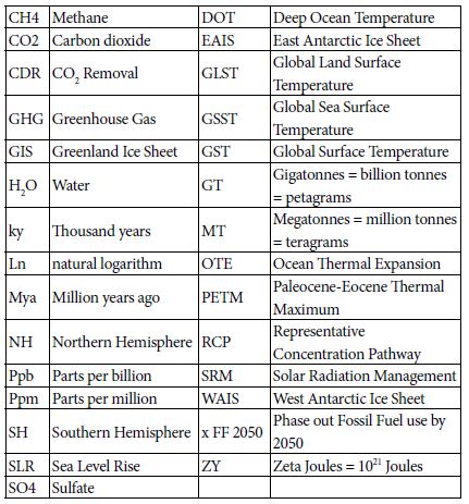
List of Acro

References

  1. https://data.giss.nasa.gov/gistemp/tabledata_v3/
  2. https://data.giss.nasa.gov/gistemp/tabledata_v3/GLB.Ts+dSST.txt
  3. Hansen J, Sato M (2011) Paleoclimate Implications for Human-Made Climate Change in Berger A, Mesinger F, Šijački D (eds.) Climate Change: Inferences from Paleoclimate and Regional Aspects. Springer, pp: 21-48.
  4. Levitus S, Antonov J, Boyer T (2005) Warming of the world ocean, 1955-2003. Geophysical Research Letters
  5. https://www.nodc.noaa.gov/OC5/3M_HEAT_CONTENT/
  6. https://www.eia.gov/totalenergy/data/monthly/pdf/sec1_3.pdf
  7. Hansen J, Sato M, Kharecha P, von Schuckmann K (2011) “Earth’s Energy imbalance and implications. Atmos Chem Phys 11: 13421-13449.
  8. https://www.eia.gov/energyexplained/index.php?page=environment_how_ghg_affect_climate
  9. Tripati AK, Roberts CD, Eagle RA (2009) Coupling of CO2 and ice sheet stability over major climate transitions of the last 20 million years. Science 326: 1394-1397. [crossref]
  10. Shevenell AE, Kennett JP, Lea DW (2008) Middle Miocene ice sheet dynamics, deep-sea temperatures, and carbon cycling: a Southern Ocean perspective. Geochemistry Geophysics Geosystems 9:2.
  11. Csank AZ, Tripati AK, Patterson WP, Robert AE, Natalia R, et .al. (2011) Estimates of Arctic land surface temperatures during the early Pliocene from two novel proxies. Earth and Planetary Science Letters 344: 291-299.
  12. Pagani M, Liu Z, LaRiviere J, Ravelo AC (2009) High Earth-system climate sensitivity determined from Pliocene carbon dioxide concentrations, Nature Geoscience 3: 27-30.
  13. Wikipedia – https://en.wikipedia.org/wiki/Greenland_ice_sheet
  14. Bamber JL, Riva REM, Vermeersen BLA, Le Brocq AM (2009) Reassessment of the potential sea-level rise from a collapse of the West Antarctic Ice Sheet. Science 324: 901-903.
  15. https://nsidc.org/cryosphere/glaciers/questions/located.html
  16. https://commons.wikimedia.org/wiki/File:AntarcticBedrock.jpg
  17. DeConto RM, Pollard D (2016) Contribution of Antarctica to past and future se-level rise. Nature 531: 591-597.
  18. Cook C, van de TF, Williams T, Sidney RH, Masao I, al. (2013) Dynamic behaviour of the East Antarctic ice sheet during Pliocene warmth, Nature Geoscience 6: 765-769.
  19. Vimeux F, Cuffey KM, Jouzel J (2002) New insights into Southern Hemisphere temperature changes from Vostok ice cores using deuterium excess correction. Earth and Planetary Science Letters 203: 829-843.
  20. Snyder WC (2016) Evolution of global temperature over the past two million years, Nature 538: 226-
  21. https://www.wri.org/blog/2013/11/carbon-dioxide-emissions-fossil-fuels-and-cement-reach-highest-point-human-history
  22. https://phys.org/news/2012-03-weathering-impacts-climate.html
  23. Smith SJ, Aardenne JV, Klimont Z, Andres RJ, Volke A, al. (2011). Anthropogenic Sulfur Dioxide Emissions: 1850-2005. Atmospheric Chemistry and Physics 11: 1101-1116.
  24. Figure SPM-2 in S Solomon, D Qin, M Manning, Z Chen, M. Marquis, et al. (eds.) IPCC, 2007: Summary for Policymakers. in Climate Change 2007: The Physical Science Basis. Contribution of Working Group I to the 4th Assessment Report of the Intergovernmental Panel on Climate Change. Cambridge University Press, Cambridge, UK and New York, USA.
  25. ncdc.noaa.gov/snow-and-ice/extent/snow-cover/nhland/0
  26. https://nsidc.org/cryosphere/sotc/snow_extent.html
  27. ftp://sidads.colorado.edu/DATASETS/NOAA/G02135/
  28. Chen X, Liang S, Cao Y (2016) Satellite observed changes in the Northern Hemisphere snow cover phenology and the associated radiative forcing and feedback between 1982 and 2013. Environmental Research Letters 11:8.
  29. https://earthobservatory.nasa.gov/global-maps/MOD10C1_M_SNOW
  30. Hudson SR (2011) Estimating the global radiative impact of the sea ice-albedo feedback in the Arctic. Journal of Geophysical Research: Atmospheres 116:D16102.
  31. https://www.currentresults.com/Weather/Canada/Manitoba/Places/winnipeg-snowfall-totals-snow-accumulation-averages.php
  32. https://data.giss.nasa.gov/gistemp/tabledata_v3/ZonAnn.Ts+dSST.txt
  33. https://neven1.typepad.com/blog/2011/09/historical-minimum-in-sea-ice-extent.html
  34. https://14adebb0-a-62cb3a1a-s-sites.googlegroups.com/site/arctischepinguin/home/piomas/grf/piomas-trnd2.png?attachauth=ANoY7coh-6T1tmNEErTEfdcJqgESrR5tmNE9sRxBhXGTZ1icpSlI0vmsV8M5o-4p4r3dJ95oJYNtCrFXVyKPZLGbt6q0T2G4hXF7gs0ddRH88Pk7ljME4083tA6MVjT0Dg9qwt9WG6lxEXv6T7YAh3WkWPYKHSgyDAF-vkeDLrhFdAdXNjcFBedh3Qt69dw5TnN9uIKGQtivcKshBaL6sLfFaSMpt-2b5x0m2wxvAtEvlP5ar6Vnhj3dhlQc65ABhLsozxSVMM12&attredirects=1
  35. https://www.earthobservatory.nasa.gov/features/SeaIce/page4.php
  36. Shepherd A, Ivins ER, Geruo A, Valentina RB, Mike JB, et al. (2012) A reconciled estimate of ice-sheet mass balance. Science 338: 1183-1189.
  37. Shepherd A, Ivins E, Rignot E, Ben Smith (2018) Mass balance of the Antarctic Ice Sheet from 1992 to 2017. Nature 558: 219-222.
  38. https://en.wikipedia.org/wiki/Greenland_ice_sheet
  39. Robinson A, Calov R, Ganopolski A (2012) Multistability and critical thresholds of the Greenland ice sheet. Nature Climate Change 2: 429-431.
  40. https://earthobservatory.nasa.gov/features/CloudsInBalance
  41. Figures TS-6 and TS-7 in TF Stocker, D Qin, GK Plattner, M Tignor, SK Allen, J Boschung, et al. (eds.). IPCC, 2013: Climate Change 2013: The Physical Science Basis. Contribution of Working Group I to the Fifth Assessment Report of the Intergovernmental Panel on Climate Change. Cambridge University Press, Cambridge, UK and New York, NY, USA.
  42. Zelinka MD, Zhou C, Klein SA (2016) Insights from a refined decomposition of cloud feedbacks. Geophysical Research Letters 43: 9259-9269.
  43. Wadhams P (2016) A Farewell to Ice, Penguin / Random House, UK.
  44. https://scripps.ucsd.edu/programs/keelingcurve/wp-content/plugins/sio-bluemoon/graphs/mlo_full_record.png
  45. Fretwell P, Pritchard HD, Vaughan DG, Bamber JL, Barrand NE et al. (2013) Bedmap2: improved ice bed, surface and thickness datasets for Antarctica .The Cryosphere 7: 375-393.
  46. Fairbanks RG (1989) A 17,000 year glacio-eustatic sea- level record: Influence of glacial melting rates on the Younger Dryas event and deep-ocean circulation. Nature 342: 637-642.
  47. https://en.wikipedia.org/wiki/Sea_level_rise#/media/File:Post-Glacial_Sea_Level.png
  48. Zelinka MD, Myers TA, McCoy DT, Stephen PC, Peter MC, al. (2020) Causes of Higher Climate Sensitivity in CMIP6 Models. Geophysical Research Letters 47.
  49. https://earthobservatory.nasa.gov/images/4073/panama-isthmus-that-changed-the-world
  50. https://sunearthday.nasa.gov/2007/locations/ttt_cradlegrave.php
  51. Hugelius G, Strauss J, Zubrzycki S, Harden JW, Schuur EAG, et al. (2014) Improved estimates show large circumpolar stocks of permafrost carbon while quantifying substantial uncertainty ranges and identifying remaining data gaps. Biogeosciences Discuss 11: 4771-4822.
  52. DeConto RM, Galeotti S, Pagani M, Tracy D, Schaefer K, al. (2012) Past extreme warming events linked to massive carbon release from thawing permafro.st Nature 484: 87-92.
  53. Figure SPM-2 in IPCC 2007: Summary for Policymakers. In: Climate Change 2007: The Physical Science Basis.
  54. Figure 22.5 in Chapter 22 (F.S. Chapin III and S. F. Trainor, lead convening authors) of draft 3rd National Climate Assessment: Global Climate Change Impacts in the United States. Jan 12, 2013.
  55. Dorrepaal E, Toet S, van Logtestijn RSP, Swart E, van der Weg, MJ, et al. (2009) Carbon respiration from subsurface peat accelerated by climate warming in the subarctic. Nature 460: 616-619.
  56. MacDougall AH, Avis CA, Weaver AJ (2012) Significant contribution to climate warming from the permafrost carbon feedback. Nature Geoscience 5:719-721.
  57. Shakhova N, Semiletov I, Leifer I, Valentin S, Anatoly S, et al. (2014) Ebullition and storm-induced methane release from the East Siberian Arctic Shelf. Nature Geoscience 7: 64-70.
  58. Sandeman J, Hengl T, Fiske GJ (2018) Soil carbon debt of 12,000 years of human land use PNAS 114:36, 9575-9580, with correction in 115:7.
  59. Stern N (2007) The Economics of Climate Change: The Stern Review. Cambridge University Press, Cambridge UK.
  60. Rind D, Goldberg R, Hansen J, Rosenzweig C, Ruedy R (1990) Potential evapotranspiration and the likelihood of future droughts. Journal of Geophysical Research. 95: 9983-10004.
  61. https://www.wsj.com/articles/economists-statement-on-carbon-dividends-11547682910
  62. www.climateadvisers.com/creating-negative-emissions-the-role-of-natural-and-technological-carbon-dioxide-removal-strategies/
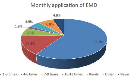
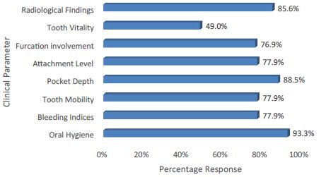
Marking with a Dye to Visualize the Limits of Resection in Breast Conserving Surgery

DOI: 10.31038/CST.2020544

Abstract

Objective: To study the technical aspects of the marking of the resection margins with a dye in breast-conserving surgery and to evaluate its aesthetic and oncological impacts.

Methods: Injection of methylene blue on a perpendicular path, at a controlled distance from the tumor. The tumor has previously been located by ultrasound or palpation. Then we study the carcinological and aesthetic results.

Results: Over a period of 4 years we operated on 36 patients. The average age was 43. Large breasts of average size were found in the majority of cases. Tumor sizes were dominated by T3 tumors and tumors were mostly located in the upper outer quadrant. The most frequently encountered histological types were invasive carcinomas with non specific type. The incisions were classic in more than 80% of cases or sometimes oncoplastic. The aesthetic results were satisfactory in 78% of cases. The carcinological results were marked by invaded margins in 3% of patients.

Conclusion: The results of the methylene blue injection technique to secure the excision margins and perform breast conserving surgery are satisfactory from the aesthetic and oncological point of view.

Keywords

Marking; Methylene blue; Aesthetic results; Oncological results.

Introduction

Breast cancer surgery is basically a total mastectomy or breast-conserving surgery (BCS) which is a partial removal of the gland, removing the tumor and a margin of healthy tissue. This resection is associated with a sentinel lymph node biopsy or an axillary dissection. For non-palpable lesions, identification by medical imaging with the placement of a harpoon helps guide the excision. For lesions of larger sizes, guidance and assessment of the margins is done by ultrasound or palpation of the mass [1]. Extemporaneous examination of lumpectomy specimens shows invasion of the margins and a need for resection in 25% of cases [2]. In daily practice at the Dakar Cancer Institute, we consider larger margins for BCS and breast cancer oncoplasty. For this we have introduced into our practice the peritumoral injection of methylene blue and oncoplasty techniques for conservation. The objective of this work was to study the technical aspects of dye marking in BCS and to assess its aesthetic and carcinological impacts.

Materials and Methods

Patients had to present with a tumor smaller than 4 cm initially or after chemotherapy. Pure methylene blue, a 10 cc syringe and a spinal anesthesia needle were used (Figure 1). The injection was around the tumor and more than 3 cm from the edges after localization by palpation or ultrasound (Figure 2), from the skin to the pectoralis major apnevrosis. The excision was done on the blue paths (Figure 3). We used Krishna Clough classification to assess aesthetic results.

fig 1

Figure 1: Injection Equipment.

fig 2

Figure 2: Infiltration of methylene blue over 3 cm.

fig 3

Figure 3: Resection on the blue path.

Results

Over a period of 4 years we operated on 36 patients. The average age was 43 with extremes of 25 and 62. Large breasts were found in 27% of cases, medium-sized breasts in 56% of cases and small breasts in 17% of cases. At the tumor level, 6 patients (16%) were classified as T1, 16 patients (44%) were classified as T2 and 14 patients (40%) were classified as T3. The tumor was located in 20 patients in the supero-external quadrant, i.e. 56% of cases. The histologic types were distributed as follows: 27 cases of Invasive Carcinomas with non Specific Type (ICNST) (50%), 2 cases of In Situ carcinoma (ISC) (12%), 2 cases of atypical ductal hyperplasia (ADH) (12%), 1 case of relapsed grade 2 phyllodes tumor (6%), 1 case of mammary lymphoma (6%), 1 case of ADH and ISC association (6%), 1 case of ICNST and ISC association (6%), 1 case of ICNST and lobular larcinoma association (6%) ). The predominant incision was the orange quarter (14 patients or 39% of cases). The other types of incision were periareolar (8 patients, 22% of cases), triangular (2 patients, 0.03% of cases), “batwing” and “hemibatwing” types (10 patients, 14% of cases). All patients had clear margins at the macroscopic specimen examination. At microscopic level, margins were invaded in 1 patient, i.e. 3% of cases, by an ISC of an extensive nature with foci of ADC giving rise to the indication of a mastectomy. One patient, 3% of cases, presented 1 mm close margins. Simple monitoring following radiotherapy was decided. The 1-year MRI was normal. We found 28 satisfactory aesthetic results, i.e. 78% of cases, 6 average results and 2 bad results. Four patients, i.e. 12% of cases, presented breast lymphatic drainage disorders with chronic pain and in 1 case 1 episode of acute lymphangitis. After 4 years follow up we found 1 recurrence (2, 7%).

Discussion

Young women benefit more from BCS than older women [3]. The breast shape of the young woman is a better guarantee of a good breast conserving technique. The injection of methylene blue is all the easier because the breast is less flabby. It is the same with the size of the breasts. The concern for a good margin is less in large breasts. The larger breast size is an argument of choice in BCS [4]. The tumor size and the extensive in situ component, especially in combination with foci of atypical hyperplasia, are risk factors for local recurrence. The size of the tumor is a risk factor for local recurrence and long-distance dissemination. Tumors larger than 5 cm N + have an 84% 5-year survival rate [1]. The tumor site did not change the injection technique. Upper and outer quadrant (UOQ) tumors are more accessible to conventional techniques because the gland is more developed and axillary dissection is done through the same incision. Lumpectomy of the UOQ offers more possibilities for simple surgery without recourse to oncoplastic reconstruction techniques [4]. Local recurrence and invaded margins were correlated with histological type. The presence of a combination of ductal carcinoma and extensive carcinoma in situ as well as large lesion size, presence of nuclear pleomorphism, absence of cellular polarisation and extensive necrosis has been implicated [5]. The surgery of phyllodes tumors owes its success to a good excision passing in clear margins. Lymphoma is a rare tumor of the breast. Its treatment is BCS and treatment of micrometastatic disease. In case of microscopic residue, if margins are not demarcated the risk of recurrence increases. Neo-adjuvant chemotherapy tends to reduce the risk of local recurrence despite the role of advanced nodal involvement at diagnosis, residual tumor larger than 2 cm, multifocal residual disease, and lymphovascular space invasion [6]. The type of incision depends on the tumor location, the breast and the tumor size, and the breast shape. The decision-making factors on the type of incision are the proximity of the tumor to the skin, the tumor site, the size of the breast, the possible conversion to mastectomy after a definitive histological result, with the possibility of immediate reconstruction, the choice expressed by the patient or the need to perform breast reduction or symmetrization at the same time. Oncoplastic technics using upper and lower pedicles, inverted T, pure vertical technics or round-block can be used independently of the location. More and more tumor size does not matter in the decision [7]. Symmetrization by glandular or skin excision may be an aesthetic imperative in carefully selected patients [8]. Aesthetic sequelae that occur in 20 to 30% of cases associate breast deformities, areola malposition and skin damage [4]. The sequelae are aggravated by radiotherapy of the breast. This led to the development of radiotherapy techniques on the site, in particular the Accelerated Partial Breast Irradiation (APBI). This radiotherapy modality, which includes interstitial brachytherapy, intraoperative radiotherapy and hypofractionation, although not very widespread, has been validated as a safe alternative because it gives recurrence rates almost identical to RTE with less chronic sequelae on breast and critical organs including the heart and lungs [9,10]. The oncological results are progressive over time. The recurrence and death rate is low. BCS does not increase mortality. The choice of technique must obey technical and carcinological requirements.

Conclusion

Identifier les marges dans BCS à l’aide d’un colorant pour cibler le chemin de coupe est une technique simple et bien tolérée. C’est une contribution importante à la sécurisation des marges et à la gestion des grosses tumeurs. Les résultats esthétiques et carcinologiques sont satisfaisants.

References

  1. Kapoor MM, Patel MM, Scoggins ME (2019) The Wire and Beyond: Recent Advances in Breast Imaging Preoperative Needle Localization. Radiographics 39:1886-1906.
  2. Rubio IT, Ahmed M, Kovacs T, Marco V (2016) Margins in breast conserving surgery: A practice-changing process. Euro J Surg Oncol 42: 631-640. [crossref]
  3. Lazow SP, Riba L, Alapati A, James TA (2019) Comparison of breast-conserving therapy vs mastectomy in women under age 40: National trends and potential survival implications. Breast J 25: 578-584. [crossref]
  4. Bertozzi N, Pesce M, Santi PL, Raposio E (2017) Oncoplastic breast surgery: comprehensive review. Eur Rev Med Pharmacol Sci 21: 2572-2585. [crossref]
  5. Provenzano E, Hopper JL, Giles GG, Marr G, Venter DJ, et al. (2004) Histological markers that predict clinical recurrence in ductal carcinoma in situ of the breast: an Australian population-based study. Pathology 36: 221-229.
  6. Chen AM, Meric-Bernstam F, Hunt KK, Thames HD, Oswald MJ, et al. (2004) Breast conservation after neoadjuvant chemotherapy: the MD Anderson cancer center experience. J Clin Oncol 22: 2303-2312. [crossref]
  7. Walcott-Sapp S, Srour MK, Lee M, Luu M, Amersi F, et al. (2020) Can Radiologic Tumor Size Following Neoadjuvant Therapy Reliably Guide Tissue Resection in Breast Conserving Surgery in Patients with Invasive Breast Cancer?. Am Surg 86: 1248-1253. [crossref]
  8. Deigni OA, Baumann DP, Adamson KA, Garvey PB, Selber JC, Caudle AS, Smith BD et al. (2020) Immediate Contralateral Mastopexy/Breast Reduction for Symmetry Can Be Performed Safely in Oncoplastic Breast-Conserving Surgery. Plast Reconstr Surg 145: 1134-1142. [crossref]
  9. Romero D (2020) APBI is an alternative to WBI. Nat Rev Clin Oncol [crossref]
  10. Veronesi U, Cascinelli N, Mariani L, Greco M, Saccozzi R, et al. (2002) Twenty-year follow-up of a randomized study comparing breast-conserving surgery with radical mastectomy for early breast cancer. N Engl J Med 347: 1227-1232. [crossref]

Smaller and Small: Strategies to Iterate to Knowledge about the Granular Aspects of Donations

DOI: 10.31038/CST.2020543

Abstract

The paper presents the use of an emerging science, Mind Genomics, to understand a practical aspect of daily life: what motivates a person to donate to a specific charity. Beyond the knowledge of specific messages which are deemed to be potentially effective as a stimulus to donation, the paper shows how knowledge of a specific end-use can inform us about the mind of a person for a more general problem—how understanding the messages for donation drives a deeper understanding of human motivation. The paper moves from inexpensive pilot tests, through an affordable experiment, and onto the creation of a tool to assign new people worldwide to the proper groups, so they can receive the appropriately targeted messages.

Introduction

Knowing What to Say to Donors to Encourage Giving

In today’s world, departments of development for various organizations have become increasingly important and active. One is inundated daily by requests for donations for all sorts of causes, ranging from simple letters from individuals to sophisticated outreach including brochures and other presentations with information intended to tap one’s emotions and open one’s wallets. Most appeals from organizations appear to be ‘on point,’ with the proper phrases, the proper images, and so forth [1-3].

Approaches to Science – Idiographic versus Nomothetic

Today’s culture of science drives research towards large samples and well-defined stimuli. Despite the fact that a great deal of science is exploratory, the majority of studies published would have us believe that the studies are following the hallowed dicta of philosopher of science Karl Popper, invoking the hypothetico-deductive system, creating a hypothesis, and then falsifying it. The editors of major journals look for breakthrough work, combining a robust combination of novelty and familiarity. Such work is not common, although it occasionally surfaces. The evolving culture of science focuses on extensions of today’s state of knowledge as represented in the existing scientific literature. The typical phrase is ‘plugging holes in the literature,’ or ‘answer a call from the literature.’ Scientific rigor is as much rigorous statistics as rigorous thinking. The published work must convince by virtue of statistical differences, not by daring challenges which advance science. Despite what is promoted as scientific ‘doctrine,’ today’s scientific world frowns upon these new directions, however, when the content of journals and the reactions of reviewers are studied in detail. A quandary arises when the research is meant to explore a topic rigorously with good underlying design but with affordable samples, with the goal to be used for practical ends while truly adding to knowledge of a topic. Can this effort be called science? Typically, these problems emerge in the social and behavioral sciences, but less frequently in the harder sciences.

The focus of this paper is how one can quickly, inexpensively, and rigorously uncover the nature of the donor’s mind for a specific end recipient, that recipient being Children’s Cancer Center (name disguised to preserve confidentiality). The objective is to support children with cancer by addressing their medical, social, and psychological needs, as well as their family’s challenges. The problem is to discover what type of messages are likely to drive a person to donate. The problem is a practical one with a limited scope, specifically Children’s Cancer Center’s donations, but the learning which emerges from the study is relevant to an understanding of other communications driving support for a given charity. The empirical part of this paper shows the two steps followed to discover what to say to potential donors about Children’s Cancer Center. The combination of the two studies may be viewed as a discussion of ‘method,’ so-called methodological research. The specific findings of the second study, which is larger, but still small in terms of general practice, show what can be discovered for practical use.

About Children’s Cancer Center

Data from the World Health Organization (WHO) and the National Cancer Institute reveal that, in the United States, cancer is the leading cause of death by disease past infancy and will lead to the deaths of approximately 1,190 children in the U.S. in 2021. Further, As of January, 2015, the most recent data readily available, The National Cancer Institute reports that there are 429,000 survivors of childhood and adolescent cancer (diagnosed at ages 0 to 19 years) alive in the United States, and these survivors face serious medical problems during and after the acute phase of their disease (National Cancer Institute, 2018, 2020) [4,5].

Childhood cancer is a global issue. According to St. Jude Children’s Research Hospital’s website, cancer is diagnosed each year in about 175,000 children ages 14. The World Health Organization reports that more than 300,000 new cases are diagnosed annually in children ages 0-19. The number of actual cases is probably greater, because children in low-income countries are not likely to be included as part of the count. As Alex’s Lemonade website points out, “globally, cancer stole 11.5 million years of healthy life away from children in 2017.” This is because of life years taken away from kids who die, as opposed to a 90-year-old adult who dies of cancer and has very few life years left (Alex’s Lemonade, 2020) [6].

Despite the global prevalence of childhood cancer and the death rates associated with it, now 80% survival rates for US children but only 20% globally, only 4% of US government funding in the cancer sector is directed towards pediatric cancers. This has been challenged by pediatric cancer activists for years. A 2015 article by Kristin Connor in the Washington Examiner sheds light on the logic behind why our government doesn’t increase funding for childhood cancer:

“…cancer research funds are driven by the number of people — of any age — who have the disease. And, of course, adults, with decades of exposures and behaviors, experience cancer in much greater numbers than young children. This approach therefore seems like the “democratic” way to distribute federal money. Yet it doesn’t do much for the more than 15,700 children diagnosed each year with cancer, and the more than 40,000 children undergoing cancer treatment each year all across the United States. But instead of looking at the number of annual diagnoses, perhaps we should consider the number of life-years potentially saved. For each child with cancer, on average, as many as 71 potential life years might be saved. That’s an important factor that is not being considered when funding allocation decisions are made.” [7].

Despite great progress in US survival rates (84% of children diagnosed with cancer are alive at least five years after diagnosis), 16% are still dying AND those who do survive for five years are not necessarily cured, and many of them suffer from long-term side effects from their illness and associated treatments. According to Alex’s Lemonade, “Children who were treated for cancer are twice as likely to suffer chronic health conditions later in life versus children without a history of cancer.”

Some reason for optimism comes from the WHO: “most childhood cancers can be cured with generic medicines and other forms of treatments including surgery and radiotherapy. Treatment of childhood cancer can be cost-effective in all income settings.” Early intervention is critical to improving pediatric cancer outcomes. The WHO also calls for childhood cancer data systems, which are “needed to drive continuous improvements in the quality of care, and to drive policy decisions.” Donating to organizations like Children’s Cancer Center supports those factors that will lead to improved outcomes around the world. With the WHO’s statement that “the most effective strategy to reduce the burden of cancer in children is to focus on a prompt, correct diagnosis followed by effective therapy,” supporting an organization like Children’s Cancer Center is critical to reducing death rates of children worldwide [8].

The Mind Genomics Approach

Mind Genomics is an emerging science with roots in experimental psychology, sociology, consumer research, and statistics, respectively. The objective of a Mind Genomics study is to understand the messages for a topic which drive a specific response, such as ‘Dislike/Like,’ ‘Not interested/Interested,’ ‘Will Not donate/ will donate,’ ‘Will pay a certain amount,’ ‘expected to feel a certain way,’ and so forth. The purview of Mind Genomics is everyday life and the expected decisions that people make when they are presented with messages about a specific, granular, situation, of the type that would confront them daily. The process of Mind Genomics, the intellectual underpinnings, the statistics, and business-relevant patents have been documented extensively, and need not be repeated in their specifics. The reader is directed to a representative list [9-11]. Mind Genomics grew out of the need to create a new vision of science, one studying the behavior of the everyday, from the viewpoint of experimentation, rather than observation. Anthropology already studied individual cultures and behaviors in depth, with recent efforts attempting to move from purely descriptive to quantitative [12]. Sociology already studies everyday behavior but does not conduct experiments, and looks for general rules in everyday behavior, rules which are ‘nomothetic,’ dealing with generalities. Social psychology moves more closely into the world of the mind but again deals with issues of nomos. Social psychology is not experimental, and while it may deal with ordinary daily behavior, it attempts to provide a broad sweep of the behavior of people, rather than focusing on the topic itself. The topic of the study is only a means to understand the person. In the above disciplines, researchers focus on the person, using the normal situation to understand the person.
In contrast to other disciplines, Mind Genomics focuses on the specifics of the situation, using the person and the rules of judgment to understand. Thus, the learning is about the specifics of daily life, and less so about the person himself or herself. Indeed, one might use the metaphor that Mind Genomics focuses on the situation, with the situation ‘illuminated’ through the lights of different sources. These ‘lights,’ these different forms of illumination, are the people. The ultimate objective of Mind Genomics is to create a ‘Wiki of daily experience,’ a virtual encyclopedia of daily life and the different aspects of that daily life, dimensionalized into specifics, with the data being the aspect and numbers representing the way the ordinary person feels about that specific, on some type of scale. The problem for the ‘project of science’ is what type of information is acceptable for science? That is, the project discussed has a specific objective. Does the fact that there is such an objective invalidate the science, simply because the results pertain to a specific end-user, the Children’s Cancer Center charity? Furthermore, are the results not ‘valid’ because the base size is low? Finally, what is the status of the preparatory study—a small preliminary study to identify whether there are messages which resonate? Do preparatory studies deserve a place in the research report, because they illustrate the way towards making the larger discovery, by one or a set of small, ‘trial’ experiments?

Illustrating the Process of Mind Genomics Applied to Donations

Mind Genomics has already been used to study the nature of effective communication for donations [10,13]. The objective of the study is to understand the most productive and effective way to communicate to a prospective donor to Children’s Cancer Center. The relevance of the topic, donation, and the relevance of Children’s Cancer Center in the world of charity organizations for children with cancer will become obvious from the review of today’s information about children and cancer. Thus, anything helping to understand WHAT to communicate, and to WHOM, can play a major role in the world of health care and fundraising. The ordinary process for understanding what to communicate does not invoke science, nor does it invoke foundational experiments bridging the world of science and application. The ordinary process might be either to select previous messages that ‘worked’ to drive donations, or perhaps to classify the prospective donors into different groups, based upon WHO they are, WHAT they have done in the past, or how they THINK about general topics. The short case presented here shows how a rigorous scientific approach to understand how the mind of the donor can be applied to situations where guidance is needed, rather than where one wishes to establish for a scientific proposition with reasonable certainty. The underlying world view is that even within the world of application, one can create knowledge which informs the greater science. In the case study presented here, we show how a small pair of studies, one with four respondents and a succeeding one with 50 respondents, informs the world of charitable donations, establishing patterns that can used later on as springboards either for more application or for theory building. We now move to the science of Mind Genomics, following the process, not so much to establish general rules, but rather to investigate a specific, defined situation: donation to Children’s Cancer Center Hospital. We follow a series of steps, whether the Mind Genomics study is designed to understand charitable donations in general, or to understand charitable donations to a specific cause.

Our presentation of the process shows the results from two iterations. The first iteration, with the very small base size of four respondents (n=4), will show how Mind Genomics extracts information at virtually the level of one or a few individuals, in a manner similar to the way the anthropologist or the consumer researcher extracts information from in-depth interviews with one or two people or from focus groups of three or more people. The second iteration will move on with a more quantitative study of the responses from 50 individuals, after building on the learning from the first iteration, changing some of the material, and then testing. It is important to note that the process need not be restricted to one small study followed by one larger one, but might comprise several small studies, until these sequences of ‘iterations’ provide the information which seem to be most appropriate to answer the applied question, and to provide the structured knowledge for a ‘wiki of the mind’ with respect to the topic.

Step 1: Choose a Topic

This step sounds simple, but it requires the researcher to focus on a specific topic. Choosing the specific topic is the start of critical thinking required by Mind Genomics, whether the topic is a general one of daily behavior (what makes a person donate to a charity?) or a specific one (what makes a person want to donate to Children’s Cancer Center Hospital?).

Step 2: Create Four Questions Which ‘Tell a Story,’ Pertaining to the Topic

The iterative nature of Mind Genomics ensures that the researcher need not worry that the questions are correct. Indeed, part of the underlying world view of Mind Genomics is that science should be exploratory.

Step 3: Create Four Answers to Each Question

Again, these answers need not be the correct answers. The ability to iterate, to run a number of these small experiments, generate data which guide the researcher to better questions and better answers.

Step 4: Select a Rating Scale

The rating scale can be 5, 7 or 9 points. The actual number of scale points is left to the discretion of the respondents, as is the rating scale. There is no right or wrong scale. The topic of questions and scales has been a focus of researchers for a century. The pragmatic side of Mind Genomics is that the scale should be simple. The scale for this type of question (not donate vs. donate) should be simple to understand, anchored at both ends. An odd number of scale points is easier to work with when there is the possibility of a neutral point.

Step 5: Launch the Study and Get the Results Fully Analyzed within 90 Minutes

The process obtains respondents through a panel service (Luc.id), with the Mind Genomics platform automatically analyzing the data and returning a complete report, the entire process typically taking less than one to one and a half hours.

Step 6: Present the Appropriate Vignettes to the Respondent, Vignettes Created for That Respondent by the Permuted Experimental Design

Record the rating on the anchored 1-9 scale, and record the response time (consideration time), operationally defined as the number of seconds from the appearance of the vignette on the screen to the actual rating assigned by the respondent. Each respondent evaluates the appropriate set of vignettes to constitute an experimental design, allowing subsequent powerful analyses. Each respondent evaluates a unique set of combinations of messages, so that across the set of respondents the evaluations cover many of the possible combinations, rather than covering a few combinations, but with precision. The learning will be in the stimuli, not in the precision of the measurement.

Step 7: Obtain Data Analyzable Both at the Level of the Individual and at the Level of the Group, Respectively

Each respondent evaluates a full experimental design, analyzable at the level of the individual respondent. For the design comprising four questions and four answers (elements), the design prescribes 24 combinations (vignettes). Each vignette comprises 2-4 elements, no more than one element or answer from any question. The design ensures that each element appears 5x, uncorrelated with any other element; The experimental design is maintained, but the combinations are changed according to a permutation scheme [14,15]. Thus, the combinations cover more of the ‘design space’ than the usual approach using experimental design. The underlying rationale is that it is more productive to test many possible combinations with underlying variability (noise) in each measurement than to limit oneself to a few combinations, measuring each point in the design with many replicate measures to average out the variation. In short, the argument by Mind Genomics is that knowledge emerges from scope with modest precision at each point (the big pattern emerges), rather than from precision with narrow scope. This is the key tenet of Mind Genomics: scope is better than precision, at least in the early explorations of a topic.

Step 8: Convert the Rating Scale in Two Ways

The first transformation is ‘Top 3’ defined as a transformed value of 0 when the original rating was 1-6, defined as 100 when the original was 7-9. The first transformation focuses on what ‘drives’ a person to select ‘donate.’ The second transformation is ‘Bot 3’ defined as a transformed value of 0 when the original rating was 4-9, defined as a transformed value of 100 when the original rating was 1-3. The second transformation focuses on what ‘drives’ a person to select ‘will not donate.’ To all transformed ratings a small random number was added (<10-5) to ensure variation in the transformed rating, and thus to ensure that the OLS (ordinary least-squares regression) will ‘work,’ and not ‘crash.’ OLS regression requires variation in the dependent variable. The addition of the small random number ensures that variation without materially affecting the results.

Step 9: Cluster the Individual Respondents Based Upon the Pattern of Their 16 Coefficients for Top3

The clustering is done using k-means clustering with the measure of distance being (1-Pearson Correlation), viz., [16]. The Pearson correlation coefficient shows the strength of a linear relation between two sets of measures. When the relation is perfectly linear, increases in one measure correspond to precise increase in the other measure. There is no scatter, the Pearson correlation is +1, and the distance is 0 (1-1=0). In contrast, when the relation is perfectly inverse, increases in one measure correspond to precise decreases in the other measure. Again, there is no scatter, the Pearson correlation is -1, and the distance is 2 (1–1=2). The clustering program generates two, and then three groups, called mind-sets, because the clusters represent groups who attend to the elements or messages in different ways. We select that cluster solution (the array of mind-sets) which tells the most obvious story (interpretable), and which comprises the smallest number of segments (mind-sets). For the data in this study, the three-mind-set solution was easier to understand.

Step 10: Create the Model for All Appropriate Data from the Respondents from Each Key Subgroup

Each group (Total, three Mind-Sets) generates three models or equation; Top3 (drivers of positive response), Bot3 (drivers of negative response), and RT (response time, or consideration time, measure of engagement with the material, whether the response to the element was positive or negative).

The model is a simple weighted, linear equation of the form:

Top3 (or Bot3) = ko + k1(A1) + k2(A2) … k16 (D4)

Response Time = k1(A1) + k2(A2) …. K16 (D4)

The additive constant k0, shows the estimated Top3 (or Bot3) response in the absence of elements. The additive constant can be thought of as a baseline response, or the underlying, fundamental likelihood of the respondent to ‘donate’ (Top3) or ‘not donate’ (Bot3). The additive constant is not meaningful for response time RT, since in the absence of elements there is nothing to which one can respond.

Step 11: Assign a New Person to One of the Mind-sets by Means of a Short Questionnaire, the PVI, Personal Viewpoint Identifier

The PVI assigns a NEW person to one of the mind-sets, and by so doing expands the scope of the small-scale studies to practical use, whether to create a more effective campaign (application), or to understand the distribution and possibly nature of the people in the different mind-sets. This adds to our general knowledge of the minds of people regarding messages relevant to donations (science).

Results

The Two Studies

To illustrate the value of small studies and what can be learned with a sequential approach requiring 2-3 days, we present the results of two studies designed to understand what messages may work for a campaign. The project deals with messaging to drive donations for Children’s Cancer Center, a hospital devoted to pediatric cancer (name of actual hospital disguised to maintain confidentiality). To make the topic general, the actual study was conducted among the general population to uncover the messages which would appeal the general population, not simply appeal to previous donors to Children’s Cancer Center.

The knowledge development was done in two phases. The first phase, or experiment, can be considered a pilot study with 10 respondents, sufficient to provide deep insights. The key difference between a pilot study of 10 respondents and a larger scale study of 40-50 respondents, or even a much larger scale study of 100-200 respondents, is simply the ability to identify different groups in the population and study the pattern of their responses.

Study 1: Preliminary Learning through a ‘Mini-Study’

As noted above, the Mind Genomics project begins with the topic (donating to Children’s Cancer Center specifically, or a cancer hospital for children in general). The next step requires the researcher to formulate the four questions that ‘tell a story.’ The questions emerging from the initial discussion tell such a story. They may not be the only questions, but in an exploratory study the objective is to learn just ‘what works.’ The four questions are:

A. Question A: What is it like to be a pediatric cancer patient?

B. Question B: Why is it important to support Children’s Cancer Center?

C. Question C: What are the outcomes for children when you donate?

D. Question D: How do you give your donation?

The study was executed with 10 respondents chosen from a large group of panel participants recruited by Luc.id, Inc., based in Louisiana, a provider of panel participants for on-line studies. Each respondent evaluated a different set of 24 vignettes, constructed according to Step 6 above. With as few as one respondent the Mind Genomics study generates meaningful data, readable at the level of that single respondent. With 10 respondents, and occasionally even as few as three or four, patterns rapidly emerge, patterns which are relevant for the respondents, but which may or may not be projectible to the population at large.

Table 1 shows the coefficients for the response time, the positive coefficients for the positive responses (I will donate), and the positive coefficients for the negative responses (I will not donate).

Table 1: The four questions, four answers to each question and the coefficients from the grand model relating the 16 elements to the binary transformed rating. To help the underlying patterns emerge, only the positive, non-zero, coefficients are shown for Top3 and for Bot3. The response times are shown for all elements, but only the response times of 1.1 seconds are shown, those driving ‘engagement’.

table 1

The response time gives a sense of the elements which most engage the respondent. Even with a small base size of 10 respondents, the data from the deconstruction of the ratings into the contribution of the elements gives a sense of the nature of elements that effectively engage. Those elements talk about the children, and survival. The elements may not ‘drive expected donations,’ but they do engage as shown by the long response time (consideration time). Moving on to the ratings, or more specifically the transformed ratings, Table 1 suggests that the additive constant, the proclivity to donate or not to donate ranges between 40 and 50. In the absence of elements which provide specific information, there is no dramatic drive to donate or not to donate, at least for these randomly chosen respondents. What is more important, however, is that among the 16 elements or, the messages, only two reach significance (coefficients of 8 or higher).

You can donate online with the click of your mouse!

Children’s Cancer Center freely shares their research and treatment protocols with hospitals around the world.

The two elements have little in common, suggesting that there is probably no single strong message. It is the nature of researchers to continue looking. These data suggest no ‘magic bullet.’ They do suggest that if there are any ‘magic bullets,’ they may be found in different mind-sets in the population, if such mind-sets can be identified. It is at this point that one can begin to formulate hypotheses about the psychology of donations. The hypothesis emerging here is that ‘painting a graphic word picture’ of the child will engage attention. The science of Mind Genomics has now enriched our thinking about the psychology of donations and generosity, suggesting that graphic design of the recipient is something to consider. The data suggest a further opportunity to understand the nature of the portrait being painted.

Study 2: Identifying the Underlying Structure of What Works for Donating to the Hospital

Study 1 constituted the first foray into the topic, executed with 10 respondents. Although 10 respondents are not often considered to be sufficient to establish results, a base of 10 respondents from one or two focus groups is acceptable when considered to be an exploratory step. Thus, we considered Study 1 to be exploratory, providing information in a disciplined way, but with simply too few respondents.

Here again are the questions from Study 1

Question A: What is it like to be a pediatric cancer patient?

Question B: Why is it important to support Children’s Cancer Center?

Question C: What are the outcomes for children when you donate?

Question D: How do you give your donation?

Based upon the patterns of responses, here are the four revised questions. The key change is Question D, and of course the text of the elements themselves.

Question A: What is it like to be a pediatric cancer patient (why would you want to help)?

Question B: Why is it important to support Children’s Cancer Center?

Question C: What are the outcomes for children when you donate?

Question D: What would inspire you to give?

The second study was conducted with 50 respondents, of which the data from 48 respondents were retained. The remaining two respondents did not provide age or gender, and so their data were eliminated.

Table 2 shows the same type of data as does Table 1, this time for the new set of respondents, and the new set of elements. Once again, each respondent evaluated a unique set of 24 vignettes, constructed by experimental design, so that the data can be analyzed down to the level of the individual respondent. This strategy, so-called ‘within-subjects design’ ensures that the data can be further deconstructed into subgroups called ‘mind-sets,’ based upon the patterns of the coefficients for each respondent. At first glance, the data reaffirm the previous finding from Study #1 that there are no elements which strongly driving expected donations, when the topic is associated with Children’s Cancer Center. One might consider this a failure when the objective is to discover the so-called ‘magic bullet,’ the message that will work for everyone. The result might be the continued search for this ‘magic bullet’ in successive efforts, only to realize in the end that there is no ‘magic bullet,’ or if there is, no one has any idea about what specifically it is  and how to express it. At the practical level, the effort will be seen to have been wasted. There will be no science of communication about charitable contributions and how people feel. The unsatisfactory conclusion, soon to be discarded is ‘no business results, no contributions to the science of people, no additional knowledge for science of charity communications.’

Table 2: Results from the total panel from Study #2.

table 2

The picture changes, and significant learning for practical application and for foundational knowledge emerges, when one dives more deeply into Mind Genomics and discovers mind-sets. In Mind Genomics, the continuing data suggest the existence of what could be called mind-sets, different patterns of ideas which are interpretable in the form of a ‘story,’ patterns that seem to attach themselves to people. In the world of Mind-Genomics, considering people simply as ‘protoplasm which responds,’ there emerge groups of ideas which separately drive strong responses. People are the carriers of these ideas. People allow these groups of ideas to emerge. A person typically falls into a specific mind-set for a topic and not into the other mind-sets for the same topic. When we look at the data through the lens of mind-sets, using the computational process outlined in Steps 9 and 10 above and doing the computation on the Top3 (positive responses), we emerge with three new-to-the-world mind-sets, shown in Table 3 for Top3 (positive response – likely to donate), and in Table 4 for Bot3 (negative response – not likely to donate).

Table 3: Drivers of positive responses to messages, showing total panel, gender, and the three emergent mind-sets based on clustering using Top3.

table 3

To strengthen the scientific aspect of the results—the learning which is meant to be foundational rather than simply a direction for messaging to raise money—we include gender, as well, comparing the responses of males and females. Table 3 suggests three mind-sets. It is in the mind-sets that the strong elements emerge, elements with coefficients of +8 or higher.

a. There are some positive elements by gender, but no strong performers at all. Both male and female respondents are modestly interested in donating (additive constant=49)

b. Mind-Set 1 – Describe the professional services (modestly interested in donating at a basic level, additive constant=40)

c. Mind-Set 2 – Describe the person helped (modestly interested in donating at a basic level, additive constant=39)

d. Mind-Set 3 – Describe the institution’s performance (strongly interested in donating at a basic level, additive constant=69).

Table 4 shows the messages that should be avoided, the messages driving the response of ‘Not Donate.’ The coefficients emerge from considering only ratings of 1 and 2 as relevant on the 5-point scale, with ratings of 3-5 (neutral, will donate) as not relevant, and coded as 0. The additive constant is far lower for Not Donate than it is for Donate, meaning that people are more inclined to say that they will donate. Several messages to be used by the Center are likely to ‘backfire’, driving donors away. Mind-Set 2 is especially sensitive to the wrong messages.

Table 4: Drivers of negative responses to messages, showing total panel, gender, and the three emergent mind-sets based on clustering using Top3.

table 4

Finding these Respondents in the Population

A continuing topic in Mind Genomics is the value of a ‘next step’ beyond the already-important discovery of mind-sets. Mind-sets themselves provide a way of understanding daily life, through a new focus on the every-day and the way people differ in their typical behaviors. Yet, beyond the scientific contribution of knowledge is the remarkable potential of expanding the value of the learning, moving beyond the respondents tested in the study to the entire world. A simile is the colorimeter used to quantify colors of objects. The science of color can be developed in any location with any material. The real value of the science in terms of the ‘world outside’ is to measure the colors of new objects, not by repeating the study in which the colors were discovered, but rather by measuring the colors of the new objects using a machine in which the science has been already programmed [17-23]. The approach used in Mind Genomics is called the PVI, the personal viewpoint identifier. The objective is to use the data from Table 3 (MS1, MS2, MS3) to create a short questionnaire (six questions), on a simple to-use scale. The questions come from the actual study. The pattern of responses assigns a NEW PERSON to one of the three mind-sets. There are 64 possible patterns, each pattern mapping to one of the three mind-sets. Figure 1 shows the PVI, doing so in two parts. The left part is a short introduction, to introduce the person to the task, and to obtain optional background information. The right part is the actual PVI, including some basic questions about attitudes towards ‘giving’ and the six-question PVI. The results are forwarded to a database and can be sent to the respondents, as well.

fig 1

Figure 1: The PVI, personal viewpoint identifier, based upon the second study. The PVI is located at: https://www.pvi360.com/TypingToolPage.aspx?projectid=1261&userid=2018.

Discussion and Conclusion

The empirical results are simple to discover, just by looking at the table of elements and how the elements or messages drive interest in donating. The message used in requesting should be straightforward and focus on how the organization saves and changes lives for the better. The outcome of the organization’s work, and not the process, should be the main message. One should avoid directly focusing on needs and tax breaks, respectively. Although a minority of prospective donors will care about needs or tax advantages, most people say that they will contribute when they are suitably convinced by the cause and mission of the effort and in the vision detailing how their contribution can help. It is at this point that one can begin to formulate hypotheses about the psychology of donations. The hypothesis emerging here is that ‘painting a graphic word picture’ of the child will engage attention. The science of Mind Genomics has now enriched our thinking about the psychology of donations and generosity, suggesting that graphic design of the recipient is something to consider. The data suggest a further opportunity to understand the nature of the portrait being painted. It is not important to point out major ‘learnings’ from the results, learnings which confirm or disconfirm what is known in the literature, or what is hypothesized to be the case for the psychology of donors or the psychology of children with cancer. That information is, of course, important to know for science. What is more important, however, is the ability to have at one’s disposal a tool for small-scale, iterative experimentation: Mind Genomics, a tool which returns rich information even with remarkably small base sizes, such as n=10 or even fewer. In the world of science, Mind Genomics becomes a tool bridging the gap between the idiographic (individual) and the nomothetic (the general world). Just as important, Mind Genomics becomes both a practical tool to increase donations, as well as a tool for the development of systematized knowledge, both for the current generation and for those to come—a ‘wiki of the mind.’ Finally, viewed from the grand proscenium arch of civilization, Mind Genomics provides a record of how people of a certain time, in a specific environment, and faced with known needs, think about topics— a record of inestimable value to philosophy, psychology, history, sociology, anthropology, and economics, just to name a few disciplines where knowledge of the granular is important.

References

  1. Cao X, Jia L (2017) The effects of the facial expression of beneficiaries in charity appeals and psychological involvement on donation intentions: evidence from an online experiment. Nonprofit Management and Leadership 27: 457-473.
  2. Das N, Guha, A, Biswas A, Krishnan B (2016) How product–cause fit and donation quantifier interact in cause-related marketing (CRM) settings: Evidence of the cue congruency effect. Marketing Letters 27: 295-308.
  3. Mejova Y, Garimella VRK, Weber I, Dougal MC (2014) February. Giving is caring: understanding donation behavior through email. In Proceedings of the 17th ACM conference on Computer supported cooperative work & social computing pg: 1297-1307.
  4. Childhood Cancer Survivor Study: An Overview. (2018, September 27). The National Cancer Institute. https://www.cancer.gov/types/childhood-cancers/ccss
  5. Childhood Cancer. (2020, Nov 7). The National Cancer Institute. https://www.cancer.gov/types/childhood-cancers
  6. Alex’s Lemonade (2020) Global Childhood Cancer Facts: By the Numbers. (2020, Dec 7). Alex’s Lemonade. https://bit.ly/3a49Cpl
  7. Connor, K. (2015, May 25). Why childhood cancer research gets shortchanged. Washington Examiner. https://www.washingtonexaminer.com/why-childhood-cancer-research-gets-shortchanged.
  8. Jude’s Children Research Hospital, 2020 Childhood Cancer Facts. (2020, Dec 7). St. Jude Children’s Research Hospital. https://www.stjude.org/treatment/pediatric-oncology/childhood-cancer-facts.html .
  9. Gabay G, Moskowitz HR (2012) The algebra of health concerns: implications of consumer perception of health loss, illness and the breakdown of the health system on anxiety. International Journal of Consumer Studies 36: 635-646.
  10. Galanter E, Moskowitz H, Silcher M (2011) The Price of Grace: Donations, Charities, and the Mind. People, Preferences and Prices: Sequencing the Economic Genome of the Consumer Mind pg:103.
  11. Moskowitz HR, Gofman A (2007) Selling blue elephants: How to make great products that people want before they even know they want them. Pearson Education.
  12. Williams LL, Quave K (2019) Quantitative Anthropology, A workbook. Elsevier.
  13. Gabay G, Moskowitz H, Gere A (2019) September. UNDERSTANDING THE DONATING MIND & OPTIMIZING MESSAGING–PUBLIC HOSPITALS. In 12th Annual Conference of the EuroMed Academy of Business.
  14. Gofman A, Moskowitz H (2010a) Isomorphic permuted experimental designs and their application in conjoint analysis. Journal of Sensory Studies 25: 127-145.
  15. Moskowitz H, Gofman A, I novation Inc (2003) System and method for content optimization. U.S. Patent 6,662,215.
  16. Ramasubbareddy S, Srinivas TAS, Govinda K, Manivannan SS (2020) Comparative Study of Clustering Techniques in Market Segmentation. In Innovations in Computer Science and Engineering, pg: 117-125, Springer, Singapore.
  17. Gofman A, Moskowitz, HR (2010b) Improving customers targeting with short intervention testing. International Journal of Innovation Management, 14: 435-448.
  18. Global Initiative for Childhood Cancer. World Health Organization. (2020, December 7). https://www.who.int/cancer/childhood-cancer/en/
  19. Health Affairs, 2020. https://www.healthaffairs.org/doi/full/10.1377/hlthaff.25.2.541
  20. Importance of CEO involvement in creating a culture of philanthropy in hospitals.
  21. Moskowitz HR, Gofman A, Innovation Inc, (2011). System and method for performing conjoint analysis. U.S. Patent 7,941,335.
  22. Notaro S (2020) https://bit.ly/3b7wBQi.
  23. Social Science Direct (2020) https://www.sciencedirect.com/science/article/abs/pii/S2213076415300051. Use of social media by US Children’s’ hospitals.