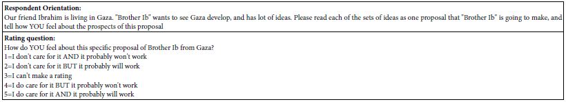
Monthly Archives: December 2022

fig 1

Spatial Patterning of Artefacts Using Variable Hierarchical Clustering and Bivariate Spatial Autocorrelation: A Case Study in Williston Reservoir, British Columbia

DOI: 10.31038/GEMS.2022435

Abstract

Artefacts in the Williston Reservoir, British Columbia were collected and recorded by an archaeological firm over several years. While a large and extensive dataset of the locations of these artefacts was built up, several challenges to management and interpretation of the use of the landscape are presented. This study used the Variable Clumping Method (VCM) hierarchical clustering technique to detect clusters of artefacts for each object type. These detected clusters were then used for an object-type spatial correlation analysis, using Multivariate Local Indicators of Spatial Association (LISA). The results from LISA analysis included detection of significant global and local associations between several object-type pairs. For instance, strong spatial correlation was found between Scrapers and Points, which may suggest significant use areas, such as regularly used butchering sites or campsites. While it is not possible to draw a definitive conclusion of exactly what these relationships mean in terms of landscape use, they suggest a number of interesting hypotheses of possible uses of the area in the ancient time.

Keywords

Artefacts, Archaeological materials, Hierarchical clustering, Variable clumping method, LISA

Introduction

Archaeological data is intrinsically spatial in nature, and spatial analysis can often play a key role in interpreting the distribution of archaeological materials across a landscape. This approach is particularly useful in a situation where the artefacts are scattered across the site without stratigraphic relationships or known features to provide the context. In particular, spatial patterning among the artefacts and the behavioural interpretation across the site require rigorous intrasite spatial analysis and modelling so as to deduce the kind of activities that occurred at the site [1]. A range of intrasite spatial analytical techniques have been applied to date [2], but the treatment of the spatial patterns of the artefacts and other entities occasionally presents challenges at the point of interpretation as their spatial tendency is not always correctly recognised [3]. This is mainly due to the direct application of either (1) a non-spatial statistical approach whereby all observations are treated as spatially independent in nature and that spatial randomness is warranted as the base distribution behind the spatial arrangement of the artefacts, or (2) a spatial statistical approach with the understanding that spatial dependency exists among the intrasite spatial configuration of the artefacts but the spatial patterning is often sought with respect to a predetermined set of scales informed by the specific context of the site—in other words, the spatial statistical methods are usually applied with parameters set a priori, despite that contexts may not be always available. The spatial arrangement of the artefacts found or excavated at a site is likely to have spatial dependency among them, and the scale of activities (e.g. an individual engaging in a house task, or a community taking part in a social activity) will likely vary between the types of activities and the participants involved which are difficult to calibrate without stratigraphic narratives or known features that offer the context. The objective of this study is to identify spatial associations between different types of archaeological artefacts found across an excavation site and gain knowledge on the spatial configuration and the lifestyle of the ancient community that lived in this area. To overcome the challenges stated above, this study uses two types of spatial analytical methods that can extract the hierarchical spatial structure: (1) a local variant of a spatial autocorrelation method called Multivariate Local Indicators of Spatial Association (LISA) [4], and (2) a hierarchical cluster detection method called Variable Clumping Method (VCM) [5,6]. Clustering helps to simplify a large archaeological dataset to make spatial patterns easier to discern; but they need to be arranged at suitable scales with the recognition of the multi-scale across different levels of activities. Finding clusters in the distribution of the artefacts across multiple scales would provide more natural groupings for use in the subsequent analysis. Exploration of the spatial relationships between different types of artefacts through LISA could provide us with a clue to infer activities that took place in an ancient time and could greatly enhance our understanding on how the landscape was used at the time. The study focuses on artefacts retrieved from Williston Reservoir, British Columbia, Canada.

Literature Review

Spatial Analysis in Archaeology

Spatial analysis and GIS have been used in archaeology for years, as evidenced in a study by Kintigh and Ammerman (1982) [7] which highlights the usefulness of computer-based analysis, informed by expert interpretation, for identifying meaningful patterns in archaeological data. According to Carr (1984) [1], there are two levels of archaeological spatial analysis: inferential and operational. The goals of inferential analysis are to spatially delineate the activity areas as well as to identify the tool kits of artefact types. At the operational level, the focus is placed on identifying patterns in the spatial arrangement of different artefact types, including clustering, and relationships between different artefact types. In many cases, applying inferential analysis may not be suitable. Even where the spatial relationships between artefact types can be identified, Carr (1984) [1] cautions that these do not imply an activity area and that there may be a number of other possible explanations for the observed patterns. Dynamic processes, including human activities, occurring in both space and time, have contributed to the superimposition of materials to produce static patterns [8]. For instance, artefacts may have been found clustered due to intense human activity in that location in the past, but Wood and Johnson (1978) suggest it could also result from natural processes such as water transport and sorting, or recent human activity such as farming. Deriving the nature of these processes from the static patterns can therefore be extremely difficult. Nevertheless, spatial analysis has proven as an important step to understand the nature of the archaeological deposits. A number of methods for detecting patterns in the spatial distribution of archaeological deposits have been proposed in the past and applied by a number of studies [3]. For instance, Kintigh and Ammerman (1982) [7] used the k-means cluster detection technique to iteratively split and lump points in the dataset into a user-defined maximum number of clusters and, thereby, minimise the sum of the squares of the distances between each point and its cluster centre to find the optimal solution. More generally, Carr (1984) [1] refers to a number of methods used in intrasite archaeological contexts for determining presence of clustering as well as delimiting clusters in a point dataset. These include the Nearest Neighbour Analysis [9] used for determining presence of clustering; Whallon’s Radius Approach [10] for delimiting clusters using the frequency distribution of nearest neighbour distances between point observations; and conditional spatial patterning, a multi-scale method to test for spatial patterning in an archaeological dataset [8].Other applications of these methods vary in location, site type and the scale. For instance, in a cave site in Western Belize, artefacts scattered on different surfaces, including in niches and on ledges, were mapped and recorded in a GIS to analyse the spatial arrangement of the archaeological objects [11]. They adopted a clustering method, as some artefacts were found in multiple fragments in close proximity to one another and that the uses the individual object locations for analysis would have resulted in unequal weighting. A non-hierarchical method, k-means, was used to define natural groupings of objects in space, and the resultant clusters were analysed with regard to their association with cave features. Moyes’ (2002) [11] findings suggest that clustering and comparative analysis of the morphologic cave features could provide the context and the relative analytical units for use on a broader scale.

The examples above, however, are situations where the sites and the archaeological context are well defined. Many of these methods primarily deal with “more or less intact living surfaces” [12] that may not be applicable to other archaeological situations that lack an intact or a clear definition of the site. An example of such a situation is found in Australia; similar to the Williston Reservoir case, where the archaeology consists of open sites [13]. These open sites are extensive in area size, lack stratigraphy or clear boundaries, and contain few features [13]. In essence, it is a vast expanse of a surface scattered with primarily lithic artefacts. Site boundaries are difficult to determine in this type of landscape and, for the management purposes, arbitrary rules are often used to define boundaries that are not meaningful for analysis [13]. In these situations, a site-less analysis is required; i.e. the analysis is based on individual artefacts rather than sites [13]. As a result, the first step with open sites is to identify patterns in the spatial location of artefacts; after which, attempts can be made to interpret the patterns archaeologically. Holdaway et al. (1998) [13] address these concerns through geomorphological mapping of the landscape used for understanding the patterns of surface artefact density. This step determined that the depositional surfaces had lower artefact densities, which were excluded from the subsequent analysis to avoid bias in case undiscovered artefacts were buried under the sediments. Different buffer radii were used to look at different scales, and the resultant cluster patterns of individual artefact types were then used to identify assemblages and patterns between artefact types [13]. Other studies have also explored different methods for determining the associations between artefact types. These include a variety of statistical tests based on the number of artefact in partitioned units to determine patterns of aggregation and segregation between different artefact classes [14]. In this case, the definition of the unit shape and size may impact the results of the analysis. This is known as Modifiable Areal Unit Problem (MAUP) in spatial analysis [15,16]. Hietala and Stevens (1977) [14] therefore suggest changing the partition size to determine patterns for multiple partition options. Berry et al. (1980) [17] suggest the permutation test, which can use either grid-count values or point locations, and so can avoid the problems associated with defining a grid unit size. The permutation test uses as its test statistic the “average within-class distance” (Berry et al., 1980, p. 56) [17], and thus can test for significant associations between multiple classes. These methods detect global associations between artefact classes; i.e. they assess the overall density or the tendency of clustered-ness across the study area. However, as Premo (2004) [18] points out, being able to quantify the local spatial patterns (which enables us to identify the location, the extent and the intensity of each individual cluster) is important for the understanding and interpretation of archaeological material distributions. Methods for local spatial pattern detection used by Premo (2004) [18] include local Moran’s I and local G statistics, mainly for the purpose of detecting local spatial autocorrelation. These local statistics have a great potential for multiple archaeological applications, including that of multivariate analysis for identifying the association between artefact types or material types Premo (2004) [18].

Hierarchical Clustering Methods in Spatial Analysis

With the development of data collection technology such as Global Positioning Systems (GPS), remote sensing, and vast amount of spatial data is becoming increasingly available. Yet their interpretation is not always straightforward, and dealing with the data to extract meaningful information can be difficult at times. Exploratory spatial data analysis (ESDA) offers an important first step for deriving information from large spatial datasets [19]. Cluster analysis is a spatial extension of ESDA used across a broad range of disciplines, including crime analysis, disease analysis, and archaeology [6,7,20]. Cluster detection techniques for point datasets include techniques that simply determine the presence of clustering, such as nearest neighbour indices [21], as well as techniques that identify the individual points within a cluster [6]. Early clustering techniques include the Geographical Analysis Machine [22] for identifying hot spots or areas of high intensity; while more recent techniques are designed to identify which points belong to a particular cluster—some of these techniques can be classified further into partitioning, hierarchical, and graph-based techniques [21,23]. Partitioning methods, such as k-means, group all points in the dataset into a user-defined number of groups [21]. In addition to the disadvantage of having to specify a number of groups, which can lead to bias in the analysis, partitioning techniques are unable to identify cluster shapes that are not convex [24,25]. Hierarchical methods are typically either top-down or bottom-up; for top-down methods, points are either grouped into a single cluster, then that cluster split according to some function to create two clusters, those clusters further split, and so on [26]. Bottom-up methods, such as the nearest neighbour hierarchical clustering technique use some function to group the individual points into a number of clusters, then proceed to group the primary-level clusters into secondary-level clusters and so on, until there is a single cluster. One advantage of hierarchical methods is that the user does not specify how many clusters to generate; however, user-defined criterion are required to tell the software when to stop clustering, or to define the initial clustering criteria [21,24,26]. A limitation is that each level of clustering depends on the previous level. Graph-based techniques are those that compute a graph, where the points are vertices and edges are lines connecting pairs of points, with edge lengths representing the proximity of pairs of points [26]. The minimum spanning tree (MST) and Delaunay diagram are examples of graphs used in clustering algorithms. Some cluster methods falling into this category include AMOEBA [23], AUTOCLUST [26], and VCM [5]. AMOEBA and AUTOCLUST are similar techniques based on the Delaunay Diagram. AMOEBA uses the global mean and standard deviation of all edge lengths in the graph, compared to the local mean of all edges connected to a single point, to determine a tolerance value. Edge lengths exceeding this tolerance value are removed from the graph such that the remaining connected points form the clusters. The algorithm is then reiterated to generate sub-clusters from the primary clusters, and so on until no more edges are present in the graph, producing hierarchical clusters. AMOEBA detects clusters of different density, and also non-convex clusters [23]. AUTOCLUST is like AMOEBA, but it compares local mean and standard deviation of edge lengths for a point to the average local standard deviation of all points to determine the tolerance [26]. Like AMOEBA, it succeeds in identifying clusters of different density and arbitrary shape [26]. Other similar algorithms for finding clusters have been presented by various authors [25,27].

Variable clumping method (VCM) is a hierarchical and graph-based method that uses a minimum spanning tree (MST) as the graph of edges [5]. It detects “clumps” of points at varying distances by iterating through the ordered (by length) set of edges in the MST and using each length in turn as the radius of circles centered on the points, so that a set of points within connected circles constitute a clump [5]. The use of the variable radii enables detection of clumps at multiple scales. VCM also uses Monte Carlo simulation to determine which clumps at each radius are significant, and only includes these significant clumps in the final set [5,6]. All these clustering techniques offer many advantages but they also have limitations. Selecting an appropriate clustering technique requires defining the needs of the particular analysis to determine which limitations are acceptable. While there are hierarchical clustering approaches that would serve the needs of this analysis (e.g. AMOEBA, AUTOCLUST), they are mostly unavailable as a ready-to-use software package. CrimeStat is an exception, as a freely available software package that includes a nearest neighbour hierarchical clustering routine [21]. However, preliminary tests with this routine revealed several undesirable qualities such as the need to input parameters of the minimum number of points to include in the cluster, as well as the threshold distance [21], but these parameters may be difficult to estimate in a case where no context or the extent is available. Also, after running the clustering routine on a sample dataset (a subset of the Williston artefacts dataset), some of the member points within a cluster turned out to be closer to points in another cluster, which violates the primary goal of clustering as described above. Finally, each subsequent cluster level only clustered the clusters, so that outliers from the primary-level clustering remained isolated in the secondary-level clustering and so on. These attributes made it unsuitable for this study. To overcome these challenges, this study adopts the VCM approach. While it does require a user-defined parameter, this is only needed for specifying the number of hierarchical levels to generate, which is constrained by the amount of complexity the analysis can handle (with more levels, the complexity increases). As detailed in the discussion below, it ensures that the distances between points within a cluster are minimised, through the use of natural breaks, and that any point within the cluster is closer to other points within the cluster than it is to points outside the cluster. Also, each cluster level is based on the full set of points, so outliers from the first cluster level are incorporated into higher-order clusters.

Methodology

Study Area

The study area of Williston Reservoir is located in northern British Columbia, Canada. It was created by the construction of the WAC Bennett Dam in the late 1960s, and is one of the largest reservoirs in the world [28]. Reservoir operation over the last 50 years has led to the exposure of primarily unvegetated large expanses of “beach”, made up of fine silts, clays, gravels, or sand. This area was heavily used by the First Nations peoples throughout history, and physical evidence of this use remains on the landscape in the form of exposed surface lithic artefacts and other cultural remains [29,30]. Millennia Research Limited, an archaeological consulting firm, has conducted archaeological surveys of the inundation zone of Williston Reservoir annually since 2008. The surveyed area consists of discrete beaches, which are confined and delineated by the natural boundaries, usually in the forms of large creeks or rivers. Artefacts found during these surveys were recorded using handheld Global Positioning Systems (GPS) units, with an estimated average accuracy of ±5 m. The reservoir is composed of three main “reaches”, the northernmost of which is Finlay Reach, where the majority of the archaeological work has been done. Several of the core beaches of Finlay Reach (those that are most densely populated with artefacts) form the study area for this project (Figure 1). The archaeologically surveyed portion of these beaches totals over 68 km2, in which over 6,000 artefacts have been recorded for 2009-2011 alone. The environment of the study area and the characteristics of the archaeological remains present some difficulties for the management of the archaeological resource. In British Columbia, archaeological resources are protected by law, and the provincial Archaeology Branch maintains a registry of the archaeological sites [31]. Thus, for management purposes, a site definition is required. In this environment, with vast areas covered by scatters of artefacts without clearly defined features, defining the boundaries of the archaeological site can be challenging. Furthermore, the management decisions for archaeological resources are often dependent on their significance. As highlighted by Glassow (1977) [32], significance can be difficult to define. This is even more so if the unit of analysis is unclear because the extent and the boundary of the archaeological site is ambiguous. Ideally, the unit of analysis should be extracted from non-arbitrary grouping of associated archaeological materials, yet identifying the categories for such grouping can be very difficult, because of the sheer volume of the Williston Reservoir artefact dataset, which makes visual identification of patterns impractical. There are other challenges such as the lack of stratigraphic context, defined landforms, or geomorphological features; as well as the lack of intact archaeological features. In addition, the landscape is not static, which means that new artefacts are discovered each year in areas that had been previously surveyed. All of these factors pose challenges for interpretation, analysis and management of this vast archaeological resource.

fig 1

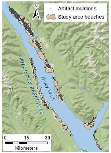
Figure 1: Study area beaches and artefact locations

Hierarchical Clustering

VCM is a spatial analytical method for detecting statistically significant multi-level clumps [5]. Circles of a variable-sized radius are drawn around each observed point, and any connected set of circles represents a clump. Clumps have some key properties including the clump radius (r) and the clump size (k), i.e. the number of connected circles. The “variable” part of VCM comes from varying the radius, so that the clumps identified at varying radii, and thus multi-scale clumps, are identified. The clumping state at a specific radius C(r) is defined by the number of clumps of size k at radius r, or N(k|r), so that C(r) = (N(2|r), N(3|r), … , N(n|r)) [6]. Note that a clump of size one is not considered a proper clump [5]. A minimum spanning tree (MST) represents the distances between points, using the property of edge length (l), so that at radius r, any points connected by an edge with length lr form a clump. Because clumps will appear even in a random distribution of points, VCM also conducts a significance analysis to determine which clumps are significant [5,6]. A radius interval and maximum radius are specified to define a set of radii for the analysis. The set of clumping states of the observed points for this set of radii is then determined. Next, 10,000 simulations, using randomly generated point distributions and finding the MST for these point distributions, provide a frequency distribution of clumping states for the set of radii. From this distribution, using a significance level (α) of α = 0.05, the critical number for each clump size at each radius is determined from this frequency distribution. The null hypothesis (H0) states that the number of clumps of observed clump size k at a radius r will be less than or equal to the critical value for k and r. The results from the observed data are then compared to these critical values, and H0 is rejected where the observed number of clumps of size k at radius r is greater than the critical value [5,6]. A clustering method such as VCM is based on the MST of the points in the dataset. However, this study used a classification method to limit the number of distances at which to generate clusters. Individual line segments of the MST were classified by length using a natural breaks classification, to determine the distance thresholds at which each cluster level was defined. Thus, the number of classes chosen defines the number of levels in the resulting hierarchy. Figure 2 illustrates this process. In Figure 2a, the MST line segments have been classified into five classes. Note that the “Class 5” line is dashed – this is to indicate that this class is not used as a cluster level, as it would include all of the points in the dataset. Figure 2b shows the convex hulls of the resultant clusters. The process is cumulative, so that “Cluster level 2” includes all points connected by “Class 1” as well as “Class 2” line lengths.

fig 2

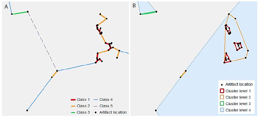
Figure 2: An illustrative example of hierarchical clusters; (a) classified MST lines connecting artefact point locations, (b) hierarchical clusters shown as convex hulls surrounding the original artefact point locations.

The specific methodology used for the dataset in this study was to first separate the overall artefact dataset into individual datasets by beach. This was done so that the resulting clusters would reflect the distribution of artefacts on a particular beach. Some of the beaches are densely populated with artefacts, while others are more sparsely populated. As the beaches are well-defined by major landforms (creeks and rivers), it is sensible that they should be treated individually. An MST was generated for each dataset, and then classified using the Natural Breaks classification method, which is based on Jenks’ optimisation method. In essence, this clustering problem is very similar to the choropleth mapping problem discussed by Jenks (1967) [33] in that, while it may seem ideal to present every data value, or in the case of hierarchical clustering, every possible cluster level, a limited number of classes must be used in order to be able to understand and interpret the data. In that case, it is desirable that each class should contain very similar values, so that the within-class deviation is minimised.

Step 1: Select all of the primary-level cluster lines (i.e. lines that have a length less than or equal to the Class 1 breakpoint).

Step 2: Buffer the selected lines.

Step 3: Dissolve any overlapping buffer polygons.

Step 4: Spatially join the original points layer to the buffer polygons, so that they are assigned the buffer polygon ID, which becomes the “Cluster 1 ID”.

Step 5: Generate convex hulls, grouping by Cluster 1 ID.

Step 6: Repeat above steps for each cluster level, such that the each successively higher cluster level includes all line lengths smaller than the break value (i.e., each cluster includes points from lower-order clusters).

The resulting datasets included a point dataset with all of the artefacts assigned an ID value for each cluster level, as well as convex hulls of all of the clusters at each level, and a size one standard deviation ellipse for each cluster at each level.

Bivariate Autocorrelation Analysis for Object Type Relationships

Bivariate local Moran’s statistical analysis [34] is often used for describing the spatial correlation between the spatial distribution patterns of two variables; i.e. it is a local method that identifies the actual locations where significant spatial dependency was observed between the two variables. GeoDa software [35] was used to perform a multivariate LISA analysis on pairs of object types in order to determine if any statistically significant relationships exist between them locally or globally. Anselin (1995) [4] defines a LISA as any statistic that indicates the degree and significance of spatial clustering of similar values around each observation. In addition, the sum of LISA statistics for a set of observations must be proportional to a global statistic [4]. GeoDa uses the Moran’s I statistic for LISA analysis. The global Moran’s I value is an indicator of overall clustering within the dataset, while the local Moran’s I value indicates the locations of clusters [36]. A significant local association may occur that is not globally significant, or there may be patterns occurring locally that are opposite to the global trend [4]. When applied as a multivariate test of spatial correlation, the statistic compares values for one variable at a location to values for a second variable at neighbouring locations. Values are “standardised such that the mean is zero and standard deviation equals one” [33]. The standardised values at each observation location are compared to the spatially lagged, standardised values at neighbouring locations to produce a global multivariate Moran’s I [34]. The contributions of individual observations to this global value are also calculated to determine local multivariate Moran’s I statistics. These values can then be compared to the values expected under a scenario of complete spatial randomness in order to determine the significance of the relationship between the two variables, both globally and locally [34]. This is done by calculating the Moran’s I for a large number of randomised permutations, in which one of the variables is kept static, while the other is randomly reallocated amongst the observations. Running several thousand random permutations produces an indicator of how extreme, and therefore how significant, the observed values are [4]. Thus, within the GeoDa multivariate LISA analysis, it is possible to obtain both global and local indicators of significant spatial association between two different variables. For each pair of variables a pseudo-significance level for the calculated local Moran’s I statistic was determined using 9,999 randomised permutations. The results, including the local Moran’s I value for each cluster with neighbours, the spatial association type, and the significance p-value for the association, were saved to a table.

The outcome of the significance test of LISA classifies individual cluster location into four different categories:

High-High

If the LISA statistic is statistically significant, takes a positive value, and the standardised count/value of object type A is positive, then both the object type A and the object type B are significantly high.

Low-Low

If the LISA statistic is statistically significant, takes a positive value, and the standardised count/value of object type A is negative, then both the object type A and the object type B are significantly low.

Low-High

If the LISA statistic is statistically significant, takes a negative value, and the standardised count/value of object type A is negative, then the object type A is low but the object type B is high.

High-Low

If the LISA statistic is statistically significant, takes a negative values, and the standardised count/value of object type A is positive, then the object type A is high but the object type B is low.

Analysis

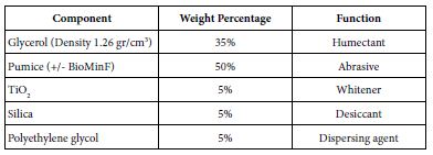
In the analysis, a two-tier cluster levels were used for testing the spatial patterns of artefacts at different scales. The primary-level clusters were combined into a single dataset, and the secondary-level clusters were combined into another dataset. The object types that were used in the analysis are listed in Table 1. Some object type categories had very few members to the extent that they would not sustain robust analysis and were therefore excluded from the analysis. One very large category of object types, Flake Debitage, was also excluded because these items were often recorded only cursorily, making the data for this object type unreliable for use in this analysis.

Table 1: List of object types used in the analysis, with number of clusters for each object type

Object Type

#Level 1 Clusters

#Level 2 Clusters

Macroblade

74

61

Flake Tool

321

235

Impact Fractured Point

33

32

Cody Point (also included in point category)

30

29

Biface Preform

43

38

Scraper

379

211

Point (excludes impact fractured points)

227

167

Biface

119

106

Core

85

77

Microblade core

20

20

Microblade

35

32

Spall

71

63

Battered Biface

14

14

Hammer Stone

14

11

Alberta point (also included in point category)

6

5

GeoDa was used for generating a binary spatial weights matrix, in which a distance cut-off was applied to determine whether each cluster is considered a neighbour of another polygon. Clusters falling within the distance band are counted as neighbours in the analysis, and those falling outside the distance band are not considered [35]. GeoDa automatically calculates a distance that ensures that all clusters have at least one neighbour. However, the default distance turned out to be too large to provide archaeologically meaningful results, and it was adjusted through an exploratory process to calibrate it for localised analysis that also retains sufficient neighbours for most locations. Through this process, the primary-level clusters were set with the distance threshold of 250m, and the secondary-level clusters at 500 m. The resulting weights matrix for primary-level clusters had some isolated, neighbourless locations (Figure 3a). For the secondary-level clusters, every location had at least one neighbour (Figure 3b). This second level of analysis provides a more regional view of the relationships between object types, while the first level provides a more localised view.

fig 3

Figure 3: Detected artefacts clusters (a) distribution of primary-level clusters with the omission of the neighbourless clusters, (b) distribution of secondary-level clusters.

Of the 20 different relationships between object types tested at the first cluster level, three global significant relationships were discovered, and significant local associations were present in all of the comparisons. Amongst the statistically significant global patterns which emerged from the analysis was a positive correlation between Alberta Points and Macroblades. The negative correlations observed between Impact Fractured Points and Scrapers, and Impact Fractured Points and Flake Tools were statistically significant. The secondary-level cluster analysis did not result in many global significant associations; however, a positive correlation between Scraper object types and Point object types was significant. The secondary-cluster level results provide a more regional summary of the relationships between object types. None of the significant primary-level global associations were present as global associations for secondary-level clusters. Table 2 summaries the significant local relationships for primary-level clusters by their spatial association types, and Table 3 offers the same for secondary-level clusters. The association types are perhaps the most informative with regards to the nature of the relationships, as the actual Moran’s I value is not necessarily easy to interpret on its own.

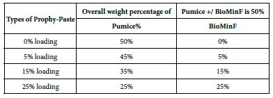
Table 2: Significant results from primary-level multivariate local Moran’s I analysis

Core Variable

Spatially Lagged Variable

#Of Clusters with significant Relationship
    High-High Low-Low Low-High

High-Low

Battered Biface Flake Tool

2

73 117

5

Battered Biface Hammer Stone

1

511 78

12

Battered Biface Scraper

1

54 150

3

Biface Flake Tool

8

71 109

29

Biface Preform Scraper

2

72 117

13

Macroblade Microblade

1

227 165

43

Microblade Microblade core

0

389 84

30

Core Flake Tool

2

74 106

20

Flake Tool Scraper

20

47 119

85

Point Scraper

13

54 130

66

Alberta Point Macroblade

3

104 178

2

Cody Point Macroblade

3

100 182

21

Impact Fractured Point Flake Tool

0

73 120

17

Impact Fractured Point Point

1

163 117

14

Impact Fractured Point Scraper

0

58 150

19

Scraper Point

11

144 103

115

Scraper Impact Fractured Point

3

182 58

240

Scraper Flake Tool

17

66 95

82

Spall Flake Tool

3

70 117

21

Spall Scraper

6

56 140

14

Table 3: Significant results from secondary-level multivariate local Moran’s I analysis

Core Variable

Spatially Lagged Variable

#Of Clusters with significant Relationship
High-High Low-Low Low-High

High-Low

Battered Biface Flake Tool

2

77 45

1

Battered Biface Hammer Stone

1

120 36

4

Battered Biface Scraper

2

51 25

1

Biface Flake Tool

2

69 42

9

Biface Preform Scraper

1

53 25

2

Macroblade Microblade

6

103 111

15

Microblade Microblade core

7

66 116

15

Core Flake Tool

2

68 43

13

Flake Tool Scraper

7

44 19

19

Point Scraper

2

47 25

12

Alberta Point Macroblade

1

119 60

0

Cody Point Macroblade

1

119 64

4

Impact Fractured Point Flake Tool

1

77 43

3

Impact Fractured Point Point

2

230 112

7

Impact Fractured Point Scraper

0

49 28

3

Scraper Point

39

185 77

51

Scraper Impact Fractured Point

0

49 28

3

Scraper Flake Tool

12

52 32

26

Spall Flake Tool

3

73 41

5

Spall Scraper

1

54 26

3

Maps of selected variable pair results display some interesting trends (Figures 4-7). For example, Figure 4a shows the association between Flake Tool and Scraper object types for primary-level clusters. While there are many High-High associations (as seen in Table 2), most of these are grouped in two locations at the north end of the study area. However, when the secondary-level cluster map for this association is compared (Figure 4b), these groupings have disappeared. Instead, new locations of High-High associations appear at this different scale. For the association between Point and Scraper (Figure 5), a similar pattern shows, with most of the High-High associations for primary-level clusters (Figure 5a) grouped in two locations at the north end of the study area. Note that the southern of these two High-High groups for Point and Scraper is in the same location as one of the Flake Tool to Scraper primary-level cluster groups. Again, these significant associations disappear at the secondary-cluster level (Figure 5b). At the first cluster level, Battered Bifaces and Hammerstones do not tend to occur together (Figure 6a), except for a single High-High cluster. At the secondary-cluster level, this High-High association has disappeared, and a new High-High association location has appeared, towards the northern portion of the study area (Figure 6b). It is interesting to note that this also occurs in the same location as one of the High-High groupings seen in both Figures 4a and 5a. Elsewhere in the reservoir, the general non-association trend between Battered Bifaces and Hammerstones holds at the secondary-cluster level. Other trends of interest include the globally significant positive correlation between Alberta Points and Macroblades. When the local associations are viewed on the map (Figure 7a), all of the High-High associations are grouped in one area, towards the center of the study area. The primary-level global negative correlation between Impact Fractured Points and Flake Tools is also visible in the local association types, as there are no High-High associations (Figure 7b). At the secondary-cluster level, the global association between Scraper and Point object types is apparent as several groups of High-High associations (Figure 7c). However, there are also several significant High-Low locations, most notably the very large group of these two association types which occurs in the northern part of the study area.

fig 4

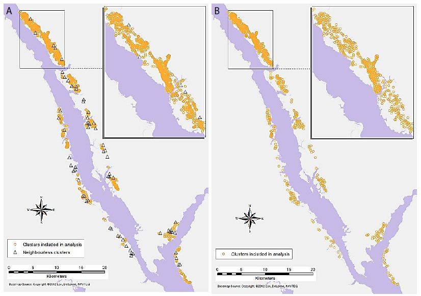
Figure 4: Significant associations between Flake Tool and Scraper object types for (a) primary-level clusters, and (b) secondary-level clusters (insignificant associations and neighbourless clusters omitted).

fig 5

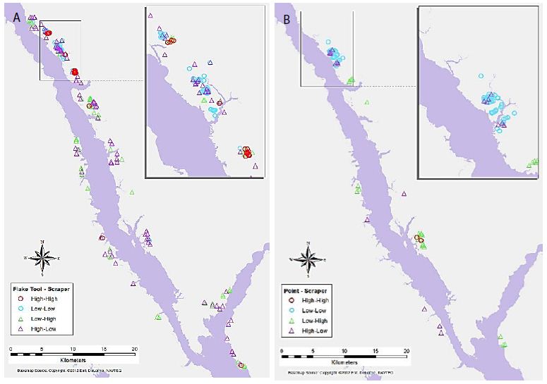
Figure 5: Significant associations between Point and Scraper object types for (a) primary-level clusters, and (b) secondary-level clusters.

fig 6

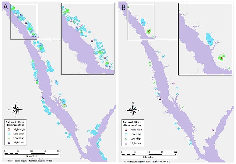
Figure 6: Significant associations between Battered Biface and Hammerstone object types for (a) primary-level clusters, and (b) secondary-level clusters.

fig 7

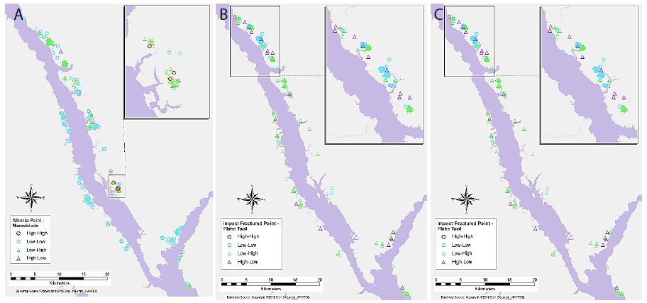
Figure 7: Significant associations between (a) Alberta Point and Macroblade object types for primary-level clusters, (b) Impact Fractured Point and Flake Tool object types for primary-level clusters, and (c) Scraper and Point object types for secondary-level clusters.

Discussion

Key results of the LISA analysis include the four global significant associations, between Alberta Points and Macroblades, Impact Fractured Points and Flake Tools as well as Scrapers, and Scrapers to Points. A number of interesting local patterns were also discovered, including the suggested High-High groupings seen at the same location for multiple object-pairs (Figures 4-6), and scale differences in these local patterns as highlighted by the use of two different levels of clustering. The significant relationships may have a number of explanations. The negative correlations between Impact Fractured Points and Scrapers/Flake Tools suggest that the Impact Fractured Points are hunting losses, rather than retrieved from a kill and then discarded at a campsite or butchering site. If the latter were the case, they would be expected to be found more frequently in association with Flake Tools and Scrapers, both of which object types would typically be found at camp or butchering locations. Furthermore, the Impact Fractured Point to Scraper results for secondary-level clusters. None of the clusters have a significant local High-High relationship at this level and, while not globally significant, this seems to follow the trend of the primary-level cluster results, thus implying that this relationship may persist at this scale across the site. The global relationship between Scrapers and Points at the secondary-cluster level was composed of several distinct groupings of local High-High associations. These may suggest significant use areas, such as regularly used butchering sites or campsites. However, perhaps of equal or greater interest is the area with a large grouping of High-Low significant associations, which oppose the global trend of positive correlation, suggesting that something quite different may be occurring in this particular region. The Alberta Point to Macroblade global association could indicate that these items were used contemporaneously, thus providing a possible scenario of temporal patterning. Though this association is not significant at the secondary-cluster level, even at this scale there are no clusters with high numbers of Alberta Points and low numbers of Macroblades and one second level cluster retains a significant local High-High association, suggesting that Alberta Points are not typically found far from Macroblades. Other local relationships observed have indicated some interesting trends that may have a number of explanations. The groups of High-High clusters seen in the same locations for several of the variable pairs (Figures 4-7) suggest that these are not likely to be randomly strewn artefacts but may be an indicator of some important activity areas, such as camp locations, though further research would be required to confirm this hypothesis. Hierarchical clustering has proven to be an effective tool for comparing the change in clusters over time, as well as the discovery of associations between different artefact types across multiple scales. The object type analysis revealed significant patterns in the association between different artefact types at multiple scales, and while it is not possible to draw a definitive conclusion of exactly what these relationships mean in terms of landscape use, they suggest a number of interesting hypotheses of possible uses and provide direction for further studies.

References

  1. Carr C (1984) The Nature of Organization of Intrasite Archaeological Records and Spatial Analytic Approaches to Their Investigation. Advances in Archaeological Method and Theory 7: 103-222.
  2. Bevan A, Conolly J (2009). Modelling spatial heterogeneity and nonstationarity in artefact-rich landscapes. Journal of Archaeological Science 36: 956-964.
  3. Gillings M, Hacıgüzeller P, Lock G (2020). Archaeological Spatial Analysis: A Methodological Guide, Routeledge.
  4. Anselin L (1995) Local Indicators of Spatial Association—LISA. Geographical Analysis 27: 93-115.
  5. Okabe A, Funamoto S (2000) An exploratory method for detecting multi-level clumps in the distribution of points – a computational too, VCM (variable clumping method). Jouranl of Geographical Systems 2: 111-120.
  6. Shiode S, Shiode N (2009) Detection of multi-scale cluster in network space. International Journal of Geographic Information Science 23: 75-92.
  7. Kintigh KW, Ammerman AJ (1982) Heuristic approaches to spatial analysis in archaeology. American Antiquity 47: 31-63.
  8. Voorrips A, O’Shea JM (1987) Conditional spatial patterning: Beyond the nearest neighbour. American Antiquity, 52: 500-521.
  9. Clark PJ, Evans FC (1954) Distance to nearest neighbor as a measure of spatial relationships in populations. Ecology 35: 445-453.
  10. Whallon R (1972) A new approach to pottery typology. American Antiquity 37: 13-33.
  11. Moyes H (2002) The use of GIS in the spatial analysis of an archaeological cave site. Journal of Cave and Karst Studies 64: 9-16.
  12. Kintigh KW (1990) Intrasite spatial analysis: A commentary on major methods. In Mathematics and Information Science in Archaeology: A Flexible Framework, edited by Albertus Voorrips. Studies in Modern Archaeology 3: 165-200.
  13. Holdaway S, Witter D, Fanning P, Musgrave R, Cochrane G, et al. (1998). New approaches to open site spatial archaeology in Sturt National Park, New South Wales, Australia. Archaeology in Oceania 33: 1-19.
  14. Hietala HJ, Stevens DE (1977) Spatial Analysis: Multiple Procedures in Pattern Recognition Studies. American Antiquity 42: 539-559.
  15. Openshaw S (1984) The Modifiable Areal Unit Problem. Concepts and Techniques in Modern Geography, No.38, Norwick: Geo Books.
  16. Buzzelli M (2020) Modifiable areal unit problem. In Kobayashi, A. (ed). International Encyclopedia of Human Geography, 2nd, Elsevier, pg: 169-173.
  17. Berry KJ, Kvamme KL, Mielke PW Jr. (1980) A Permutation Technique for the Spatial Analysis of the Distribution of Artefacts into Classes. American Antiquity, 45(1), 55-59.
  18. Premo LS (2004) Local spatial autocorrelation statistics quantify multi-scale patterns in distributional data: an example from the Maya Lowlands. Journal of Archaeological Science 31: 855-866.
  19. Murray AT, Estivill-Castro V (1998) Cluster discovery techniques for exploratory spatial data analysis. International Journal of Geographical Information Science 12: 431-443.
  20. Wheeler DC (2007) A comparison of spatial clustering and cluster detection techniques for childhood leukemia incidence in Ohio, 1996-2003. International Journal of Health Geographics 6. [crossref]
  21. Levine N (2004) CrimeStat III: A Spatial Statistics Program for the Analysis of Crime Incident Locations (Version 3.3): Ned Levine & Associates, Houston, TX, and the National Institute of Justice, Washington, DC.
  22. Openshaw S, Charlton M, Wymer C, Craft A (1987) A Mark 1 Geographical Analysis Machine for the automated analysis of point data sets. International Journal of Geographical Information Systems 1: 335-358.
  23. Estivill-Castro V, Lee I (2000a) AMOEBA: Hierarchical clustering based on spatial proximity using Delaunay diagram. Paper presented at the 9th International Symposium on Spatial Data Handling, Beijing, China.
  24. Qu Y, Lee K, Lee I (2011) Cluster polygonization and qualitative cluster reasoning overview. Interntational Journal of Advancements in Computing Technology 3.
  25. Yang X, He L, Lu H (2009) A New Method for Non-spherical and Multi-density Clustering. Third International Symposium on Intelligent Information Technology Application, 2009, pg: 35-38.
  26. Estivill-Castro V, Lee I (2000b) AUTOCLUST: Automatic Clustering via Boundary Extraction for Mining Massive Point-Data Sets. Paper presented at the 5th International Conference on Geocomputation, University of Greenwich, United Kingdom.
  27. Malik M, Singh P, Sharma DAK (2011) A novel spatial clustering approach for outlier detection & cluster generation by probing various distance matrices & Delaunay triangulation. International Journal of Computer Science and Technology 2: 104-108.
  28. BC Hydro (2012) Williston Reservoir Retrieved August 24, 2012.
  29. Eldridge M, Brunsden J, Parker A, Eldridge R (2008) Permit 2008-0179 BC Hydro 2008 Williston Dust Abatement Project Archaeological Impact Assessment Final Report: Millennia Research Limited.
  30. Eldridge M, Thiesson V, Parker A, Eldridge R (2010) BC Hydro 2010 Williston Dust Abatement Project Archaeological Impact Assessment Final Report: Millennia Research Limited.
  31. The Province of British Columbia (2022) Ministry of Forests, Lands, and Natural Resource Operations: Archaeology.
  32. Glassow MA (1977) Issues in evaluating the significance of archaeological resources. American Antiquity, 42: 413-420.
  33. Jenks GF (1967) The data model concept in statistical mapping. International Yearbook of Cartography 7: 186-190.
  34. Anselin L, Syabri I, Smirnov O (2002) Visualizing Multivariate Spatial Correlation with Dynamically Linked Windows. New Tools for Spatial Data Analysis: Proceedings of the Specialist Meeting.
  35. Anselin L (2022) GeoDa (Version 1.20): GeoDa Center for Geospatial Analysis and Computation.
  36. Anselin L, Syabri I, Kho Y (2006) GeoDa: An Introduction to Spatial Data Analysis. Geographical Analysis 38: 5-22.
fig 2

Impact of Temperature Rise on the Bombus Population and Their Geospatial Movements

DOI: 10.31038/GEMS.2022434

Abstract

Impact of climate change is felt across a wide range of events on earth surface, including the geospatial movements by insects. This research aims to measure the impact of rising temperature on the Bombus (Bumble bee) population. The study firstly divides an 11-year accumulation of Bombus spotting data from Oxfordshire, United Kingdom into four categories that reflect the respective stages in the Bombus life cycle. Using regression analysis, the study investigates how the temperature has influenced the bee population at each stage. Results from the regression analysis revealed that the rise in temperature is affecting the population size of the Bombus population in all stages of their life cycle, particularly at an early stage where queen bees and worker bees emerge. Spatial analysis using the mean centre and the deviational ellipse also revealed that the queen bees are migrating generally towards north-west, and are becoming increasingly dispersed, expanding continuously in the direction of north-west to south-east.

Keywords

Bombus, Temperature, Phenology, Migration, Regression analysis

Introduction

A French botanist Charles Morren first defined the term phenology as “the science of theses sort of things” in 1833 [1]. The term has since evolved and, in modern research, it is used as a reference to the seasonal natural phenomena such as the life cycles of plant, animal and insect species in relation to seasonal changes. A main indicator of seasonal change is the change in temperature. Like many countries in the world, the United Kingdom is currently experiencing rise in the temperature as an effect of global warming with an accelerated pace in the past decade, and it is likely that an over-forty degrees Celsius temperature in the summer would become a norm within this century [2]. It would mean that the summer in the UK would not be dissimilar from that of the current state of Sahara Desert [3], something we did not previously anticipate in the region north of the temperate zone [4]. This situation makes the phenological life cycles particularly volatile. Bombus bumblebees are part of the Apidae (bee) family, who are mostly known for their furry bodies and large wings. They are mostly found in the temperate climates with seventy-nine species found in Europe [5]. They play a crucial role in the pollination of crops, often filling in the gaps for those that honeybees cannot cover [6]. They live in colonies which are led by one female referred to as the ‘queen.’ The queen is the only survivor from the previous season’s colony, and she emerges out of hibernation in early spring in search of food to begin the production of her nest. The locations of these nests vary with settlings occurring under thick vegetation in areas of grassland (O’Conner et al. 2014) or rodent holes and abandoned birds’ nests in urban environments [7]. Once a habitat is established, she lays her first set of eggs which would become the first batch of worker bees. These worker bees are responsible for the maintenance and sustenance of the nest by foraging throughout the season as well as rearing the constant new broods that emerge. The timing of a worker bees’ emergence is known to be crucial as this will indicate the queen’s physiology for the rest of the season [8]. Once late summer to early autumn reaches, the queen begins to give birth to both the male and female offspring, respectively. When the males have sexually matured, they permanently exit from the nest to seek female bees from other colonies—each batch of male bees exiting a nest is referred to as ‘drones’ [9]. Shortly after the drones depart, the females begin to exit to begin mating. It is said that the mating rate is heavily influenced by the temperature with the optimum occurring at 23 degrees [9] —an indication that mating can only occur in the late season. Once the mating season is over, all but the inseminated females survive, and they go on to seek shelter to hibernate over the winter period.

To this end, the seasonal temperatures have a profound impact on the life cycle of the Bombus population from triggering their release from hibernation to egg production and mating. As temperature in the UK during the summer has shown a steady increase over the last sixty years, its impact on the wider insect phenology is of great concern. This study investigates the effect of the temperature rise on the Bombus population, as they have a key role within the pollination community and, thereby, have serious implications on the local fauna and flora [10]. In particular, this study aims to unravel how the increasing seasonal temperatures in the UK has affected the Bombus phenology by delving into the main stages of their life cycle and investigating how temperature influences the size of Bombus population. The study also investigates how the seasonal temperature changes may affect the sphere of activities of the Bombus population at each stage of their life cycle by analysing their geographical trend overtime and movement.

Literature Review

Discussion surrounding the change in bee populations has been pursued for some time. Trends in the reduction and distribution of bee populations have been documented since the 1960’s with longitudinal and long-term analysis beginning to occur in the 1980’s [11]. Some of the first indicators of climate changes were studied by investigating the spatial distribution of certain Bombus species, with some disappearing from their native lands and others migrating to different areas (Williams 1982). The potential reasons for local declines have been explored since then, and several studies have reported the loss of agricultural sites [12], reduction in the availability of preferred flora [13], parasite invasion [14], the increased presence of electromagnetic radiation [15] and, above all, rise in the temperature. The UK has seen rise in local temperatures with the summer season being affected particularly heavily. Climate models predict that, without the mitigation of greenhouse gases, the possibilities of extreme heat (beyond 40 degrees Celsius) will be common in the foreseeable future [2]. The consensus amongst the literature points towards increasing temperatures negatively impacting the Bombus population, namely due to the deficiency in flight performance and the lack of colony productivity [16-18] reported that, due to the rising temperature in the UK, the start date of summer has advanced by an average of three days per decade since 1954. As of 2007, the summer start date stood as the 7th of May: 18 days prior to that in 1954. This shift in the start date of summer implies that the exit from hibernation for Bombus species may have also advanced, as a queen’s emergence from dormancy is dictated by the temperature [19]. This assumption has been indeed recently proven by a group of researchers who studied the association between the temperature and the stages of the Bombus life cycle over a 35-year period in Central Europe [20]. They found that the rising temperatures are advancing the flight period by an average of 10-23 days. This piece of research had focused on four particular Bombus species and determined that, with an increase in temperature, both the emergence of queen bees and flight period had advanced. As mentioned earlier, the flight period begins when worker bees first exit the nest to begin foraging which continues throughout the entire summer. As the summer in the UK is advancing, this also indicates that the foraging period may not only be advancing but extending in length.

Kirbyshire and Bigg (2010) [18] also note a delay in the onset of autumn. The first frost date has generally been recorded later and later over a 50-year period, which suggests that winter is contracting on both ends. A more detailed study was also performed in the form of comparative analysis across 37 different climate models. The results showed that winter had contracted at an average rate of 2.1 days per year since 1952 and increased in temperature by 0.26 degrees every decade [21]. While findings by Guan and Yuping (2021) [21] is an aggregate across the entire northern hemisphere, it supports and develops on the study by Kirbyshire and Bigg (2010) [18]. As the Bombus mating period occurs between late summer and early autumn, the contraction of winter and the delay in the arrival of autumn may be also causing a delay in their mating period. Previous research on the association between the temperature and the Bombus lifecycle has reported varying findings. In many cases, they were studied under controlled temperatures where a set of bees were monitored over a period of time, and temperatures were artificially increased and decreased to study the optimum efficiency. These studies were aimed at identifying optimum temperatures to certain stages in a bee’s life cycle. For example, Kenna et al. (2021) [16] determined that the thermal performance of a bee is retained up to 27 degrees, suggesting that foraging activities during the summer months may be undermined if the temperature exceeds this limit. Another study showed that the queen exits hibernation between 5-9 degrees of temperature [19], suggesting that queens may emerge sooner if winter begins to become warmer. While research in the Bombus behaviour is rife, studies on the migration of or change in the spatial distribution of the Bombus population is limited. To date, most research papers have been in controlled environments, as it is difficult to monitor and assess the natural movement of bees. At the same time, there have been reports of a mass migration of bumble bees, mainly reported in the research domain of bird’s migration. The location of the new habitats of Bombus is unknown, but Fijen (2020) [22] suggests that they may be moving towards the north-east of their previous respective territories on the northern hemisphere. Research surrounding more local migrations has also been limited. One of the few exceptions was the study conducted by Williams (1982) [11] on the change of distribution in pre- and post-1960 Britain. They studied the distribution of all main British Bombus species and found that many species that were present pre-1960’s had either disappeared from the native area or had moved to neighbouring areas. They had also noted that the Bombus species have seen an overall reduction with those in more isolated areas becoming extinct. They concluded that this was due to the reduction in the favoured flora. However, in recent years, many of insect migration and related changes are being revisited and are considered to be triggered by the increase in temperature. Nevertheless, confirming the association between insect migration and temperature change is deemed quite complex, as it requires synthesis of knowledge from various domains such as meteorology, remote sensing and climatology [23]. This requirement for the combination of advanced knowledge from a variety of topics may be the reason why there is so little research studying the topic of temperature and insect migration, especially the correlation between bumble bee migration and temperature.

In a Bombus colony, the Queen bee is a lead figure and influences every stage of their life cycle. As mentioned earlier, her role as a Queen starts when she exits hibernation in spring. Makinson et al. (2019) [24] monitored the flight movement of Queen Bee’s in the county of Hertfordshire during a two-week period in 2015 to understand what dictates her flight and direction. They had inserted transponders into artificially hibernated Queens and tracked them using a harmonic radar system which recorded their GPS co-ordinates during their journey. Their results through random walk modelling (due to an expected unpredictability of queen’s flight movement) found that Queens spent more time resting than actively flying; on average, Queens fly 3 km to find their nesting site. They also note that there is no common pattern on their dispersal and, as Queens exit hibernation, they start moving at different angles randomly. The team also went on to analyse whether the Queens’ flight and distance were affected by wind direction, wind speed or solar hours; but concluded that none of them had any influence. This indicates that these climate features are not affecting the queen’s behaviour at exit, and that rise in the temperature may still be a key influencing factor.

Pawlikowski et al. (2020) [20] studied the influence of the temperature on Bombus sightings. They recorded the mean dates of the emergence of each bee type and period: first queen, first worker, first male and the beginning of the main flight period, end of main flight period, main flight and duration of main flight and performed 8 separate regression models for each respective type and period. They discovered that there was an advance in bumble bee foraging period over a 35-year period. They also discovered that the most significant change was in the Bombus’s flight period which occurs between June and July, and that this was the part of the life cycle that was affected the most by the change in temperature. The above review suggests that, while the association between temperature change and Bombus population, their lifecycle and their geographical movement have been investigated by some, it remains largely understudied, especially with respect to their spatial distribution. This study aims to analyse how the change in temperature is affecting the phenology and the spatial distribution of the Bombus Bumble bees. Specifically, we will explore the following questions: (1) which part of the Bombus cycle is affected the most by the increasing temperatures? and (2) how does the spatial distribution of the Bombus bees change? We will address them by means of exploratory data analysis and regression modelling.

Methodology

Datasets

The study area is the entire extent of the County of Oxfordshire, United Kingdom. It is located in Central England and provides a reasonable representation on the UK’s temperature change (i.e. no extreme changes of temperature anticipated). Historic data from the weather stations are also easily accessible. The data on the average maximum temperature was taken from the UK Meteorological (Met) Office archives between the years of 2011 and 2021 (Table 1). It shows a gradual increase in temperature over the 11-year period. The study period of 2011 to 2021 was determined by the quality of data available for the bumble bee sightings.

Table 1: Average Maximum Temperature in Oxfordshire County between 2011 and 2021

Jan

Feb Mar Apr May Jun Jul Aug Sep Oct Nov Dec

2011

7 10.4 12.4 19.4 18.9 19.3 21.4 20.7 20.7 17.2 13.5

9.3

2012

9.8

7.3 14 12.6 17.7 18.9 20.5 21.8 18.4 13.4 10.1 8.6

2013

6.4 6.2 6.3 12.9 15.9 19.3 25.5 23.1 19 16.3 9.9

10

2014

9.3

9.7 12.8 15 17.1 21.5 24.9 20.8 21.1 16.8 11.5 8.7

2015

8.4 7.5 11.4 15.9 16.8 21.1 22.6 21.3 18.4 15.1 13.1

13.4

2016

9.4

9.1 10.2 12.9 18.4 20 23.3 23.5 20.9 15.1 9.4 9.6

2017

7.3 9.5 13.7 15.1 19 22.7 23.3 21.4 18.5 16.1 10.7

8.3

2018

8.9

6.4 9.1 14.2 19.9 22.8 27.4 23.4 20.4 15.6 11.7 10.2

2019

7.2 11.8 12.7 15.1 18 20.4 24.5 23.9 20.6 14.5 9.6

10.5

2020

11.4

10.5 11.4 17.8 20.4 21.6 22.5 23.5 20 14.2 11.9 8

2021

6.6 8.9 11.6 12.5 15.7 21.4 23.7 21 21.6 16.2 10.9

9.8

Bombus sightings in the Oxfordshire region between 2011 and 2021 (Table 2) was sourced from the National Biodiversity Network. It records the location where a variety of insects and animals were spotted. Data was retrieved between the years of 2011 and 2021, as data preceding 2011 was not sufficiently reliable to sustain robust analysis. While these records do not offer an exhaustive account of every spotting in the county, it provides a reasonable-sized sample of the population for analysis. It holds a total of 4130 sightings recorded throughout the 11-year period ranging across 24 different species. The data fails to categorize the individual bees, i.e. queen or worker. We note that data used for the bee spotting’s may have a degree of ‘chance sighting’ which can perhaps reduce the credibility of findings obtained through its analysis. Much of the literature studying phenology have mentioned the same issue; i.e. difficulty in finding data and hence one of the reasons this area has remained unexplored. However, bees are spotted throughout the entire county and across the year, thus implying that the entire county is being roamed for sightings. Sighting in each season is also very much in proportion with what we would expect from the bumble bees, i.e. less sighting in the winter and magnitudes more frequent in the peak of summer, then a decline in the late summer and early autumn. For this reason, we assume that the data is sufficient for investigating the relative difference in the frequency of sightings between different seasons.

Table 2: Bee Spottings in Oxfordshire County between 2011 and 2021

Jan

Feb Mar Apr May Jun Jul Aug Sep Oct Nov Dec Total

2011

8 20 17 46 40 5 1

137

2012 4 19 13 17 5 8 66

2013

1 2 30 40 75 76 81 17 6 2 1

331

2014

1

4 42 67 60 136 74 63 11 3 1 462

2015

2 16 35 70 113 96 66 13 11 1

423

2016

2

14 56 34 114 101 52 28 4 1 406

2017

32 55 83 104 114 51 25 8

477

2018 26 68 105 133 133 68 36 7 1 608

2019

14 26 46 39 92 92 156 40 16 1

579

2020

2

8 44 75 131 67 67 37 45 17 15 4 531

2021

11 9 20 10 11 11 11 10 5 10 1 1

110

Total

17

14 230 466 609 1011 821 594 229 82 21 8

4130

Models

This study uses OLS regression analysis to assess the influence of seasonal temperature (Table 1) on the number of bees (Table 2). The data are grouped into four categories for separate modelling, reflecting the four different stages in the Bombus life cycle as mentioned earlier. Here are the four models:

Model A (The Queen Model)

This model takes bee sightings between 1 January and 20 April, which is when Queen Bees are expected to exit hibernation to forage and seek nesting sites. While they mainly exit between late March and early April, some sightings were recorded in earlier months.

Model B (The Worker Model)

Existing studies refer to this period as ‘foraging’ or ‘flight’. This model takes on bee sightings between 15 May and 30 July, which is when worker bees are most prevalent.

Model C (Drone and Mating Model)

This model takes bee sightings between the dates 15 August and 15 September which is when worker bees have mostly deceased. The male bees survive on average 30 days to search for a mate.

Model D (New Reign Model)

This model takes on sightings between the dates 20 September and 10 December. During this phase, the inseminated females forage and seek hibernation sites to overcome the winter.

Due to lack of information on the classification of individual bees (e.g. queen or worker), we assume that the bee sightings during the respective period when a specific type of bee is most active (e.g. a queen bee in a period specified for Model A) are of that type of bee.

Once the regression models are executed, the most significant model will undergo spatial analysis. In order to investigate the extent and direction of any geographical change of the spotting data over the 11-year period, the spatial mean centre and the directional ellipses analyses are carried out. The mean centre will give an indication as to which direction, how quickly and how far the bees are migrating or spreading. The directional ellipses will give an indication of how they are geographically distributed during each period.

Analysis

Influence of Temperature on Bombus Sightings

The result of regression analysis shows a positive correlation between temperature and Bombus sightings in all models (Figure 1), which confirms the relationship of a higher temperature and a more frequent Bombus spotting. However, the influence of temperature on the Bombus spotting was statistically significant for Model A (The queen model) and Model B (The worker model) only, with p<0.05 of t-statistic for the regression coefficient (Table 3). On the other hand, the influence of temperature in Models C and D is statistically insignificant (with p>0.05), which means that there is little influence of temperature on bee sightings. The degree of goodness-of-fit of the regression model is in the order of Model A, Model B, Model C and Model D. This is shown in the R-squared values (Table 3).

fig 1

Figure 1: Results of the Regression Models: (a) Model A (The Queen model), (b) Model B (The worker model), (c) Model C (Drone & Mating Model), (d) Model D (New Reign Model).

Table 3: Key Statistics from the Regression Models

Coef (const)

Coef (α) t P>|t| R-squared

Model A

-24.669 4.114 3.596 0.001

0.341

Model B

-127.306

9.848 2.824 0.009 0.235

Model C

-43.480 2.858 1.823 0.087

0.172

Model D

6.267

0.016 0.052 0.959

0.000

The result generally confirms findings from past research in that it is difficult to understand how temperature affects the final stages of the Bombus cycle, as the influence the end of a season has on both fauna and flora is a lot more difficult to measure than that of early season [18]. Sparks and Smithers (2002) [25] also noted a similar challenge and asserted that phenological responses to temperature change is more prevalent in the early seasons and less so later [25]. Although climatologists have stated that the onset of autumn is seemingly delayed [21], it has not been transposed sufficiently enough in the Bombus population according to the two late season models, namely, mating and new reign; which makes it difficult to delve deeper into these two life stages. The queen model’ yielded the highest goodness-of-fit value and provides the regression model of y = 4.114x – 24.669. According to this equation, Queen Bees only exit hibernation once the temperature exceeds 6 degrees. This is supported by Alford (1969) [19] who reported that hibernation exit usually occurs once temperatures reach 6-9 degrees. This equation is only credible when the average maximum temperature is between 5-23 degrees; as the model was specified and performed within this range. Once the temperature exceeds 30 degrees, bee spottings are likely to decline as intense temperatures and humidity can have a negative impact on Bee morphology, impacting their flight performance [16]. Therefore, the assumption that the rising temperature brings forward the release of Queen Bees from hibernation can be considered to hold to a certain extent. Once this degree is reached, the rise in the temperature may result in the reduction of the number of Queen Bees present. However, this is yet to be seen until we see British winters reaching temperatures beyond 30 degrees. As such, this cannot be determined – only predicted. The analysis here found that an increase in seasonal temperature has a potential to increase the emergence of Queen Bees from hibernation and increase the number of worker bees. Although, the periods of mating and new reigns also show some form of positive correlation, their degree is significantly smaller than the periods of the earlier seasons (confirmed by a statistical insignificance of the regression coefficient and the model itself).

Bombus’s Migration

This section investigates the geographical movements of Bombus over time by drawing the Mean Centre and the Deviational Ellipse for different periods. The analysis focuses on the queen bees, as the regression analysis in the previous section found out that, among the four types of bees, Queen Bees are the most sensitive to the temperature change, and therefore can be regarded as a representative of Bombus on the reaction to temperature change.

Figure 2 maps the change in the mean centres and the deviational ellipses during the four periods of life cycles between 2011 and 2021. The figure firstly shows that the mean centre has consistently moved farther to the north-west as the years have progressed, which indicates that Queen bees—and hence their colonies—have also moved in this direction. The mean centre has moved each year covering a total distance of 16.24 km north-west during this period (Table 4). Although we do not see a direct proportionality between the temperature and the distance travelled, we note that, in the years between 2014-2016 and 2017-2019, there was a temperature reduction of 0.14 degrees, and the distance moved within this time was at its smallest at 3.7 km. The years between 2011-2013 and 2014-2016 showed a movement of 7.88 km with the temperature increased 0.89 degrees. The years between 2017-2019 and 2020-2021 showed a movement of 4.66 km, in response to the temperature increase of 0.45 degrees. The deviational ellipses show how the distribution of the Queen Bees have generally become more dispersed over the years, which is reflected in the size of the directional ellipse. If the size of the ellipse in the first time period was set at 1.0, that for the second, third and the fourth is 1.3, 2.5 and 1.1, respectively. The orientations of the ellipses are between 113° to 129.9° throughout the years, meaning that the orientation of the dispersion constantly expands north-west to south-east, which broadly consistent with their movement direction.

fig 2

Figure 2: Change in the mean centre and the deviational ellipse (2011-2022)

Table 4: Mean Centre and Deviational Ellipses results

Period

Distance moved (km)

Average Max Temp. (degrees) Orientation of the ellipse (degrees)

2011-2013

  – 8.87

113.01

2014-2016

7.88

9.76 129.59

2017-2019

3.7 9.62

148.64

2020-2021

4.66

10.07

129.86

Discussion

Findings from this study suggest that the increase in the temperature has clear influence on the Bombus phenology. Results from the regression analysis show that there is an impact of rising temperature on the emergence of Bombus in all stages of their life cycle, particularly the early two stages. The regression model performed most robustly for the Queen model, indicating that she is most vulnerable to the temperature changes. Therefore, it is logical to assume that as the UK climate warms and spring continues to advance, more and more queen bees will begin to emerge sooner. If her resources are abundant upon her release and she has the ability to forage off her desired flora, her colony may also emerge sooner. On the contrary, if her early emergence means her desired flora is not available, she will go on to produce a futile colony which will unlikely survive a season. Earlier emergence can also cause an imbalance of the rest of the cycle, meaning that the proceeding stages must not function at their optimum. This will cause the extinction and reduction of many Bombus species, which has already been recorded [26]. The result of the spatial analysis shows that bumble bees are gradually moving in the north-westerly direction, which coincides with findings in some of the literature [22]. In summary, the geographical patterns of the Queen bees are: (1) moving towards north-west, (2) becoming increasingly dispersed, and (3) their spread constantly expand in the directions of north-west to south-east. Overall, there seems to be some consistency in the movement of Queen’s suggesting that there is a common form of migration going on. Unlike Makinson et al. (2019) [24] who recorded that dispersion and flight of Queens are unpredictable; our study saw a consistent pattern with a clearly specified directionality. Oxfordshire has seen a general rise in its temperature during the winter to spring months over the past eleven years. Of course, temperature increases are not demonstrated as a definitive cause behind the bee migration, but this study shows that it could be a contributing factor to a Queen’s re-location. Increasing temperatures can also assist a Queen’s metabolic process and, therefore, she would be capable of flying farther afield to nest (Kenna et al. 2021) [16], the earlier she emerges from hibernation, the more time she is afforded to search for and building a nest, leading to a further distance being flown; whilst warmer winters are tampering with a queen’s thermal limits, possibly leading to flight confusion [27]. The theories for the Queen bee’s dispersal patterns are almost endless and perhaps open up other research areas.

While these findings are implied and may fall short of proving the causation for this shift to be the change in temperature, it is worth noting that much of the literature points toward warming climates as the reason for the general insect migrations. Past research has shown butterflies have chosen to move south and grasshoppers have migrated to neighbouring regions to accommodate their climate needs [28]. If Bombus continuously begin to move northbound, it may eventually create reduction in the Bombus population in the southern region; which in turn may have an adverse impact on the wildlife biodiversity due to pollination reduction. There is also an associated risk to the migration of the Bombus population, if they continue to migrate north. As bumble bees can only survive in temperate zones, their migratory locations are limited and, therefore, they may be forced into areas which cannot accommodate their needs, thus heading towards the death of a colony. On the other hand, Roff and Fairbairn (2007) [29] note that insects which migrate into areas that are inhospitable to their liking, could trigger a genetic variation to increase their chances of living in what may have been perhaps perceived as an extreme climate in the past. If another dataset with more details on Bombus sightings was to be identified, it would be interesting to see how other climate attributes may be potentially driving this migration such as rainfall and humidity. The result of the analysis would be also more accurate, if it contained classifications of the type of Bombus bee spotted; i.e. a queen or a worker, similar to that observed by Palowkowski et al. (2020). This would have enabled us to build a more clearly defined models based on the type of bees; as opposed to dividing the regression models using seasonal dates and assuming we assign the most likely bees in that respective period; and this forms another future aspiration. Further analysis on the Queen’s emergence from hibernation can be extended by repeating this project in other countries where Bombus bees are native, as this will give insights into whether the tendencies found in this study are a global phenomenon or a more localised tendency.

Data Source

Bombus Sightings between 2011 and 2021. Source: National Biodiversity Network. Available at: National Biodiversity Network (nbn.org.uk).

Oxfordshire Temperature between 2011 and 2021. Source: Met Office. Available at: National Meteorological Archive Met Office.

References

  1. Damarre G, Rutishasher T (2009) Origins of the Word “Phenology”. Eos, Transactions, American Geophysical Union 90.
  2. Christidis N, McCarthy M, Stott PA (2020) The increasing likelihood of temperatures above 30 to 40°C in the United Kingdom. Nature Communications 11.
  3. Cook K, Vizy E (2015) Detection and Analysis of an Amplified Warming of the Sahara Desert. Journal of Climate 28: 6560-6580.
  4. Lauenroth WK, Epstein HE, Paruelo JM, Burke IC, Aguiar MR, et al. (2004) Potential effects of climate change on the temperate zones of North and South America. Revista Chilena de Historia Natural 77: 439-453.
  5. Rasmot P, Guillaume G, Terzo M (2021) Bumblebees of Europe and neighbouring regions, NAP Editions.
  6. Wahengbam J, Raut AM, Pal S, Banu N (2019) Role of Bumble Bee in Pollination. Annals of Biology 35: 290-295.
  7. McFrederick QS, LeBuhn G (2006) Are urban parks refuges for bumble bees Bombus spp. (Hymenoptera: Apidae)? Biological Conservation 129: 372-382.
  8. Sarro E, Sun P, Mauck K, Rodriguez-Arellano D, Yamanaka N, et al. (2021) An organizing feature of bumble bee life history: worker emergence promotes queen reproduction and survival in young nests. Conservation Physiology 9. [crossref]
  9. Belsky JE, Camp AA, Lehmann DM (2020) The Importance of Males to Bumble Bee (Bombus Species) Nest Development and Colony Viability. Insects 11. [crossref]
  10. Baur A, Strange JP, Koch JB (2019) Foraging Economics of the Hunt Bumble Bee, a Viable Pollinator for Commercial Agriculture. Environmental Entomology 48: 799-806.
  11. Williams P (1982) The Districution and Decline of British Bumble Bees. Journal of Agricultural Research 21: 236-245.
  12. Carvell C, Roy DB, Smart SM, Pywell RF, Preston C, Goulson D (2006) Declines in forage availability for bumblebees at a national scale. Biological Conservation 132: 481-489.
  13. Bommarco R, Lundin O, Smith HG, Rundlöf M (2012) Drastic historic shifts in bumble-bee community composition in Sweden. Proceedings: Biological Sciences 279: 309-315.
  14. Meeus I, Brown MJ, De Graaf DC, Smagghe G (2011) Effects of invasive parasites on bumble bee declines. Conservation Biology 25: 662-671. [crossref]
  15. Lazaro A, Chroni A, Tscheulin T, Devalez J, Matsoukas C, et al. (2016) Electromagnetic radiation of mobile telecommunication antennas affects the abundance and composition of wild pollinators. Journal of Insect Conservation 20: 1-10.
  16. Kenna D, Pawar S, Gill RJ (2021) Thermal flight performance reveals impact of warming on bumblebee foraging potential. Functional Ecology 35: 2508-2522.
  17. Guirad M, Cariou B, Henrion M, Baird E, Gérard M (2021) Higher developmental temperature increases queen production and decreases worker body size in the bumblebee Bombus terrestris. Journal of Hymenptera Research 88: 39-49.
  18. Kirbyshire AL, Bigg GR (2010) Is the onset of the English summer advancing? Climatic Change 100: 419-431.
  19. Alford DV (1969) A Study of the Hibernation of Bumblebees (Hymenoptera:Bombidae) in Southern England. Journal of Animal Ecology 38: 149-170.
  20. Pawlikowski T, Sparks TH, Olszewski P, Pawlikowski K, Rutkowski L, et al. (2020) Rising temperatures advance the main flight period of Bombus bumblebees in agricultural landscapes of the Central European Plain. Apidologie 51: 652-663.
  21. Wang J, Guan Y, Wu L, Guan X, Cai W, et al. (2021) Changing lengths of the four seasons by global warming. Geophysical Research Letters 48.
  22. Fijen TPM (2020) Mass-migrating bumblebees: An overlooked phenomenon with potential far-reaching implications for bumblebee conservation. Journal of Applied Ecology 58: 274-280.
  23. Sujayanand GK, Karuppaiah V (2016) Aftermath of climate change on insect migration: A review. Agricultural Reviews 37: 221-227.
  24. Makinson JC, Woodgate JL, Reynolds A, Capaldi EA, Perry CJ, et al. (2019) Harmonic radar tracking reveals random dispersal pattern of bumblebee (Bombus terrestris) queens after hibernation. Scientific Reports 9.
  25. Sparks TH, Smithers RJ (2002) Is Spring getting earlier? Weather 57: 157-166.
  26. Lopez O, Koch J, Morales M, Navarette D (2021) Reduction in the potential distribution of bumble bees (Apidae: Bombus) in Mesoamerica under different climate change scentarios: Conservation implications. Global Change Biology 27: 1772-1787. [crossref]
  27. Oyen KJ, Giri S, Dillon ME (2016) Altitudinal variation in bumble bee (Bombus) critical thermal limits. Journal of thermal biology 59: 52-57. [crossref]
  28. George M (2022) Migration of butterflies. Kerala Forest Research Institute 17: 844-847.
  29. Roff D, Fairbairn DJ (2007) The Evolution and Genetics of Migration in Insects. BioScience 57: 155-164.
fig 1

Assessing the Association between the Types of Greenspace and Their Biodiversity

DOI: 10.31038/GEMS.2022433

Abstract

Green infrastructure refers to all manners of established green spaces that provides habitat for wildlife and ecosystem services for people. Areas with richer biodiversity is known to provide measurable benefits to the local wellbeing and the wider ecosystem, but it remains unclear if the size and the type of greenspace affect the extent of species richness. This study investigates the distribution of 92 species across green infrastructure in England to identify the variables which have the most effect on species richness. The results suggest that Forestry Commission Woodlands and Country Parks had the highest species richness, whilst Doorstep Greens and Village Greens returned the lowest species richness. ANOVA confirmed that the variation between the groups was significant. The main difference in the groups was the area, with Forestry Commission woods being on average 140 times larger than Doorstep Greens. When considering the greenspace with the highest species richness, habitats having highest mean area were woodland, managed grassland and waterfronts. These results confirm our intuition but also suggest that richer biodiversity can be only achieved in well preserved and managed woodlands and country parks occupying a sizable plot, and that regular patches of green infrastructure embedded within the urban areas do not offer high species richness.

Keywords

ANOVA, Biodiversity, Green infrastructure, Species richness, Woodlands

Introduction

Green Infrastructure (GI) is a relatively new term that is loosely defined as “a spatial structure providing benefits from nature to people [which] aims to enhance nature’s ability to deliver multiple valuable ecosystem goods and services such as clean air or water” [1]. More generally, it is a reference to established green spaces and new sites (of greenspace) that is considered to have a positive effect on our wellbeing and the wider society) [2], and they range from large areas such as agricultural land, forests, wetlands, woodlands and parks to individual street trees, private gardens, green roofs, rivers and transport corridors (UK Green Building Council 2015) [3]. Aside from the various social benefits and cultural services they offer to our society, GI has the potential to provide habitat and connectivity to wildlife. For instance, cities in the United States have seen an increase in the frequency and diversity of wildlife sightings, as more cities have invested in GI to improve their respective urban environment and achieve environmental resilience [4]. A systematic review of the literature [5] suggests that increase in biodiversity is generally considered to yield positive effect on human health. Also, GIs with greater diversity of avian species are known to evoke positive emotional responses from their visitors [6].

However, what triggers a greater range of biodiversity remains unclear. Lawton (1998) [7] once suggested that a coherent and resilient ecological network for biodiversity requires a series of larger habitat patches with good connectivity to other sites. In other words, larger areas usually hold more species present within them and the connectivity to other areas reduces the risk of localised extinctions due to changes in the local conditions. However, securing a large area of green space within and around the confined space of cities can be challenging. Also, it is unclear as to what types of green space are likely to offer high species richness. Most studies on GI and general greenspace have focused on a small sample size, or a short duration and were often unable to differentiate between greenspace type or quality. As a result, the association between the attributes of GI (the types of GI and the size in particular) and biodiversity remains understudied. Furthermore, with the predicted change in climate, a number of studies have investigated the ability of GI to alter the urban environment and alleviate the impact of climate change such as extreme temperature, rising sea levels, frequent extreme weather events and increase in the spread of diseases and pests [8-11]. Climate change is also considered to affect biodiversity with an increase in the intensity and frequency of droughts, storms and fires. For instance, the intense fires in Australia in 2019 and 2020 have increased the number of threatened species in GI and the vicinity of cities by 14% (The Royal Society 2021) [12].  Against this background, this study investigates which aspects of greenspaces would yield benefit for people and wildlife through maintaining and enhancing biodiversity.

Literature Review

Impact of Green Infrastructure on People

Green space is often considered to have a positive effect on our wider wellbeing, ranging from the reduction of post-surgery recovery time [13] to lowering cortisol levels and blood pressure [14]. However, this assertion is not conclusive, and some studies report a mixed or even negative impact of green space on our wider wellbeing. For instance, Shanahan et al. (2015) [15] systematically reviewed relevant studies and concluded that some studies reported reduced mortality and generally enhanced wellbeing, whilst some studies found no association between green space coverage and mortality, and one study even reported increase in mortality in relation to larger green space coverage. Similarly, Maas et al. (2009) [16] investigated the association between green space coverage and morbidity and other disease within a 1km window, and concluded that, the degree of urbanity of the study areas, rather than the area of green space, had stronger impact on the health outcomes. At the same time, Maas et al. (2009) also highlighted that having access to a greater green space coverage helped reduce anxiety related disorders. Others (Gong et al. 2014 [17], Coutts and Hahn, 2015) [18] report that, while accessibility of green space generally improves our health and wellbeing, the effect varies between different types of green space.

Impact of Green Infrastructure on Wildlife

The direct and indirect effects of GI on humans is wide ranging and findings in the literature are also varied. The impact of GI on wildlife, on the other hand, is more straightforward in that it provides habitat connectivity in an increasingly urbanised world [19]. Several studies have attempted to assess which aspects of GI are important for different species, and their findings vary greatly, including size, connectivity/isolation, the management regime and type of habitats present within the GI [20-22]. Birds are among the most widely studied taxa in relation to GI, because they are relatively easy to survey and their life cycles are well understood [23]. For instance, Chamberlain et al. (2007) [24] investigated bird species richness in urban parks in London and found that site area was the most important factor related to bird species richness and that, in smaller sites, the presence of a high number of adjacent gardens caused the species richness to increase. In addition to size, those areas which held rough grass or waterbodies also returned higher species richness. The authors noted that the relationship between size and species richness simply reflects the fact that larger greenspaces tend to contain a higher number of habitats, which could attract a wider range of species. Negative associations were also recorded for the presence of buildings, roads and pavements across both the species groups and the seasons. In a similar study, Zorzal et al. (2020) [20] found that the taxonomic diversity of bird species recorded across six urban greenspaces in Brazil was positively associated with greenspace area. However, when analysing the bird diversity against a proximity index, the study found that there were no correlations with maximum noise or the degree of patch isolation. They also found that species richness had a positive correlation with the heterogeneity of the habitats within each greenspace. The study was limited to a relatively small sample size as it was constrained by the number of accessible urban greenspaces available. Other studies ranged from bird populations in Sweden [22], to bumble bee populations in relation to the urban features of San Francisco [25], amphibians in New Jersey, McCarthy and Lathrop (2011), and general insect diversity in green roofs in Nova Scotia [26], most of which found richer biodiversity in GI away from urban centres, and in GI with larger area.

Furthermore, a study in Slovenia by Groot et al. (2021) [27] found that out of the 2 most prevalent urban greenspace types in Ljubljana (urban forest and managed park) there was a lower abundance of bird species within parks than urban forest, but that species richness and species composition were not affected by greenspace type. Greenspace area significantly affected the bird abundance and greenspace type influenced which species was designated as indicative of the habitat. Although there were no significant differences in bird biodiversity between urban and peri-urban areas, Ljubljana holds relatively large areas of urban forest and the impact of urbanisation (e.g. disturbance, predation) are likely to be reduced. The link between biodiversity and the provision of ecosystem services has been explored further in a literature review by Sandifer et al. (2015) [5]. In their review, papers concentrating on the effects of biodiversity on ecosystem services were considered in order to provide a body of evidence on the effects of biodiversity on human health. The review highlighted that in the most part, biodiversity assists good human health and that in studies where relationships were not found, this could be attributed to a lack of suitable data, although there is the possibility of a confounding effect of socio-economic status on human health. Most of the studies investigated had inadequate sample sizes, study durations or measured controls, or were found to be lacking in rigorous statistics; objective data; unable to differentiate between greenspace type or quality; showing evidence of long-term effects; or suffering from the suite of health data collected being too narrow. Very few studies also attempted to identify the mechanisms through which the effects of biodiversity work.

Assessing the Quality of Green Infrastructure

Many of the studies highlighted above did not account for the quality of the GI in their analyses. Quality of GI can be measured in the field, which allows for detailed surveys of local areas, but this is time-intensive and cannot be easily extrapolated across larger areas. Another way to determine quality is through the use of GIS and spatial modelling where a set of spatial criteria are captured through remote sensing and/or a composite index was used for representing the regional environmental quality [28]. The quality of GI measured with respect to their benefit to humans as well as the wildlife can be analysed by assessing the current value of different Ecosystem Services within an area. One of these tools is the Outdoor Recreational Value tool (ORVal), which seeks to estimate the number of visits a greenspace might receive and the monetary equivalent of those visits. The ORVal tool estimates the value of a GI through the application of a recreational demand model which places importance on the cost in time of visiting a greenspace, and the quality of the recreational experiences at that greenspace [29]. The quality of recreational experiences is thus considered to be based on an extensive set of variables encompassing greenspace type, size, land cover, designations, points of interests and direct connectivity with other greenspaces. These studies suggest that GI has a generally positive effect on humans and the wildlife, but there is a gap in the literature where a systematic investigation into their effect and the contributing factors towards species richness is understudied at the larger, national scale.

Context and Data

As mentioned earlier, majority of the studies carried out on evaluating the impact of green space focus on a small sample size or a specific type of greenspace. This study will investigate the relationship between the recreational value of greenspace and the number of species they hold across England. England contains an estimated 27,000 public parks, and its National Planning Policy Framework (NPPF) mandates new developments to provide more GI—in the form of safe and accessible areas of greenspace with recreational, cultural and social facilities—as these areas are considered to help mitigate climate change effects and deliver wider benefits for nature [30]. Other areas of nature reserve and conservation areas are also protected from development. Despite that, the amount of green space in urban areas has dropped from 63% to 55% between 2001 and 2018 [31]. To mitigate the loss of sites, maintaining GI of high quality and the capacity to nurture biodiversity is essential. The quality of GI can be measured in a variety of different ways, including the proximity to urban areas and types of land cover, and it is difficult to extract a single attribute as a proxy to describe each GI. The Outdoor Recreational Value (ORVal) tool mentioned earlier is a tool developed by the University of Exeter in collaboration with DEFRA. Its primary purpose is to give an estimate of the quality for people of greenspaces across the United Kingdom both in monetary terms and as an estimated number of visits. At the same time, the tool also models the interactions between the habitats present, whether the site has any legal designations or points of interest, and whether there are any shared boundaries with other greenspaces; and it is these auxiliary data that this study will exploit. Habitat areas in ORVal are derived as a combination of the 25m-grid of the 2007 Land Cover Map (LCM), Ordnance Survey Master Map data, the Priority Habitat Inventory dataset from Natural England [32] and Open Street Map data.

The estimated greenspace visits are taken from the Monitor of Engagement with the Natural Environment (MENE) survey administered by Natural England. The estimated value of each greenspace is calculated through an opportunity cost model of recreational trip choice, whilst taking into account the socio-economic factors. While both values are estimates derived from the respective surveys and cost models, they have been calibrated through empirical studies to improve their accuracy [29]. Species data is taken from the National Biodiversity Network (NBN) which provides access to arguably the most comprehensive set of aggregated biodiversity data from multiple recording schemes across England and Wales. The NBN gateway limits the maximum number of downloads to 500,000 records per species and 10 million in total. To comply with these limits, the number of species included in this study was limited to amphibians, birds, butterflies, mammals (including bats) and reptiles listed in section 41 of the Natural Environment and Rural Communities (NERC) Act 2006; namely, those of principal importance for the purpose of conserving biodiversity and are considered most likely to be accurately recorded across the whole of England. Species groups such as beetles, moths and freshwater fish were excluded due to the lack of reliability in the measurement of their recording and/or because of their irrelevance to the terrestrial habitats under study.  Some species listed in section 41 are deemed sensitive, and to avoid reporting the specific locations of these species, the NBN gateway provides the location at a reduced geographical resolution. The exact location of these species records is stored internally and only available to individuals having enhanced access, with the data provided on the public interface being generalised to a lower resolution of 1km grid. To align all analyses, location data of the species records was renumerated to 1km grids. Further data processing and cleaning were conducted on QGIS platform and with R-Studio software. The ORVal website provides a GIS shapefile detailing the boundaries of the greenspaces. Greenspace types that may not be open to the public (e.g. golf course) were removed from the data set. This left 22,698 greenspaces in the analysis. Table 1 shows the number of each greenspace type after the data processing.

Table 1: Number of each greenspace type

Greenspace Type

Number of features

Common

1283

Country Park

413

Doorstep Green

103

Forestry Commission Woods

193

Garden

331

Millenium Green

81

Nature

2844

Park

9633

Village Green

669

Wood

7166

Species records were plotted as points, and the points falling within each 1km grid square of England were aggregated to the respective grid so that the total number of records within each grid square was classified by the species’ groups. Additionally, the presence of each species was calculated within the grid squares; i.e. for each species group, the presence of species within that group was counted to give the number of unique species. The number of species records in each group is shown below (Table 2).

Table 2: Number of records for each species group

Species group

Number of records

Amphibians

98,453

Bats

77,756

Birds

2,208,575

Butterflies

687,150

Mammal

430,380

Reptiles

136,514

While different species and attribute data exhibited different patterns of distribution, a log(Y+1) transformation offered an overall best fit to bring each distribution closer to normal distribution and was therefore performed for all variables.

Analysis

The independent variables were identified through the literature as having potential correlations to species richness were plotted in scatter graphs (Figure 1). To understand the contributing factors for the biodiversity (unique number of species), this study conducted OLS regression. In other words, the OLS regression was used to determine which variables were significant in explaining the sum of unique species. Figure 2 shows the association between these variables and the number of species within greenspace. As a result, the following variables were used in the OLS regression model as the independent variables: area, wood, natural grass, managed grass, parking, urban percentage, rivers and canals, and the number of habitats. All variables were analysed using the transformed log(Y+1) data.

fig 1

Figure 1: Scatterplots of the log of unique species against variables used in OLS regression

fig 2

Figure 2: Variables affecting the number of species within greenspace

Figure 1 shows the scatterplots of the variables used in the OLS regression model against the unique species number. Whilst there is strong positive correlation between some variables, most have weak positive correlation even after transformation. The outputs of the scatterplots suggest that the analysis would be best achieved with non-parametric tests. However, due to the number of records used in the analysis, applying non-parametric tests to the entire dataset holds the risk of returning inaccurate results [33,34].

To explore the spatial concentration of these variables, the Local Indicator of Spatial Autocorrelation (LISA) was calculated in the form of local Moran’s I for each variable in the OLS regression (Figure 3). The maps clearly show that “area” size has very few hotspots or coldspots, with smaller low-low area clusters being generally around urban areas and larger high-high area clusters being generally clustered in rural areas. A large proportion of the greenspaces have no significant clustering of area, except for woodlands which show a clear contrast between the hotspots (or the areas with high concentration of woodlands surrounded by similarly high proportion of woodlands) and the remaining regions. In particular, counties with higher percentages of woodland area such as Surrey appear to be well represented in hotspot clusters in the woodland variable, with counties having typically lower woodland cover such as Suffolk and Somerset showing up as coldspots. There are areas such as Cornwall and the Lake District which have low overall woodland coverage but are both shown as having hotspot clusters, suggesting that in these counties the woodlands which are present occur in close proximity to each other rather than being dispersed across the wider county. Managed grassland habitat areas tend to be larger in urban areas whilst natural grassland habitat areas tend to be larger in rural greenspaces. Parking is again fairly sparse with large areas of no significant clustering. Whilst there appear to be some hotspots for parking in urban areas and some coldspots in rural areas, this does not hold true across the country.

fig 3

Figure 3: Local Moran’s I clusters for each log variable: area; woodland; natural grassland; managed grassland; parking; rivers and canals; number of habitats; and urban percentage.

Rivers and canals have large significant hotspots in north-west and south-west with coldspots mainly concentrated in the south and south-east. The total number of habitats shows significant hotspots mainly in urban areas, however as man-made habitats were included in the calculation for number of habitats, there is perhaps a predisposition to urban areas with significant coldspots occurring in rural areas in a similar pattern to the managed grassland variable. The urban percentage clusters appear generally as expected, although there are comparatively few high-high clusters in urban areas. Table 3 shows the results for the OLS regression of unique species counts. It illustrates the highly significant relationship for all variables with a low standard error (≤0.5162). The variables explained 76 % of the variance of the species richness. Analysis of the t-values shows that woodland area has the strongest positive relationship with unique species number, and rivers and canals showing the weakest relationship if still significant. Urban percentage was shown to have a weak negative relationship.

Table 3: Results of OLS regression

Variable

Estimate

Std error

T Value

Pr(>|t|)

(Intercept)

-2.81E-01

1.50E-02

-18.7

<2e-16

***

Area

6.33E-04

2.86E-05

22.14

<2e-16

***

Woods

5.16E-01

3.42E-03

150.83

<2e-16

***

Natural Grass

3.01E-01

7.05E-03

42.75

<2e-16

***

Managed Grass

1.94E-01

5.97E-03

32.45

<2e-16

***

Parking

4.07E-01

2.07E-02

19.71

<2e-16

***

Rivers/canals

9,49E-02

8.48E-03

11.19

<2e-16

***

Number of Habitats

3.92E-01

1.28E-02

30.68

<2e-16

***

Urban Percentage

-2.02E-01

1.49E-02

-13.69

<2e-16

***

To examine the relationship between greenspace type and species richness, a boxplot was produced (Figure 4). It highlights the difference in the number of unique species in each type of greenspace with Forestry Commission Woods and Country Parks having the highest species richness, whilst Doorstep Green and Village Green showing the lowest number of species. Woods and Nature had large variations in species richness, partly due to the frequent outliers present for these categories. An ANOVA test returned a significant result for the variation, where the sum of squares = 3184 and p = < 2.2e-16 with 1 DF.

fig 4

Figure 4: Boxplot of log +1 unique species count and greenspace type

Further analysis of the means for the lowest and highest groupings are shown in Figure 5. Unsurprisingly, both country parks and forestry commission woods have higher areas of woodland cover than doorstep green does, although country parks also have more managed grassland. Parking, built habitats, and rivers and canals were also higher in country parks than the other greenspace types investigated. Whilst it was not plotted on the graph due to the large variation in size even at a log scale and the resultant skewing of the y-axis, Forestry Commission Woods were on average approximately 140 times larger than Doorstep Greens, and average area of Country Parks were approximately 50 times larger than Doorstep Greens.

fig 5

Figure 5: Mean habitat areas by greenspace type

Discussion

Figure 3 showed that the contributing factors towards high species count (hence, high biodiversity) tend to be spatially aggregated into known species diversity hotspots such as the New Forest and Jurassic Coast, Ainsdale NNR, the Cambridge fens and the Norfolk and Suffolk coasts. The presence of hotspots mainly outside of urban area validates the use of the total unique species to determine species richness rather than using species abundance. The presence of coldspot clusters also confirms results consistent with findings from previous studies whereby species richness decreases with increasing urbanicity [25,26].  The decision to aggregate species counts by 1km2 may have affected the clustering, and a smaller grid could have given a more detailed picture of the species distributions. The large blocks of hotspots and coldspots may have been an artefact of the large data set, and analysis using smaller grid units may have resulted in more nuanced distribution of clusters.

The locations of the high-high clusters suggest that the best greenspaces for both people and wildlife mainly occur on the edges of suburbs around large urban centres, or in larger urban parks, although this may again simply be highlighting an issue with the extraction method for the species data. Analysis of the variables which make up each of the cluster grouping suggests that those greenspaces which are composed of woodlands with managed grassland are more likely to benefit wildlife. However, clusters of high species-low value greenspaces had a high mean woodland area, without a high mean managed grassland area. The large impact of woodlands on high biodiversity may also be an artefact of the species data which was used. Bird records accounted for more than 60% of the records and studies investigating the effects of landcover on bird diversity have reported a strong relationship between species richness and woodland cover [22,35]. The results of the OLS models confirm that the woodland area of a greenspace is the most important factor when predicting the number of unique species present within that greenspace. This finding reiterates the suggestion above that the heavy skew towards bird records within the original species data, and the strong relationship between bird biodiversity and woodland area, may be over-emphasising the relationship.

Further analysis of the grouped species data would be necessary to identify if the same trends are found in other species groups. The relatively low result for area in the regression model was surprising, with the estimate being ranked 5th out of the 8 variables modelled. This may be due in part to the negative multicollinearity with both natural grassland and rivers and canals. It may also be that since there are many factors that could affect each species differently, if the species groups were modelled separately then the size of each greenspace may have shown more significance in explaining species richness for generally lower mobility groups such as butterflies. The relatively high effect of parking suggests that even though attempts were made to reduce recorder bias, bias may still exist within the data as it gives the impression that an increase in parking area resulted in higher unique species counts. The variance in species richness caused by these variables is unlikely to be geographical in origin, as the geographic variation cannot be discerned at this spatial scale. The exceptions are the managed grassland and natural grassland variables, both of which broadly follow the respective distributions. A potential alternative method would have been to geographically subset the data in order to provide the local Moran’s I for each area. Also, splitting the data down into distinct geographical regions such as the south-east, south-west and so on may have provided a method to investigate how the variables behave with an adaptive bandwidth. Indeed, the effect of greenspace type on biodiversity appears to reflect their size and ruralness. Both country parks and forestry commission woods tend to be large areas of greenspace, which may explain the positive relationship between these and the number of unique species. Country parks have a set criterion for designation including a minimum area, facilities and accessibility whilst being a predominantly semi-natural landscape. Country parks should be over 10ha in size and as an increase in area typically results in an increase in the number of habitat types and thus available habitat niches, as well as reducing population isolation and disturbance [36]. As Forestry Commission Woods are the largest supply of sustainably managed timber in the UK, and commercial forestry operations require large amounts of land, Forestry Commission Woodlands are on average the largest greenspace type within the analysis.

Conclusion

This study found that green space outside the urbanised areas has a high level of species diversity than those within urban areas. Variables that contributed to high species richness were area, woodland cover, grassland cover (both managed and natural), rivers and canals, parking, number of habitats and percentage urban cover. Greenspace types with large areas (e.g. country parks and forestry commission woods) corresponded to a higher number of unique species present than those that are usually small in size (e.g. village greens and doorstep greens). Where size is not dictated by greenspace type, such as in the case of woods and commons, these result in a lower average unique species with a large number of outliers being present in the data. Potential avenues for further investigation into this topic include analysis of different species groups and comparing their findings with those from this study; and identifying similar greenspaces with similar recording effort across the country in order to test whether the differences shown in species richness during this study are geographical or an artefact of over- and under-recording. Despite these challenges, this study confirmed that richer biodiversity can be generally only achieved in well preserved and managed woodlands and country parks occupying a sizable plot, and that regular patches of green infrastructure embedded within the urban areas do not offer high species richness. This has policy implications in that, while we can explore the positive effect of having a varying extent and types of green infrastructure within urban areas, we cannot expect high biodiversity in relation to such green infrastructure.

References

  1. EU (2013) Green Infrastructure (GI) — Enhancing Europe’s Natural Capital.
  2. Natural England (2009) Green Infrastructure Guidance, York.
  3. UK Green Building Council (2015) Demystifying Green Infrastructure, London.
  4. Hunold C (2019) ‘Green Infrastructure and Urban Wildlife: Toward a Politics of Sight’, Humanimalia 11: 89-109.
  5. Sandifer, P. A., Sutton-Grier, A. E. and Ward, B. P. (2015) Exploring connections among nature, biodiversity, ecosystem services, and human health and well-being: Opportunities to enhance health and biodiversity conservation. Ecosystem Services, Elsevier, 12: 1-15.
  6. Cameron RWF, Brindley P, Mears M, McEwan K, Ferguson F, et al. (2020) ‘Where the wild things are! Do urban green spaces with greater avian biodiversity promote more positive emotions in humans?’, Urban Ecosystems 23: 301-317.
  7. Lawton JH (1998) Daily, G. C. (Ed.). 1997. Nature’s services. Societal dependence on natural ecosystems. Island Press, Washington, DC. 392 pp. ISBN 1-55963-475-8 (hbk), 1 55963 476 6 (soft cover).’ Animal Conservation, Cambridge University Press, vol. 01, no. 01, p. S1367943098221123.
  8. Arntz, W., Strobel, A., Moreira, E., Mark, F., Knust, R., Jacob, U., Brey, T., Barrera-Oro, E. and Mintenbeck K (2012) Impact of climate change on fishes in complex Antarctic ecosystems. Advances in Ecological Research 46: 351-426.
  9. Forzieri G, Feyen L, Russo S, Vousdoukas M, Alfieri L, et al. (2016) ‘Multi-hazard assessment in Europe under climate change’, Climatic Change 137: 105-119.
  10. Emilsson T, Sang ÅO (2017) ‘Impacts of Climate Change on Urban Areas and Nature-Based Solutions for Adaptation’, ln: Kabisch N, Korn H, Stadler J, and Bonn A (eds) Nature-Based Solutions to Climate Change Adaptation in Urban Areas: Linkages between Science, Policy and Practice, Cham, Springer International Publishing, pg: 15-27 [Online].
  11. IPCC Secretariat (2021) Scientific review of the impact of climate change on plant pests – A global challenge to prevent and mitigate plant pest risks in agriculture, forestry and ecosystems., Rome.
  12. The Royal Society (2021) Climate Chang eand Biodiversity – Interlinkages and Policy Options, London.
  13. Ulrich RS (1984) View Through a Window May Influence Recovery from Surgery, Science, American Association for the Advancement of Science 224: 420-421.
  14. Grazuleviciene R, Vencloviene J, Kubilius R, Grizas V, Dedele A, et al. (2015) ‘The Effect of Park and Urban Environments on Coronary Artery Disease Patients: A Randomized Trial’, Castelnuovo, G. (ed), BioMed Research International, Hindawi Publishing Corporation.
  15. Shanahan DF, Lin BB, Bush R, Gaston KJ, Dean JH, et al. (2015) Toward improved public health outcomes from urban nature. American Journal of Public Health 105: 470-477. [crossref]
  16. Maas J, Verheij R, de Vries S, Spreeuwenberg P, Schellevis F et al. (2009) ‘Morbidity is related to a green living environment’, Journal of Epidemiology and Community Health 63: 967-973. [crossref]
  17. Gong, Y., Gallacher, J., Palmer, S. and Fone, D. (2014) Neighbourhood green space, physical function and participation in physical activities among elderly men: The Caerphilly Prospective study. The International Journal of Behavioral Nutrition and Physical Activity 11. [crossref]
  18. Coutts C, Hahn M (2015) Green Infrastructure, Ecosystem Services, and Human Health. International Journal of Environmental Research and Public Health 12: 9768-9798. [crossref]
  19. Zhang S, Ramírez F (2019) Assessing and mapping ecosystem services to support urban green infrastructure: The case of Barcelona, Spain. Cities 92.
  20. Zorzal R, Diniz P, Oliveira R, Duca C (2020) Drivers of avian diversity in urban greenspaces in the Atlantic Forest. Urban Forestry & Urban Greening 59.
  21. Holtmann L, Philipp Becke, Fartmann T (2017) Effects of habitat and landscape quality on amphibian assemblages of urban stormwater ponds. Urban Ecosystems 20.
  22. Mörtberg U, Wallentinus HG (2000) Red-listed forest bird species in an urban environment — assessment of green space corridors. Landscape and Urban Planning, Elsevier 50: 215-226.
  23. Leveau LM, Isla FI (2021) Predicting bird species presence in urban areas with NDVI: An assessment within and between cities’, Urban Forestry & Urban Greening, Urban & Fischer 63.
  24. Chamberlain DE, Gough S, Vaughan H, Vickery JA, Appleton GF (2007) Determinants of bird species richness in public green spaces. Bird Study, Taylor & Francis 54: 87-97.
  25. McFrederick QS, LeBuhn G (2006) Are urban parks refuges for bumble bees Bombus spp. (Hymenoptera: Apidae)? Biological Conservation 129: 372-382.
  26. MacIvor JS, Ksiazek-Mikenas K (2015) Invertebrates on Green Roofs. Pg ; 333–355.
  27. de Groot M, Flajšman K, Mihelič T, Vilhar U, Simončič P et al. (2021) Green space area and type affect bird communities in a South-eastern European city. Urban Forestry & Urban Greening, 63.
  28. Rahman Md R, Shi ZH, ad Chongfa C (2014) Assessing regional environmental quality by integrated use of remote sensing, GIS, and spatial multi-criteria evaluation for prioritization of environmental restoration’, Environmental Monitoring and Assessment 186: 6993-7009.
  29. Day B, Smith G (2017) The ORVal Recreation Demand Model: Extension Project, Exeter.
  30. Communities and Local Government Committee (2012) The National Planning Policy Framework: Eighth Report, London.
  31. Public Health England (2020) Improving Access to Greenspace: A new review for 2020, London.
  32. Day B, Smith G (2016) Outdoor Recreational Valuation (ORVal) Data Set Construction, Exeter.
  33. Skovlund E, Fenstad G (2001) Should we always choose a nonparametric test when comparing two apparently nonnormal distributions? Journal of Clinical Epidemiology 54: 86-92.
  34. Fagerland MW (2012) t-tests, non-parametric tests, and large studies—a paradox of statistical practice? BMC Medical Research Methodology 12.
  35. Jokimäki J (1999) Occurrence of breeding bird species in urban parks: Effects of park structure and broad-scale variables. Urban Ecosystems 3: 21-34.
  36. Zhao JM, Zhou LZ (2018) Area, isolation, disturbance and age effects on species richness of summer waterbirds in post-mining subsidence lakes, Anhui, China. Avian Research 9.
fig 7

Epidemiological and Anatomopathological Profile of Breast Cancers in Mauritania

DOI: 10.31038/AWHC.2022531

Abstract

The incidence of breast cancer in women is on the rise worldwide, including in developing countries. The objective of this study was to describe the epidemiological, clinical, and histological characteristics of breast cancer in women in Mauritania. Data were collected from 60 female patients monitored and treated at the National Hospital Center (NHC) and Military Hospital Center (MHC) in Nouakchott. The variables studied were age, parity, age at first pregnancy and menarche, place of residence, socioeconomic status, medical coverage, tumor site, Scarff Bloom and Richardson histoprognostic grade, location, Tumor Nodes Metastasis stage, molecular phenotype, and lymph node involvement. The average patient age was 48.71 ± 12.45 years, ranging from 17 to 70 years. Regarding histological types, invasive ductal carcinoma was the most frequently encountered (70% of cases). Immunohistochemical profile analysis revealed that 44% of the tumors were luminal A type, 24% were triple-negative type, and 22% were luminal B type. Our results also revealed that smoking patients had more grade III tumors, and that age was significantly correlated with disease stage (p=0.047) and molecular classification (p=0.0011). The characteristics of breast cancer in Mauritania do not differ from those in other developing countries.

Keywords

Cancer, Breast, Epidemiology, Mauritania

Introduction

Cancer is a major public health problem, and according to the World Health Organization, it is the second leading cause of death worldwide, causing 8.8 million deaths in 2015. Nearly one in six deaths worldwide are due to cancer. According to the latest WHO estimates, the number of cancer deaths is expected to continue to rise, and to exceed 11 million people per year by 2030.

Breast cancer is the most common malignant tumor type in women worldwide, and its incidence continues to increase, particularly in the 35-55 age group [1]. Mauritania ranks first in terms of breast cancer incidence and mortality among women [2]. According to some studies [3,4], this pathology is indeed the first cancer in women, although its frequency varies according to ethnicity, and it remains a major source of female mortality, as diagnoses are usually made at an advanced stage.

Several risk factors for the development of breast cancer have been recognized, including family history of breast cancer, advanced age, early puberty, late menopause, nulliparity, and obesity. However, no factor directly linked to its onset has been identified, except for the hereditary transmission of the BRCA 1 and 2 genes, which have been implicated in 5-10% of cases of breast cancer cases since Bittner’s discovery. In addition, many viruses are suspected to cause breast cancer [5]. This prospective study aimed to highlight the epidemiological, clinical, and histological characteristics of breast cancer in Mauritanian women.

Methods and Materials

This is a descriptive study of sixty patients. The study included patients newly admitted to the National Hospital Centers (NHC) and Military Hospital Centers (MHC) in Nouakchott for the treatment of breast cancer. All histologically confirmed malignant breast tumors were included in this study. The following variables were studied: age, parity, age at first pregnancy and menarche, place of residence, socioeconomic status, medical coverage, tumor site, Scarff Bloom and Richardson histoprognostic grade, location, TNM stage, molecular phenotype, and lymph node involvement. The data were collected by consulting hospitalization records, which are kept in the archives on a pre-established sheet. Data entry and analyses were performed using Microsoft Office Excel and RStudio, respectively. Correlations between certain factors, such as the grade, stage, presence or absence of metastasis, molecular classification, tobacco consumption, and patient age were analyzed in this study. In particular, the presence of a relationship between grade and tobacco consumption was investigated.

Results

Sixty patients with breast cancer were included in this study. The average age was 48.71 ± 12.45 years, ranging from 17-70 years. The average age of menarche was 12.66 ± 1.21 years, ranging from 11-16 years. The mean age at first pregnancy was 21.89 ± 3.02. The average number of births was 1.32 ± 0.60. Two of the patients were nulliparous. Overall, 43.33% were White Moors, 35% were Black Moors, 10% were Fulani, 8.33% were Wolof, and 3.33% were Soninke. A total of 53.33% of patients lived in rural areas; 71.66% of the patients were married, and 81.66% had a low socioeconomic level. A total of 56.66% of women had no social security coverage, and 11.66% of the patients were smokers. Only 5% of the patients were physically active, and 93.33% of patients had palpable nodules.

In our series, the most marked clinical tumor size according to the TNM classification was T2 (74,98%) (Figure 1). Of the tumors, 65% were stage IIA and 28.33% were stage IIB (Figure 2). The SBR grade II was the most represented in our series (73.33%) (Figure 3). The right breast alone was the most frequently affected (58.33%), followed by the left breast alone (36.66%), and bilateral location (5%).

fig 1

Figure 1: Distribution of cases by TNM classification

fig 2

Figure 2: Distribution of cases by disease stage

fig 3

Figure 3: Distribution of cases according to grade

Histological analysis showed that invasive ductal carcinoma (70% of cases) was the most frequent type (Table 1). Regarding immunohistochemical profiles, the analysis revealed that 44% of the tumors were luminal A type, 24% triple-negative type, and 22% luminal B type (Table 2). Of these patients, 51.33% had undergone chemotherapy. Local recurrence was observed in 41.66% of patients and regional recurrence in 1.66% of patients. Of these patients, 16.66% presented with metastasis. 97% of patients are alive during hospitalization (Figure 4).

Table 1: Case distribution according to histological groups

Histology

Adenofibroma

IC

DC

NSC

SC

MC

DC (L)

PC

DC (R)

Number

1

1

2

6

1

1

42

5

1

Frequency

1.66

1.66

3.33

10

1.66

1.66

70

8.33

1.66

IC: Invasive Carcinoma; DC: Ductal Carcinoma; NSC: Non-specific Carcinoma; SC: Sarcoma Carcinoma; MC: Mixed Carcinoma; PC: Phyllodes Carcinoma; CRC: Cribiform Carcinoma

Table 2: Distribution of biological subtypes

Phenotype

HER2+

Luminal A

Luminal B

Triple negative

RP+ RE- HER2+

RP+ RE- HER2-

Number

3

22

11

12

1

1

Frequency

6

44

22

24

2

2

fig 4

Figure 4: Patient mortality distribution. Yes: alive; No: dead

The results are shown in Figures 5-10. Patients who smoked had more grade III tumors. In addition, age was significantly correlated with disease stage (p=0.047) and molecular classification (p=0.0011).

fig 5

Figure 5: Correlation between age and grade

fig 6

Figure 6: Correlation between age and stage

fig 7

Figure 7: Correlation between age and molecular classification

fig 8

Figure 8: Correlation between age and presence of metastasis

fig 9

Figure 9: Correlation between age and tobacco consumption

fig 10

Figure 10: Histological grade according to tobacco consumption

Discussion

We enrolled 60 patients with newly diagnosed breast cancer. The 40-50 age group accounts for 36.66% of women affected by this pathology. The median age at the time of diagnosis was 48.71 years. This does conflicts with the data obtained in France (mean age: 61 years) [6], and in Algeria (average age: 50 years) [5]. The average age at menarche was 12.66 years in this study. The literature data are consistent with those of our study; we found that more than half (58.33%) of our patients had their first period at ≤12 years, and puberty before 12 years is known to increase the risk of breast cancer in adulthood through longer exposure to estrogen. The incidence of nulliparity was low in the present study. However, our patients were not multiparous and the majority (71.66%) only had one child. However, a higher number of children appeared to have a protective effect [7].

Breast cancer diagnoses often occur at a late stage, which could be due to insufficient health education and the poor socioeconomic status of the population. Of our patients, 16.66% were in a metastatic stage at the time of diagnosis. Considering these factors, it is clear that screening and awareness campaigns should be launched and strengthened to help resolved these problems. Of the patients, 93.33% discovered the disease through self-examination of a nodule. In 58.33% of cases, the tumor involved the right breast. The predominance of cancer in one breast over the other can be explained by breastfeeding habits [8]. In the literature, breast cancer is generally unilateral and rarely affects both the breasts. This was confirmed by our study, in which bilateral localization representing only 5%.

A relatively high number of young patients experience additional problems in terms of care. Indeed, several studies [9-12] have reported that breast cancer in young women tends to be more aggressive with a higher frequency of grade III SBR classification and negative estrogen receptors; in our study 20% of the patients were young (<40 years). Measurement of tumor size, both clinically and macroscopically, is an important prognostic element for therapeutic management. In our series, we noticed a slight decrease in advanced T3 and T4 forms compared to the results found in the studies by Mesmoudi [13] and Marrakech [14]. The T2 form was the most common (74.98%). The histological type was identified in all patients; invasive epithelial tumors were the most frequent, with infiltrating ductal carcinoma occurring in 70% of the cases.

Many studies have established that patients with locoregional metastases have poorer prognoses than those without lymph node involvement. Overall, ten-year survival is 70% when there is no lymph node involvement, and 25-30% in the presence of neoplastic invasion of the lymph nodes [15]. In our series, 96.66% of patients had lymph node invasion, and an average of two nodes were affected. All studies showed that metastatic risk and survival are strongly correlated with grade, regardless of the grading system used, and SBR grade III was associated with poorer prognosis than grades I and II. In the present study, grade II tumors had a predominance of 73.33%. Hormonal estrogen receptors are markers of tumor differentiation, whereas progesterone receptor positivity reflects the functionality of estrogen receptors. Hormonal receptors are prognostic factors because their expression is an indicator of good prognosis and is especially predictive of the response to hormone treatment [16]. Hormone receptors were studied in our patients, and 24% were triple negative.

Conclusion

Late diagnosis continues to worsen the prognosis for this cancer. The other findings in terms of epidemiological, clinical, and histopathological aspects were similar to those of previous studies in developing countries. Through this study, we concluded the following: 1) the rate of tumors diagnosed at a late stage remains relatively high; 2) the rate of tumors with a high histoprognostic grade and histological lymph node invasion remains significant; 3) invasive epithelial tumors are the predominate type of breast cancer. Breast cancer remains a serious pathology that is difficult to overcome, and its management remains hindered by socioeconomic conditions; therefore, a screening policy at a cost affordable to the population should be implemented and the awareness campaigns should be continued.

References

  1. Parkin DM, Whelan SL, Ferlay J, Teppo L, et al. (2002) Cancer Incidence in Five Continents: Volume VIII. Lyon: International Agency for Research on Cancer 155. [crossref]
  2. Ferlay J, Ervik M, Lam F, Colombet M, et al. (2020) Global Cancer Obser-Vatory: Cancer Today. International Agency for Research on Cancer; Lyon, France.
  3. Baba ND, Sauvaget C (2013) Le cancer en Mauritanie: résultats sur 10 ans du registre hospitalier de Nouakchott. Pan Afr Med J 14: 149. [crossref]
  4. Mohamed S (2017) Étude Épidémiologique de cancers en Mauritanie. Mémoire de Master Université de Nouakchott AL Asriya.
  5. Bouzbid S, Aouras H, Djeddi H, Yassi F (2014) Le cancer du sein chez la femme dans le département d’Annaba, Algérie. Revue d’Épidémiologie et de Santé Publique 62: S215.
  6. World Health Organization. Morocco: Incidence, Mortality and Prevalence by cancer site. Globocan 2018. Accessed 23 November 2019.
  7. Pathak DR, Speizer FE, Willet WC, Rosner B, et al. (1986) Parity and breast cancer risk: possible effect on age at diagnosis. Int J Cancer 37: 21-25. [crossref]
  8. Bonafos M, De Canelier R (1971) Cancers génitaux de la femme algérienne. Revue Afrique Noire 18: 235-240.
  9. Bakkali H, Marchal C, Lesur-Schwander J, Verhaeghe L (2003) Le cancer du sein chez la femme de 30 ans et moins. Cancer/radiothérapie 7: 153-159.
  10. Tabbane F, El May A, Hachiche M, Bahi J, et al. (1985) Breast cancer in women under 30 years of age. Breast Cancer Res Treat 6: 137-144.
  11. Althuis MD, Brogan DD, Coates RJ, Daling JR, et al. (2003) Breast cancers among very premenopausal women (United States). Cancer Causes Control 14: 151-160. [crossref]
  12. De Jesus MA, Fujita M, Kim KS, Goldson AL (2003) Retrospective analysis of breast cancer among young African American females. Breast Cancer Res Treat 78: 81-87. [crossref]
  13. Menikhar I (2017) Cancer du sein étude rétrospective à propos de 270 cas au CHU Ibn-Rochd de Casablanca. Casablanca-Maroc. Faculté de médecine et de pharmacie de Casablanca.
  14. Bouaalloucha S (2012) Le profil épidémiologique et clinique du cancer du sein chez la femme au CHU Mohammed VI de Marrakech. Marrakech- Maroc. Faculté de médecine et de pharmacie Marrakech.
  15. Galant C, Berliere M, Leconte I, Marbaix E (2010) Nouveautés dans les facteurs histopronostiques des cancers du sein. Imag. de la Femme 20: 9-17.
  16. Moise N, Hery M, Serin D, Spielmann M (2005) Cancer du sein: Compte-rendu du cours supérieur francophone de cancérologie. Saint Paul de Vence: Springer Paris. [crossref]
fig 2

Inferior Hip Dislocation during Treatment of Developmental Dislocation of Hip – A Rare Complication from Hip Abduction Splint: A Case Report and Review of Literatures

DOI: 10.31038/IJOT.2022523

Abstract

Background: DDH constitutes a group of conditions involving hip sublaxation and dislocation. It is mandatory for management of these cases to be followed by aftercare with Braces. Some complications may develop during follow-up in hip spica or hip brace.

Introduction: DDH encompasses a spectrum of diseases that includes dysplasia (a shallow or underdeveloped acetabulum), subluxation, and dislocation. These conditions are commonly seen with arthrogryposis, myelomeningocele, and Larsen’s syndrome. Cases of developmental dislocation of the hip (DDH) still occur after walking age because of Late or missed diagnosis and failed conservative treatment. Lack of follow-up leads to a lot of complications.

Case presentation: 4years old female child admitted to our hospital complaining of limbing and had neglected history of right DDH. She w managed by derotation femoral osteotomy and hip spica cast with smooth follow-up recovery. At 12 weeks an abduction hip brace was advised but follow-up last for few weeks. When returned back and during routine x-ray inferior dislocation was noticed. Patient planned for surgery and hip Spica cast. Follow-up passed smoothly for 12 months then the Spica cast replaced by Abduction hip brace. The reduction was confirmed by good x-ray.

Discussion: Bracing is an important step in follow-up treatment program of DDH. Loss of reduction as a complication may occur during follow-up regimen. Inferior hip dislocation in the hip abduction brace is a rare complication and rarely mentioned in the literatures. Avoidance of this complication can be achieved by having good orthotics in the hospital and applying the brace under supervision of the orthopedic surgeon. Immediate x-ray to check for good position of the head, and closed monitoring of the patient to detect any changes in the hip position.

Conclusion: Inferior hip subluxation in the hip brace rarely occurs as a complication during follow-up program of DDH treatment. Early recognition of this complication and reduction of the flexion angle led to a stable dislocation of the hip.

Keywords

Developmental hip dislocation, Dysplasia, Hip spica, Hip brace

Introduction

Developmental hip dysplasia (DDH) encompasses a spectrum of conditions that include dysplasia (a flat or underdeveloped acetabulum), subluxation, or dislocation. There is also a teratologic hip that is dislocated in utero and irreducible on neonatal examination. It has a pseudo-acetabulum, and is associated with neuromuscular and genetic disorders. These disorders are common in arthrogryposis, myelomeningocele, and Larsen syndrome. Cases of developmental hip dislocation (DDH) continue to occur even after walking age owing to late diagnosis or failure of conservative treatment [1]. Conservative or surgical treatment for DDH needs aftercare for braces. Lack of aftercare leads to a lot of complications related to Spica Casting – hip abduction braces (Figure 1). These complications involve compression of femoral nerve due to hyperflexion, inferior dislocation, skin detachment and the most important one is avascular necrosis of femoral head. Care of the cast or the brace should bear attention to the fully reducible hip, child not attempting to stand, close regular follow-up (every 1-2 weeks) by imaging and adjustments of the brace when necessary by the surgeon[2-3]. Pavlik Harness Failure may occur due to: Improper application and follow-up by the physician, inadequate initial reduction, failure to recognize persistent dislocation and poor parent compliance. The risk factors predispose to Pavilk harness failures include: bilateral hip dislocation, age greater than seven weeks prior to initiation of treatment with the harness and lack of Ortolani sign at initial examination.

fig 1

Figure 1: Spica Casting – hip abduction braces

Case Presentation

Four years female child presented to the orthopedic department of El-Hussein University Hospital with painless limping, limb shortening and radiographs showed a neglected right DDH. The patient was scheduled for surgery (femoral shortening with derotation osteotomy) and hip spica. Recovery was smooth and follow-up care was good. At 12 months the hip Spica was removed and the patient was advised to have an abduction hip brace. She went to a place outside the hospital and the technician applied the brace. The patient did not come back to the hospital to continue the follow-up program. After 6 weeks the child’s parents returned back to our hospital to make sure of the condition. Unfortunly plain x-ray showed strange inferior dislocation of hip (Figure 2a and 2b) and CT confirmed the diagnosis Figure 3.

fig 2

Figure 2: X-ray showing strange inferior dislocation of hip

fig 3

Figure 3: CT diagnosis

Plan of Management

The patient was scheduled for operative intervention. Closed reduction was an attempt first but failed as there was a band of elasticity feeling preventing relocation of the hip. We decided to go to open intervention.

Operative Details

We used the same incision. The operative findings revealed the femoral head was buttonholed in the capsule that preventing reduction. The capsule was release and the head was relocated easily to the acetabulum. The position was checked by C-arm and hip Spica applied for 4 weeks. The abduction hip splint was applied by the orthopedic surgeon and an immediate X-ray was done and confirmed the good reduction (Figure 4). The postoperative course was uneventful, with no early or late infection being observed. The results were evaluated according to modified McKay criteria, Severin radiological criteria, and Bucholtz – Ogden system of AVN grading after a mean follow-up for 6 months. In the last follow-up, the Clinical Evaluation patient reported no significant hip pain, and radiologically no signs of dislocation or AVN (Figure 5).

fig 4

Figure 4: X-ray of abduction hip splint

fig 5

Figure 5: Radiologically no signs of dislocation or AVN

Discussion

Bracing is considered a gold standard in treating Developmental Dysplasia of the Hip (DDH) in infants less than 6 months of age with reducible hips. A variety of braces are available that work on similar principles of limiting hip adduction and extension. The brace eliminates dislocating forces from the hamstrings, the block to reduction of the psoas and improves the muscle line of pull to stabilize the hip joint [4]. The use of excessive force or exceeding the safe zone to maintain hip position can lead to complications, such as femoral nerve palsy and avascular necrosis (AVN) [5-6]. Inferior dislocation (obturator dislocation) from the abduction brace rarely mentioned in literature. Rombouts and Kaelin [3] mention two cases of inferior dislocation but in a neonate due to the Pavlik harness. Also, they reviewed the literatures and mentioned Five cases of inferior (obturator) dislocation complicating the treatment of developmental dislocation of the hip that had been reported previously [7-10]. Only one of these cases was in a neonate [10]. Pediatric orthopedic surgeons have been aware of the problem but no one has studied it fully to declare why it happens and there were no studies to follow up and report on the final results for children with this complication. Ramsey et al. [11] emphasized that adequate hip flexion must be obtainable so that the femoral head is directed towards the triradiate cartilage. Excessive hip flexion, however, directs the metaphysis of femur to come below the triradiate cartilage and may produce an inferior (obturator) dislocation. This complication is classified as grade IIIb according to the Clavien-Dindo classification [12] (Intervention under general anesthesia). To avoid this complication we need to have good orthotics in the hospital, application of the brace should be under the supervision of the orthopedic surgeon, immediate x-ray to check for good position of the head, and closed monitoring of the patient to detect any changes in the hip. In our case and after open reduction; a hip spica cast was applied and followed for 4 weeks. After that an abduction brace was applied carefully by the surgeon and under C-arm image control to verify the proper location of the hip. The brace was gradually weaned over a period of several months [13].

Conclusion

Abduction brace can cause inferior hip dislocation during treatment of DDH. Gentle manipulation may be tried and if failed go for open reduction. Closed monitoring of the brace is mandatory. Early recognition of the complication and diminution of the angle of flexion gave a stable relocation of the hip joint.

Abbreviations

DDH: Developmental Dysplasia of Hip; AVN: Avascular Necrosis

References

  1. Gulati V, Eseonu K, Sayani J, Ismail N, Uzoigwe C, et al. (2013) Developmental dysplasia of the hip in the newborn: A systematic review. World J Orthop 4: 32-41. [crossref]
  2. Viere RG, Birch JG, Herring JA, Roach JW, Johnston CE (1990) Use of the Pavlik harness in congenital dislocation of the hip. An analysis of failures of treatment. J Bone Joint Surg Am 72: 238-244. [crossref]
  3. Rombouts JJ, Kaelin A (1992) Inferior (obturator) dislocation of the hip in neonates. A complication of treatment by Pavlik harness. J Bone Joint Surg Br 74: 708-710. [crossref]
  4. Merchant R, Singh A, Dala-Ali B (2021) Principles of Bracing in early management of Developmental Dysplasia of Hip.Indian Journal of Orthopaedics 55: 1417-1427. [crossref]
  5. Tiruveedhula M, Reading I, Clarke N (2015) Failed Pavlik harness treatment for DDH as a risk factor for avascular necrosis. Journal of Pediatric Orthopedics 35: 140-143. [crossref]
  6. Pool RD, Foster BK, Paterson DC (1986)Avascular necrosis in congenital hip dislocation. The significance of splintage. J Bone Joint Surg Br 68: 427-430. [crossref]
  7. Lloyd-Roberts GC, Swann M (1966)Pitfalls in the management of congenital dislocation of the hip.J Bone Joint Surg Br 48: 666-681. [crossref]
  8. Mubarak S, Steven G, Raymond V, Bert McKinnon, David Sutherland D (1981) Pitfalls in the Use of the Pavlik Harness for Treatment of Congenital Dysplasia, Subluxation, and Dislocation of the Hip. J Bone Joint Surg 63: 1239-1248. [crossref]
  9. Mendez AA, Keret D, MacEwen GD (1990) Obturator dislocation as a complication of closed reduction of the congenitally dislocated hip: a report of two cases.J Pediatr Orthop 10: 265-269. [crossref]
  10. Langkamer V, Clarke G, Witherow P (1991) Complications of splintage in congenital dislocation of the hip. Archives of Disease in Childhood 66: 1322-1325.
  11. Ramsey PL, Lasser S, MacEwen GD (1976) Congenital dislocation of the hip. Use of the Pavlik harness in the child during the first six months of life. J Bone Joint Surg 58: 1000-1004. [crossref]
  12. Dindo D, Demartines N, Clavien PA (2004)Classification of surgical complications: a new proposal with evaluation in a cohort of 6336 patients and results of a survey.Ann Surg 240: 205-213.
  13. Emara K, Kersh MA, Hayyawi FA (2019) Duration of immobilization after developmental dysplasia of the hip and open reduction surgery. Int Orthop 43: 405-409. [crossref]

Lupus Pancreatitis in City Rheumatological Consultation in Bamako (Mali)

DOI: 10.31038/IJOT.2022522

Abstract

Lupus pancreatitis is a rare but potentially severe entity. It is a visceral complication of multifactorial and poorly elucidated pathogenesis. The diagnosis combines two of the three criteria: typical pain, the elevation of pancreatic enzymes above three time’s normal, and imaging. Improved prognosis depends on early diagnosis and efficient treatment. We describe the diagnostic approach and clinical features of a 19-year-old melanoderma patient.

Keywords

Pancreatitis, Systemic Lupus, Mali

Introduction

Described for the first time in 1939 by Reifeinstein et al [1], pancreatitis is a rare visceral manifestation during Systemic Lupus Erythematosus (SLE). Its incidence varies from 0.4 to 1.1 cases per 1000 lupus per year. Early diagnosis is pledge of an efficient therapy (corticosteroids and immunosuppressants) to ensure a good prognosis. We report our first observation in a melanoderma subject suffering from SLE in severe flare [2-4].

Observation

A 19-year-old girl had been followed for 45 days for SLE and chronic endoscopic gastritis. The diagnosis of SLE was based on the EULAR/ACR 2019 classification criteria (presence of antinuclear antibodies, malar rash, alopecia, synovitis, fever, leuco-neutropenia). The therapy included prednisone (10 mg/day) and azathioprine (100 mg/day). She is hospitalized in emergency for transfixing epigastric pain, abdominal pain, diarrhea, incoercible vomiting and fever. The physical examination noted patient lying in trunk’s anteflexion, feverish at 40°c, epigastric defense and distended abdomen, with much rumbling. SLE activity was very high with a SLEDAI score of 24. Biological assessment revealed inflammatory syndrome (CRP at 150 mg/L, ESR at 110 mm), amylasemia at 392 IU/L and lipasemia at 853 IU/L. Liver tests and stool examinations were normal. The chest-abdominal-pelvic CT-scan was normal. The diagnosis adopted is lupus pancreatitis after having eliminated other causes (biliary lithiasis, toxic, traumatic, drug and neoplastic). She received a bolus of methylprednisone, parenteral analgesics, isocoagulation and rehydration. She underwent a strict 48 hours diet. The evolution was favorable to 5th day hospitalization with apyrexia and pain amendment. The relay by oral corticosteroids and hydroxychloroquine was instituted.

Discussion

The occurrence of pancreatitis can complicate the evolution of connectivitis, vasculitis and granulomatosis. Pancreatic involvement during SLE is rare. Its incidence varies from 0.4 to 1.1 cases per 1000 lupus per year. It can be concomitant with other lupus disorders in 50% of cases, inaugural and revealing in 11% of cases, or a potentially serious complication. It was subsequent in our patient, which is a particularity. The pathogenesis of this pancreatitis is not well understood. It is multifactorial; difficult to separate what amounts to vasculitis, thrombosis in the context of anti-phospholipid syndrome, or iatrogenic or concomitant complications. The diagnosis is based on the association of two of the following three criteria: • Typical pain • Increased pancreatic enzymes above three times normal • Computed tomography (CT) imaging, remnography (MRI) or ultrasound [5-7]. Pancreatic pain is relieved by anteflexion of the trunk (pancreatic position) and aspirin. In our patient, epigastric pain incorrectly labelled as gastritis by digestive endoscopy could lead to mistake. The classic aspirin therapy test was not done for fear of a hypothetical gastric perforation. However, any abdominal pain syndrome and/or vomiting in a lupus context suggest lupus pancreatitis. The elevation of lipasemia is of a better diagnostic specificity because lipase is exclusively pancreatic. The elevation of protein C Reactive has an interest in prognosis but she suggested looking for infectious etiology in the patient. CT-scan has proved to be the reference examination in the diagnosis but the pancreas can be normal in 14 to 29% of cases as in our patient. The drug toxicity in this case of azathioprine and prednisone can be invoked initially acute pancreatitis [8,9]. However, the chronology of evident clinical signs in our patient minimizes iatrogenia. Many observations in the literature raise the difficulty of specifying the exact etiology of lupus pancreatitis, even autopsy studies are often non-contributory [10]. Most authors proceed by excluding other possible etiological factors and improving symptomatology with anti-inflammatory treatment to indirectly retain, responsibility for SLE. Efficient therapeutic management depends on early diagnosis for a good prognosis. Methylprednisone bolus having improved the patient, a relay with oral corticosteroids and substitution of azathioprine with synthetic antimalarials (hydroxychloroquine) was decided.

Conclusion

Most lupus pancreatitis has been described in leukoderma subjects. However, our first observation in melanoderma does not suggest any singularity. In all cases, the best prognosis depends on early diagnosis and efficient management.

References

  1. Papo T, Le Tchi HD, Godeau P, Piette JC (1997) Pancreatitis and systemic diseases. Gastroenterol Clin Biol 21: 768-775. [crossref]
  2. Kefi A, Kammoun S, Jaziri F (2019) Lupus pancreatitis: a rare but potentially serious disease! Revmed 40: A105-A214.
  3. Aringer M, Costenbader K, Daikh D (2019) European League Against Rheumatism/American College of Rheumatology Classification Criteria for Systemic Lupus Erythematosus. Arthritis Rheumatol 7: 1400-1412. [crossref]
  4. Bombardier C, Gladman DD, Urowitz MB(1992) Derivation of the SLEDAI. A disease activity index for lupus patients. Arthritis & Rheumatism 35: 630-640. [crossref]
  5. Alaoui M, Ammouri W, Bourkia M (2018) Acute lupus pancreatitis: About 18 cases. Revmed 39: A23-A102.
  6. Jebali A, Gharsallah G, Klii R (2014) Acute pancreatitis and haemopagocytic syndrome during a lupic outbreak. Revmed 35S: A96-A200.
  7. Ben DB, Aydi Z, Boussema F (2012) Lupus pancreatitis: a series of 6 cases. J Afr Hepatol Gastroenterol 6: 169-174. [crossref]
  8. Agostini S, Durieux O, Mirabel T (2000) Chronic pancreatitis. Encycl Méd Chir Radiodiagnostic – Digestive System 33: 652-A-10.
  9. Bléry M, Tasu JP, Rocher L (2002) Imaging of acute pancreatitis. Encycl Méd Chir Radiodiagnostic – Digestive System 33: 651-A-10.
  10. Uchida K, Okazaki K, Konishi Y (2000) Clinical analysis of autoimmune-related pancreatitis. Am J Gastroenterol 95: 2788-94.
fig 17

The Effect of Loading of Bioactive Glass in Desensitizing Polishing Pastes on Tubular Occlusion

DOI: 10.31038/JDMR.2022611

Abstract

Objective: To determine 1) the most effective loading of the bioactive glass in a prophylactic polishing paste containing Bioactive glass particles that provides a more effective tubular occlusion and 2) the ideal application time required to achieve this objective using an in-office rotary cup with a fixed pressure and speed.

Materials and Methods: 60 dentine discs were divided equally into 15 groups treated with 0%, 5.0%, 15.0% and 25.0% bioactive glass loading respectively and Nupro® at different applications (30, 60 and 120 seconds). Dentine permeability (Percentage flow rate) of each specimen was measured using a modified Pashley hydraulic conductance model at four different time points: (1) before toothpaste application, (2) after toothpaste application, (3) after saliva immersion and (4) after an acid challenge. Data were analysed by ANOVA to determine whether there were any significant differences with the control group (Nupro®) compared to the test groups at three different time intervals (30, 60 and 120 seconds). 20 dentine discs were analysed to observe the surface tubular occlusive effect following application of the various loadings at different times using scanning electron microscope (SEM).

Results: There was an increased percentage fluid flow rate (FR) reduction with increasing bioactive glass loading (0.0%, 5.0%, 15.0%, 25.0%) compared to the control material Nupro®. The 25% bioactive glass loading was the most effective in reducing fluid flow at the various time points although there were no significant differences between the 15% and 25% glass loading. The 25.0% bioactive glass loading at 120 seconds also demonstrated effective tubular occlusion compared to the control prophylaxis paste. A comparison between the control and the various glass loadings at the various time points using SEM demonstrated increasing tubule occlusion with increasing time of application. Tubular occlusion also increased following artificial saliva immersion but decreased following an acidic challenge.

Conclusions: Increasing the bioactive glass loading resulted in a greater fluid flow rate reduction with an increase of time of applications. Overall, the most effective application was with the 25% loaded bioactive glass at 120 seconds although the application of the 15% loaded bioactive glass prophylaxis paste for 30 seconds demonstrated effective tubular occlusion and fluid flow reduction.

Keywords

Bioactive glass, Desensitising polishing pastes, Tubular occlusion, Hydraulic conductance

Introduction

According to Hench 45S5 bioactive glass was developed as a bone ceramic [1] which was also used to  improve  periodontal bone  regeneration in bony defects caused by periodontal disease-(PerioGlas®) [2].  Several investigators [3-6] have also evaluated a bioactive glass (45S5) as a desensitizing toothpaste without fluoride. More recently bioactive glass-based toothpastes have been developed for over the counter (OTC) products. These products include NovaMin® (GlaxoSmithKline [GSK]) containing fluoride and BioMinF™ (Biomin Technologies Ltd) although the surface deposits on the exposed dentine are different with. NovaMin® producing a hydroxy carbonate like apatite (HCA) layer whereas BioMinF™ provides a fluoroapatite layer, which is more resistant to an acid challenge [7]. Bioactive glass (45S5) has also been incorporated into a prophylactic polishing paste (in-office dental procedure) to remove stain and reduce dentine hypersensitivity (DH) (Nupro®). Previously there were limited published data regarding the ideal loading concentration of bioactive glass into either toothpaste or polishing paste formulations although Tie et al. [8] reported that a 5% glass loading was the ideal concentration for a toothpaste formulation. Sauro et al. [9] compared dentine permeability in vitro for both prophylactic and air-polishing procedures and concluded that a Sylc bioactive glass (Sylc™; OSspray, London, UK) was more effective in reducing dentine permeability  in both the polishing paste and air-polishing systems compared to  the controls. Milleman et al. [10] compared a Nupro® Sensodyne prophylaxis paste with Novamin® for the treatment of DH in a 4-week clinical study and concluded that the reduction in DH was statistically significantly compared to the group receiving a standard prophylaxis paste. No differences were, however detected between the two NovaMin® polishing pastes with and without fluoride. Neuhaus et al. [11] also conducted a double-blinded  randomised  clinical  trial and concluded that a 15% NovaMin® loading with and without fluoride had the same immediate DH effect for 28 days following root surface debridement (RSD). A systematic review by Zhu et al. [12] concluded that the prophylaxis paste containing 15% calcium sodium phosphosilicate was favoured over the negative control at reducing post-periodontal therapy DH (root sensitivity), although the level of evidence was categorized as “low”.

Aim

The aim(s) of the present study, therefore, was to 1) to determine the most ideal loading for a bioactive desensitising polishing paste with the most tubular occlusion and 2) to determine the effect of the application time (30s, 60s, 120s) and the effect of an acidic challenge on each of the experimental bioactive glass prophylactic polishing pastes with the percentage of loading (0%, 5%, 15%, and 25%).

Materials and Methods

This exploratory study was based on two objectives. The first part of the study was designed to choose the ideal abrasivity of the pumice that would be incorporated into prophy-paste formulations using white light profilometry has been previously described by Hussain  et al. [13]. The second part of the study evaluated selected pastes to determine their effectiveness in tubular occlusion using scanning electron microscopy (SEM) and hydraulic conductance (Fluid flow) techniques and is the focus of this paper.

Preparation of Materials

Collection of Teeth

A total of 120 extracted, caries free human premolars and molars were collected from  the  walk-in  dental  polyclinics  from  Kuwait in 2017 after obtaining verbal consent from patients for the use of their teeth in research. The teeth were stored in a small container of Listerine mouthwash (Johnson and Johnson, UK) and brought to the UK by Hamad Hussain (HFH) under QMUL guidelines UK. The teeth were transferred and stored in a 70% concentration Ethanol solution in a specimen container at room temperature within the Department of Dental Physical Sciences Unit at Mile End, London in accordance with HTA regulations.

Preparation of Mid Coronal Dentine Sections

90 non-carious human premolars, and molars were selected and prepared into dentine disc specimens of 1.2 mm thickness as described by Tie et al. [8] using an automatic precision cutting machine (Struers Accutom 5, Denmark). The dentine discs were then ground using a Kemet 4 machine (Kemet Maidstone Kent ME15 9NJ UK) followed by polishing with three different silicon carbide papers in a descending order of abrasive coarseness, starting from carbide paper grade P600, P1000 to P2500. The polishing was considered complete when the discs were polished to a thickness of 1.0 mm. The thickness of the discs was monitored constantly using a digital micrometer to avoid over polishing.

Etching of Dentine Sections

The etching of dentine discs was performed prior to using the discs for the experimental steps. This was performed by immersing the discs into 6% w/w citric acid solution for two-minutes. The discs were ultrasonicated with deionized water in an ultrasonic bath for 30 seconds to remove any residual acid using the methodology described by Tie et al. [8].

Artificial Saliva Preparation

Artificial saliva was prepared using the following constituents: 2.24 grams of KCl, 1.36 grams of KH2 PO4, 0.76 grams NaCl, 0.44 grams of CaCl2 .2H2 O, 2.2 grams of porcine Mucin and 0.2 grams of NaN3 (all Sigma-Aldrich, UK) which was mixed with 800 grams of deionized water in a 1 litre volumetric flask. The mixture was stirred using a magnetic hotplate stirrer for 30 minutes until all reagents were fully dissolved. The mixture’s pH was then adjusted to 6.5 at room temperature using a pH meter (Oakton, Netherlands) by adding 0.5 M of KOH sequentially until the desired pH was obtained. Separately, 0.5 M of KOH was previously prepared by mixing 1.40 grams of KOH (Sigma-Aldrich, UK) in 50 ml deionized water. The final mixture was made up with deionized water to 1 litre. The produced artificial saliva solution was kept in a fridge set at 5°C until required and used within 2 weeks of preparation [8].

Preparation of the Prototype Bioactive Glass Polishing Paste

The bioactive glass used in the prophy-paste formula was BioMin F which was manufactured by Cera Dynamics Ltd Stoke UK and is the same glass powder used by Biomin Technologies Limited, UK in toothpaste formulations. The composition of the Bioactive Glass is shown in Table 1. The material was stored at room temperature in a closed dry container until required.

Table 1: Composition of the Bioactive Glass used in the prophy paste

table 1

Preparation of the Prophylaxis Polishing-Paste for the Different Bioactive Glass Loading

The composition of prophy-paste components that was prepared in the laboratory was based on the components’ range of the Safety Data Sheet number 801363 of Nupro® Sensodyne® Prophylaxis Paste with Novamin® (GSK). Initially this consistency (viscosity) of this formula was poor and therefore the formula was modified as shown in Table 2. Materials were measured separately, and mixed using a metal spatula, and then stored at room temperature until required.

Table 2: Composition of both loaded and unloaded prophy-paste to produce 90 grams that was used during the main study

table 2

The final loading percentages of both the formulated Biomin prophylaxis polishing paste and pumice control are shown in Table 3.

Table 3: Loading percentages of both the formulated Biomin prophylaxis polishing prophy-paste and pumice control

table 3

Methodology

Preparation of Samples and Procedures

The experimental sample was composed of 60 teeth that were adequately prepared on the dentine discs following a specific protocol before starting the experimentation.

Scanning Electron Microscopy

15 out of 20 etched stored dentine discs were used in this study. A prophylaxis polishing-paste was applied on the discs at the different proportions of the bioactive glass (0%, 5%, 15%, 25% and, Nupro® control) and for the different times (30s, 60s, 120s) using a portable prophylaxis polishing handheld device (Table 3). Three-dentine discs were assigned for every prophylaxis polishing-paste group. Each disc was fractured into equal halves using orthodontic pliers to provide two sections. One dentine disc was used for (1) untreated control and (2) treated with a prophy-paste for 30 seconds. The second one was used for (3) treated with the same prophylaxis polishing-paste for 60 seconds and (4) treated with the same prophy-paste for 120 seconds. The third dentine disc that was halved was used for (5) treated with the same prophylaxis polishing- paste, salivary immersion, and one-minute in an acid challenge and (6) treated with the same prophylaxis polishing-paste, salivary immersion and a two-minute acid challenge. The five groups were tested using the same protocol. The same process was also used when treating the dentine discs for hydraulic conductance procedure (Table 4).

Table 4: The number of discs by percentage (%) glass loading and the time of application

table 4

Prior to the SEM analysis and visualisation, the specimens were prepared for drying, mounting, and coating. After applying the treatment to all specimens, they were placed in a vacuum desiccator to dry. Each specimen was then mounted on a metal stub using double sided carbon tape. Finally, the specimens were coated with gold-palladium using a sputter coater. After the specimens were prepared by the three above steps, they were visualised using SEM (FEI Inspect F SEM, USA) at different magnification of x1000 and 10,000. The working distance, which is the distance between the specimen and the source beam was maintained at  a fixed 10mm) for all the specimens with a working voltage at 20kV [6].

Hydraulic Conductance (FRR Values)

Based on the design developed by Outhwaite, et al. [14,15], a modified Pashley hydraulic conductance was used in the study to measure dentine permeability (Lp).

45 teeth (molar) were used for the evaluation of hydraulic conductance (Lp) following initial immersion in 6% citric acid for two minutes, teeth were divided into the test groups (1, 2 and 3). Baseline fluid flow (FR) measurements were recorded prior to the application of the test and control prophylaxis polishing pastes at  the designated timings and loadings. Following application of the designated prophylaxis polishing paste and timings the discs were rinsed in deionised water for 10 seconds and placed in the modified Pashley conductance system and FR measurements were recorded. All teeth were subsequently immersed in 10ml of artificial saliva for 30 seconds, rinsed and immersed in 30ml of 6% citric acid for one and two minutes and a final set of FR measurements were recorded. The teeth were subsequently air dried and prepared for SEM evaluation (500x, 1000x, 5000x and 10,000x magnification)

Analysis of the dentinal permeability measurement was conducted as follows [8]:

a) Percentage flow reduction after treatment with the polishing paste.
for 1

b) Percentage flow reduction after treatment with the polishing paste and immersion in artificial saliva.

for 2

c) Percentage flow reduction after treatment with polishing paste, immersion in artificial saliva and acid challenge.

for 3

where V0 = Dentine permeability at baseline (after acid etch)

V1 = Dentine permeability immediately after polishing paste application

V2 = Dentine permeability following immersion in artificial saliva

V3 = Dentine permeability following acid challenge

Statistical Analysis

Mean, standard deviation with 95% C.I.: for each variable was assessed. for the total sample used in the explorative study. A one- way ANOVA was estimated to compare flow rate, FR, means between the different loading groups at a specific time of application as well as assessing the effect of time of application for a specific loading of the bioactive glass. Bonferroni´s post-hoc test was used as a multiple comparison test, to control the propagation of a Type-I error. A two- way ANOVA with between subjects’ factors, the loading group and time of application was also used to explore the interactions and obtain the overall conclusions regarding the effect of both factors.  In view of the low numbers of disks used in this explorative study    a complementary non-parametric Brunner-Langer model was employed Distributions (not means) of FR rates were compared using an ATS-test (ANOVA-type).

Results

The permeability of the dentine tubules in  the  dentine  discs was tested and previously established as a laboratory technique to measure the fluid rate reduction using hydraulic conductance [14,15]. The reduction of the fluid flow at the three different experimental applications (FR1 after application, FR2 after immersion in saliva, FR3 after an acid challenge) on a disc at the different loading of the bioactive glass from 0.0%, 5.0%, 15.0%, to 25.0% is shown in Table 4 and Figures 1-3 respectively. The effect of application time (30s, 60s and 120s) vs. % loading, immersion in saliva, following an acid challenge was also analysed. For example, following polishing the dentine disc for one minute, there was a gradual pattern in the percentage fluid flow reduction. The pattern of the reduction did not however exist at 0% to 5% although it showed a steady increase in Lp. There was however a significant change in the pattern increasing the reduction’s flow once the glass loading was more than 15% (at 25% loading) It was clear that after applying the prophylaxis polishing-paste for a minute, the fluid flow was reduced. There was slightly more reduction after immersing the disc in artificial saliva for an hour. Whereas a two-minute acidic challenge increased the fluid flow (Table 5).

fig 1

Figure 1: Comparison of flow rates reduction by Group (application: 30 seconds)

fig 2

Figure 2: Flow rate reduction FR1 values by the loading group after paste application at time=30s

fig 3

Figure 3: Flow rate reduction values (FR2) by loading group following saliva immersion (time=30s)

Table 5: Flow rates reduction by Group (application time: 30 seconds)

table 5

Analysis of the selected loading at 30 seconds using ANOVA (p<0.001) and Bonferroni´s test can be observed in Table 5. The 25% Bioactive glass loading provided significantly more reduction than any other concentration (p<0.001). The same analytical methodology was employed throughout the study (Table 6).

Table 6: FR1 values by loading group at the time of application=30 s: results of multiple comparisons by Bonferroni´s test

table 6

FR2: After Saliva Immersion

The FR mean was 1.19 ± 0.00% if no bioactive glass was incorporated into the prophy-paste. With the 5%- glass loading the mean increased to 39.20 ± 0.09%. Higher loading levels (15% and 25%) involved new increments to 63.01% ± 0.05 and 72.99 ± 0.49%. The fluid flow reduction of the Nupro®   solution values increased to 62.55 ± 0.05%. Therefore, the optimal tubular occlusion occurred using a 25%-loading of the Bioactive glass (Figure 3).

Analysis of the selected loading following saliva immersion using ANOVA (p<0.001) and Bonferroni´s test can be observed in Table 6. There were significant differences between the groups. Loading at 25% was the most effective. Nupro® had similar values to a 15% glass loading of bioactive glass (Table 7):

Table 7: FR2 values by loading group at the time of application=30 s: results of multiple comparisons Bonferroni´s test

table 7

FR3: After an Acid Challenge

The FR mean was 0.83 ± 0.00% if no bioactive glass was incorporated into the prophy-paste. With a 5%-proportion of glass the mean increased to 36.91 ± 0.08%. At the higher loading levels (15% and 25%) the FR reduction increased to 62.44% ± 0.05 and 72.49 ± 0.05% respectively. The Nupro®  solution FR value was 61.96 ± 0.05%. Therefore, the optimal tubular occlusion took place using a 25%-loading of Bioactive glass (Figure 4).

fig 4

Figure 4: Flow rate reduction values (R3) by loading group after an acid challenge at time=30s

Analysis of the selected loading following saliva immersion using ANOVA (p<0.001) and Bonferroni´s test can be observed in Table 7. There were significant differences between the groups. Loading at 25% was the most effective.

Analysis of FR at Time of Application=60 s

The following Table 8 and Figure 5 show the basic statistics of fluid flow reduction, FR, values over the experiment period after 60s of paste application (Table 9):

Table 8: FR3 values by loading group at the time of application=30 s: results of multiple comparisons Bonferroni´s test

table 8

fig 5

Figure 5: Flow rate reduction values by loading group at the time of application=60s

FR1: After Prophy-Paste Application

The FR mean was -5.74 ± 0.02% if no bioactive glass was incorporated into the prophy-paste glass. With the 5%-loading, this reduction increased to 39.39 ± 0.09%. At the higher loading levels (15% and 25%) the FR reduction values increased to 67.53% ± 0.05 and 74.94 ± 0.04% respectively. The Nupro®  solution FR values were 63.20 ± 0.05%. The 25%-loading of bioactive glass provided the maximum tubular occlusion values (Figure 6).

fig 6

Figure 6: flow rate FR1 reduction values by loading group after paste application at time=60s

Analysis of the selected loading following saliva immersion using ANOVA (p<0.001) and Bonferroni´s test can be observed in Table 9. There were significant differences between groups. The glass loading at 25% was the most effective (Table 10).

Table 9: Comparison of the flow reduction rate vales by Group (application: 60 s)

table 9

Table 10: FR1 reduction values by loading group at the time of application=60 s: results of multiple comparisons Bonferroni´s test

table 10

FR2: After Saliva Immersion

The FR mean was 0.84 ± 0.00% if no bioactive glass was incorporated into the prophy-paste. With 5%-loading, the FR reduction values increased to 41.18 ± 0.09%. At the higher loading levels (15% and 25%) involved new increments to 70.83 ± 0.05% and 77.17 ± 0.06%. Nupro® solution involved 65.78 ± 0.05%. Again, the 25%-loading of bioactive glass was associated with an increase in tubular occlusion (Figure 7).

fig 7

Figure 7: Flow rate FR2 reduction values by loading group after saliva immersion at time=60s

Analysis of the selected loading following saliva immersion using ANOVA (p<0.001) and Bonferroni´s test can be observed in Table 10. There were significant differences between the groups. The loading at 25% of bioactive glass was the most effective (Table 11).

Table 11: FR2 reduction values by loading group at the time of application=60 s: results of multiple comparisons Bonferroni´s test

table 11

FR3: After an Acid Challenge

The FR mean value was 0.48 ± 0.00% if no bioactive glass was incorporated into the prophy-paste. With the 5%-proportion the mean reduction increased to 39.35 ± 0.09%. The higher loading levels (15% and 25%) reduction increased to 70.52 ± 0.05% and 77.02 ± 0.04% respectively. The Nupro®   solution values were 65.41 ± 0.05%. Therefore, the optimal tubular occlusion occurred using a 25%-loading of bioactive glass (Figure 8).

fig 8

Figure 8: Flow rate FR3 reduction values by loading group after an acid challenge at time=60s

Analysis of the selected loading following saliva immersion using ANOVA (p<0.001) and Bonferroni´s test can be observed in Table 11. There were significant differences between the groups. 25% Bioactive glass loading was the most effective (Table 12).

Table 12: FR3 values by loading group at time of the application=60 s: results of multiple comparisons Bonferroni´s test

table 12

Analysis of FR Values at the Time of Application=120 s

Table 13 and Figure 9 show the basic statistics of the FR reduction values over the experiment after 120s of paste application:

fig 9

Figure 9: Flow rate reduction values by loading group at the time of application=120s

Table 13: Flow rate reduction values by group (application: 120 s)

table 13

FR1: After Prophy-Paste Application

The FR mean was -9.92 ± 0.03% if no bioactive glass was incorporated into the prophy-paste. With 5%-loading, the FR reduction increased to 40.84 ± 0.09%. The higher loading levels (15% and 25%) increased the reduction to 70.54 ± 0.05% and 77.74 ± 0.04%. Nupro®  solution involved 67.30 ± 0.05%. 25%-loading was associated to the maximum power of occlusion (Figure 10).

fig 10

Figure 10: Flow rate FR1 reduction values by loading group at time of application=120s

Analysis of the selected loading following a 120 second application time using a one-way ANOVA (p<0.001) and Bonferroni´s test can be observed in Table 13. There were significant differences between the groups. Loading at 25% was the most effective.

FR2: After Saliva Immersion

FR mean was 0.36 ± 0.00% if no bioactive glass was present. With 5%-loading, the reduction of fluid flow increased to 43.08 ± 0.09%. Higher loading levels (15% and 25%) involved newer reduction increments to 73.11 ± 0.04% and 79.23 ± 0.04%. Nupro® solution involved 70.55 ± 0.05%. The 25%-loading was associated to the maximum power of occlusion (Figure 11).

fig 11

Figure 11: Flow rate FR2 reduction values by loading group after saliva immersion at time=120s

Analysis of the selected loading following saliva immersion using a one-way ANOVA (p<0.001) and Bonferroni´s test can be observed in Table 14. There were significant differences between the groups. Loading at 25% was the most effective (Table 15).

Table 14: FR1 by loading group at time of application=120 s: results of multiple comparisons Bonferroni´s test

table 14

Table 15: FR2 by loading group at time of application=120 s: results of multiple comparisons Bonferroni´s test

table 15

FR3: After an Acid Challenge

FR mean was 0.12 ± 0.00% if no bioactive glass was present. With 5%-proportion mean reduction increased to 41.43 ± 0.09%. Higher loading levels (15% and 25%) involved new reduction increments to 72.91 ± 0.04% and 79.15 ± 0.04%. Nupro® solution involved 70.31 ± 0.05%. Therefore, the optimal tubular occlusion took place using 25%-loading (Figure 12).

fig 12

Figure 12: Flow rate FR3 reduction values by loading group after an acid challenge at time=120s

Analysis of the selected loading following an acid challenge using one-way ANOVA (p<0.001) and Bonferroni´s test can be observed in Table 16. There were significant differences between groups. Loading at 25% was the most effective.

Table 16: FR3 by loading group at time of application=120 s: results of multiple comparisons Bonferroni´s test

table 16

Analysis of FR at Loading=0%

Table 17 highlights the basic statistics of FR over the experiment following 0%-bioactive glass paste application:

Table 17: Flow rate reduction values by time of application (0% loading)

table 17

FR1: After Prophy-Paste Application

The FR1 mean was -5.05 ± 0.02% within discs treated for 30s, -5.74 ± 0.02% in discs treated 60s and, finally, -9.92 ± 0.03% for the longest duration 120s (Table 16).

Analysis of the time of application at the time of loading (0%) using one-way ANOVA (p<0.001) and Bonferroni´s test indicated that there were significant differences between times, with the time of application at 30s being the most effective option.

FR2: After Saliva Immersion

The FR2 mean was 1.19 ± 0.00% within discs treated for 30s, 0.84 ± 0.00% in discs treated 60s and, finally, 0.36 ± 0.00% for the longest duration 120s (Table 16). Analysis of the time of application at the time of loading (0%) using one-way ANOVA (p<0.001) and Bonferroni´s test indicated that there were significant differences between times, with the time of application at 30s being the most effective option.

FR3: After an Acid Challenge

The FR3 mean was 0.83 ± 0.00% within discs treated for 30s, 0.48 ± 0.00% in discs treated 60s and, finally, 0.12 ± 0.00% for the longest duration 120s (Table 16). Analysis of the time of application at the time of loading (0%) using one-way ANOVA (p<0.001) and Bonferroni´s test indicated that there were significant differences between times, with the time of application at 30s being the most effective option.

Analysis of FR at Loading=5%

Table 18 provides the basics statistics of FR reduction values over the experiment following a 5%-bioactive glass paste application:

FR1: After Prophy-Paste Application

The FR1 mean was 37.77 ± 0.08% within discs treated for 30s, 39.39 ± 0.09% in discs treated 60s and, finally, 40.84 ± 0.09% for the longest duration 120s (Table 17). Analysis of the time of application at the time of loading (5%) using one-way ANOVA (p<0.001) and Bonferroni´s test indicated that there were significant differences between times, with the time of application at 120s being the most effective option.

FR2: After Saliva Immersion

The FR2 mean was 39.20 ± 0.09% within discs treated for 30s, 41.18 ± 0.09% in discs treated 60s and, finally, 43.08 ± 0.09% for the longest duration 120s (Table 17). Analysis of the time of application at the time of loading (5%) using one-way ANOVA (p<0.001) and Bonferroni´s test indicated that there were significant differences between times, with the time of application at 120s being the most effective option.

FR3: After an Acid Challenge

The FR3 mean was 36.91 ± 0.08% within discs treated for 30s, 39.35 ± 0.09% in discs treated 60s and, finally, 41.43 ± 0.09% for the longest duration 120s (Table 17). Analysis of the time of application at the time of loading (5%) using one-way ANOVA (p<0.001) and Bonferroni´s test indicated that there were significant differences between times, with the time of application at 120s being the most effective option.

Analysis of FR at Loading=15%

Table 19 provides the basics statistics of FR over the experiment after 15%-bioactive glass paste application:

Table 19: Flow rates reduction values by time of application (15% loading)

table 19

FR1: After Prophy-Paste Application

The FR1 mean was 60.86 ± 0.05% within discs treated for 30s, 67.53 ± 0.05% in discs treated 60s and, finally, 70.54 ± 0.05% for the longest duration 120s (Table 18). Analysis of the time of application at the time of loading (15%) using one-way ANOVA (p<0.001) and Bonferroni´s test indicated that there were significant differences between times, with the time of application at 120s being the most effective option.

Table 18: Flow rate reduction values by time of application (5% loading)

table 18

FR2: After Saliva Immersion

The FR2 mean was 63.01 ± 0.05% within discs treated for 30s, 70.83 ± 0.05% in discs treated 60s and, finally, 73.11 ± 0.04% for the longest duration 120s (Table 18). Analysis of the time of application at the time of loading (15%) using one-way ANOVA (p<0.001) and Bonferroni´s test indicated that there were significant differences between times, with the time of application at 120s being the most effective option.

FR3: After an Acid Challenge

The FR3 mean was 62.44 ± 0.05% within discs treated for 30s, 70.52 ± 0.05% in discs treated 60s and, finally, 72.91 ± 0.04% for the longest duration 120s (Table 18). Analysis of the time of application at the time of loading (15%) using one-way ANOVA (p<0.001) and Bonferroni´s test indicated that there were significant differences between times, with the time of application at 120s being the most effective option.

Analysis of FR at Loading=25%

Table 20 provides the basics statistics of FR over the experiment after 25%-bioactive glass paste application:

Table 20: Flow rates reduction values by time of application 25% loading

table 20

FR1: After Prophy-Paste Application

FR mean was 70.68 ± 0.05% within discs treated for 30s, 74.94 ± 0.04% in discs treated 60s and, finally, 77.74 ± 0.04% for the longest duration 120s (Table 19). Analysis of the time of application at the time of loading (25%) using one-way ANOVA (p<0.001) and Bonferroni´s test indicated that there were significant differences between times, with the time of application at 120s being the most effective option.

FR2: After Saliva Immersion

FR mean was 72.99 ± 0.49% within discs treated for 30s, 77.17 ± 0.06% in discs treated 60s and, finally, 79.23 ± 0.04% for the longest duration 120s (Table 19). Analysis of the time of application at the time of loading (25%) using one-way ANOVA (p<0.001) and Bonferroni´s test indicated that there were significant differences between times, with the time of application at 120s being the most effective option.

FR3: After Acid Challenge

The FR3 mean was 72.49 ± 0.05% within discs treated for 30s, 77.02 ± 0.04% in discs treated 60s and, finally, 79.15 ± 0.04% for the longest duration 120s (Table 19). Analysis of the time of application at the time of loading (25%) using one-way ANOVA (p<0.001) and Bonferroni´s test indicated that there were significant differences between times, with the time of application at 120s being the most effective option.

Analysis of FR at Nupro® Group

Table 21 provides the basics statistics of FR over the experiment following the Nupro® paste application:

FR1: After Prophy-Paste Application

The FR1 mean was 57.11 ± 0.05% within discs treated for 30s, 63.20 ± 0.05% in discs treated 60s and, finally, 67.30 ± 0.05% for the longest duration 120s (Table 20). Analysis of the time of application at the time of loading (Nupro®) using one-way ANOVA (p<0.001) and Bonferroni´s test indicated that there were significant differences between times, with the time of application at 120s being the most effective option.

FR2: After Saliva Immersion

The FR2 mean was 62.55 ± 0.05% within discs treated for 30s, 65.78 ± 0.05% in discs treated 60s and, finally, 70.55 ± 0.05% for the longest duration 120s (Table 20). Analysis of the time of application at the time of loading (Nupro®) using one-way ANOVA (p<0.001) and Bonferroni´s test indicated that there were significant differences between times, with the time of application at 120s being the most effective option.

FR3: After an Acid Challenge

The FR3 mean was 61.96 ± 0.05% within discs treated for 30s, 65.41 ± 0.05% in discs treated 60s and, finally, 70.31 ± 0.05% for the longest duration 120s (Table 20). Analysis of the time of application at the time of loading (Nupro®) using one-way ANOVA (p<0.001) and Bonferroni´s test indicated that there were significant differences between times, with the time of application at 120s being the most effective option.

Analysis of FR by Both Loading and Time of Application

The analysis of the results would indicate that 1) the higher the bioactive glass loading resulted in a greater potential to occlude the tubules and 2) the longer time of application resulted in a greater potential to occlude the tubules.

Data as displayed in Figures 12-14 (FR 1-3) were used to determine whether the benefits of a high glass loading was similar for all conditions at the time of application and whether the benefit of a longer time of application was similar for all glass loading conditions. A more general statistical model was estimated to assess the interaction between both factors. The results indicated that for all flow rate reductions (FR1-3) by loading group and time of application (F-test of 2-way ANOVA.) clearly demonstrated that differences between the time of application were significant for any loading (Figure 14). This model concludes that differences are even more apparent as the glass loading was increased (p<0.001, interaction) (Figure 15).

fig 13

Figure 13: Flow rate FR2 reduction values by loading group and time of application

fig 14

Figure 14: Flow rate FR3 reduction values by loading group and time of application

fig 15

Figure 15: The relative effects from the Brunner-Langer model of the different prophy-paste loading through the three treatment FR1, FR2 and FR3 and different times 30, 60 and 120 seconds

The relative effects from the Brunner-Langer model of the different prophy-paste loading through the three treatment regimens (FR1, FR2 and FR3) and the different application times (30, 60 and 120 seconds) was also analyzed (Figure 16).

fig 16

Figure 16: Summarizes the results regarding both 15% loaded glass and Nupro® groups through the three treatment modalities FR1, FR2 and FR3 at three different times (30, 60 and 120 seconds).

This above figure demonstrates that the magnitude of the FR to the different elements (paste, saliva, acid) depends specifically in the % loading and time of application. There was a high inter-correlation involving all factors included in the analysis. In other words, the higher the bioactive glass loading was, the higher the positive effect of polishing a longer time. Alternatively, for longer times of application, the slope of the increment of FR rate is higher, that is an increment of loading involves a higher impact. For example, a 15% loaded bioactive glass showed the best effect when applied to samples for 30 seconds.

The results of the model confirmed that the pattern of FR changes depends specifically on the conditions of both loading and time of application.

Comparison between the 15%-Glass Loading and the Nupro® Polishing Paste

This comparison is important since these two products share    the same proportion of glass but are manufactured differently. For example, the 15% Bioglas loading is an experimental paste whereas the Nupro® paste is an established commercial product. Table 21 and Figure 16 compares the results between the 15% glass loading and Nupro® group at different times (30s, 60s and 120s) (Table 22).

Table 21: Flow rates reduction values by time of application (Nupro® group)

table 21

Table 22: Comparison between the 15% glass loading and Nupro® group at different times (30 s, 60 s and 120 s)

table 22

Comparison of the FR rates by loading group (15% vs. Nupro®) at different times of application: using a 2-sample t-test indicated that there were significant differences for every comparison apart from the 30s application. The results of the analysis suggested that a 15%-glass loading was better (higher FR reduction value) than the Nupro® paste (for each time and phase) (Figure 17).

fig 17

Figure 17: a-e Comparison of different prophylaxis polishing-pastes assessed in the study; 0%, 5%, 15%, 25% loaded glass and a Nupro® control at 10,000x magnification

Scanning Electron Microscope (SEM).

The surface morphologies of each dentine disc were evaluated under the scanning electron microscopy at x1000 (1k) and x10000 (10k) magnifications at different stages of treatment. For viewing the occlusal characteristic of dentine tubules, the discs were mounted flat on the stub. Each dentine disc was viewed after (1) acid etching as a control, (2) 30 seconds of a prophy-paste application, (3) 60 seconds after a prophy-paste application, (4) 120 seconds after a prophy paste application, (5) 1-minute of an acid challenge after 1-hour of salivary immersion and (6) 2-minutes of an acid challenge after 1-hour of salivary immersion.

Effect of a 0%, 5%, 15%, 25% and a Nupro® control) loading of prophylaxis polishing-paste:

In the control group where the dentine disc was etched for 2 minutes with citric acid no tubular occlusion was evident and the  open dentinal tubules were observed. Immediately after 30 seconds of applying a prophylaxis polishing-paste of 0% loading, the surface had some particles on the outer surface as well as inside the dentinal tubules, although the dentinal tubules were open. Increasing the time to 1-minue and 2 minutes with the same loading in different tooth samples, more particles were deposited over the surface of the disc, but the dentinal tubules could still be observed. When the discs were challenged in an acidic environment for one-minute and two-minutes after the discs were treated for 60 seconds and immersed for an hour in artificial saliva, there were fewer scattered particles on the dentine surface compared to the previously treated disc for a minute. Furthermore, more dentinal tubules were visualised after two-minutes of an acidic challenge (Figure 17a). Increasing the application time of 5.0% loaded prophy-paste from 30 seconds, 60 seconds to 120 seconds resulted in more scattered particles over the dentinal surface with fewer open dentinal tubules were at the 2-minutes of prophy-paste application interval. By way of comparison following increasing the time in an acidic challenge solution after 1 minute of prophy-paste treatment resulted in fewer scattered particles over the dentine surface although there were more opened dentinal tubules observed (Figure 17b). It appeared there was a pattern established when increasing the application time, since more occluded dentinal tubules were observed. After treating the sample for 30 seconds when applying the 15% loaded prophy-paste, more scattered particles and some obvious signs of angular shaped particles which appeared to be bioactive glass were noted. Once the application time increased to 60 seconds and 120 seconds, more glass particles were observed and the whole disc surface was covered with a dense layer of the material. Once the disc was placed in citric acid for 1-minute and 2-minutes, the dense layer was washed away although the prophylaxis polishing- paste material was observed inside the dentinal tubules (Figure 17c). By increasing the loading of the bioactive glass and application time, more occluded dentinal tubules were observed. After 30 seconds of application of a 25% loading, a dense layer covering the external surface of the sample was observed. No differences were noticed when applying the 25% loaded bioactive glass at 1-minue and 2-minutes. When the sample was placed as part of an acidic challenge for 1-minute, the dense layer of the material was noticed. Once the acidic challenge time increased to 2-minutes however, the orifices of the blocked dentinal tubules were observed (Figure 17d). The Nupro® control followed the same pattern as the 15% loaded prophy-paste where a dense layer was observed after 1-minute of application. When exposed to an acidic challenge, it was evident that the dense layer formed at the external surface was affected in a similar manner to the 15% loaded prophy-paste when applied after 2-minutes (Figure 17e).

Discussion

Bioactive glass has been previously used as an active ingredient in a desensitizing prophy-paste to treat DH by blocking dentinal tubules [3-6]. The use of bioactive glass products has been reported for its effectiveness in blocking dentinal tubules in a desensitising toothpaste in reducing DH [3-6] as well as an active ingredient in prophylaxis polishing pastes. Although Bioactive glass products have been incorporated in both toothpaste and prophylactic polishing pastes [12] there appears to be limited data regarding the actual percentage of the loading of Bioactive glass for a desensitizing prophylactic polishing paste as well as the time requirement for use in an in-office application. Neuhaus et al. [11] conducted a double-blinded randomised clinical trial and concluded that a 15% NovaMin® loading with and without fluoride had the same immediate DH effect for 28 days following root surface debridement (RSD). For this reason, fluoride was not incorporated into the prophy-paste formulation, however Brauer et al. [16] suggested that incorporating fluoride into dental materials bioglass formulations would be beneficial since the formed fluoroapatite layer may improve in withstanding an acidic challenge.

The effectiveness of the different loading of bioactive glass at 0.0%, 5.0%, 15%, 25% and Nupro® from Sensodyne® from Densply was investigated in the present study. Nupro® was used in the study as it was commercially available as a prophy-paste and as such was used as a control when comparing the various loading of bioactive glass in novel prophy-paste preparations in its effect on fluid flow and tubular occlusion. The other issue to be evaluated in the present study was to choose the ideal time of paste application as there was available data evidenced in the published literature. In the present study three different application times namely 30 seconds, 60 seconds and 120 seconds were selected. Due to the limited number of extracted teeth available for this study it was not possible to investigate other higher percentage loading of bioactive glass or different times and this could therefore be part of a future study. There were numerous limitations and difficulties, however when using these two techniques. Firstly, the individual tooth has unique characteristics when comparing the dentine tubules within a mid-coronal section of dentine (dentine disc). There was also a problem with source of the teeth as the age, tooth pathology and collection procedures as well as regional variations and differences with the tooth itself [17,18] which may account in turn to the regional variation in fluid flow through dentine [10]. These factors however, made standardization of the dentine discs difficult to achieve. To overcome this issue or at least minimise these effects Mordan et al. [19] developed methodology to standardize the evaluation of the dentine disc by limiting the area of evaluation to the centre of each disc and sectioning the disc into a test and control section for comparison.

Dentine Permeability Evaluation

The results of the first treatment phase which included applying the different loading of bioactive glass in prophy-pastes for different times showed a reduction in dentine permeability except for the 0% bioactive glass loading. There was however some occlusion of the dentinal tubules in the cross-section samples using SEM. According to Gillam et al. [6], this may be due to the presence of silica in a polishing paste, or toothpaste, it may also be possible for the extra- fine pumice to play a role in blocking the dentinal tubules. Although these effects were insignificant when comparing the hydraulic conductance measurements. The results also indicated that increasing the application time influenced both tubular occlusion and flow rate (FR).

When applying the 5% glass loading of bioactive glass at 30 seconds, the fluid flow was reduced by 37.77%. As the glass loading increased to 15% the fluid flow was reduced to 60.87%. When comparing the 15% glass loading with Nupro®, Nupro® showed less fluid flow reduction (57.11%). At the 25% glass loading a 70% flow rate, FR, reduction was noted. A similar pattern was noticed when applying the different glass loading of the prophy paste at different times namely 60 seconds and 120 seconds where the highest reduction of 77.7% of fluid flow occurred at 120 seconds when using the 25% loading of bioactive glass. Furthermore, when comparing Nupro® with the 15% loading, the 15% loading showed a fluid flow reduction at the three different time applications. Moreover, the benefit of a longer application time (60-120s) was evident at the 15%-loading compared to a shorter application time (30s) (Figure 16).

Immediately after the prophylaxis polishing paste application, the same specimens were immersed in artificial saliva for an hour. Reduction of fluid flow in all specimens was statistically significant (Figure 4.38). The optimum occlusion was noticed with the 25% loading with a 120 second application time (Figure 16). There was a slight increase in tubular occlusion at the 0% loading which suggested some effects of the artificial saliva as previously indicated above.

The final treatment involved challenging the specimens in a 6% citric acid solution for two minutes after the prophy-paste application with the dentine disc placed in the hydraulic conductance  cell.  Citric acid was used in the present study due to its weak acidity that resembled fruit juices freely commercially available and consumed orally on a regular basis by consumers. Citric acid has an erosive effect unlike the neutralising effect of saliva and will remove the precipitated layer opening the dentinal tubules thereby increasing the flow rate within the tubules. The FR values of all groups were reduced following the immersion in an acid solution although the 25% bioactive glass loading appeared to withstand the effects of this challenge better than the other groups showing the least amount of opening dentinal tubules when compared with the rest of the groups (Figure 15).

When the Brunner-Langer model applied to verify the relative effect magnitude of FR to the different elements (paste, saliva, acid) depending specifically on the loading and time of application. There was a high inter-correlation involving all factors included in the analysis. In conclusion, the greater bioactive glass loading together with an increased application time, the greater the effect on tubular occlusion and flow rate. On the other hand, the 15% loaded bioactive glass showed the best effect when applied on samples for 30 seconds (Figure 16). One of the main issues, however, to consider when discussing the results was the low sample size used in the present study and for future studies a larger sample size is recommended.

SEM Analysis

SEM was used to magnify and amplify the specimens under magnification of x1000 and x10,000. The images were grouped together for comparison purposes. These were first etched with 6% citric acid to remove the smear layer which opened the dentinal tubules as observed in the control groups. All the specimens with the different bioactive glass loading and application times together with the Nupro® control were analysed using SEM (Figure 17a-e).

All groups with the different loading of bioactive glass 0%, 5%, 15%, 25% and Nupro® produced a precipitated layer on the dentine disc surface. The specimens of 0% prophy-paste of bio-active glass at 30, 60 and 120 seconds showed some occlusion of the dentinal tubules that was possibly due to the 5% of the silica used in the patent composition of the prophy-paste. Also, the extra-fine pumice which is a highly vesicular silica was used in the ingredient, its particle size was smaller than the dentinal tubules which may induce some tubular occlusion. On increasing the loading of bioactive glass in the other groups from 5% to 25%, more precipitation and blocking of the dentinal tubules was observed particularly at the higher glass loading. The 5% loading had a lower density of the precipitation layer, and the dentinal tubules were partially blocked. The 15% loading however showed a much higher coverage of the dentinal tubules with great reduction in its size. At the 25% loading, no dentinal tubules were observed, and the whole surface of the specimen was covered with a dense precipitation layer (Figures 17a-e). When comparing the Nupro® prophy-paste used as a control with the other loading bioactive glass prophy paste groups, the 15% and 25% loaded SEMs showed a superior effect on occluding the dentinal tubules (Figure 17c-e). Increasing the time from 30 seconds, 60 seconds to 120 seconds had an impact on the tubular occlusion. These results would suggest that using a higher loading of bioactive glass together with increasing the application time would have a major effect on the degree of tubular occlusion. It was evident from the study that the 25% bioactive glass and 2 minutes application time was the most ideal formulation for a prophy-paste an observation that was also supported by the reductions in FR in the hydraulic conductance experiment. By way of comparison there was little evidence of tubular occlusion in the 0% loading prophy-paste at 30 seconds. The samples were then immersed in saliva for an hour prior to an acidic challenge with 6% citric acid for one minute and two minutes following a one- minute application with the different loading of bioactive glass and Nupro® as a control. When the specimens were immersed in saliva and then challenged in 6% citric acid for one minute, no further effect on tubular occlusion was observed due to the density of the precipitated layer on the dentine surface particularly in the high loading groups (15%, 25%) and the Nupro® control. On the other hand, challenging the specimens for two minutes showed a slight reduction effect on tubular occlusion although this effect varied between the groups.

The same effect was observed in the 0% and 5% loading of bioactive specimens with the removal of some of the surface deposit exposing the dentinal tubule orifices (opening) as compared with the 15%, 25% loading and Nupro® groups. The resistance of the surface precipitation following an acidic challenge can be explained by the formation of a fluoro-apatite layer which is more resistant to an acidic challenge rather than a hydroxy-carbonated layer formed by the Nupro® control.

Conclusions

Increasing the bioactive glass loading resulted in a greater fluid flow rate reduction with an increase of time of applications. Overall, the most effective application was with the 25% loaded bioactive glass at 120 seconds although the application of the 15% loaded bioactive glass prophylaxis paste for 30 seconds demonstrated effective tubular occlusion and fluid flow reduction. The incorporation of bioactive glass into a prophylactic-polishing paste may be advantageous in reducing DH following both non-surgical and surgical periodontal treatment in that it may be an effective tubular occludent. Clinical studies however should be conducted to evaluate whether incorporated a novel bioactive glass at the recommended loadings from this in vitro study would be an effective desensitizing agent in the treatment of DH.

References

  1. Hench LL (2006) ‘The story of Bioglass’. J Mater Sci Mater Med 17(11): 967-978. [crossref]
  2. Hamad N, Karpukhina N, Gillam D, Hill R (2021) Quantifying the Effect of Adding Alkaline Phosphatase Enzyme to Silicate/Phosphate Glass Mixtures to Enhance Bone Regeneration. Journal of Dental and Maxillofacial Research 4(3).
  3. Litkowski L, Hack GD, Sheaffer HB and Greenspan DC (1997) ‘Occlusion of dentin tubules by 45S5 Bioglass®’. Bioceramics 10: 411-414.
  4. Litkowski L and Greenspan DC (2010) ‘A clinical study of the effect of calcium sodium phosphosilicate on dentin hypersensitivity–proof of principle’. J Clin Dent 21(3): 77-81. [crossref]
  5. Gillam DG, Tang JY, Mordan NJ and Newman HN (1998) The Effects of a Novel Bioglass Dentifrice on Dentine Sensitivity. A Scanning Electron Microscopy Investigation. Scanning 20: 257-258. [Crossref]
  6. Gillam DG, Tang JY, Mordan NJ and Newman HN (2002) ‘The effects of a novel Bioglass dentifrice on dentine sensitivity: a scanning electron microscopy investigation’. J Oral Rehabil 29(4): 305-313. [crossref]
  7. Hill R, Brauer D, Gillam DG, Karpukhina N, Bushby A, and Mneime M (2011) Inventors; Queen Mary and Westfield College, UK, assignee, Bioactive glass composition.
  8. Tie SF, Hill R, Gillam D (2020) The Influence of Glass Content on the Hydraulic and Tubule Occlusion of Novel Bioactive Glass Toothpastes. Journal of Dental and Maxillofacial Research 3(3): 1-7.
  9. Sauro S, Watson TF, Thompson I (2010) ‘Dentine desensitization induced by prophylactic and air-polishing procedures: An in vitro dentine permeability and confocal microscopy study’. J Dent 38(5): 411-422. [crossref]
  10. Milleman JL, Milleman KR, Clark CE, Mongiello KA, Simonton TC, et al. (2012) NUPRO sensodyne prophylaxis paste with NovaMin for the treatment of dentin hypersensitivity: a 4-week clinical Am J Dent 25: 262-268. [crossref]
  11. Neuhaus K, Milleman J, Milleman K, Mongiello K, Simonton T, et al. (2013) ‘Effectiveness of a calcium sodium phosphosilicate containing prophylaxis paste in reducing dentine hypersensitivity immediately and 4 weeks after a single application: a double-blind randomized controlled trial’. J Clin Perio 40(4): 349-357. [crossref]
  12. Zhu M, Li J, Chen B, Mei L, Yao L, Tian J, and Li H (2014) ‘The Effect of Calcium Sodium Phosphosilicate on Dentin Hypersensitivity: A Systematic Review and Meta- Analysis’, Chinese Journal of Evidence-Based Medicine 14(9): 1126-1130.
  13. Hussain H, Hill RG, Gillam DG (2020) Quantification of Tooth Wear by Selected Desensitizing Polishing Pastes Using White Light J Dent Maxillofacial Res 3 (4).
  14. Outhwaite WC, Mc Kennzie DM. and Pashley DH (1974) ‘A versatile split chamber device for studying dentine permeability’. J Dent Res 57: [crossref]
  15. Pashley DH, Galloway SE (1985) The effects of oxalate treatment on the smear layer of ground surfaces of human Arch Oral Biol 30: 731-737. [crossref]
  16. Brauer DS, Karpukhina N, O’Donnell MD, Law RV, Hill RG (2010) Fluoride- containing bioactive glasses: effect of glass design and structure on degradation, pH and apatite formation in simulated body fluid. Acta Biomater 6(8): 3275-3282. [crossref]
  17. Mjör IA, Smith MR, Ferrari M, Mannocci F (2001) The structure of dentine in the apical region of human Int Endod J 34 (5): 346-353. [crossref]
  18. Pashley DH, Andringa HJ, Derkson GD, Derkson ME, Kalathoor SR (1987) Regional variability in the permeability of human dentine. Arch Oral Biol 32(7): 519-523. [crossref]
  19. Mordan NJ, Barber PM, Gillam DG (1997) The dentine disc. A review of its applicability as a model for the in vitro testing of dentine hypersensitivity. J Oral Rehabil 24(2): 148-156. [crossref]

World Issues, Artificial Intelligence, and People’s Minds – Bringing Structured Internet in Gaza

DOI: 10.31038/ASMHS.2023711

Abstract

The paper presents a new way to understand problems in a rapid, transnational fashion. The approach defines a problem, uses artificial intelligence to select our aspects of the problem which ‘tell a story’, and then uses artificial intelligence to select four answers to each question. These sixteen questions are combined by experimental design into permuted sets of 24 vignettes, each vignette set up for a unique experimental design with the desired mathematical properties, valid at the level of a single individual.. Within an hour, the same study was run in 14 countries, 20 respondents per country. The analysis shows how OLS (ordinary least squares regression)creates ‘grand models’ showing how the different answers (elements) drive two types of responses (emotional, rational, respectively), and how other information about the respondents (country, gender, age) can be used to augment the knowledge by revealing the part-worth contribution of each of the 14 countries, two genders, and five age groups. The approach also lends itself to uncovering mind-sets in the population. As a demonstration, the approach was run in one evening with 280 respondents analyzed in a few hours, showing the potential for creating early-stage knowledge-driven databases to explore any topic of human decision making.

Keywords

Schizophrenia; Typical antipsychotic drug; Atypical antipsychotic drug; Extrapyramidal symptoms; Tardive Dyskinesia; Medication induced movement disorder

Introduction

A cursory look of any newspaper, any news channel, or of course conversations among friends will quickly reveal the focus of people on the problems of the world. Not only do one’s personal problems clamor for discussion, but also problems that seem to be insolvable. These ever-present problems become the grist for conversations, most of which do not lead anywhere. We might say about world problems the same thing that Mark Twain said about the weather, namely ‘everyone talks about it, but no one does anything about it.’

Of course, whereas we realize the futility of talking about problems that we cannot solve, billions of dollars are spent by countries, by international bodies such as the United  Nations, and  by many hundreds, if not thousands, of NGO’s (non-governmental organizations). These organizations study the problem, often seemingly doing so ad infinitum, make recommendations, and occasionally actually implement their recommendations.

What is missing in much of these efforts is a rapid way of getting suggestions about solving the problems, doing so inexpensively, rapidly, with some sense of the response of real people to the policies and actions recommended. By the foregoing we mean simply that the standard long methods may be the traditional way to deal with these problems, but today’s methods to understand people’s points of views, really their minds, and to measure their responses to alternative ideas, potential solutions, has developed into a technology that asks for use dealing with world problems.

Part of the problem may be traced back to the world of academics, and specifically to the world of science as the scientist deals with issues of human behavior and human opinion. The academic world has evolved to look for the hallmarks of solid, possibly irrefutable evidence, such evidence emerging from ‘tight’ research protocols, hypothesis statement at the start of the study, and powerful statistics to ensure that the research either confirms the ingoing hypothesis, or falsifies it [1]. There is room for observational research, and even the use of statistics to substantiate the findings, but there observational research is often considered ‘less scientific,’ more a matter of educated observation than real science.

In the middle of this divided world, strong science on the one side guided experiments, and observations research on th other, enters the emerging science of Mind Genomics. The objective of this emerging science is to use simple, but powerful experiments to understand how people make decisions. Mind Genomics itself comprises simply the creation of experimental designs specifying combinations of messages, creation of these combinations by combining phrases (test stimuli), evaluation of these combinations by people, and then the estimation of what each messages does to drive the rating assigned by a person (respondent) to the different combinations.

The original vision of Mind Genomics was to create an easy-to- use research template, one which allow the researcher to quantify the importance of the different messages as drivers of human judgment. Mind Genomics was created from the realization that when it comes to the way people make judgments, it is often counterproductive and simply wrong to present ideas/messages to a person, one at a time, make a measurement (e.g., respondent rating importance). Messages are not experienced one at a time, out of context. Experiences comprise combinations of features. It is better to imitate experience through combinations which are ‘somewhat more real’ than to force people to judge one idea at a time.

Mind Genomics and Its Augmentation by Artificial Intelligence

Mind Genomics is an emerging science with origins in psychology, statistics, and consumer research. The objective of Mind Genomics is to quantify how people make decisions about the world of the everyday.

We are accustomed to human interest stories about decision making, especially when there is a surprise factor, such as the fact that we tend to believe what agrees with our prejudices (so-called confirmation bias), and that we can get a good idea of the number pieces of candy in a big bowl by averaging the guesses of many hundreds of thousands of people (so-called wisdom of the crowd). These are interesting stories, sometimes surprising, sometimes not, but they are not particularly useful for decision making just being stories. The stories are interesting, but more important are methods to arrive at how people think about topics.

Mind Genomics approaches the topic of thinking about an issue using simple methods, specifically showing a person a combination of features, getting a rating of that combination, doing the same ‘operation’ many times with different combinations, and finally estimating the contribution of each item in the combination, each particular message. Mind Genomics works by creating specific combinations of features, rather than combining them at random. The features are combined by what statisticians call an ‘experimental design’. The design specifies the different combinations. By creating specific combinations viz., those prescribed by the experimental design, I becomes possible to estimate the number of ratings points contributed by each message or element.

The third contribution, consumer research, tells us how to run the study, how to present the information to the respondent, how to make the topic seem like a survey, and how to look at the answers from the point of view of a person’s everyday mind. Consumer research moves beyond traditional psychology, the science, and towards the specifics of psychology in the life of the everyday

The actual process of Mind Genomics has been explicated in various papers, some going back almost 20 years [2,3]. The approach is not new. What has evolved has been the recognition of practical issues, such as the need to have simple, short experiments, with quick set up, quick execution, rapid and automatic statistical analysis, and ‘next steps to make the results come alive after the research has been done and reported. The rationale for speed and low cost emerges from the history of applications by author Moskowitz over the past twenty five years. It has become obvious during the evolution of Mind Genomics that it is difficult to develop ideas (viz., thinking), that the world of research has become overly accepting of ‘slow and steady but absolutely correct’, and that more often than not the design of a study takes so long for technical and personal reasons that the real miracle is that the study is executed at all. Quite often the process implodes because it’s difficult to think of the test stimuli, reach consensus, and then agree upon the test specifics. The notion of DIY, do-it-yourself research is now becoming increasing well accepted, but as far back as 22 years ago the notion of a DIY version of Mind Genomics was already presented to the public, and evidence of implementation presented at that time [4].

Mind Genomics emerged from the world of application, from the world of realistic timelines, and from a world where those who needed the technology really make good use of it, rather than those who were simply interested in a technology to burnish one’s resume. It is in this spirit that the current study was run, a spirit of exploring ideas, not the spirit of ‘filling a hole’ in the literature [5] but rather to explore new limits on what could be done.

The process of Mind Genomics is straightforward, following these steps.

  1. Select a topic. The topic should involve human decision making at some level, because the Mind Genomics project will focus on the different aspects of the way people make decisions.
  2. For the topic select four The questions should tell a ‘story’. It is at this step that research often breaks down, simply because in today’s world education and scientific research fail to teach people about how to ask questions which tell a story. The increasingly narrow focus on specifics, viz. intellectual reductionism, which manifests itself as researchers become more focused, more sophisticated, narrows the scope of the topic until the researcher cannot really ‘feel’ the bigger picture as a motivation for the study. People do understand the bigger picture, but often have a difficult time filling out the picture.

For those new to a topic, the Mind Genomic program (www. BimiLeap.com) incorporates an AI component called Idea Coach. The researcher who wants coaching and AI to set up the four questions writes a small paragraph about the topic and what is being sought, doing so in a specific screen on the program. The AI then returns with up to 30 questions. It is best to involve Idea Coach several times, and then select the four questions which best tell the story in questions. Idea Coach need not remain shackled with one description. The researcher can invoke Idea Coach several times with the same basic description, obtaining different questions, and can also change the description.

For each question, the researcher is instructed to provide four answers to each question. Typically  the task of providing answers   to questions ends up being a great deal easier than generating the questions in the first place. This difference may well be due to the way people are educated. Students are taught to answer questions, the questions being provided by a second party. For those individuals who wish to avail themselves of the built in access to AI, one can request Idea Coach to provide sets of up to 15 answers to each question. Again, one can interrogate the AI several times to get a sense of the different possible answers.

The researcher now writes a short introduction to the topic, so that the respondent will understand what is being presented. This orientation will appear on each page, introducing the test stimulus. As shown below, the introduction is deliberately made to be short, conveying little information. The rationale for the short, incomplete introduction is the desire to have the specific test phrases generate the primary communication. The orientation can be thought of as a way of creating coherence among the test stimuli.

The research has the option to ask up to eight questions, each question offering up to eight answers, with the respondent instructed to select the ‘appropriate’ one answer for each question. These classification questions allow the respondent to define the respondent in terms of WHO the respondent is, what the respondent THINKS about a topic, and what the respondent DOES. These eight questions, along with standard questions of gender and age enable the researcher to understand the respondent in terms of standard types of questions.

Underlying the Mind Genomics program is a built-in experimental design, specifically created to allow different numbers of independent variables. The underlying experimental designs, developed and patented by author HRM are set up so that they can be permuted [6], viz., different ‘daughter designs’ be created, each having the same underlying mathematical structure. These daughter designs are structurally identical, having a specific number of independent variables (the questions), an equal number of levels (the answers), all of the answers being present an equal number of times. The design for the study presented here comprises four questions, four answers for each question, and 24 combinations. The combinations are called vignettes. Each vignette comprises 2-4 answers, at most one answer from a question. The design ends up with each answer (aka ‘element’) appearing five times in 24 vignettes, absent 19 times. Each question thus contributes to 20 vignettes, and does not contribute to four vignettes. The result is that the vignettes are incomplete, allowing for the use of OLS (ordinary least squares) regression [7], and the estimation of the absolute values of the coefficients.

One of the key issues is research is the desire to minimize random variability in the experiment, and by doing so let the actual ‘signal’ come through, instead of the signal being lost in the ‘noise’. Typically, this is done by having many measurements of the same stimuli, viz., many people evaluating the same set of vignettes. That strategy is called replication to reduce variation, and comes from the world of statistics. Mind Genomics works in a different manner, more in the spirit of the MRI (magnetic resonance imaging). The aforementioned experimental design, comprising 24 vignettes, is set up to allow     the analysis of the data from one respondent. The desire now is to strengthen the signal. Another way to strengthen signal is to take different pictures, in the way that the MRI does. Mind Genomics allows for those different pictures, by the strategy of permuting the experimental design, without changing the mathematical properties. Permutation means simply moving around the labelling of answers. In the original design an answer could have been called A1. The underlying experimental design combines these answer as described above, to create a set of 24 combinations. Permutation allows the creation of an entirely different set of vignettes, albeit with the same mathematical properties. These desirable properties are that the 16 elements (answers) are statistically independent of each other, and that the data from each respondent can be analyzed separately by OLS regression. As we will see below, these properties provide a unique opportunity to increase the power of the data to reveal patterns with relatively few respondents.

  1. The researcher creates a set of rating questions on a Likert scale. The scale is anchored at both ends to evaluate feeling on an ‘aspect’ felt by the respondent upon reading the test stimulus (e.g., 5 = agree 1 = disagree; 5 = will be successful vs. 1 = will not be successful). It is in the structure of the rating scale that allows the respondent to communicate one’s feeling about the test stimuli. In recent studies, author HRM has used a number of two dimensional scales, allowing the researcher to explore the topic more deeply. The two dimensional scale is structured as follows:
  2. i)   5 = Yes for Aspect 1 AND Yes for Aspect 2

    ii)  4 = Yes for Aspect 1 BUT No for Aspect 2

    iii) 3 = Cannot answer or No opinion

    iv) 2 = No for Aspect 1 BUT Yes for Aspect 2

    v)  1 = No for Aspect 1 AND No for Aspect 2

    1. The researcher specifies the nature of the respondent (called panel composition), and selects the number of respondents to participate.
    2. The researcher launches the By launching is meant that the BimiLeap program either returns with a link to be sent directly to respects (called self-sourcing), works with a preferred supplier directly through a credit card, or sends the link to a specialist to recruit specific types of respondents who would otherwise be very difficult to recruit (e.g., physicians for medical studies).
    3. The respondents receive email invitations, containing a short note and the link to the The respondents participate in the study, which typically lasts 3-4 minutes on the computer. The study can be done with a smartphone, a tablet, or a personal computer. The respondent needs only to have an internet connection.
    4. The BimiLeap program analyzes the data, producing a report, which includes as its main aspect the parameters of model or equations relating the presence/absence of the elements as it affects the specific dependent

    A Worked Example – Efforts to Improve the Israel- Palestine Conflict with Efforts in Gaza

    The origin of this study emerged from a conversation with experts on the Israel-Palestine situation, and the desperate need to educate Gaza youth in technology. The precise question was ‘what type of benefits from Internet technology would be welcomed by the Palestinian population’. The question grew in its complexity from finding the benefits which would appeal to understanding whether the Palestinian respondents were like-minded in their  response.  That second soon morphed into the question of what would be the response of other people who would learn about the program in Gaza. Would respondents in other countries feel the same as respondents  in Palestine? The literature on education opportunities in Gaza is relatively sparse, and the topic of internet-based education is just emerging [8-12].

    The foregoing issue could have been solved by doing small sale studies of the same topic in Palestine, and in other countries, with the inevitable adjustments for the  country,  the  desire  to  change the language, the respondent qualifications, and so forth. From the discussions emerged the interest in whether a small scale, affordable, easily, and rapidly executable study could be done in several countries in precisely the same way, with the entire set of studies analyzed as one study. What could be learned by creating a template to do cross- national executions of the same study? Could a new approach be developed to understand the world’s response to a specific topic, creating in its wake a usable database? And, most important, could this new approach be scaled to offer an advanced in understanding the minds of people>

    The study reported here represents what may well be the first attempt to create the foregoing described database. The word is ‘attempt’ because the effort was done in a way which paralleled what might be done in those cases where funds are hard to acquire, where time to solution (viz., database) is minimal, and where the topic is totally new to the researcher, who must use methods like artificial intelligence to tackle the problem.

    Select the Topic

    The topic was ‘response to a proposal to help the Gaza economy grow by providing training in computer technology, especially technology linked closely with Internet-based efforts. It was not sufficient to teach the Palestinian youth. The effort had to focus on Internet based efforts. Section A of Table 1 presents the background given to Idea Coach.

    Create Four Questions

    Section B of Table 1 presents the first iteration to create the four questions. The Idea Coach process was run three times, each time with the same input (Section A). Each of the three iterations produced different numbers of questions, as well as different questions, although some questions repeated.

    Table 1: Input to AI and output from AI to create the four questions, and the four answers to each question

    table 1

    Create Four Answers for Each Question

    Section C presents 15 answers to question #1, as created by Idea Coach. Idea Coach was run twice for each of the four questions. From the two runs emerged the four good questions.

    Table  2 presents the four final questions, and the four answers  to each question. The questions and answers  emerged  from  the Idea Coach program, but in many cases were slightly edited by the researchers.

    Table 2: Finally array of four questions and four answers to each question

    table 2

    Step 4: Create Classification Questions

    Traditional research often focuses on how people think about topics. Although Mind Genomics is technically an experiment, as will be shown below, there is room in the protocol to ask classificaiton questions in order to learn mor about the respondent. The Mind Genomics interview builds in two ‘self-profiling’ classification questions,  on gender,  and on age respectively. In addition, however, there is room in the Mind Genomics experiment (described below) to ask an additional eight questions, each question having up to eight answers. The respondent answers these self-profiling classifications at the start of the experiment. Table 3 presents the questions and answers  to  the  questions.  Note that these questions will not be used in the analysis for this particular introductory paper, but they can be used to great advantage in studies of this type. The reason is that there would be simply too much information to deal with in the space of a short paper.

    Table 3: The two optional self-profiling questions, created by the researcher, in addition to the standard questions of gender and age

    table 3

    Step 5: Create the Orientation Paragraph and the Rating Scale

    Table 4 (top portion) shows the paragraph, which is deliberately vague. As note before, the orientation paragraph simply sets the context. It is left for the actual elements to convey the specific information. Table 4 (bottom portion) shows the rating scale. The rating scale has two dimensions, collapsed into one scale. The dimensions are ‘care’ and ‘work’.’ The five points show different combinations of caring (an emotional response) and belief that it will work (a cognitive response).

    Table 4: The respondent orientation (top) and the five point binary response scale

    table 4

    Step 6: Execute the Study on the Internet

    The BimiLeap program provides the researcher with the option of selecting either members from on-line panels world-wide, or providing one’s own respondents. In this case, the researcher opted to have BimiLeap provide respondents, specifically 20 respondents from each of 14 countries. To make the ‘fielding’ of the study possible, the researcher duplicated the study, to create 14 identical studies, all in English, differing only in the name of the study, which was the country.

    An on-line panel aggregator, Luc.id, a strategic partner, recruited and invited respondents from each country to participate in the study for that country. The objective was to provide exactly 20 respondents from each country. In some countries, there were a few more than 20 respondents who ended up participating. Once the respondent in a country numbered 20, the remaining respondent data were eliminated.

    It is important to note that Step 6 is almost automated, providing a series of identical studies, to be given to different groups in the same general population. In this study the general population is respondents in different countries. It is also important to keep in mind that the respondents in each country will end up being considered part of one big set. Thus, across the 280 respondents, there would be 280 different permutations tested, these being permutations of the same basic design. To summarize, the large study with all 280 respondents can be considered to be one big study, with 14 country subgroups.

    As a matter of record, it took less than one hour for each study to complete. Luc.id sends out ‘waves’ of invitations, with a few minutes or more between waves. The study does not close until it has obtained the requisite data from the specified group of 20 respondents, whoever they may be. The field execution could take as short of 10 minutes to acquire all the data. Sometimes, in the case of a shortfall, the Luc.id system waits 30+ minutes and send out a new invitation.

    Step 7: Combining the Data into One Large Data Set

    For subsequent analyses, the data  were  combined.  Each country contributed 480 rows of data, each row corresponding to a respondent and a vignette. Each row, in turn, comprised the country, the respondent identification number, rating on the self-profiling classification (including age and gender, but also the answers to the two additional self-profiling questions shown in Table 4). The remainder of the row comprises 16 columns, one column for each element, as well as two final columns for the dependent variables, the rating assigned, and the response time. The coding for the 16 element columns was ‘1’ when the element was present in the vignette, and ‘0’ was absent from the vignette. The rating was the 1-5 scale, and the response time was recorded to the first decimal place, tenths of seconds. Step 7 prepares the data for analysis.

    Step 8: Transform the Data

    Researchers usually feel comfortable with Likert scales, like a 1-5 or 1-9 scale, etc. With respondents the Likert scale if often accompanied by anchor points, so that the respondent ‘knows’ what the scale points mean. In contrast, users of research do not feel as comfortable with these Likert Scales, often asking ‘how do interpret a 3.7?’ or some such question. A common practice over the past century has been and remains to ‘transform’ the rating scale to something which makes the user of the data feel comfortable. This transformation usually becomes something of the order like ‘ratings of 1-3 are transformed to 0 to denote lack of …, whereas ratings of 4-5 are transformed to 100 to denote presence of…’. The exact numerical criteria are left to the researcher. However, the end goal is to divide the scale into two halves, based upon a meaningful criterion, and then assign one end the value ‘0’ to denote ‘lack of ’ and to assign the other end the value ‘100’ to denote presence of.

    In this study, there were two transformation. The first was ‘Feel’ with ratings of 5 and 4 transformed to 100, versus ratings of 3,2,1 transformed to 0. The second was ‘Work’ with ratings of 5 and 2 transformed to 100, versus ratings of 4,3,1 transformed to 0. These transformations accord with the language of the scale, picking up the two sides of the scale (feel, work).

    Step 9: Create an Equation for the Total Panel, Based Only on the Ratings

    The step uses the standard statistical method of OLS (ordinary least-squares regression). The equation relates the presence/absence of the 16 elements to the binary transformed variable. The equation is written as:

    formula

    DV is the dependent variable. The dependent variable, DV, may be R54, the transformed rating which takes on the value 100 when the rating is 5 or 4. Or the dependent variable may be R52, which takes on the value 100 when the rating is 5 or 2.

    K0 is the additive constant, an estimate of value of DV when all of the elements (A1-D4) take on the value ‘0’, viz, when all of the elements are absent from the vignette. Thus the additive constant can be considered a baseline. For instance the additive constant is the likelihood that the respondent will select the rating 5 or 4 (for DV = R54), in the absence of elements. The reality is that the underlying experimental design ensures that all vignettes comprise 2-4 elements. Thus, the additive constant can be considered to be a baseline.

    The coefficients k1-k16 show the additive (positive coefficients) or subtract effect (negative coefficients) when the element is inserted into the vignette. For the study here, we focus only on the positive coefficients. The negative coefficients are ambiguous. They can refer to the loss of positive responses because the respondent actually felt negative (viz., for R54, ‘Care’ ratings of 1 and 2), or the rating 3 (viz., cannot decide). We focus here on the element which ‘drives’ the [positive rating. It is in those elements where the story is to be found.

    Step 10: Results from the Total Panel for Care (Table 5) and for Work (Table 6)

    Table 5 (first data column labelled Total) shows the additive constant and the 16 elements for rating R54, ‘Care’) Similarly, Table 6 (first data column labeled Total) shows the additive constant and the coefficients for the 16 elements for rating R54 (‘Work’).

    Table 5: Models relating elements to ‘Care’ (dependent variable = 5 and 4)

    table 5

    Table 6: Models relating elements to ‘Work’ (dependent variable = 5 and 2)

    table 6

    The first thing we notice is that the additive constant is higher for ‘care for it’, and lower for ‘will work’ (65 vs. 52). This means that although people like what they hear (emotional response), when they think about this strategy actually working, they are substantially less positive.

    The second thing we see for the total panel is that very few elements have positive coefficients of 2 or higher, and none have strong positive coefficients of 8 or higher. This finding may be disappointing, the reality is that the ‘flatness’ of the result is probably due to different groups of people, with different points of view, competing with each other. A visual analogy might be a still pool, but with water rushing into that still pool from different directions. The water streams cancel each other out, even though we don’t yet realize that.

    Step 10: Identify Mind-sets by Clustering, and then Create a Separate Equation for Each Mind-Set

    The creation of questions for the total panel, whether for R54 (care for it) or from R52 (will work) revealed that only a few elements generated positive coefficients, and no element performed ‘strongly’, defined as a coefficient of +8 or higher.

    If the poor performance is due to different ‘groups’ or mind-set in the population who have different ways of thinking about what is presented, then how does the researcher operationally disentangle these groups, these mind-sets. The question is even more relevant when the topic is entirely new, or when the researcher wants to explore a well-explored topic, but in a new way. The problem becomes a conundrum when these different ways of considering a problem are thought of as opposite groups, who data cancel each other. There is no ingoing idea of the number of such mind-sets for data, nor the nature of each mind-set, nor even how big the mind-set may be. Each data set is different, with its own granular set of elements, its own set of respondents and so forth. How can the learning from the data be extended to mind-sets in an automatic manner, independent of any a priori knowledge?

    The answer to the question about discovering underlying mind-sets emerges from statistical methods known as clustering  [13]. Clustering refers to a class of statistical techniques, purely mathematical in nature, which seeks patterns in data so that the individuals in a dataset can be allocated to different, usually mutually exclusive, and exhaustive groups. These groups are called ‘segments’. In the language of Mind Genomics these groups are called ‘mind-sets. The mind-sets are obtained mathematically, and then interpreted in a post-hoc way by the researcher, based on commonalities among the members in each mind-set.

    For this specific type of study, so-called 4×4 (four questions, four answers for each question), Mind Genomics clusters the respondent by the pattern of their individual set of 16 coefficients, independent of any other information about the respondent. Recall that the underlying experimental design prescribed a specific set of 24 combinations, in which each of the 16 elements appears five times in the 24 vignettes and is absent 19 times. Furthermore, the experimental design ensures that the 16 elements are statistically independent of each other, and that a vignette can contain at most one element or answer from a question, never two or more answers. This design ensures that the data generated by each individual respondent can be analyzed by ordinary least-squares (OLS) regression, in the same way that the data from the total panel are analyzed. OLS regression returns with an additive constant, and 16 coefficients for the respondent.

    The embedded k-means clustering program computes the Pearson correlation, R, between each pair of respondents, based on the 16 coefficients for each respondent. The Pearson correlation measures the strength of the linear relation between two sets of observations, varying from a +1 for perfect linear co-variation, to -1 to perfect inverse linear co-variation. The k-means clustering program defines the ‘distance’ or ‘dissimilarity’ between two respondents as the quantity (1- Pearson R). With this measure of ‘distance’ the underlying algorithm assigns each of the 280 respondents first into two mutually exclusive and exhaustive groups (two segments, or two mind-sets), and then, starting from the beginning, into three mutually exclusive and exhaustive groups. The criterion for the mathematical solution is to minimize the distance between respondents within a group, and at the same time maximize the distance between the 16 centroids for two groups, or maximize the distance among the 16 centroids for three groups.

    Clustering methods are heuristic, with results only approximate. They give a qualitative sense of the possibly different mind-sets among people. The researcher using the clustering should make every effort to minimize the number of mind-sets (parsimony), while at the same time selecting an array of mind-sets which tells a meaningful story from each mind-set (interpretability). Both requirements are subjective, not fixed in stone, and rely upon the judgment of the analyst.

    The clustering was done twice, first on the basis of the 16 coefficients estimated for each respondent, with the dependent variable being R54 (the coefficients for ‘care’ for this idea; generating MS3A, MS3B, MS3), and then again on the basis of the different set of 16 coefficients estimated when the dependent variable was R52 (the coefficients for ‘will work’; generating MS3D, MS3E, MS3F). The clustering thus considered the two variables as different from each other, even though the two variables

    It is with clustering based on the coefficients that the ‘stories’ begin to emerge. Rather than being stuck with data with a great number of blanks, that we observe for the total panel, the stories are clear when the clustering is done. Furthermore, clustering based on the coefficients tend to be more meaningful, more interpretable than clustering based on the more conventional variables answered directly by respondents, such as geo-demographics (WHO), what a person says about what they believe (THINK), or what a person does (BEHAVIOR).

    When we cluster on the basis of emotion (Care, DV = R54) we find these three mind-sets, based upon the strong performing elements in cluster or mind-set.

    Table 5: Clustering based on ‘care’

    MS3A = Focus on ‘working together’ to create positive change MS3B = Focus on education and development of skills

    MS3B = Focus on improved economic outlook. Table 6: Clustering base d on ‘work’

    Only one mind-set shows strong responses,MS3D

    MS3D = The Internet will help the young Gazans develop skills, and connect with like-minded people. This mind-set strongly believes in the efficacy of the four elements.

    MS3E = The Internet will be a positive force for change. MS3E does not strongly believe in this, however, but these ended up as the strongest performing elements.

    MS3F = The internet will give opportunities for improvement, education, and investment. MS3F does not, however, believe strongly in these elements, although it begin with the highest additive constant (58), viz., the highest level of starting belief that the Internet will be a positive force.

    Step 11: Incorporating Self-profiling as Moderating Variables for More Insights

    What happens, when we want to augment our predictor set, moving beyond the 16 elements. Suppose we wish to look at the model for the Total Panel, or the model for mind-set, but while looking at the model, measure the additional ‘effect’ of country, gender, age, or even order of testing vignette (viz., effect attributable to the vignette being in positions 1-12 versus effect attribute to the vignette being in positions 13-24).

    This question moves in a different direction than has been the custom for analyzing Mind Genomics data. The traditional way has been to run separate models for each subgroup, such as what has been done for the two sets of mind-sets Tables 5 and 6 show the totally separate analyses, first for the respondents, and then only for the respondent in the different mind-sets.

    We could repeat the analysis, running a separate model by each country, a separate model by each gender, a separate model by each age group, and indeed, a separate model for each subgroup defined by the open ended question. This effort could be done but might end up being very confusing.

    The approach introduced here introduces new ‘dummy’ models, 14 for country, two for gender, five for age, and two for test order. Each vignette is defined by the respondent’s membership in country (1 for yes, 0 for no), by membership in gender, by membership in age group, and by order of appearance in the 24 vignettes (first group v second group). The OLS regression treats this information as new variables, moderating variables estimated in the same equation.

    When we do the additional we know that the respondent has to have a country, gender, age, and that the vignette has to have been presented in positions 1-12 or positions 13-24, respectively. In order for the OLS (ordinary least squares) regression to run without error, the independent variables must all be  statistically  independent.  That statistical independent for the 16 elements is ensured by the underlying experimental design, and furthermore ensured at the  level of the individual respondent. This NOT the case when we come to the classification variables. For every vignette there must be one country, one age, one gender, and one test order. Furthermore when we know the condition of any 13 countries we automatically know the condition of the 14th country. The same knowledge occurs when we know one gender. We automatically know the status of the other gender, and so forth.

    The answer to making the self-profiling classifications independent is to deliberately leave one of the classification options out of the predictor occasion. Thus one of the answers must be held out for  test order (select order 1,) country (select UAE), one gender (select Female), one for age (select age 16-21). It does not matter which of the classification answers is held out, because the coefficients will be all relative to the one held out. The regression returns with the additive constant, the 16 coefficients for the 16 elements, respectively, 13 coefficients for country with the coefficient for UAE set automatically to 0, the coefficient for male set to 0, the coefficient for age 16-21 set to 0, and the coefficient for order = 1 (first 12 vignettes) set to 0. The coefficients for these four variables are relative.

    Now, consider the results in Table 7, the ‘enhanced models’ for the dependent variable ‘care’ (R54). The UAE is held at 0. Take Mexico for example. When that is done, Mexico generates a coefficient of +8 meaning that an addition 8% of the respondents would be expected to rate the vignette 5 or 4. Now consider the opposite. Let Mexico be held out, and thus assigned the weight of 0. Then we would expect the coefficient for the UAE still to be 8 points lower, and so the coefficient for the UAE would be -8. The differences among the coefficients for the same variable (e.g., country) remain the same, but they change  in magnitude depending upon which classification variables selected to be the ‘references’, viz., not appear as predictors in the regression equation, and their coefficients set to 0.

    Table 7: Augmented models, for R54 (care), showing parameter for modes run for Total, and for the three mind-sets

    table 7

    Table 7 shows us the enhanced models for R54 (appeals to me). Table 9 shows the enhanced models for R52 (work). Again only positive coefficients are shown. Furthermore, the entire equation is re- estimated with these new sets of 13 country predictors (UAE held out as the reference), one for gender predictor (female held out), and four age predictors (age 16-21 held out) and one order predictor (order 1, vignettes 1-12(,

    The key insight comes from the Total Panel. Chile, Hungary, and Mexico care strongly for the idea. Ghana and Serbia think the effort will work. Gender makes no difference. Age makes a difference, not so much for R54 (CARE), but for R52 (will work) (Table 8).

    Table 8: Augmented models, for R54 (work), showing parameter for models run for Total, and for the three mind-sets

    table 8

    In general, the insights emerging from the augmented model are suggestive of effects, but do not pinpoint the effects as the models directly created for each country, for each age, for both orders, and for both genders. By giving up the specific, however, the augmented sense of predictors provides a general, simply summarized effect of country, gender, age, and order.

    Step 12: Looking for Insights without Knowing What Elements Mean

    Up to now we have been looking at the data with full knowledge of what the elements ‘mean.’ That is, the test stimuli, the vignettes, comprise elements which have meaning. We don’t infer what is happening from trying to guess the nature of the stimuli to which the respondents react. We KNOW what the stimuli mean. Let us turn the analysis around 180 degree. Without knowing what the elements actually mean, let us attempt to understand the nature of differences across country, gender, age, and order of testing.

    Table 9 shows what we would be left with were the elements in the study had no ‘cognitive richness’, viz., no meaning. Were we interested, we could do many different analyses, although the learning would be relatively superficial, requiring us to infer what might be happening. The only information we have available to us is the pattern of the responses themselves. There are clearly group differences, with the largest differences emerging for country. In contrast, by working both with cognitively meaningful elements and with meaningful differences among respondents, we can more deeply understand what might be happening, either by using the countries (and other predictors) as co- variates when we create models, or actually creating models for each country, each gender, or each age, respectively.

    Table 9: Patterns of ratings by country, gender, age. Numbers in the body of the table show the frequency of the rating(s) by key subgroup

    table 9

    Discussion and Conclusions

    The development of Mind Genomics in the early 1990’s recognized that experimental design applied to ideas could provide a powerful way to create databases of the mind for a variety of topics [2]. These early studies were done before the Internet became popular, and were analyzed by a systematized approach to reveal how people make decisions. One of the first studies, on coffee, was done in different countries around the world, in collaboration with early adopters of Mind Genomics, members of ESOMAR (World Society of Market Research). The study revealed four mind-sets across the participating countries, with these mind-sets emerging after the data were analyzed independent of country, to obtain the basic mind-sets. Only after the trans-national study was done and the global mind-sets extracted were the country of origin of the respondents determined [14].

    That pioneering study suggested that with the proper technology to set up, execute, and analyze experiments, it would someday become possible to run identical transnational studies on virtually any topic that involved human decision making. The early study on coffee took about three months to design, execute, and analyze, not so much because the data required the time, but because the logistic required — individual thinking about the elements, cooperation in the execution of the study, and then the careful analysis of new-to-the-work type of data, and out-of-the-box thinking about mind-set segmentation.

    The more than 25 years since the presentation of that pioneering study at the ESOMAR Congress in Turkey, 1996, has seen this early trans-national approach evolve from an effortful study to one that can be done in the space of a few hours, for a little more than $1,000 or so. The effort to think of ideas has been shifted to artificial intelligence, whether better or worse. The study implementation has been enhanced by the creation of an automatic system, www.BimiLeap.com, and the easy, fast, and inexpensive execution on the web.

    The result of the foregoing, as shown in this study about the Internet in Gaza, can be presented the next day. More importantly, however, this transnational study can be iterated half a dozen times in less than a week, often in a few days, allowing the interested party to explore different aspects of the Internet, different aspects of Gaza, or different aspects of the combination as perceived by the world. And finally, most important, in the spirit of what has been shown here, virtually any topic can be chosen, deeply explored, populated with issues and answers, and iterated several times resulting in a unique, timely, relevant data base about the mind of people where judgment is relevant.

    Acknowledgements

    The authors would like to thank their many colleagues and friends for the opportunity to develop these ideas through patient discussion.

    References

    1. Prasad V, Jena AB (2013) Prespecified falsification end points: can they validate true observational associations? JAMA 309: 241-242. [crossref]
    2. Moskowitz HR, Gofman A (2007) Selling Blue Elephants: How to Make Great Products That People Want Before They Even Know They Want Pearson Education.
    3. Moskowitz HR, Gofman A, Beckley J, Ashman H (2006) Founding a new science: Mind Journal of Sensory Studies 21: 266-307.
    4. Moskowitz HR, Gofman A, Itty B, Katz R, Manchaiah M, et al. (2001) Rapid, inexpensive, actionable concept generation and optimization: the use and promise of self-authoring conjoint analysis for the food service Food Service Technology 1: 149-167.
    5. Gallouj F, Zanfei A (2013) Innovation in public services: Filling a gap in the Structural Change and Economic Dynamics 27: 89-97.
    6. Gofman A, Moskowitz H (2010) Isomorphic permuted experimental designs and their application in conjoint Journal of Sensory Studies 25: 127-145.
    7. Huang FL (2018) Multilevel modeling and ordinary least squares regression: how comparable are they? The Journal of Experimental Education 86: 265-281.
    8. Alarabeed W (2021) Youth in post-conflict reconstruction: The case of the Gaza Strip. In Youth Civic Engagement and Local Peacebuilding in the Middle East and North Africa 97-108.
    9. Al-Najar H, Khalil H, Rahayu YS (2019) High unemployment records of graduated students in the development of urban agriculture in the Gaza Strip. Indonesian Journal of Science and Technology 4: 196-203.
    10. Fares F, Taha DS, Sayad ZTE (2018) Achieving public participation in inaccessible areas using virtual reality a case study of Beit Hanoun–Gaza–Palestine. Alexandria Engineering Journal 57: 1821-1828.
    11. Roy S (1994) Separation or integration: closure and the economic future of the Gaza Strip Middle East Journal 48: 11-30.
    12. Shehab A, Alnajar TM, Hamdia MH (2020) A study of the effectiveness of E-learning in Gaza Strip during COVID-19 pandemic: The Islamic University of Gaza “case study”. In Proceedings of the 3rd Scientia Academia International Conference (SAICon-2020), Kuala Lumpur, Malaysia 26-27.
    13. Likas A, Vlassis N, Verbeek JJ (2003) The global k-means clustering Pattern Recognition 36: 451-461.
    14. Moskowitz HR, Bernstein R (2000) Variability in hedonics: Indications of world- wide sensory and cognitive preference Journal of Sensory Studies 15: 263-284.
FIG 4

Effects of Aqueous Extract of Spirulina platensis on Some Reproductive Performances in Rabbit Does (Oryctolagus cuniculus)

DOI: 10.31038/IJVB.2022621

Abstract

The present study was conducted to assess the effects of Spirulina platensis extract on some reproductive performances. Twenty-four nulliparous sexually mature female rabbits weighing between 2100 g and 2200 g were used. These rabbits were divided into 4 groups of 6 animals each. Each group was randomly attributed orally the following Spirulina extract doses: 0 (control group), 5, 10 and 20 mg respectively of Spirulina per kg body weight (bw) for 60 days. After 30 days of treatment, blood was collected (for analyses) and the females were mated. The treatment continued during pregnancy. Then, receptivity, fertility, weight, viability, litter size, and pups sex-ratio were determined. Spirulina extract had no significant P>0.05) effect on the rate of receptivity, fertility, viability, body weight, serum concentration of FSH, estradiol and protein. However, administration of 10 mg per kg bw produced the best results. The serum LH concentration, litter size, time limit of male acceptance, pups weight and Sex-ratio were significantly higher (P<0.05) in the group of does which received 10mg/kg of Spirulina extract. Aqueous extract of Spirulina platensis can be used to improve female reproductive performances

Keywords

Aqueous extract, Spirulina, Does, Reproduction

Introduction

For the past decades, some plants have been playing important role in disease curing along with artificial medications commonly called medicinal plants. The growing demand for natural or Bio products reanimates the rate of interest of researchers to study plants and their extracts [1]. A larger number of these plants and their extracts have shown beneficial therapeutic effects including fertility enhancing and contraceptive compounds, anti-oxidant, anti-inflammatory, anti-cancer, anti-microbial, hépatoprotective, immunological and aphrodisiac [2,3]. These properties are used in animal production [4]. Spirulina (Spirulina platensis) is a microalgae belonging to the phylum cyanophyceae and growing in alkaline, salty and warm water. Studies of Spirulina and their extract have shown they contain anti-inflammatory, anti-cancer, anti-microbial, hepato-protective and antioxidant activities [5-7]. Many studies have been conducted in animal production on the effects of aqueous extract on growth performance; but very little information exist regarding their effect on reproductive performances especially concerning spirulina aqueous extract [8,9]. Experimental studies have shown that in rats treated with Spirulina platensis at the doses 2 and 8 mg/Kg per body weight, there was an increase in the body weight, libido and rate of reproductive hormones [8-10]. Although these studies showed some positive effects of spirulina, results on the effects of its aqueous extract on the reproductive performances especially in females are rare. Thus this study was carried out to investigate the effect of the aqueous extract of spirulina on some reproductive performances in female rabbit.

Materials and Methods

Obtainment and Preparation of Spirulina platensis Aqueous Extract

The harvested spirulina were dried in the shade and then ground into fine powder. In the Laboratory of Animal Physiology of the Faculty of Agronomy and Agricultural Sciences, 250 grams of the powder were dissolved in 1.5 liters of distilled water for 48h at room temperature and filtered through Whatman number 3 paper. The filtrate obtained was transferred to an evaporator (drying-cupboard) at 45°C until a solid blackish paste was obtained. The powder was used for extraction respecting the protocol described by Bougandan [11]. The extraction yield (Y) was 26.25% determined by the following formula:

Y (%)=weight after extraction/weight before extraction x 100

Photochemistry of Spirulina platensis Aqueous Extract

Chemical screening of the AESP has been done following standard methods (Harbone, 1973) and the components revealed are presented in Table 1.

Table 1: Chemical components of aqueous extract of Spirulina platensis

Components

Types of réactions

Aqueous extract of Spirulina platensis

Alkaloïds MAYER

+

Steroïds  

Liberman Buchar

++

Triterpèns

+

FlavonoÏds Schinoda

+

Phénols Chlorure ferrique/MeoH

+

Tanins H2O/Chlorure ferrique

++

Saponins

++

Solutions of the aqueous Spirulina platensis Aqueous Extract were prepared at different experimental doses by dissolution in distilled water, as indicated in Table 2.

Table 2: Preparation of the aqueous extract of Spirulina platensis Extract leaves

Dose (mg/kg bw)

Quantity of extract (mg)

VDW (ml)

FVS (bw ml/kg)

CS (mg/bw ml/kg)

0

0

1000

1000

0

5

5

955

1000

5

10

10

950

1000

10

20

20

980

1000

20

CS: Concentration of the Solution; VDW: Volume of Distilled Water; FVS: Volume of the Final Solution.

Twenty-four nulliparous sexually mature female rabbits weighing 2100-2200 g and aged 6 months, mated with untreated sexually mature male during the treatments, in the sex ratio 1:3 were used. The animals were randomly divided into 4 groups of 6 rabbits does each comparable. In terms of body weight (bw). Each group was randomly administered orally for 60 days (30 days before gestation and 30 days of gestation), the following Spirulina extract doses: 0 (control group), 5, 10 and 20 mg of Spirulina per kg body weight, done daily between 6:30 and 8:30 am. Throughout the experimental period, feed and water were provided ad libitum to animals.

After 30 days of treatment, animals were anaesthetized using blood samples were collected into tubes free of anti-coagulant for dosing biochemistry characterisics. Serum was isolated and stored at -20°C prior to analysis. Samples were centrifuged at 3000 r/min for 10 min to obtain plasma. The females were mated and reproductive performances collected.

Receptivity and Fertility

The rate of receptivity was determined using the following formula:

Rate of receptivity=(number of female which accepted male/number of female presented to male) x 100

The time limit of male acceptance was evaluated by considering the number of days taken by females to accept the male.

The rate of fertility was determined using the following formula:

Rate of fertility=(number of mated female/Total number of females) ×100

Pups Body Weight, Viability and Sex-ratio

The body weight of pups was evaluated at birth and every week during three weeks. Viability and sex-ratio were determined using following formula:

Rate of viability=(Number of life pups/total-pups) x 100

Sex-ratio of pups=(Number of male pups/Number of female pups)

Biochemical Analysis

Total protein contents in serum were determined using the methods of biuret [12]. FSH, LH and estradiol were determined using a commercial kit ELISA Pathozyme® (Omega Diagnostics Inc).

Statistical Analysis

The data collected were submitted to one way analysis of variance (ANOVA) to test the effects of different treatments of aqueous extracts (0, 5, 10 and 20 mg/kg bw) on studied characteristics. The Duncan test was performed to separate means when a significant difference existed (Vilain, 1999). The limit of significance was fixed at 5% and the software SPSS 20.0 was used for the analysis. Results were expressed as mean standard deviation.

Results

Body Weight

As shown in the Table 3, Spirulina aqueous extract had no significant effect (P>0.05) on the body weight of the animals. However, body weight increased more with the dose of 10 mg/kg bw of extract than the other groups.

Table 3: Centesimal composition and bromatological characteristics of the ration

Ingredients

Amount (kg/100 kg)

Corn

25.00

Bran wheat

10.00

Palm kernel cake

15.5

Cotton seal meal

5.00

Soybean meal

10.00

Fishmeal

4.00

bone meal

1.00

Premix 5%

5

Salt

0.5

Palm oil

4.00

Pennisetum purpurum

20.00

Total

100.00

Chemical Characteristics
Metabolized energy (Kcal/kg)

2600.00

Crude protein (%)

19.00

Crude fiber (%)

14.18

Calcuim (%)

1.05

Phosphorus (%)

0.68

Sodium (%)

0.27

Lysin (%)

1.01

Methionin (%)

0.4

Receptivity, Fertility, Pups Body Weight, Viability and Sex-ratio

Administration of spirulina aqueous extract to females significantly increased (P<0.05) the litter size, pups body weight and sex-ratio dose-dependently compared to control group. The time of male acceptance decreased significantly with the dose of 10mg/kg body weight of aqueous extract of spirulina. Except for the dose 20 mg/kg bw, the rate of receptivity was 100% whatever the group (Table 5).

Table 4: Effects of aqueous extract of Spirulina on the body weight of female does

Characteristics

Doses of Spirulina aqueous extract (mg/kg b w)

0 (n= 6)

5 (n=6)

10 (n=6)

20 (n=6)

p

Initial body weight

2120,17 ± 439,21a

2033,83 ± 165,86a

2094,80 ± 294,80a

2045,14 ± 244,55a

0.73

Body weight after 30 days of treatment

2408,33 ± 430,70

2240,17 ± 222.89

2516,00 ± 209,33

2352,85 ± 182,73

0.51

Final Body weight at parturition

2869,66 ± 410,07a

2692,83 ± 175.89a

2953,60 ± 184,40a

2841,17 ± 285,03a

0.61

Table 5: Effect of spirulina aqueous extract on reproductive performances of female does

Characteristics

 Doses of spirulina aqueous extract ( mg/kg bw)

0 (n=6)

5 (n=6)

10 (n=6)

20 (n=6)

p

Rte of receptivity (%)

100 ± 0.00

100 ± 0.00

100 ± 0.00

95.71 ± 7.8

0.15

Time of male acceptance

1.71 ± 1.11ab

2.33 ± 1.37a

1.00 ± 0.00b

1.83 ± 0.00ab

0.03

Fertility (%)

100 ± 0.00 a

66.67 ± 51.54 b

100 ± 0.00 a

100 ± 0.00 a

0.01

Litter size

5.85 ± 1.14b

6.25 ± 0.96ab

7.8 ± 1.70a

5.60 ± 0.89b

0.03

Pups body weight at birth (g)

50.98 ± 7.12

52.8 ± 9.55

55.58 ± 3.48

55.66 ± 4.63

0.60

Pups body weight at 3 weeks (g)

266 ± 56.51 b

292 ± 36.62ab

311.5 ± 37.25 a

290.66 ± 48.013ab

0.05

Pups viability at birth (%)

90.00 ± 22.36 ab

100 ± 0.00 a

67.5 ± 46.43 b

97.55 ± 5.49 a

0.01

Pups viability at 3 weeks (%)

30.47 ± 24.57

37.77 ± 42.71

40 ± 41.82

33.71 ± 35.82

0.73

Sex-ratio

0.50 ± 0.70b

1.53 ± 0.58ab

2.33 ± 1.53a

1.33 ± 0.58ab

0.00

Biochemical Characteristics

It appears that the serum LH increased significantly (P>0.05) with spirulina extract dose compared to the control group. The value obtained from the group that received 10mg/kg bw was higher than that of the other groups. The administration of spirulina aqueous extract did not significantly affect the serum FSH and estradiol. However the latter increased dose-dependently with higher values for the group of rabbits which received 10 mg/kg b w of extract (Figures 1-4).

FIG 1

Figure 1: Effects of spirulina aqueous extract on serum total proteins

FIG 2

Figure 2: Effects of spirulina aqueous extract on FSH concentration

FIG 3

Figure 3: Effects of spirulina aqueous extract on LH concentration

FIG 4

Figure 4: Effects of spirulina aqueous extract on estradiol concentration

Discussion

The results of this study indicated that Spirulina platensis had a significant increase on the litter size and pups body weight. These results are comparable to those found by Lienou et al. [13] in female rats treated with aqueous extract of Senecio biafrae at the dose of 32 and 64 mg/kg bw and Ainehchi and Zahedi, [14] in female rats treated with 200 and 400 mg/kg bw of hydroalcoolic extract of Artemisia lanata. This may be due to the induction of follicular growth or folliculogenesis. In fact, the process of follicular growth is under the control of FSH and LH. This extract may have biological compounds or analogous of a general excitatory neurotransmitter of the central nervous system which induce the pulsatile releases of GnRH. The latter leads to the pulsatile release of pituitary hormones which enhance the proliferation of the follicles and therefore increase litter size. The increase of pups body weight can be attributed to essential amino acids [15] present in the spirulina. This work also revealed a significant increase of pups sex-ratio in treated groups. This result could be explained by the synthesis and the action of androgens secretes by fetal testicle during sexual differentiation. In fact, spirulina antioxidant activity and its antioxydant power may protect against disturbing androgens. These disturbing androgens cause gonads feminization.

The aqueous extract of Spirulina platensis also resulted in a significant decrease of the time of male acceptance. These results corroborated the finding of Lienou et al. [13] in female rats treated with aqueous extract of Senecio biafrae at the dose of 8 and 32 mg/kg. Estrogens and estrogen –like (phytoestrogens) are well known regulators of receptivity in rabbits [16]. They exert their biological effect following their fixation to the receptors in their main target organs (ovary, uterus, hypothalamus…) thus leading to a chain of reactions, culmulating in the biosynthesis of biomacromolecules and the increase of sexual appetite. As concerning the test on biochemical parameters, a non-significant increase in serum protein in rabbits which received extract of spirulina was obtained. These results are comparable to those found by Kameni, [17]. In rats treated with aqueous extract of Nymphaea lotus at the dose of 75 mg/kg bw, and Kamtchouing et al. [18] in rats treated for 8 days with Pentadiplandra brazzeana. This may be due to the high digestibility of protein contained in the spirulina. The Spirulina platensis aqueous extract treatment also resulted in a significant increase of LH. These results corroborated the finding of Adaay et Mattar [19] in female rats treated with a mixture of aqueous and ethanolic extract of Tribulus terrestris, Phoenix dactylifera and Nasturtium officinale at the doses of 75, 150 and 300mg/kg/days et contradict the finding by Woode et al. [20] in male rats treated with éthanolic extract of Xylopia aethiopica fruits at the doses of 30, 100 et 300 mg/kg bw. This elevation may explain the increase in the litter size mentioned before and the increase of estradiol also. It is known that LH induces the pulsatile release of estrogen by stimulating ovary.

Conclusion

From the study on the effects of aqueous extracts of Spirulina platensis on the reproductive characteristics of rabbit does, the main conclusions were as follows: the Spirulina platensis aqueous extract had beneficial effects on reproduction by stimulating the production of LH estradiol and serum protein concentration and improves the litter size, time limit of male acceptance, pups weight and Sex-ratio. The reproductive characteristics were put to evidence by the significantly greater concentrations of LH with the maintenance of fertility. Therefore it can be advised for use by female to improve the reproductive performance. In case of its utilization, the dose 10 mg/kg bw is recommended, since protective effects were more pronounced at this dose.

Conflict of Interest Statement

We declare that we have no conflict of interest.

Funding

This research received no external funding.

Author Contributions

Conceptualization was done by DEUTCHEU NIENGA Sorelle, VEMO Bertin Narcisse and Ngoula Ferdinand.; Methodology, data collection and writing was done by DEUTCHEU NIENGA Sorelle, VEMO Bertin Narcisse and CHONGSI Margaret Mary Momo.

Data Availability

The data sets used during the current study are available from the corresponding author upon reasonable request.

References

  1. Agence Française de Sécurité Sanitaire des Aliments (AFSSA) (2007) Propositions pour une démarche d’évaluation de substances ou de produits « nouveaux » destinés à l’alimentation animale Cas particulier des substances et produits à base de plantes.
  2. Kale BP, Kothekar MA, Tayade HP, Jaju JB, Mateeddin M (2003) Effect of aqueous extract of azadirachta indica leaves on hepatotoxicity induced by antitubercular drugs in rats. Indian Journal of Pharmacology 35.
  3. Chowdhury NY, Islam W, Khalequzzaman M (2009) Insecticidal Activities of Stem Bark Extracts from Vitex negundo L. against Tribolium castaneum (Herbst). Journal of Bio-sciences 17: 63-70.
  4. Recoquillay F (2009) L’intérêt des huiles essentielles. 9ème Journée Productions porcines et avicoles.
  5. Wu LC, Ho JA, Shieh MC, Lu IW (2005) Antioxidant and antiproliferative activities of Spirulina and Chlorella water extracts. Journal of Agriculture Food and Chemistry 53: 4207-42012. [crossref]
  6. Guan XY, Zhang WJ, Zhang XW, Li YX, Wang JF, et al. (2009). A potent anti-oxidant property: fluorescent recombinant alpha -phycocyanin of Spirulina. Journal of Applied Microbiology: 1093-10.
  7. Banks J., (2007) Etudie de la faisabilité de la mise en place d’une filière spiruline sur le site du Palacret, dans les Côtes d’Armor (22). pp 6.
  8. James R, Sampath K, Thangarathinam R, Vasudevan I (2006) Effect of dietary spirulina level on growth, fertility, coloration and leucocyte count in red swordtail, Xiphophorus helleri. Israeli Journal Of Aquaculture Bamidgeh 58: 97-104.
  9. Kim CJ, Yoon SK, Kim HI, Park YH, Oh HM (2006) Effect of Spirulina platensis and probiotics as feed additives on growth of shrimp Fenneropenaeus chinensis. Journal of Microbiology and Biotechnology 16: 1248-1254.
  10. Razafindrajaona JM, Rakotozandriny J, Randria Ramampiherika (2010) Etude de la performance nutritionnelle de la spiruline de Madagascar (Spirulina platensis variété Toliarensis) sur la souris.
  11. Bougandoura N (2010) Pouvoir antioxydant et antimicrobien des extraits d’espèces végétales Sature jacalaminthas spnepta (nabta) et Ajugaiva L. (chendgoura) de l’ouest d’Algérie. Mémoire magister; université Tlemcen.
  12. Gornal AG, Bardwil GS, David MM (1949) Determination of serum proteins by mean of Biuret reactions. Biochemistry 177: 751-766. [crossref]
  13. Lienou LL, Telefo BP, Bale B, Yemele D, Tagne RS, et al. (2012) Effect of the aqueoux extract of Senecio biafraeon sexual maturation of immature,femelle rat.
  14. Ainehchi N, Zahedi A. (2014) Effects of Artemisia lanata extract on Reproductive parameters of female rats. Crescent Journal of Medical & Biological Science 1: 49-53.
  15. Garreau H, Rochambeau H de (2003) La sélection des qualités maternelles pour la croissance du lapereau. 10èmes Journées de la Recherche Cunicole, INRA-ITAVI, 19-20 nov. 2003, Paris, ITAVI, Ed. Paris, 61-64.
  16. Salissard Marie (2013) La lapine, une espèce à ovulation provoquée.Mécanismes et dysfonctionnement associé: la pseudo-gestation.Thèse d’exercice, Médecine vétérinaire, Ecole NationaleVétérinaire de Toulouse – ENVT, 2013, 102 p.
  17. Kameni PM (2011) Evaluation des effets de l’extrait aqueux des fleurs de Nymphaea lotus L. (Nymphéacées) sur la fonction de reproduction des rats normoglycémique et diabétique de type 1. Thèse de Masters, Université de Yaoundé 1. pp. 36-70.
  18. Kamtchouing P, Fandio GYM, Dimo T, Jatsa HB (2002b) Evaluation of androgenic activity of Zingiber officinale and Pentadiplandra brazzeana in male rats. Asian Journal of Andrology. 4: 299-301.
  19. Adaay MH, Mosa AAR (2012) Evaluation of the effect of extract of Tribulus terrestris on reproductive parameters in female mice. J Mater Environ Sci 3: 1153-1162.
  20. Woode E, Alhassan A, Chrissie SA (2011) Effect of ethanolic fruit extract of Xylopia aethiopica on reproductive function of male rats. International Journal of Pharmaceutical and Biomedical Research 2: 161-165.
fig 2

Knowledge of Risks of Preeclampsia and Its Contributing Variables in Imo State

DOI: 10.31038/EDMJ.2022623

Abstract

A major hazard to world health is the global pandemic of preeclampsia (PE risk. It is acknowledged as a chronic, incapacitating illness with major complications. This finally leads to the untimely death of both the mother and the fetus. It also drastically reduces life expectancy, can result in multi-system morbidities, and raises healthcare expenses. Regardless of knowledge, all forms of preeclampsia result in unacceptably high stress for Imo State in terms of people and society. Therefore, this study focused on Imo State in Southeast Nigeria to examine the knowledge impact of the hazards related to pre-eclampsia during pregnancy. In this investigation, both descriptive and analytical study designs were used. Target, stratified, and random sampling were all used as data collection methods. The sample size included 3690 individuals from different parts of the state. Data collection for the study was done using questionnaires. With the generated data, tables and charts were made. In terms of statistics, Chi-square analysis was used to determine the difference between patient and individual knowledge of risk factors. Out of 2700 persons that responded to the question on whether they know about risks of preeclampsia, 68% of them representing 1761said “Yes”, while 32% representing 829 said “No”; a chi-square contingency analysis on the respondents’ knowledge of risks of preeclampsia yielded a value of 70.6764   (p<0.05). On whether they know if they are living with risks of preeclampsia, 829 out of 2700 respondents which represent (11.33%)of the responses said “Yes”, while 2340 which accounted for (88.67%) of the responses said “No”. This puts the prevalence rate at 11.33%, but blood pressure screening results puts the prevalence rate at 39.00%. When asked if they know their blood pressure, 31% of the respondents which accounted for 811±7.8 out 2700 responses said “Yes”, while 61.00% representing 1494±2.1490 out 2700 said “No”; a chi-square contingency analysis gave a value of 152.7232 with a p-value of <0.001 indicating very high significant difference. Also, great percentage of the respondents has idea of hereditary as risk factors that associated with risks of preeclampsia. Pregnant women in Imo state are not well informed about PE. Higher education is a key element that promotes adequate knowledge of physical education.

Keywords

Impacts, Imo State, Pre-eclampsia, Risks, Knowledge

Introduction

Preeclampsia (PE) is a multisystem illness associated with pregnancy that lacks a known cause. PE’s underlying cause is currently being researched. It is believed to happen in two stages, though. The first stage includes the impairment of local placental hypoxia and fetal trophoblastic invasion of the decidua. The second stage involves abnormal production of pro-inflammatory, antiangiogenic, and angiogenic factors as well as the release of placental blood-related substances into the maternal circulation [1].

Elevated blood pressure and proteinuria are the typical symptoms of Preeclampsia, and the clinical manifestation often starts around the 20th week of pregnancy or later in the pregnancy, regressing after delivery. Early-onset PE (occurring before 34 weeks of gestation) and late-onset PE (occurring beyond 34 weeks of gestation) are the two primary kinds. Early-onset PE is linked to higher odds of problems than late-onset PE, including preterm birth, fetal growth restriction, and maternal morbidity and death [2]. This is true even if the presenting characteristics of early- and late-onset PE may overlap. Women living with Preeclampsia also exhibit a variety of indications and symptoms that are related to various organ systems. The multi-organ system dysfunction in Preeclampsia frequently results in headaches, visual abnormalities, abnormal renal function, severe hypertension, chest pain, pulmonary oedema and low oxygen saturation, nausea, and abnormal liver function, among other symptoms. First pregnancy, age (pregnancy after 18 or at an advanced age), family history of Pre-eclampsia, personal history of Pre-eclampsia, obesity, gestational diabetes, multiple pregnancy, and preexisting illnesses such chronic hypertension are all risk factors for Pre-eclampsia [3].

According to reports, Pre-eclampsia complicates 2-8% of pregnancies globally and up to 10% in underdeveloped nations, making it one of the top causes of maternal mortality and morbidity. Very high percentage of Imo people are thought to have Pre-eclampsia. It is one among the top five killers of pregnant women and newborns. PE can develop into eclampsia, which can result in adverse fetal outcomes like preterm birth, small-for-gestational-age babies, placental abruption, and perinatal death. It can also raise the risk of cardiovascular and cerebrovascular diseases, as well as venous thromboembolism in later life .Additionally, women with Pre-eclampsia are more likely to experience postpartum depression and other mental health problems such shame, remorse, failure-related feelings, a sense of loss of control, and post-traumatic stress disorder [4].

Adequate understanding of a disorder aids in its management, control, and prevention. According to reports, people who are knowledgeable about their disease are more likely to adhere to therapy and experience fewer difficulties. The slow reporting of women to healthcare facilities after experiencing a sign or symptom in Imo State Nigeria is a significant barrier in the fight against Preeclampsia. Preeclampsia is a disease with visible signs and symptoms that needs to be treated right away. With the right information, women experiencing Preeclampsia would notify the hospital sooner, receive treatment sooner, and experience fewer negative effects. This highlights how important it is for women to understand the disease fully [5,6].

In order to accomplish this, it is necessary to evaluate the pre-existing knowledge about Preeclampsia, particularly among high-risk groups like pregnant women. Previous research from the Nigeria  and a few African nations  suggests that women generally have little awareness of PE [7]. However, there isn’t a study available right now that assesses Imo State’ level of Preeclampsia knowledge.

Due to a lack of reliable statistical information, it is difficult to establish full understanding on Risks Associated with Preeclampsia during Pregnancy in Imo State. The goal of the current study is to contrast the risks associated with preeclampsia during pregnancy in Imo State, Nigeria. The results of this analysis should help Imo State, Nigeria, establish efficient preeclampsia management and general prevention efforts.

Materials and Methods

Study Area

The study was carried out in Nigeria’s Imo State. One of Nigeria’s 36 States, Imo State is situated in the Southeast geopolitical zone. Imo State has an area of roughly 5,100 sq km and is located between latitudes 4°45’N and 7°15’N, as well as longitudes 6°50’E and 7°25’E. It is bordered on the east by Abia State, on the west by Delta State and the River Niger, on the north by Anambra State, and on the south by Rivers State. Isu, Okigwe, Oguta, Orlu, Mbaise, Mbano, Mbaitoli, Mbieri, Orodo, Nkwere, and Orsu are among Imo State’s important cities in addition to Owerri [8].

Study Design

This study used both descriptive and analytical study designs [9]. This included the knowledge of risks connected to pregnancy-related pre-enclampsia. Analytical design was utilized to analyze the distribution’s determinants, whereas descriptive design was employed to evaluate the risks associated with pre-enclampsia during pregnancy.

Survey Methods and Sampling Technique

The survey methods used in this study were random, target, and stratified sampling [10]. Random sampling was used to gather data from the LGAs, target was used to gather data from the hospitals, and stratified was used to gather data for the entire state, in which case each LGA was used as a stratum.

Sample Size

With survey software’s sample size calculator, the confidence interval and level were set at 5% and 90%, respectively. The distribution of Imo State’s population by gender, age, profession, and other factors is not known with any recent accuracy. The official 2006 census served as the foundation for this study’s population estimations. It is reported that Imo State had 3,927,563 people living there as per the official census from 2006. According to projections, the population will increase by 3.3% from 2006 to reach 5,408,800. Males made up 1,976,471 (or 50.3%) of the population in 2006, while females made up 1,951,092 (or 49.7%). There is no discernible difference in the proportion of men and women.

One can extrapolate from the aforementioned facts since there was no official information available regarding the number of women of childbearing age. Groups of people aged 0 to 14 (1,415,929) and 65 and older (170,069) were not included because they were either too young or too old. The group of people aged 15 to 64 (2,341,565) has now left. 49.7% of the population was female overall in 2006. From the entire 15- to 64-year age range, the female population was estimated as 0.497 × 2,341, 565=1,163,75.

Questionnaire 1: 2700 (no of questionnaires administered to each LGA depended on the population of the LGA) respondents for the general populace.

Questionnaire 2: 540 (20 from each LGA) respondents for the category of Risks Associated with Pre-enclampsia during pregnancy.

Method of Data Collection

Research instrument for data collection was questionnaires and materials such as blood pressure measuring kits, measuring tape and weighing balance was used for physical examination.

Questionnaires

Well-structured questionnaires were used to obtain data from respondents; the questionnaires were arranged in the following order:

Questionnaire 1

This was used to indicate information from the general populace. It was organized into knowledge impact of Risks Associated with Preeclampsia during pregnancy

Ethical Consideration

Before administering surveys to respondents, letters of approval or authorization were submitted for the management of health institutions’ approval. Additionally, before giving out questionnaires, those who had Risks Associated with Preeclampsia during Pregnancy were asked for their permission. Before administering the questionnaires to the broader public, a similar consent was requested.

Data Presentation and Statistical Analysis

The association between the risks of preeclampsia during pregnancy and age was measured using correlation and regression analysis, in which case r (correlation coefficient) and r2 (coefficient of simple determinant) were obtained using SPSS statistical software version 17.0.

Tables and charts with the generated data were created. Data that were produced in accordance with various parameters that were taken into consideration in this study were measured for correlation using descriptive statistics, including mean, relative standard error, and standard deviation. Version 17.0 of the statistical program SPSS was used for this [11]. Patients’ perceptions of risk factors for preeclampsia and complications were evaluated using chi-square.

Utilizing computer-aided software, GenStat Statistical Software, the coefficient of variation (% CV), which measures variability, was calculated for the data collected from the various LGAs.

Results

This research work on knowledge impacts of Risks Associated with Pre-eclampsia during pregnancy in Imo State. The data and results that were obtained from this research study were presented in Tables (Figures 1 and 2).

fig 1

Figure 1: Responses to knowledge risk of preeclampsia.
Knowledge of risk of preeclamsia (1) The results showed that 1761 (68%) respondents answered positively to knowing about risk of preeclamsia while 829 (32.00%) responded negatively to knowing about preeclamsia. A chi-square statistical test yielded a value 70.6764 (p< 0.0526) which was very significant at p< 0.05.
The result on whether the respondents knew whether they were living with risk of preeclamsia showed that 299 (11.33%) knew they were living with risk of preeclamsia while 2340 (88.67%) did not know if they were living with risk of preeclamsia. A 27 x 2 contingency chi-square test of significance gave a value of 13964.021 (p<0.0000) which was significant at p<0.001.
Greater percentage of the respondents which represented 1883 (72.62%) answered negatively to having a relative with risk of preeclamsia while 710 (27.38%) responded positively to having relatives with risk of preeclamsia. A chi-square test gave a value of 58.4932 (p=0.2808) which was not significant at p>0.05.
The results showed that 1056 (40.51%) of the respondents have never been screened for risk of preeclamsia while 1551 (59.49%) respondents have been screened for risk of preeclamsia before. A chi-square test of significance gave a value of 93.493 (p=0.0005) which was very highly significant at p<0.05.

fig 2

Figure 2: Responses to Knowledge risk of Preeclampsia 2.
Knowledge of risk of preeclampsia (2) The second section on the knowledge of risk of preeclampsia (2) is shown in Table 2 below. 850 (33.44%) respondents answered ‘Yes’ to knowing their aging contribute to Risk of preeclampsia while 1692 (66.56%) respondents answered ‘No’ to knowing their aging contribute to Risk of preeclampsia. A chi-square test of significance having degree of freedom of 26 yielded a value of 115.7206 (p<0.001) which was very highly significant at p<0.05.
955 (39.00%)respondents answered ‘Yes’ to knowing their blood pressure level while 1494 (61.00%) respondents answered ‘No’ to knowing their blood pressure level. A chi-square test of significance yielded a value of 152.7232 (p<0.001) which was very highly significant at p<0.001.The results equally showed that majority of the respondents did not know their blood pressure level.
On whether the respondents knew being obese contribute to risk of preeclampsia, 257 (11.24%) respondents answered ‘Yes’ to knowing that being obese contribute to Risk of preeclampsia while 2030 (88.76%) respondents answered ‘No’ to knowing that being obese contribute to Risk of preeclampsia. A chi-square test of significance having degree of freedom of 26 yielded a value of 71.2682 (p=0.047775) which was very highly significant at p<0.05.

Discussion

Preeclampsia Risks in Imo State: The Impact of Knowledge

Preeclampsia risks have been shown to have a negative impact on Imo State people. Other studies have measured knowledge status using a number of characteristics, including career, education, income, or regional deprivation. Numerous facets of knowledge state may be represented by these markers [12].

One of the reasons for poor performance at work has been linked to preeclampsia risk. Preeclampsia knowledge increases the likelihood that a woman will be at low risk. Obesity and blood pressure are associated with higher preeclampsia risks and also have worse knowledge levels [13]. The fact that most participants were aware of PE, primarily due to awareness of chronic hypertension, can be linked to the population’s lack of knowledge of PE. However, only a small percentage of people were well informed on the signs, causes, and complications of PE.

Preeclampsia is now well acknowledged as a potential problem. It is immediately identified as “high blood pressure in early pregnancy” due to its alarming nature. Almost everyone who was tested or interviewed in this study referred to the illness that was being studied as a “sickness that hurt the embryo [14].

This suggests that most people in Imo State were already aware of the disease. Preeclampsia is a risk that many people in the state acknowledged, although a sizable portion of them did not know about other preeclampsia risks. Contrary to the fact that they were aware of the sickness, many did not know what their blood pressure was. This shows that many people, whether they have preeclampsia or not, have not been diagnosed with the risks associated with the condition or do not care to know what their blood pressure is [15].

Pre-eclampsia often begins after 20 weeks of pregnancy in women whose blood pressure was previously normal. The mother and the kid could both encounter serious, perhaps fatal, issues.

There might be no symptoms. High blood pressure and protein in the urine are important indicators. However, it could be difficult to distinguish between this and an usual pregnancy [16].

Pre-eclampsia is commonly managed with oral or intravenous medication until the infant is old enough to be delivered. In many cases, this entails weighing the risks of an early birth against those of chronic pre-eclampsia symptoms. Pre-eclampsia is responsible for 9% of maternal mortality in Africa and Asia and problems in 2-8% of pregnancies worldwide [17]. Globally, the majority of deaths attributed to pregnancy-associated hypertension diseases occur in underdeveloped countries. According to the World Health Organization, pre-eclampsia is projected to occur seven times more commonly in less developed countries (2.8% of live births) than in more developed ones (0.4%) [18,19]. Imo State, Nigeria, has a higher and nearly twice as high prevalence rate when compared to the rest of the world and the continent of Africa. It’s possible that Imo State in Nigeria’s rising crises is to blame for this high incidence. The genesis of preeclampsia may be influenced by maternal, paternal, and fetal genetic factors, according to early family-based research. According to the WHO, with a 2.8 prevalence rate, there are about three new cases every 40 seconds, or close to 10 million cases per year [20]. In Imo State, four new cases would consequently occur every 40 seconds, with a prevalence rate of 11.33%. According to observation, the largest rises are anticipated to take place in regions with a majority of developing economies. Imo State is located in Nigeria, where emerging economies are the majority. This makes Imo State’s situation worse.

Without concerted efforts to halt it in its tracks, the prevalence rate of 11.33% in Imo State would likely rise to greater levels in the upcoming years, which is quite concerning. Throughout the course of the study, more residents of Imo State were discovered to be ignorant about their preeclampsia risks. After being admitted to the hospital or when their health has gotten worse, they only realize they are at risk for preeclampsia [21,22].

Preeclampsia concerns have also resulted in restrictions on movement in preeclampsia patients due to increased blood pressure. As a result, it makes social interaction between people take longer. However, given factors that affected awareness of PE were not static or general demographic factors, the low knowledge of PE found in this study might be improved. Evidently, after controlling for confounders that could have confounded the association, the high educational level was the only significant factor that was independently associated with adequate knowledge of PE. This study suggests that efforts to reduce PE-related fatalities in Imo State might be greatly aided by the employment of an efficient method of teaching women, possibly at prenatal appointments and through media channels. Indeed, it has been demonstrated that increasing patient understanding of PE encourages earlier reporting of signs and symptoms, which can result in prompt treatment and better health outcomes for both the mother and the infant.

Conclusion

Residents of Imo State are increasingly at risk for preeclampsia, as many sufferers are unaware of their illness. Preeclampsia chances varied across the state based on factors like knowledge.

Indeed, few pregnant women are aware of preeclampsia. A higher degree of education is a key element that promotes adequate knowledge of physical education. This emphasizes the necessity of stepping up efforts to increase women’s knowledge about PE in order to enhance pregnancy outcomes. Education may be provided through national education programs, media platforms, or contextual health education at Antenal care.

References

  1. Morton CH, Seacrist MJ, VanOtterloo LR, Main EK. (2019) Quality improvement opportunities identified through case review of pregnancy-related deaths from preeclampsia/eclampsia. J Obstet Gynecol Neonatal Nurs 48(3): 275-287. [crossref]
  2. Das S, Das R, Bajracharya R, Baral G, Jabegu B, Odland JØ (2019) Incidence and risk factors of pre-eclampsia in the paropakar maternity and women’s hospital, Nepal: A retrospective study. Int J Environ Res Public Health 16(19): 1-8. [crossref]
  3. com.ng (2022). Imo State History, Local Government Area, and Senatrial Zones/Districts. [crossref]
  4. Ebrahimi A, Sayad B, Rahimi Z. (2020) COVID-19 and psoriasis: biologic treatment and challenges.J Dermatolog Treat. J Dermatolog Treat 1-5. [crossref]
  5. Belay AS, Wudad T. (2019) Prevalence and associated factors of pre-eclampsia among pregnant women attending antenatal care at Mettu Karl referral hospital, Ethiopia: cross-sectional study. Journal of Clinical Practice 25(1): 14. [crossref]
  6. World Health Organisation’ (2011). WHO recommendations for prevention and treatment of preeclampsia and eclampsia. [crossref]
  7. Wandabwa J, Doyle P, Kiondo P, Campbell O, Maconichie N, Welishe G. (2010) Risk factors for severe pre-eclampsia and eclampsia in Mulago Hospital, Kampala, Uganda. East African Medical Journal 87(10): 415-424. [crossref]
  8. Stevens W, Shih T, Incerti D, Ton TGN, Lee HC, Peneva D. (2017) Short-term costs of preeclampsia to the United States health care system. Am J Obstet Gynecol 217(3): 237-248.e16. [crossref]
  9. Nnodim J, Emmanuel N, Hope O, Nwadike C, Ukamaka E, Christian O. (2017) Membrane potential, serum calcium and serum selenium decrease in preeclampsia subjects in Owerri. Universa Medicina 36(2): 88-93.
  10. Siddiqui A, Deneux-Tharaux C, Luton D, Schmitz T, Mandelbrot L, Estellat C (2020) Maternal obesity and severe pre-eclampsia among immigrant women: a mediation analysis. Sci Rep 10(1): 1-9. [crossref]
  11. Ajah LO, Ozonu NC, Ezeonu PO, Lawani LO, Obuna JA, Onwe EO. (2016) The Feto-Maternal Outcome of Preeclampsia with Severe Features and Eclampsia in Abakaliki, South-East Nigeria. Journal of Clinical Diagnostics and Research 10(9): QC18-QC21. [crossref]
  12. Amaral LM, Wallace K, Owens M, LaMarca B (2017) Pathophysiology and Current Clinical Management of Preeclampsia. Curr Hypertens Rep 19(8): 616. [crossref]
  13. Vidaeff A, Pettker CM, Simhan H (2019) Gestational Hypertension and Preeclampsia ACOG PRACTICE BULLETIN. Clinical Management Guidelines for Obstetrician-Gynecologists. Am Coll. Obstet Gynecol 133(1): 1–25. [crossref]
  14. Williams PJ and Broughton Pipkin F (2011) The genetics of pre-eclampsia and other hypertensive disorders of pregnancy. Best Pract Res Clin Obstet Gynaecol 25: 405-417. [crossref]
  15. Cerdeira AS, O’Sullivan J, Ohuma EO. (2019) Randomized interventional study on prediction of preeclampsia/eclampsia in women with suspected preeclampsia: INSPIRE. Hypertension 74: 983-990. [crossref]
  16. Churchill D, Duley L, Thornton JG, Moussa M, Ali HS, Walker KF. (2018) Interventionist versus expectant care for severe pre-eclampsia between 24 and 34 weeks’ gestation. Cochrane Database Syst Rev 10: CD003106. [crossref]
  17. Chappell LC, Brocklehurst P, Green ME (2019) Planned early delivery or expectant management for late preterm preeclampsia (PHOENIX): a randomised controlled trial. Lancet 394: 1181-1190. [crossref]
  18. Bellamy, L, Casas, J, Hingorani, AD, Williams, DJ. (2007) Pre-eclampsia and risk of cardiovascular disease and cancer in later life: systematic review and meta-analysis. British Medical Journal 335: 974-985. [crossref]
  19. Birhanu MY, Temesgen H, Demeke G, Assemie MA, Alamneh AA, Desta M, et al. (1995) Importance of matrix metalloproteinases in human trophoblast invasion. Early Pregnancy 1(4): 263-269. [crossref]
  20. Gray KJ, Kovacheva VP, Mirzakhani H, Bjonnes AC, Almoguera B, Wilson ML, et al (2018) Gene-Centric Analysis of Preeclampsia Identifies Maternal Association at PLEKHG1. Hypertension 72(2): 408-416. [crossref]
  21. Duhig KE, Myers J, Seed PT (2019) Placental growth factor testing to assess women with suspected pre-eclampsia: a multicentre, pragmatic, stepped-wedge cluster-randomised controlled trial. Lancet 393: 1807-1818. [crossref]
  22. Hayes-Ryan D, Khashan AS, Hemming K (2021) Placental growth factor in assessment of women with suspected preeclampsia to reduce maternal morbidity: a stepped wedge cluster randomised control trial (PARROT Ireland). BMJ 374: n1857. [crossref]